We'll reuse some code from last month's web tutorial. Some of the functions and CSS classes are still applicable, with tweaks. During this web tutorial, we'll refer occasionally to previous material. We'll also be using the same data.
Time to get started
The beginning HTML is similar to how we started the bar chart. The styling for graph_container, scale_container and scale_unit are the same. The graphdata object has also been preserved. You may notice that instead of two drop-down lists, we've only kept one - the ddlStat drop-down list. That's because the line graph will show all season data, thus rendering the ddlRow drop-down list irrelevant for our purposes.
<!DOCTYPE html>
<html>
<head>
<title>Line Graph</title>
<style>
div {outline:1px solid #FFAA00;}
#graph_container
{
height:500px;
}
#scale_container
{
height:80%;
width:20px;
float:left;
border-bottom:1px solid #000000;
}
.scale_unit
{
width:100%;
border-top:1px solid #000000;
border-left:1px solid #000000;
color:#FF0000;
text-align:right;
font-weight:bold;
font-family:verdana;
font-size:0.5em;
}
</style>
<script>
var graphdata =
{
"cols":
[
{
"title":"Fernando Torres",
"stats":
[
{"year":2007,"goals":24,"appearances":33},
{"year":2008,"goals":14,"appearances":24},
{"year":2009,"goals":18,"appearances":22},
{"year":2010,"goals":9,"appearances":23},
]
},
{
"title":"Steven Gerrard",
"stats":
[
{"year":2007,"goals":11,"appearances":36},
{"year":2008,"goals":16,"appearances":34},
{"year":2009,"goals":9,"appearances":31},
{"year":2010,"goals":4,"appearances":33},
]
},
{
"title":"Dirk Kuyt",
"stats":
[
{"year":2007,"goals":3,"appearances":34},
{"year":2008,"goals":12,"appearances":32},
{"year":2009,"goals":9,"appearances":38},
{"year":2010,"goals":13,"appearances":37},
]
},
{
"title":"Ryan Babel",
"stats":
[
{"year":2007,"goals":4,"appearances":30},
{"year":2008,"goals":3,"appearances":27},
{"year":2009,"goals":4,"appearances":25},
{"year":2010,"goals":1,"appearances":1},
]
},
{
"title":"Yossi Benayoun",
"stats":
[
{"year":2007,"goals":4,"appearances":30},
{"year":2008,"goals":8,"appearances":32},
{"year":2009,"goals":6,"appearances":30},
]
},
{
"title":"David N'gog",
"stats":
[
{"year":2008,"goals":2,"appearances":14},
{"year":2009,"goals":5,"appearances":24},
{"year":2010,"goals":2,"appearances":25},
]
},
],
"rows":[2007,2008,2009,2010],
"stats":["goals","appearances"]
};
</script>
</head>
<body>
<div id="graph_container">
<div id="scale_container">
</div>
</div>
<select id="ddlStat">
</select>
</body>
</html>
You should be seeing this...

Let's modify the dataset a little. Since we'll be showing all the data (or most of it) at any one time, we should color-code it. Just select a different random color for each player.
"cols":
[
{
"title":"Fernando Torres",
"color":"#FF00FF",
"stats":
[
{"year":2007,"goals":24,"appearances":33},
{"year":2008,"goals":14,"appearances":24},
{"year":2009,"goals":18,"appearances":22},
{"year":2010,"goals":9,"appearances":23},
]
},
{
"title":"Steven Gerrard",
"color":"#440000",
"stats":
[
{"year":2007,"goals":11,"appearances":36},
{"year":2008,"goals":16,"appearances":34},
{"year":2009,"goals":9,"appearances":31},
{"year":2010,"goals":4,"appearances":33},
]
},
{
"title":"Dirk Kuyt",
"color":"#FFFF00",
"stats":
[
{"year":2007,"goals":3,"appearances":34},
{"year":2008,"goals":12,"appearances":32},
{"year":2009,"goals":9,"appearances":38},
{"year":2010,"goals":13,"appearances":37},
]
},
{
"title":"Ryan Babel",
"color":"#00AA00",
"stats":
[
{"year":2007,"goals":4,"appearances":30},
{"year":2008,"goals":3,"appearances":27},
{"year":2009,"goals":4,"appearances":25},
{"year":2010,"goals":1,"appearances":1},
]
},
{
"title":"Yossi Benayoun",
"color":"#000044",
"stats":
[
{"year":2007,"goals":4,"appearances":30},
{"year":2008,"goals":8,"appearances":32},
{"year":2009,"goals":6,"appearances":30},
]
},
{
"title":"David N'gog",
"color":"#006699",
"stats":
[
{"year":2008,"goals":2,"appearances":14},
{"year":2009,"goals":5,"appearances":24},
{"year":2010,"goals":2,"appearances":25},
]
},
],
[
{
"title":"Fernando Torres",
"color":"#FF00FF",
"stats":
[
{"year":2007,"goals":24,"appearances":33},
{"year":2008,"goals":14,"appearances":24},
{"year":2009,"goals":18,"appearances":22},
{"year":2010,"goals":9,"appearances":23},
]
},
{
"title":"Steven Gerrard",
"color":"#440000",
"stats":
[
{"year":2007,"goals":11,"appearances":36},
{"year":2008,"goals":16,"appearances":34},
{"year":2009,"goals":9,"appearances":31},
{"year":2010,"goals":4,"appearances":33},
]
},
{
"title":"Dirk Kuyt",
"color":"#FFFF00",
"stats":
[
{"year":2007,"goals":3,"appearances":34},
{"year":2008,"goals":12,"appearances":32},
{"year":2009,"goals":9,"appearances":38},
{"year":2010,"goals":13,"appearances":37},
]
},
{
"title":"Ryan Babel",
"color":"#00AA00",
"stats":
[
{"year":2007,"goals":4,"appearances":30},
{"year":2008,"goals":3,"appearances":27},
{"year":2009,"goals":4,"appearances":25},
{"year":2010,"goals":1,"appearances":1},
]
},
{
"title":"Yossi Benayoun",
"color":"#000044",
"stats":
[
{"year":2007,"goals":4,"appearances":30},
{"year":2008,"goals":8,"appearances":32},
{"year":2009,"goals":6,"appearances":30},
]
},
{
"title":"David N'gog",
"color":"#006699",
"stats":
[
{"year":2008,"goals":2,"appearances":14},
{"year":2009,"goals":5,"appearances":24},
{"year":2010,"goals":2,"appearances":25},
]
},
],
One of the things that a line graph has, which is optional for a bar chart, is a legend. Let's create one here using a div with the id legend_container.
<body>
<div id="graph_container">
<div id="scale_container">
</div>
</div>
<div id="legend_container">
</div>
<select id="ddlStat">
</select>
</body>
<div id="graph_container">
<div id="scale_container">
</div>
</div>
<div id="legend_container">
</div>
<select id="ddlStat">
</select>
</body>
And style it like so. The stuff here is mostly cosmetic.
#graph_container
{
height:500px;
}
#legend_container
{
width:50%;
margin:5% auto 0 auto;
padding:0.5em;
}
#scale_container
{
height:80%;
width:20px;
float:left;
border-bottom:1px solid #000000;
}
.scale_unit
{
width:100%;
border-top:1px solid #000000;
border-left:1px solid #000000;
color:#FF0000;
text-align:right;
font-weight:bold;
font-family:verdana;
font-size:0.5em;
}
{
height:500px;
}
#legend_container
{
width:50%;
margin:5% auto 0 auto;
padding:0.5em;
}
#scale_container
{
height:80%;
width:20px;
float:left;
border-bottom:1px solid #000000;
}
.scale_unit
{
width:100%;
border-top:1px solid #000000;
border-left:1px solid #000000;
color:#FF0000;
text-align:right;
font-weight:bold;
font-family:verdana;
font-size:0.5em;
}
Your legend looks like this because you haven't put anything in it yet.

Here, our intention is to display rows within the legend, each one showing a color and the corresponding player's name. To that end, create the legend_row CSS style. The width is 100%, and give it whatever font size you like.
Since each row will contain floated divs, add a clearfix using the :after psueudoselector.
Other than float property being set to left for both legend_color and legend_label, the rest is cosmetic and has no real bearing on your code.
#legend_container
{
width:50%;
margin:5% auto 0 auto;
padding:0.5em;
}
.legend_row
{
width:100%;
height:1.5em;
}
#legend_row:after
{
display:block;
content:"";
clear:both;
}
.legend_color
{
width:1em;
height:1em;
float:left;
}
.legend_label
{
height:1em;
float:left;
color:#000000;
font-weight:bold;
font-family:verdana;
font-size:1em;
margin-left:1em;
}
{
width:50%;
margin:5% auto 0 auto;
padding:0.5em;
}
.legend_row
{
width:100%;
height:1.5em;
}
#legend_row:after
{
display:block;
content:"";
clear:both;
}
.legend_color
{
width:1em;
height:1em;
float:left;
}
.legend_label
{
height:1em;
float:left;
color:#000000;
font-weight:bold;
font-family:verdana;
font-size:1em;
margin-left:1em;
}
Now do this to your HTML. We'll create the populate() function next.
<body onload="populate();">
The end of the populate() function is largely the same for the bar chart. We populate the drop-down list ddlStat with options taken from graphdata.
Next, we run the displayLegend() function. And create it.
function populate()
{
var ddl,option;
ddl = document.getElementById("ddlStat");
for (var i=0;i<graphdata.stats.length;i++)
{
option = document.createElement("option");
option.text = graphdata.stats[i];
option.value = graphdata.stats[i];
ddl.add(option);
}
displayLegend();
}
function displayLegend()
{
}
{
var ddl,option;
ddl = document.getElementById("ddlStat");
for (var i=0;i<graphdata.stats.length;i++)
{
option = document.createElement("option");
option.text = graphdata.stats[i];
option.value = graphdata.stats[i];
ddl.add(option);
}
displayLegend();
}
function displayLegend()
{
}
Grab the element legend_container and assign it to the variable legend. Then clear the contents. Next, declare the variables row, color and label.
function displayLegend()
{
var legend = document.getElementById("legend_container");
legend.innerHTML = "";
var color,label;
var row;
}
{
var legend = document.getElementById("legend_container");
legend.innerHTML = "";
var color,label;
var row;
}
Using a For loop, iterate through the cols array of the graphdata object.
function displayLegend()
{
var legend = document.getElementById("legend_container");
legend.innerHTML = "";
var color,label;
var row;
for (var i=0;i<graphdata.cols.length;i++)
{
}
}
{
var legend = document.getElementById("legend_container");
legend.innerHTML = "";
var color,label;
var row;
for (var i=0;i<graphdata.cols.length;i++)
{
}
}
Within the loop, create a div and assign it to the variable color. Set the class to legend_color and the background color to the color specified in the current element. Then create another div and assign it to the variable legend, and set its class to legend_label. Use the innerHTML property to display the name of the player. Finally, create another div, assign it to the variable row, and set the class to legend_row, and append color and label within row.
function displayLegend()
{
var legend = document.getElementById("legend_container");
legend.innerHTML = "";
var color,label;
var row;
for (var i=0;i<graphdata.cols.length;i++)
{
color = document.createElement("div");
color.className = "legend_color";
color.style.backgroundColor=graphdata.cols[i].color;
label = document.createElement("div");
label.className = "legend_label";
label.innerHTML=graphdata.cols[i].title;
row = document.createElement("div");
row.className = "legend_row";
row.appendChild(color);
row.appendChild(label);
legend.appendChild(row);
}
}
{
var legend = document.getElementById("legend_container");
legend.innerHTML = "";
var color,label;
var row;
for (var i=0;i<graphdata.cols.length;i++)
{
color = document.createElement("div");
color.className = "legend_color";
color.style.backgroundColor=graphdata.cols[i].color;
label = document.createElement("div");
label.className = "legend_label";
label.innerHTML=graphdata.cols[i].title;
row = document.createElement("div");
row.className = "legend_row";
row.appendChild(color);
row.appendChild(label);
legend.appendChild(row);
}
}
Man, that's pretty. Note that your drop-down list has been populated too.

Next on our to-do list is the scale. Now, the displayScale() function here is identical to the one in the bar chart, but the getMaxStatistic() function, which is required in order to display the scale, isn't. That's because instead of comparing stats across any one particular season, we're comparing stats across all seasons. So add a call to displayData() at the end of the populate() function, and create the displayData() function.
function populate()
{
var ddl,option;
ddl = document.getElementById("ddlStat");
for (var i=0;i<graphdata.stats.length;i++)
{
option = document.createElement("option");
option.text = graphdata.stats[i];
option.value = graphdata.stats[i];
ddl.add(option);
}
displayLegend();
displayData();
}
function displayData()
{
}
function displayScale(maxval)
{
var scale = document.getElementById("scale_container");
scale.innerHTML="";
var units = maxval/10;
var data_unit;
for (var i=units;i>=1;i--)
{
data_unit = document.createElement("div");
data_unit.className = "scale_unit";
data_unit.style.height = (100/units) + "%";
data_unit.innerHTML = i * 10;
scale.appendChild(data_unit);
}
}
function displayLegend()
{
var legend = document.getElementById("legend_container");
legend.innerHTML = "";
var color,label;
var row;
for (var i=0;i<graphdata.cols.length;i++)
{
color = document.createElement("div");
color.className = "legend_color";
color.style.backgroundColor=graphdata.cols[i].color;
label = document.createElement("div");
label.className = "legend_label";
label.innerHTML=graphdata.cols[i].title;
row = document.createElement("div");
row.className = "legend_row";
row.appendChild(color);
row.appendChild(label);
legend.appendChild(row);
}
}
{
var ddl,option;
ddl = document.getElementById("ddlStat");
for (var i=0;i<graphdata.stats.length;i++)
{
option = document.createElement("option");
option.text = graphdata.stats[i];
option.value = graphdata.stats[i];
ddl.add(option);
}
displayLegend();
displayData();
}
function displayData()
{
}
function displayScale(maxval)
{
var scale = document.getElementById("scale_container");
scale.innerHTML="";
var units = maxval/10;
var data_unit;
for (var i=units;i>=1;i--)
{
data_unit = document.createElement("div");
data_unit.className = "scale_unit";
data_unit.style.height = (100/units) + "%";
data_unit.innerHTML = i * 10;
scale.appendChild(data_unit);
}
}
function displayLegend()
{
var legend = document.getElementById("legend_container");
legend.innerHTML = "";
var color,label;
var row;
for (var i=0;i<graphdata.cols.length;i++)
{
color = document.createElement("div");
color.className = "legend_color";
color.style.backgroundColor=graphdata.cols[i].color;
label = document.createElement("div");
label.className = "legend_label";
label.innerHTML=graphdata.cols[i].title;
row = document.createElement("div");
row.className = "legend_row";
row.appendChild(color);
row.appendChild(label);
legend.appendChild(row);
}
}
Now derive the statistic to be displayed from the ddlStat drop-down list's selected value, assign it to the variable stat, and call getMaxStatistic() passing in stat as an argument. The result will be the variable max, which in turn will be used in the displayScale() function. Now create the getMaxStatistic() function. Unlike the one we made while making the bar chart, this one accepts only one parameter.
function displayData()
{
var stat = document.getElementById("ddlStat").value;
var max = getMaxStatistic(stat)
displayScale(max);
}
function getMaxStatistic(stat)
{
}
{
var stat = document.getElementById("ddlStat").value;
var max = getMaxStatistic(stat)
displayScale(max);
}
function getMaxStatistic(stat)
{
}
The variable max is given a default value of 1. Use a nested For loop to iterate through the cols array of the graphdata object, then through the stats array of the current element in the cols array.
function getMaxStatistic(stat)
{
var max=1;
for (var i=0;i<graphdata.cols.length;i++)
{
for (var j=0;j<graphdata.cols[i].stats.length;j++)
{
}
}
}
{
var max=1;
for (var i=0;i<graphdata.cols.length;i++)
{
for (var j=0;j<graphdata.cols[i].stats.length;j++)
{
}
}
}
Compare max against the required stat determined by the stat parameter, and set max to it if the value is greater than max. Finally, as in the last web tutorial, if max is divisible by 10, add 10 to max and return the result. If not, get max down to the nearest number divisible by 10, add 10 and return the result.
function getMaxStatistic(stat)
{
var max=1;
var temp;
for (var i=0;i<graphdata.cols.length;i++)
{
for (var j=0;j<graphdata.cols[i].stats.length;j++)
{
if (graphdata.cols[i].stats[j][stat]>max)
{
max = graphdata.cols[i].stats[j][stat];
}
}
}
if (max % 10 == 0)
{
return max+10;
}
else
{
return max - (max % 10) + 10;
}
}
{
var max=1;
var temp;
for (var i=0;i<graphdata.cols.length;i++)
{
for (var j=0;j<graphdata.cols[i].stats.length;j++)
{
if (graphdata.cols[i].stats[j][stat]>max)
{
max = graphdata.cols[i].stats[j][stat];
}
}
}
if (max % 10 == 0)
{
return max+10;
}
else
{
return max - (max % 10) + 10;
}
}
Now you have a scale.

Modify this code. Now when you change the value on the drop-down list, your scale should react. Maximum number of goals across all seasons was 24 scored by Fernando Torres, so the scale has a maximum value of 30. Maximum number of appearances over all seasons was by Steven Gerrard at 36, so the maximum on the scale is 40.
<select id="ddlStat" onchange="displayData();">
</select>
</select>
Next, we'll need to define a placeholder for the data to go. Add a div, id datacol_container, within the graph_container div after the scale_container div.
<div id="graph_container">
<div id="scale_container">
</div>
<div id="datacol_container">
</div>
</div>
<div id="scale_container">
</div>
<div id="datacol_container">
</div>
</div>
Style it like so.
#graph_container
{
height:500px;
}
#datacol_container
{
height:100%;
width:95%;
float:left;
}
{
height:500px;
}
#datacol_container
{
height:100%;
width:95%;
float:left;
}
So far so good. This is where all your data is going to appear in.

Introduce two more classes - col_container and col_section. col_container has the exact same styling as the datacol_container div... except for a margin-right property set to -100%. We'll get back to this real soon.
col_section is used to style the individual columns that will go within the div styled by col_container. Each section has a 200 pixel width, full height, and floated left.
#datacol_container
{
height:100%;
width:95%;
float:left;
}
.col_container
{
height:100%;
width:95%;
float:left;
margin-right:-100%;
}
.col_section
{
width:200px;
height:100%;
float:left;
}
Make this change to your populate() function. First, declare the variables datacol, container, node, line and label. Then declare the variable graph and set it to the datacol_container div. Next, create a nested For loop, first iterating through the cols array in the graphdata object, then iterating through the rows array of the graphdata object.
function populate()
{
var datacol, container, node, line, label;
var graph = document.getElementById("datacol_container");
for (var i=0;i<graphdata.cols.length;i++)
{
for (var j=0;j<graphdata.rows.length;j++)
{
}
}
var ddl,option;
ddl = document.getElementById("ddlStat");
for (var i=0;i<graphdata.stats.length;i++)
{
option = document.createElement("option");
option.text = graphdata.stats[i];
option.value = graphdata.stats[i];
ddl.add(option);
}
displayLegend();
displayData();
}
{
var datacol, container, node, line, label;
var graph = document.getElementById("datacol_container");
for (var i=0;i<graphdata.cols.length;i++)
{
for (var j=0;j<graphdata.rows.length;j++)
{
}
}
var ddl,option;
ddl = document.getElementById("ddlStat");
for (var i=0;i<graphdata.stats.length;i++)
{
option = document.createElement("option");
option.text = graphdata.stats[i];
option.value = graphdata.stats[i];
ddl.add(option);
}
displayLegend();
displayData();
}
Within the outer loop, set create a div and assign it to the variable col. Then assign it a class of col_container.
for (var i=0;i<graphdata.cols.length;i++)
{
col = document.createElement("div");
col.className = "col_container";
for (var j=0;j<graphdata.rows.length;j++)
{
}
}
{
col = document.createElement("div");
col.className = "col_container";
for (var j=0;j<graphdata.rows.length;j++)
{
}
}
Then in the inner loop, create a div and assign it to the variable datacol. And give it a class of col_section. Then append datacol within col. After that, in the outer loop, append col within graph.
for (var i=0;i<graphdata.cols.length;i++)
{
col = document.createElement("div");
col.className = "col_container";
for (var j=0;j<graphdata.rows.length;j++)
{
datacol = document.createElement("div");
datacol.className = "col_section";
col.appendChild(datacol);
}
graph.appendChild(col);
}
{
col = document.createElement("div");
col.className = "col_container";
for (var j=0;j<graphdata.rows.length;j++)
{
datacol = document.createElement("div");
datacol.className = "col_section";
col.appendChild(datacol);
}
graph.appendChild(col);
}
These are the four columns you just created, inside a containing div, which in turn is inside the datacol_container div.

Now add more CSS! Namely the CSS classes data_container and data_label. These are meant for styling divs that go inside the column you just created. data_container has height specified at 80% of it's parent and width at 100%. These traits will be very significant later. The background color is set to transparent explicitly, and the overflow property is hidden because stuff may spill out. data_label's styling is mostly cosmetic. As with the bar chart, the top edge has been given a thin black border.
.col_container
{
height:100%;
width:95%;
float:left;
margin-right:-100%;
}
.col_section
{
width:200px;
height:100%;
float:left;
}
.data_container
{
width:100%;
height:80%;
background-color:transparent;
overflow:hidden;
}
.data_label
{
text-align:left;
width:100%;
height:20%;
color:#000000;
font-weight:bold;
font-family:verdana;
font-size:0.8em;
border-top:1px solid #000000;
}
{
height:100%;
width:95%;
float:left;
margin-right:-100%;
}
.col_section
{
width:200px;
height:100%;
float:left;
}
.data_container
{
width:100%;
height:80%;
background-color:transparent;
overflow:hidden;
}
.data_label
{
text-align:left;
width:100%;
height:20%;
color:#000000;
font-weight:bold;
font-family:verdana;
font-size:0.8em;
border-top:1px solid #000000;
}
Now back to the populate() function. Here, we create a div, set it to the variable container and assign it a class of data_container. Then we do the same with the variable label and the class data_label. With this, we also use the innerHTML property to display the season year. Then we append both container and label within datacol.
for (var i=0;i<graphdata.cols.length;i++)
{
col = document.createElement("div");
col.className = "col_container";
for (var j=0;j<graphdata.rows.length;j++)
{
datacol = document.createElement("div");
datacol.className = "col_section";
container = document.createElement("div");
container.className = "data_container";
label = document.createElement("div");
label.className = "data_label";
label.innerHTML = graphdata.rows[j] + "<br />/" + (graphdata.rows[j] + 1);
datacol.appendChild(container);
datacol.appendChild(label);
col.appendChild(datacol);
}
graph.appendChild(col);
}
{
col = document.createElement("div");
col.className = "col_container";
for (var j=0;j<graphdata.rows.length;j++)
{
datacol = document.createElement("div");
datacol.className = "col_section";
container = document.createElement("div");
container.className = "data_container";
label = document.createElement("div");
label.className = "data_label";
label.innerHTML = graphdata.rows[j] + "<br />/" + (graphdata.rows[j] + 1);
datacol.appendChild(container);
datacol.appendChild(label);
col.appendChild(datacol);
}
graph.appendChild(col);
}
Viola!

More styles! data_node is the styling for the points on the line graph that display the data. It's a 10x10 pixel square flush left of the column using the margin-left property. The rest are cosmetic, though I'd recommend setting font color to white. data_line is the styling for the progress data. It's a 2 pixel thick line (represented by a div with 2 pixels in height). transform-origin is set to 0% 50%, which is on the left side of the div, because we expect to be rotating the line by this point. transition is optional. The margin-top and margin-left properties are set so that the line will appear to originate from data_node's center.
.data_label
{
margin: 0 auto 0 auto;
text-align:left;
width:100%;
height:20%;
color:#000000;
font-weight:bold;
font-family:verdana;
font-size:0.8em;
border-top:1px solid #000000;
}
.data_node
{
width:10px;
height:10px;
margin-left:0%;
-webkit-transition:all 1s;
transition:all 1s;
color:#FFFFFF;
font-weight:bold;
font-family:verdana;
font-size:0.4em;
text-align:center;
}
.data_line
{
height:2px;
margin-left:5px;
margin-top:-5px;
-webkit-transform-origin:0% 50%;
transform-origin:0% 50%;
-webkit-transition:all 1s;
transition:all 1s;
}
{
margin: 0 auto 0 auto;
text-align:left;
width:100%;
height:20%;
color:#000000;
font-weight:bold;
font-family:verdana;
font-size:0.8em;
border-top:1px solid #000000;
}
.data_node
{
width:10px;
height:10px;
margin-left:0%;
-webkit-transition:all 1s;
transition:all 1s;
color:#FFFFFF;
font-weight:bold;
font-family:verdana;
font-size:0.4em;
text-align:center;
}
.data_line
{
height:2px;
margin-left:5px;
margin-top:-5px;
-webkit-transform-origin:0% 50%;
transform-origin:0% 50%;
-webkit-transition:all 1s;
transition:all 1s;
}
Back to the populate() function, set the variable node to a created div and set the class to data_node. The background color should be whatever color is specified in the current element of the cols array of the graphdata object. Give it an id using the variables i and j. We'll need this in the next part of the tutorial.
Then append node within container.
for (var j=0;j<graphdata.rows.length;j++)
{
datacol = document.createElement("div");
datacol.className = "col_section";
container = document.createElement("div");
container.className = "data_container";
node = document.createElement("div");
node.className = "data_node";
node.style.backgroundColor = graphdata.cols[i].color;
node.id = "node_" + i + "_" + j;
container.appendChild(node);
label = document.createElement("div");
label.className = "data_label";
label.innerHTML = graphdata.rows[j] + "<br />/" + (graphdata.rows[j] + 1);
datacol.appendChild(container);
datacol.appendChild(label);
col.appendChild(datacol);
}
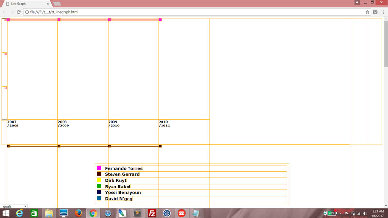
See the cobalt square on the top left corner of each column? It corresponds with the color specified for David N'gog. Why only him, you may ask? Don't worry, all will be clear soon.

For now, put in an If conditional. The line is only supposed to be there for all columns preceding the last one. Inside the If block, set the variable line to a newly created div, assign it the data_line class and give it the same background color as node. Then give it a unique id using i and j as well. Finally, append line within container.
for (var j=0;j<graphdata.rows.length;j++)
{
datacol = document.createElement("div");
datacol.className = "col_section";
container = document.createElement("div");
container.className = "data_container";
node = document.createElement("div");
node.className = "data_node";
node.style.backgroundColor = graphdata.cols[i].color;
node.id = "node_" + i + "_" + j;
container.appendChild(node);
if (j<graphdata.rows.length-1)
{
line = document.createElement("div");
line.className = "data_line";
line.style.backgroundColor = graphdata.cols[i].color;
line.id = "line_" + i + "_" + j;
container.appendChild(line);
}
label = document.createElement("div");
label.className = "data_label";
label.innerHTML = graphdata.rows[j] + "<br />/" + (graphdata.rows[j] + 1);
datacol.appendChild(container);
datacol.appendChild(label);
col.appendChild(datacol);
}
{
datacol = document.createElement("div");
datacol.className = "col_section";
container = document.createElement("div");
container.className = "data_container";
node = document.createElement("div");
node.className = "data_node";
node.style.backgroundColor = graphdata.cols[i].color;
node.id = "node_" + i + "_" + j;
container.appendChild(node);
if (j<graphdata.rows.length-1)
{
line = document.createElement("div");
line.className = "data_line";
line.style.backgroundColor = graphdata.cols[i].color;
line.id = "line_" + i + "_" + j;
container.appendChild(line);
}
label = document.createElement("div");
label.className = "data_label";
label.innerHTML = graphdata.rows[j] + "<br />/" + (graphdata.rows[j] + 1);
datacol.appendChild(container);
datacol.appendChild(label);
col.appendChild(datacol);
}
Now all the columns preceding the last one, have a thin cobalt line expanding from the node!

Now it does seem a little strange that only David N'gog's data is showing. That's because the margin-right property of col_container is set to -100%. Try this...
.col_container
{
height:100%;
width:95%;
float:left;
margin-right:0;
}
{
height:100%;
width:95%;
float:left;
margin-right:0;
}
Uh oh, what just happened? You see the data for Fernando Torress with a nice magenta and Steven Gerrard with brown, and if you scroll down further you'd probably see the rest. That's because each div styled by col_container, whch holds the columns showing player data, occupies 95% of its parent and leaves no room for the other divs, causing them to overflow. Setting the margin-right property to -100% actually forced them to overlap.
No comments:
Post a Comment