Friday, 30 April 2021

Back to the office!

It's official. Singapore's default of working from home was over as of the 5th of this month. When the news broke, I swear the sound I heard was Boomer Bosses cheering in unison all around the island, with delirious jubilation.

Because, even with the COVID-19 pandemic claiming millions of lives, companies closing and jobs being lost, we all know who has really suffered the most - Boomer Bosses. Otherwise known as employers suffering from the Chinese Towkay Syndrome. Imagine their world collapsing around them as the employees they used to micromanage no longer being required to drag their asses into the office every morning and hang onto their every word. Imagine their consternation at having little to no control over what their employees were up to during office hours now that they were no longer under watchful eye... and still being legally required to pay them. Oh, the humanity!

Unacceptable!

Cheap shots at Boomer Bosses aside, the remote working issue is an interesting one, and it's not quite as cut-and-dry. There are those who want to continue working from home in some capacity, and there are those who want to get back to the office ASAP. And both positions are equally valid, depending on context.

The case for remote working

Easier to juggle personal tasks. Ever had a dozen tiny tasks that wouldn't take much time, but you just couldn't get to because you weren't at home? Get an extra bottle of detergent. Pick up the latest free face mask from a nearby vending machine. Top up your refrigerator's supply of M&Ms. Sure, you could do all that one your way home to the office or even on the weekend, but in the mad rush of day, things get forgotten and remembered only when it's inconvenient.

No commute. That sounds petty, but it's really a big one because it all adds up. Not financially; unless you're a habitual cab rider, the savings are negligible. No, I meant in terms of time. No more getting up early to catch the bus or dealing with traffic on the way home. Time you could spend getting more shit done.

Along with not commuting or even stepping out of the house, the need for make-up, hair gel and nicely-pressed shirts is significantly reduced. Your breath can stink; no one at the office is going to be smelling it. For the record, I'm not recommending that last one. Personal hygiene is called "personal" for a reason - whether or not you're alone is no reason to be neglecting it.

And speaking of personal hygiene, years of slumming it in the most dilapidated, disgusting office restrooms known to Man has taught me never to take for granted the privilege of being able to use your own home toilet.


No need to dress up.

Breaks. When no one is watching you, it's far easier to get a short nap or a coffee break. This may sound a lot like slacking off, and in many cases, it is. However, bear in mind that the typical programmer's job has very little to do with sitting in front of a terminal and typing. The typing part is mostly implementation of a solution... a solution that may have been conceived away from the keyboard. As almost all of programming requires a thought process, a programmer may be working even while not at a terminal. Often, it's not even conscious or voluntary. We're not actively trying to think about work, but that's usually when the solution comes. So breaks are a part of the process... and said breaks are easier to take when you don't have non-programmers watching and silently judging you.

Music.
Related to the last point, sometimes playing music or listening to a podcast can aid concentration. Again, that's easier to do when there's no one around. Really, nobody needs to know that you listen to Justin Bieber. Sure, in an office environment, you could use headphones... but then you wouldn't hear the phone ring or be able to respond to people trying to get your attention.

The case for returning to the office

Drawing the line. Working from home can be a pain in the ass. You don't really get that neat separation between home and office. I feel the constant nagging urge to mop the floor, do the laundry, scrub the bathroom... and sometimes it interferes with the work process. I imagine it's worse for people who have kids. And sometimes the reverse happens - I actually end up putting in significantly more hours at work than I would otherwise do at an office, simply because the line separating work and home is just too thin.

Distractions!

Communication. Remote working gets lonely. The lack of face-to-face interaction, while nice at first, eventually turned out to be pretty grating after a few months. I guess I'm more of a social creature than I ever gave myself credit for. Yes, technically, communication can be carried out online. But screens of text and video calls just don't quite do it. People communicate more than with just words. Hand gestures, body language - these are dimensions that don't translate well over video call. Also, online communication turns some people into assholes. There are some really brave souls who talk a whole lot more shit online than they would when they're within physical punching distance.

A lot of software development work is in the thought process. Working independently is one thing, but sometimes devs need to confer. Bounce ideas off each other. Sometimes when I get stuck, explaining the problem to another dev helps with the mental constipation. Sure, there are whiteboard tools online. Call me old-fashioned, but nothing really beats being there. You don't have to deal with internet lag, for one. Also, I write a whole lot faster (though admittedly not necessarily more legibly) than I type.

Reminding the boss you still exist. Out of sight, out of mind, as they say. Relationships with those in authority may suffer, especially if you were building up a beautiful working relationship pre-pandemic. People have short memories.

Utilities. An alarming number of people seem to think that the boss saves on electricity, water and internet access if less people come to the office. That's utterly ridiculous. Whether two people are in the office or twenty, the lights still have to be on, and the air-conditioning costs just as much. And unless your company owns the building, rent still needs to be paid. Just because you incur those costs by working from home doesn't mean your employer saves on those costs. But this segues nicely into my point - not working from home saves you having to pay extra for utilities, especially if you're the sort who needs the air-conditioning turned on all day.

Implications of remote working

One common fear is that your employer may start wondering about replacing you - after all, if your job can be done just as well remotely, what's the next logical step? Cheaper offshore talent. Some programming work, especially grunt programming work, falls under this category. Also, possibly, most of office work - the kind that focuses on the ability to use a computer rather than human interaction - falls under this category.

In reality, it's far less straightforward. Offshore talent comes with its own drawbacks, such as time-zone differences, language barriers and cultural clashes. Also, the more traditional-minded employers prefer to see people hard at work, or at least pretending to do the jobs they are paid to do.

Worried about
remote working?

But yes, that's not an unreasonable fear. Should you be afraid? Well, that really depends. Take my situation for example.

One - I'm reasonably secure in my position - my job is to deliver working software solutions and while no one is irreplaceable, I like to think that I deliver enough value to justify the current work arrangement.
Two - my superior isn't a micromanaging Boomer Boss.
Three - I'm the only person in that department and working in the office adds zero value to the quality of my work.
Four - I don't actually need the money.

But that's my situation and my job; statistically, the vast majority of office workers don't have it that good. It would be disingenuous to pretend otherwise. So chances are, if your situation is like the majority of the working population, you do have plenty to worry about. But you have no cause to be embarrassed. There's no shame in being unexceptional.

If your physical presence at work is your biggest - or worse, only - significant contribution to what would otherwise be any other office job, then yes, you are absolutely right to be afraid of losing your position. Scratch that; you should be terrified. And you absolutely should go back to the office and be grateful to still have a job, even if it's one you have to protect by parking your butt at an office desk. You gotta do what you gotta do; again, there's no shame in it.

But if you don't like being in this position, then you'll need to work on yourself so that eventually, you won't be in this position. Otherwise, suck it up, dude. There are worse things in life than having to go through a nine-to-five grind at the office.

All in all

For most office work, the future is remote work. We can slow progress, but only for so long. Internet is not a luxury; it is now a necessity. As many have learned.

Still, physical presence does have its place. It's simply not as importance as it once was, because it's no longer the only option. We now have alternatives. Just bear in mind that remote working is merely one of these alternatives and not a blanket solution. At the end of the day, whatever mode one chooses, it has to make sense to both the business and the employee.

Sending regards from home,
T___T

Saturday, 24 April 2021

Ten sketches of actual programming projects

One of the greatest myths in development is that when developers write code, they simply park their asses down somewhere and type away till they're done. Nothing could be further from the truth. The process of writing code is thought. Lots of it. There has to be a rough outline before a developer even knows where to begin.

And one of the most common ways to provide a rough outline, is through sketching.

Yes, you read that right. Sketching. Pencil to paper. Crooked lines. Scribbled text. Stick figures. Here are some of the sketches I've done, that ultimately made the transition to working code. I thought it would be fun to provide a before-after dynamic. Notice how many of these sketches don't translate a hundred percent to the finished product. That's because requirements evolve. Sometimes, while I'm working on it mid-way, I hit upon a better way of implementing the idea. This may result in elements being moved around, text changed, and so on. That's just how it is.

1. Hong Kong Anti-extradition Protest Symbol (2019)

Whatever I eventually ended up thinking about the Anti-extradition Protests of 2019 in Hong Kong, there's no denying that this produced a lot of great art, some of which got me thinking about how one would represent one of these pieces in CSS.


The sketch was clumsy, the final product hopefully less so. It was basically the process of figuring out basic shapes in CSS and how to combine them. This was scribbled out over the course of devouring a lunch sandwich at my desk, and coded within the day in the evening.

2. Tic Tac Toe (2019)

Both the original and the Valentine's Day version were born from this little grid. It isn't much to look at, but there was more to this than just interface.


In here, I actually numbered the grid squares and thought about how to map out a win scenario, eventually going with an array as the main data structure.

3. Christmas-themed LESS Demo (2017)

I'm not sure at what point I decided to explore LESS, but it came in the form of making three different layouts to test my code with. Enter the 2017 Christmas-themed LESS Demo. Here, you can see the different layout drawings for each color.


Fun fact: The text in blue was preliminary thoughts for an unrelated piece of code for Ruby MadLibs.

4. Valentine Heart Animation (2019)

This was some idle doodling during an extremely boring meeting in which I was trying desperately not to fall asleep. Crude it may be, but it led to some amazing stuff.


I actually made this for my wife for Valentine's Day. She wasn't extremely impressed considering she's Chinese and doesn't celebrate Valentine's Day on 14th February... but it's the thought that counts, right?

5. The Pie Chart (2018)

While trying to produce a pie chart using CSS, there was a lot to think about in terms of angles and overlapping. The sketch I made during this thought process was extremely rudimentary. It certainly doesn't do justice to the insane amount of code I had to write in order to make this work.

The Pie Chart

However, work it did. For this, I had to think of all possible cases and how to handle them. Which was hard because at my level of CSS, I could only produce things at a right angle. Thus, the final result was a shit-ton of hacking.

6. Easter Bunny River Crossing Game (2019)

During another boring meeting, I sketched this beauty as my programmer brain clicked into full gear as to how I would make this work...


The final product differs a bit from the sketch. As you can see, I opted for full-body representations instead of cute icons. I can't recall the thought process behind it, other than "it would be cool".

7. Ada Lovelace Day Generator (2019)

During yet another boring meeting (see a pattern here?), this was born. I was thinking of ways to write a simple ReactJS app, and this came up. OK, so my drawing of Ada Lovelace looked more like some corporate suit but that was only meant to be a placeholder. I might have based the sketch on the office lady sitting opposite me at the meeting.


The controls for the number manipulation weren't as I originally envisioned. Certain considerations tend to come up only during implementation. But all is fine. I'm pretty happy with the outcome.

8. Scroll-down Christmas Carol (2016)

Work for the this was based on the scroll-down effect - but at that time I only knew how to use CSS to draw, and thus when rendering the caroler, I had to break it down into basic shapes. This was the sketch. Pretty rough, huh?


Well, as it turns out, I think my sketch actually had more life in it than the final product. Joke's on me!

9. CNY Rat SVG Animation (2020)

This one was an attempt by me to visualize how the string "2020" would morph into a graphical representation of a rat. As you can see, I had two versions, neither of which really resemble the final product.


On the other hand, these were lame. I think the end product is worlds better. I hit on the idea of using the bases of the "2"s as whiskers, while writing the code. But the sketches did give me that foundation to build on.

10. Contact Us Page (2019)

Another square drawing. This was pretty straightforward; I needed a layout for a typical Contact Us page, and just wanted to figure out what would go where.

Contact Us Page

You can even see the pin on what was my pathetic representation of a Google Map!

Whew, I'm done!

I'm definitely a worse artist than I am a developer, and that's saying something. Hopefully, from these, you can gain a greater appreciation of how this developer does things.

Sketch you later, alligator!
T___T

Tuesday, 20 April 2021

My Personal Reserves: The Why and the How

Losing one's job can be a critical blow - to confidence, finances and psychological health. Last year was perhaps the third (or fourth?) time in my life that I lost my job. Unlike those other times, however, this time felt remarkably different.

During those other times, I had a mortgage to pay. I had financial obligations that needed to be met. It may sound unbelievable considering what people know of me today, but there were times, especially when I was younger, when I suffered from anxiety about the future, and doubts about my own tech cred. Sure, it all seems silly now considering what I've managed to accomplish, but back then, this shit was brutal.

When I lost my job last year, all I felt was relief that I no longer had to work for the unprofessional wanker who was my last boss. I didn't feel any anxiety about having no income. And I certainly didn't feel like I just wasn't good enough to hold on to the job.

So what was different this time? Short answer: I had money.

I've stated before the importance of having a Fuck You Fund. Conventional wisdom states that the size of this Fuck You Fund needs to be at least six months to a year of monthly expenditure. When I checked my account, I had up to three years.

This was no accident.

Back in 2016, when my company closed down and I was in the unenviable position of having no income while needing to make mortgage payments, my bank account had a few thousand dollars left, tops. I was, metaphorically speaking, surrounded by a falling house of cards.

Everything crashing
down around me.

It was then when I made myself a promise. I must never allow myself to be in the same position again.

Realistically, of course, I couldn't prevent myself from ever losing my job again - no matter how good I am, that's not up to me. What I could do was ensure that I had money in the bank if or when I ever lost my job again.

The implementation

My life had already been simple before; now I started living like I was broke... and I actually was, or very close to it. When I got a job and started seeing income again, I continued living that way. For the next four years, no matter how much I was drawing each month, my meals were sandwiches made the night before. Eventually, I got lazy and graduated to buying a Footlong from Subway every morning, and cutting it into three portions. Sometimes, when I felt like indulging myself, I'd pay a little extra for coffee and a cookie.

Breakfast, lunch and
dinner for years.

Aside from food, my personal expenses were limited to cigarettes and the occasional movie ticket. I wasn't even doing it consciously by that point. It had simply become a habit. A habit which ensured that my bank balance continued to steadily grow.

Friends have advised me to "treat myself" more often instead of living like an impoverished old man. What they fail to realize is, their definition of a "treat" is very far removed from mine. To them, a seven-dollar coffee at Starbucks is a weekly, or even an everyday occurrence. To me, splurging seven bucks on dinner is a treat. I'm not miserable by any means - I just lack an appreciation for the finer things in life.

This thing about reserves...

To combat the COVID-19 crisis of 2020, the Singapore Government spent a total of SGD 52 billion to kickstart the economy, prop up failing businesses and financially bolster citizens in need of aid.

There's always been segments of our society that claim the Government is not spending money wisely or doing all they can to help the needy - and yes, sometimes I can see where that criticism stems from. Other times, it's just a lot of noise from children who really love the attention. The thing is, the Government saved up all that money for a rainy day. And with COVID-19, there was a downpour like never before. Instead of having to borrow heavily to finance a recovery plan, we used a hundred percent of our own money to do it.

A downpour like never before.

It was one of those times, as a Singaporean, that I couldn't have been prouder. Why, though? I wasn't directly responsible for our Government saving up all that sweet, sweet wealth. But it occurred to me, belatedly, after having lost my job, that I had done well to live my life by those very same principles - spend a lot less than you make, put money aside and don't indulge in petty but expensive pleasures. In short, be financially responsible.

Conclusion

There was no magic formula. No get-rich-quick plan. In gaming terms, what I did was the financial equivalent of Level Grinding. But fuck me, it worked.

At my current expenditure, I have more money than I know what to do with. And that includes whatever I give my parents, my wife and to various charities. As long as I don't do something sub-optimal like pick up a gambling addiction, buy a fancy car, provide loans, have kids or, y'know, frequently "treat myself", it looks to be that way for a long time.

I'm not wealthy by any stretch of the imagination. But at the same time, I'm not in the position of having to borrow money from others, nor do I have to suck it up and work for people that I don't want to work for. I work because I want to, because a life without work is too awful to contemplate. For a software developer of limited talent and modest means, that makes all the difference in the world.

Live cents-sibly,
T___T

Thursday, 15 April 2021

Web Tutorial: Free Myanmar

While the rest of the world struggles with a global pandemic, Myanmar has upped the ante in the form of a military coup that took place two months ago. The citizens of Myanmar have not been taking it lying down, however, and a massive and sustained outcry has made itself heard since. However, Myanmar has had a far rougher go of it than their counterparts in Hong Kong. The Anti-extradition protests in Hong Kong led to two deaths, one of which was due to some unlucky chap losing his balance and falling off the top of a building. The situation in Myanmar has seen, to date, at least seven hundred people die from military violence.

Now, as always with situations like these, I look for one thing - protest art. There's nothing quite like a perceived struggle against tyranny to bring out the creative romantic in all of us. My search turned out a whole bunch of images incorporating the three-fingered salute, and that's what we'll do today.

What we will use

This will be a combination of a HTML and CSS background, with the main parts done in SVG.

The HTML

Here's the boilerplate.
<!DOCTYPE html>
<html>
    <head>
        <title>Free Myanmar!</title>

        <style>

        </style>
    </head>

    <body>

    </body>
</html>


We will add a div with id svgContainer. Within it will be a svg tag.
<body>
    <div id="svg_container">
        <svg>

        </svg>
    </div>

</body>


For styling, svgContainer and the svg will be 800 by 700 pixels. svgContainer will be centered, and have a red outline so we have an idea of the borders we are working with.
<style>
    #svg_container
    {
        width: 800px;
        height: 700px;
        outline: 1px solid red;
        margin: 0 auto 0 auto;
    }

    svg
    {
        width: 800px;
        height: 700px;
    }

</style>


There you go.


And then let's style the background. I'm opting for a deeper red background (the color of Aung San Suu Kyi's party flag) that will graduate elliptically to black in the middle.
<style>
    body
    {
        background: -moz-radial-gradient(center, ellipse cover,  #000000 0%, #aa0000 100%);
        background: -webkit-radial-gradient(center, ellipse cover,  #000000 0%,#aa0000 100%);
        background: radial-gradient(ellipse at center,  #000000 0%,#aa0000 100%);
    }


    #svg_container
    {
        width: 800px;
        height: 700px;
        outline: 1px solid red;
        margin: 0 auto 0 auto;
    }

    svg
    {
        width: 800px;
        height: 700px;
    }
</style>


That's a good start! Really gives you that grim sense of foreboding, doesn't it?


Now for the SVG

We will be using path tags to represent the hand. First of all, we will style path tags to have a white outline. The background will be also white, but we will keep opacity at 0, for now.
svg
{
    width: 800px;
    height: 700px;
    margin: 0 auto 0 auto;
}

path
{
    stroke-width: 1px;
    stroke: rgba(255, 255, 255, 1);
    fill: rgba(255, 255, 255, 0);
}


The first part is the thumb. We begin with two straight lines.
<svg>
    <path
        d="M330 680 l0 -150
        l-50 -100
        "
    />

</svg>


This will form part of the wrist and thumb. You won't see it just yet.


We follow up with a curve, and then another straight line.
<svg>
    <path
        d="M330 680 l0 -150
        l-50 -100
        q0 -20 30 -50
        l130 -70

        "
    />
</svg>


You can see the thumb and its knuckle taking shape.


We follow up with two curves.
<svg>
    <path
        d="M330 680 l0 -150
        l-50 -100
        q0 -20 30 -50
        l130 -70
        q50 40 -70 100
        q50 20 50 80

        "
    />
</svg>


This completes the thumb and its base! The outline, anyway.


And here we retrace our earlier steps ending with a "Z"...
<svg>
    <path
        d="M330 680 l0 -150
        l-50 -100
        q0 -20 30 -50
        l130 -70
        q50 40 -70 100
        q50 20 50 80
        q0 -50 -55 -75
        l-10 10
        l0 -15
        l70 -40
        q35 -30 15 -55
        l-120 65
        q-25 10 -35 50
        l55 110
        l-5 10
        Z

        "
    />
</svg>


...to form a hopefully artistic outline of the thumb.


The second part is two path tags to represent the little finger. This here is the crook of the little finger...
<path
    d="M330 680 l0 -150
    l-50 -100
    q0 -20 30 -50
    l130 -70
    q50 40 -70 100
    q50 20 50 80
    q0 -50 -55 -75
    l-10 10
    l0 -15
    l70 -40
    q35 -30 15 -55
    l-120 65
    q-25 10 -35 50
    l55 110
    l-5 10
    Z
    "
/>

<path
    d="M455 350 l5 -10
    l5 -35
    l0 15
    l10 -5
    l-10 10
    l-5 20 Z
    "
/>


Doesn't look like much so far? Patience, young Padawan.


...and this is the rest!
<path
    d="M330 680 l0 -150
    l-50 -100
    q0 -20 30 -50
    l130 -70
    q50 40 -70 100
    q50 20 50 80
    q0 -50 -55 -75
    l-10 10
    l0 -15
    l70 -40
    q35 -30 15 -55
    l-120 65
    q-25 10 -35 50
    l55 110
    l-5 10
    Z
    "
/>

<path
    d="M480 680 l0 -150
    q55 -50 0 -250
    q-50 -40 -60 38
    l5 -5
    q10 -65 50 -30
    q65 190 -10 250
    l5 0
    Z"
/>


<path
    d="M455 350 l5 -10
    l5 -35
    l0 15
    l10 -5
    l-10 10
    l-5 20 Z
    "
/>


Good going.


This last part takes care of the other fingers. It's a very long sequence, but you should be able to work this out.
<path
    d="M455 350 l5 -10
    l5 -35
    l0 15
    l10 -5
    l-10 10
    l-5 20 Z
    "
/>

<path
    d="M300 385 l0 -250
    l2 -10
    q20 -50 45 0
    l2 10
    l2 -40
    q20 -50 50 0
    l2 50
    l2 -10
    l5 -10
    q15 -20 30 0
    l5 10
    l2 10
    l0 118
    l-2 1
    l0 -20
    l-10 -2
    l10 -2
    l0 -60
    l-10 -2
    l10 -2
    l0 -30
    q-20 -55 -40 0
    l0 30
    l20 2
    l-20 2
    l0 60
    l20 2
    l-20 2
    l0 60
    l10 2
    l-30 0
    l15 -2
    l0 -65
    l-20 -2
    l20 -2
    l0 -65
    l-20 -2
    l20 -2
    l-3 -70
    q-20 -45 -42 0
    l-3 40
    l-0 30
    l20 2
    l-20 2
    l-0 65
    l20 2
    l-20 2
    l0 65
    l20 2
    l-45 0
    l20 -2
    l0 -60
    l-15 -2
    l15 -2
    l0 -60
    l-15 -2
    l15 -2
    l-2 -40
    q-20 -60 -42 0
    l-0 40
    l20 2
    l-20 2
    l-0 60
    l20 2
    l-20 2
    l-0 60
    l10 2
    l-10 2
    q0 50 5 70
    Z"
/>


And here's our salute!


Now alter the CSS. The background and outline opacity we will set to 0.3...
path
{
    stroke-width: 1px;
    stroke: rgba(255, 255, 255, 0.3);
    fill: rgba(255, 255, 255, 0.3);
}


Coolness, a ghostly hand!


Now for the text. Let's style this. Both the background and outline are red, but at different opacities. I've gone with huge Impact lettering.
path
{
    stroke-width: 1px;
    stroke: rgba(255, 255, 255, 0.3);
    fill: rgba(255, 255, 255, 0.3);
}

text
{
    stroke-width: 3px;
    stroke: rgba(255, 0, 0, 0.2);
    fill: rgba(255, 0, 0, 0.1);   
    font: 180px impact
}


And then place the text behind the salute.
<text x="250" y="350">
    FREE
</text>

<text x="50" y="550">
    MYANMAR
</text>


<path
    d="M330 680 l0 -150
    l-50 -100
    q0 -20 30 -50
    l130 -70
    q50 40 -70 100
    q50 20 50 80
    q0 -50 -55 -75
    l-10 10
    l0 -15
    l70 -40
    q35 -30 15 -55
    l-120 65
    q-25 10 -35 50
    l55 110
    l-5 10
    Z
    "
/>


Here, you can see I adjusted the opacity so it blends in nicely.


And one final touch. What's protest art without a little blood? For this, we will use circle tags. Let's style them. So we can see what we're doing, I'm giving them a white outline.
text
{
    stroke-width: 3px;
    stroke: rgba(255, 0, 0, 0.2);
    fill: rgba(255, 0, 0, 0.1);   
    font: 180px impact
}

circle
{
    fill: rgba(255, 0, 0, 1);
    stroke-width: 1px;
    stroke: rgba(255, 255, 255, 1);
}


Here, I varied the sizes of the blood drops, and their positioning.
    l-10 2
    q0 50 5 70
    Z"
/>

<circle cx="250" cy="200" r="10" />
<circle cx="253" cy="220" r="5" />
<circle cx="260" cy="210" r="8" />
<circle cx="220" cy="200" r="2" />
<circle cx="230" cy="190" r="2" />
<circle cx="310" cy="190" r="1" />
<circle cx="210" cy="220" r="2" />
<circle cx="220" cy="210" r="2" />
<circle cx="230" cy="240" r="1" />
<circle cx="300" cy="180" r="2" />
<circle cx="200" cy="240" r="1" />
<circle cx="240" cy="245" r="3" />
<circle cx="250" cy="250" r="2" />
<circle cx="360" cy="230" r="2" />
<circle cx="350" cy="220" r="3" />


Adjust till you're happy.


Now turn the outline off. Here, I've opted to do that by setting the stroke-width property to 0 pixels, but you can do that just as easily by setting the stroke color to zero opacity.
circle
{
    fill: rgba(255, 0, 0, 1);
    stroke-width: 0px;
    stroke: rgba(255, 255, 255, 1);
}


Turn this outline off as well.
#svg_container
{
    width: 800px;
    height: 700px;
    outline: 0px solid red;
    margin: 0 auto 0 auto;
}


Here's your completed protest art!


Finally...

I am rather more sympathetic towards the situation in Myanmar, than the overblown drama that was Hong Kong. I'm not sure exactly why, but it feels different. For one, there's a lot more violence in the Myanmar situation. It's a storm of brutal tactics exercised by a remorseless military. And nobody deserves that.

Suu long!
T___T

Friday, 9 April 2021

Choosing between CSS and SVG (Part 2/2)

Now, let's take a look at CSS.

CSS (Cascading Style Sheets)

CSS has been around a long time, and is really versatile. I picked it up almost fifteen years ago, and to this day I don't think I've managed to plumb even half of its depths. As browsers evolve, so, too, has CSS.

Use Case. For styling pages, specifying layout and such, CSS is the tool to use, no question. And that's because CSS is the only tool that can be used for this, right now. You can't use SVG to style a page unless your entire page is an SVG, which would be really bad for SEO.

Cross-browser compatibility. CSS has had issues with cross-browser performance and capability, but most browsers do support CSS, albeit with variations in implementation that will be worked out over time. Not to say CSS isn't sometimes a pain in the ass in this regard, but SVG can be much worse. Internet Explorer, in particular, doesn't render SVG well.

Power. The power of CSS isn't in its versatility (though that certainly doesn't hurt), but its organizational ability. With judicious use of CSS rules, you can organize site structure in such a way that maintaining the look and feel, or even making wholesale changes, is much less hassle than it needs to be.

CSS is easier to organize.

SVG, on its own, does not have that capability. Maintenance can become a right mess.
<svg height="210" width="500">
    <circle cx="150" cy="250" r="140" stroke="green" stroke-width="4" fill="yellow" />
    <rect width="300" height="100" stroke="green" stroke-width="4" fill="red" />
    <line x1="0" y1="10" x2="200" y2="200" stroke="blue" stroke-width="2" />
    <line x1="10" y1="20" x2="100" y2="200" stroke="blue" stroke-width="2" />
    <line x1="0" y1="30" x2="200" y2="200" stroke="blue" stroke-width="2" />
    <line x1="10" y1="40" x2="100" y2="200" stroke="blue" stroke-width="2" />
    <line x1="0" y1="50" x2="200" y2="200" stroke="blue" stroke-width="2" />
    <line x1="10" y1="60" x2="100" y2="200" stroke="blue" stroke-width="2" />
    <line x1="0" y1="70" x2="200" y2="200" stroke="blue" stroke-width="2" />
</svg>


Compared to CSS, which can cascade rules for maximum effect.
<style>
    .myStyle
    {
        font-family: arial;
        font-size: 16px;
    }

    .myStyle h1
    {
        font-size: 1.5em;
    }

    .myStyle ul li
    {
        font-size: 0.85em;
        font-weight: bold;
    }
</style>

<div class="myStyle">
    <h1>Header</h1>
    <p>Sample text</p>
    <ul>
        <li>Line 1</li>
        <li>Line 2</li>
        <li>Line 3</li>
        <li>Line 4</li>
    </u>
</div>


Preprocessor languages such as LESS and SASS add even more power to this organizational ability, providing added oomph through mixins, variables and hierarchy.

My recommendation

Don't choose one over the other. Learn both. SVG can be styled using CSS, and it's a killer combo - the power of SVG coupled with the organizational abilities of CSS.

<style>
    svg
    {
        width: 500px;
        height: 210px;
    }

    svg circle
    {
        stroke: green;
        stroke-width: 4;
        fill: yellow;
    }

    svg rect
    {
        stroke: green;
        stroke-width: 4;
        fill: red;
    }

    svg line
    {
        stroke: blue;
        stroke-width: 2;
    }
</style>

<svg height="210" width="500">
    <circle cx="150" cy="250" r="140" />
    <rect width="300" height="100" />
    <line x1="0" y1="10" x2="200" y2="200" />
    <line x1="10" y1="20" x2="100" y2="200" />
    <line x1="0" y1="30" x2="200" y2="200" />
    <line x1="10" y1="40" x2="100" y2="200" />
    <line x1="0" y1="50" x2="200" y2="200" />
    <line x1="10" y1="60" x2="100" y2="200" />
    <line x1="0" y1="70" x2="200" y2="200" />
</svg>


I might be a bit biased here because that's the route I took, but my recommendation would be to learn CSS first because the use case is more prevalent. After you've mastered a certain amount of CSS, using it to complement SVG should be a breeze.

Stylishly yours,
T___T
Wednesday, 7 April 2021

Choosing between CSS and SVG (Part 1/2)

CSS and SVG are both non-programming languages that are part of web development. They can be embedded into HTML to create great visual effects.

While there's a certain amount of overlap, for the most part their uses cases are quite separate and distinct. SVG is mostly used for graphics, and CSS for layout. But there will be times when either CSS or SVG could do the job, and the inevitable question would be - which should you use?

Here, I'm going to take a look at each, and outline the situations where you should choose one over the other.

SVG (Scalable Vector Graphics)

I started learning SVGs while using D3.js, a Data Visualization JavaScript library. And soon fell in love with the sheer amount of artistic freedom it gave me.

Use Case. SVG is used for graphics. Be it charts and graphs, icons or fancy animations, SVG works great. CSS can do the same thing, yes... and in simple cases perhaps even outperforms SVGs.

But here's the thing: CSS graphics are mostly rectangular and square divs. Even ovals and circles are rectangular or square divs with rounded corners. It's still possible to render complex shapes from CSS, but you have to jump through an awful lot of hoops to do it. Don't get me wrong; it can be fun. But also pretty frustrating.

SVG, on the other hand, has a path tag that was made for complex shapes. Add Bezier Curves to the mix and you have a very potent tool. Animations and transformations are also relatively simple to create.

Easier to draw in SVG.

Using SVG for intricate graphic work is a much more attractive option than CSS, at least where capability and ease of use is concerned.

Learning Curve. Chances are that you already know HTML. And if you do, learning SVGs is a breeze. Everything about embedding SVGs in HTML5 is about XML tags. Circles, ellipses, rectangles, lines, paths, animations... all XML tags with attributes to specify appearance and behavior. And in case you don't feel like learning all of that, there are always SVG generators.

You also need to know HTML in order to use CSS, but that's where the resemblance ends. CSS is nothing like HTML. Some parts of CSS are easy enough to master. The rest is hellishly difficult, especially when you're trying to use CSS to do the things that SVG does.

Purely absolute positioning.
Anyone who has ever used CSS and been frustrated about the differences between relative and absolute positioning, will love this part about SVGs. Just about everything is absolutely positioned from the top left corner of the SVG. There are no questions about relative positioning from one element to another. Overlapping is also easier because whatever tag is declared last, always goes on top.

Next

We'll take a look at what CSS does better.

Friday, 2 April 2021

Web Tutorial: VueJS Easter Puzzle

What's up, you glorious geeks? Easter approaches!

Traditionally, at this time of year, we have our Easter-themed web tutorial. This year, I shall not disappoint... and there's a special treat because I will be using VueJS for this one.

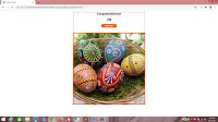
My usage of the framework will be a very rudimentary one, just to get beginners off on the right foot. What we will be doing is a very simple puzzle game. We will use an Easter-themed image, like this one. It's a 500 by 500 pixels square image.


easter.jpg

Now imagine if the image was scrambled and you had to unscramble it within a time limit. That will be what our game does!

The setup

As usual, it all begins with some HTML.
<!DOCTYPE html>
<html>
    <head>
        <title>Easter Puzzle</title>

        <style>

        </style>
    </head>

    <body>
        <script>

        </script>
    </body>
</html>


Here, let's add something to the styling - a red outline to all divs for dev purposes.
<!DOCTYPE html>
<html>
    <head>
        <title>Easter Puzzle</title>

        <style>
            div { outline: 0px solid #FF0000;}
        </style>
    </head>

    <body>
        <script>

        </script>
    </body>
</html>


The next few items are specific to VueJS. We need a div with an id of easterApp. And then we need to link the VueJS library. Finally, we begin scripting by declaring a variable app, and setting it to a new instance of the Vue object.
<html>
    <head>
        <title>Easter Puzzle</title>

        <style>
            div { outline: 1px solid #FF0000;}
        </style>
    </head>

    <body>
        <div id="easterApp">

        </div>


        <script src="https://cdnjs.cloudflare.com/ajax/libs/vue/1.0.18/vue.min.js"></script>

        <script>
            var app = new Vue
            (

            );
        </script>

    </body>
</html>


We then fill in app with an object within the new Vue object. It will have the properties el (which we will set to the id easterApp to let Vue know which DOM element to reference), methods to hold the different methods for this app, and created to define what gets run as soon as the app loads.
<script>
    var app = new Vue
    (
        {
            el: "#easterApp",
            data:
            {

            },
            methods:
            {

            },
            created: function()
            {

            }
        }

    );
</script>


Inside easterApp, add a div with an id of timeContainer. Inside that, put some HTML. These are elements that will be populated later. And then we'll also have a div with an id of puzzleContainer right under timeContainer.
<div id="easterApp">
    <div id="timeContainer">
        <h2>Message</h2>
        <h1>Seconds</h1>
        <button>ButtonText</button>
    </div>

    <div id="puzzleContainer">

    </div>

</div>


Let's style! easterApp will be 500 pixels wide. We'll use the margin property to set it center of the screen, and then set some font styling.
<style>
    div { outline: 1px solid #FF0000;}

    #easterApp
    {
        width: 500px;
        margin: 0 auto 0 auto;
        font-family: verdana;
        font-size: 12px;
    }

</style>


Next is timeContainer. It will take up full width of easterApp. We give it 150 pixels in height, and align text center.
<style>
    div { outline: 1px solid #FF0000;}

    #easterApp
    {
        width: 500px;
        margin: 0 auto 0 auto;
        font-family: verdana;
        font-size: 12px;
    }

    #timeContainer
    {
        width: 100%;
        height: 150px;
        text-align: center;
    }

</style>


Here, I'm going to style the button. Use whatever fancy CSS you like, but I'm gonna go with orange background and white text.
<style>
    div { outline: 1px solid #FF0000;}

    #easterApp
    {
        width: 500px;
        margin: 0 auto 0 auto;
        font-family: verdana;
        font-size: 12px;
    }

    #timeContainer
    {
        width: 100%;
        height: 150px;
        text-align: center;
    }

    #timeContainer button
    {
        width: 8em;
        height: 2em;
        text-align: center;
        background-color: rgba(255, 100, 0, 1);
        color: rgba(255, 255, 255, 1);
        font-weight: bold;
        border-radius: 10px;
        border: 0px solid black;
    }

    #timeContainer button:hover
    {
        background-color: rgba(255, 100, 0, 0.5);
        color: rgba(255, 0, 0, 1);
    }

</style>


And puzzleContainer will be a square, so we give it a height of 500 pixels.
<style>
    div { outline: 1px solid #FF0000;}

    #easterApp
    {
        width: 500px;
        margin: 0 auto 0 auto;
        font-family: verdana;
        font-size: 12px;
    }

    #timeContainer
    {
        width: 100%;
        height: 150px;
        text-align: center;
    }

    #timeContainer button
    {
        width: 8em;
        height: 2em;
        text-align: center;
        background-color: rgba(255, 100, 0, 1);
        color: rgba(255, 255, 255, 1);
        font-weight: bold;
        border-radius: 10px;
        border: 0px solid black;
    }

    #timeContainer button:hover
    {
        background-color: rgba(255, 100, 0, 0.5);
        color: rgba(255, 0, 0, 1);
    }

    #puzzleContainer
    {
        width: 100%;
        height: 500px;
    }

</style>


This looks like a good start, wouldn't you say?


In the data object, fill in these properties. timer is set to undefined by default. We have seconds with a value of 100 (which is perhaps a bit too much, but you can tweak this later) and btnText, whose default value is "RESET". For message, set it to "Time elapsed". pieces will be an empty array.
data:
{
    timer: undefined,
    seconds: 100,
    btnText: "RESET",
    message: "Time elapsed",
    pieces: []

},


Within the created() method, make a call to the reset() method. This means that as soon as the app loads, reset() will run.
created: function()
{
    this.reset();
}


You'll notice that reset() is prefixed by a reference to this. That's because reset() is a method within the same object that created() is a child of. We will create reset() now, under methods.
methods:
{
    reset: function()
    {

    },

},


In here, we set the properties in data to their default values.
methods:
{
    reset: function()
    {
        this.seconds = 100;
        this.btnText = "RESET";
        this.message = "Time elapsed";
        this.pieces = [];

    },
},


Then we insert calls to stopTimer() and startTimer().
methods:
{
    reset: function()
    {
        this.stopTimer();
        this.seconds = 100;
        this.btnText = "RESET";
        this.message = "Time elapsed";
        this.startTimer();
        this.pieces = [];
    },
},


Next, we create these methods.
reset: function()
{
    this.stopTimer();
    this.seconds = 100;
    this.btnText = "RESET";
    this.message = "Time elapsed";
    this.startTimer();
    this.pieces = [];
},
startTimer: function()
{

},
stopTimer: function()
{

},


For stopTimer(), we use timer as an argument in the clearInterval() function. This means, basically, that we stop the timer, and then we set timer to undefined.
stopTimer: function()
{
    clearInterval(this.timer);
    this.timer = undefined;

},


For startTimer(), this only fires off if timer is undefined. And it would be if stopTimer() was run.
startTimer: function()
{
    if (this.timer == undefined)
    {

    }

},


If timer is undefined, set timer by running setInterval with an interval of 1 second.
startTimer: function()
{
    if (this.timer == undefined)
    {
        this.timer = setInterval
        (
            () =>
            {

            },
            1000
        );

    }
},


In here, decrement seconds.
startTimer: function()
{
    if (this.timer == undefined)
    {
        this.timer = setInterval
        (
            () =>
            {
                this.seconds = this.seconds - 1;
            },
            1000
        );
    }
},


Now check for the value of seconds. If it's reached the value of 0, run stopTimer(). Then set btnText to "REPLAY" and set message.
startTimer: function()
{
    if (this.timer == undefined)
    {
        this.timer = setInterval
        (
            () =>
            {
                this.seconds = this.seconds - 1;

                if (this.seconds == 0)
                {
                    this.stopTimer();
                    this.btnText = "REPLAY";
                    this.message = "Better luck next time!";
                }

            },
            1000
        );
    }
},


Now in the HTML, replace the text we put there, with template strings.
<div id="timeContainer">
    <h2>{{message}}</h2>
    <h1>{{seconds}}</h1>
    <button>{{btnText}}</button>
</div>


Add a click event handler using v-on, and make it call reset().
<div id="timeContainer">
    <h2>{{message}}</h2>
    <h1>{{seconds}}</h1>
    <button v-on:click="reset">{{btnText}}</button>
</div>


Now you'll see that there's a number there where "seconds" was, and it's counting down each second! Also, there's a "REPLAY" button now. If you click it, reset() will be called and the seconds display will go back to 100, then start counting down again.


And once it reaches 0, the message changes!


Next, we're going to populate the puzzle. It will be a 5 by 5 square grid. So create a nested For loop like this. 5 rows, 5 columns.
reset: function()
{
    this.stopTimer();
    this.seconds = 100;
    this.btnText = "RESET";
    this.message = "Time elapsed";
    this.startTimer();
    this.pieces = [];

    for (var row = 0; row < 5; row++)
    {
        for (var col = 0; col < 5; col++)
        {

        }
    }

},


Because each square is going to be 25 by 25 pixels, declare offsetX as the product of col by 25. offsetY will be the product of row by 25.
for (var row = 0; row < 5; row++)
{
    for (var col = 0; col < 5; col++)
    {
        var offsetX = col * 25;
        var offsetY = row * 25;
    }
}


Declare a temporary object, piece. The id property will be unique and going by that formula, it will be from 0 to 24. Set the rotation property to 0, for now. And then set the offsetX and offsetY properties to the current value of offsetX and offsetY, respectively.
for (var row = 0; row < 5; row++)
{
    for (var col = 0; col < 5; col++)
    {
        var offsetX = col * 25;
        var offsetY = row * 25;

        var piece =
        {
            id: (row * 5) + col,
            rotation: 0,
            offsetX: offsetX,
            offsetY: offsetY
        }
    }
}


And finally, push piece into the pieces array. So by the time the nested For loop is done, you should have 25 elements in the pieces array, each with a different offsetX and offsetY value.
for (var row = 0; row < 5; row++)
{
    for (var col = 0; col < 5; col++)
    {
        var offsetX = col * 25;
        var offsetY = row * 25;

        var piece =
        {
            id: (row * 5) + col,
            rotation: 0,
            offsetX: offsetX,
            offsetY: offsetY
        }

        this.pieces.push(piece);
    }
}


In the HTML, inside puzzleContainer, create a div with a class of pieceContainer, and use v-for to ensure that this repeats for every element in pieces.
<div id="puzzleContainer">
    <div class="pieceContainer" v-for="piece in pieces">

    </div>

</div>


Now in the CSS, add the pieceContainer CSS class. The width and height will be 20% of puzzleContainer, which is 25 pixels. And we set the float property to left.
#puzzleContainer
{
    width: 100%;
    height: 500px;
}

.pieceContainer
{
    width: 20%;
    height: 20%;
    float: left;
}


At this point, you should have a 5 by 5 square grid, each square 25 pixels in height and width.


Back to the HTML, within each div styled using pieceContainer, insert a div styled using piece.
<div id="puzzleContainer">
    <div class="pieceContainer" v-for="piece in pieces">
        <div class="piece">

        </div>

    </div>
</div>


Use v-bind to set the data-id property to the id property of piece.
<div id="puzzleContainer">
    <div class="pieceContainer" v-for="piece in pieces">
        <div class="piece" v-bind:data-id="piece.id">

        </div>
    </div>
</div>


Let's add something to the CSS - the piece class. Each of these will fill full width and height of its parent, and its background image will be easter.jpg.
.pieceContainer
{
    width: 20%;
    height: 20%;
    float: left;
}

.piece
{
    width: 100%;
    height: 100%;
    background-image: url(easter.jpg);
    background-repeat: no-repeat;
}


And there it is...


Now use v-bind on the style attribute. The value will be what's returned from the getStyle() method with piece passed in as an argument. We'll create that next.
<div id="puzzleContainer">
    <div class="pieceContainer" v-for="piece in pieces">
        <div class="piece" v-bind:data-id="piece.id" v-bind:style="getStyle(piece)">

        </div>
    </div>
</div>


Inside the methods object, create the getStyle() method. It will accept obj as a parameter.
stopTimer: function()
{
    clearInterval(this.timer);
    this.timer = undefined;
},
getStyle: function(obj)
{

},


In here, we will generate CSS. Declare rotate and set it to some CSS code. We use the rotation property (which is currently 0 for all pieces).
getStyle: function(obj)
{
    var rotate = "transform: rotate(" + obj.rotation + "deg)";
},


Then we declare offset and do something similar, only this time it's for the background-position property, and we use the offsetX and offsetY properties of obj to generate the CSS.
getStyle: function(obj)
{
    var rotate = "transform: rotate(" + obj.rotation + "deg)";
    var offset = "background-position:" + obj.offsetX + "% " + obj.offsetY + "%";
},


And finally, we return the full CSS style string.
getStyle: function(obj)
{
    var rotate = "transform: rotate(" + obj.rotation + "deg)";
    var offset = "background-position:" + obj.offsetX + "% " + obj.offsetY + "%";

    return rotate + ";" + offset;
},


And now we have a full picture.


Let's randomly rotate all the pieces now. Get back to the reset() method. Inside the inner loop of the nested For loop, declare randomRotation. There are 4 possibilities - from 0 to 3. Then multiply by 90 to get the degree of rotation. Finally, change rotation within the temporary piece object to randomRotation.
for (var row = 0; row < 5; row++)
{
    for (var col = 0; col < 5; col++)
    {
        var randomRotation = Math.floor(Math.random() * 3) * 90;
        var offsetX = col * 25;
        var offsetY = row * 25;

        var piece =
        {
            id: (row * 5) + col,
            rotation: randomRotation,
            offsetX: offsetX,
            offsetY: offsetY
        }

        this.pieces.push(piece);
    }
}


Now this is what it should look like, with pieces all rotated.


Sweet! Now we will add something for the user to be able to rotate the pieces on their own. Use v-on to add a click event, and set it to call the rotatePiece() method.
<div class="piece" v-bind:data-id="piece.id" v-bind:style="getStyle(piece)" v-on:click="rotatePiece">

</div>


Obviously, we will then add this method under methods.
getStyle: function(obj)
{
    var rotate = "transform: rotate(" + obj.rotation + "deg)";
    var offset = "background-position:" + obj.offsetX + "% " + obj.offsetY + "%";

    return rotate + ";" + offset;
},
rotatePiece: function(e)
{

},


This will only fire off if timer is undefined, which means the game is in progress.
rotatePiece: function(e)
{
    if (this.timer != undefined)
    {
                                
    }

},


Declare piece. Set it to the element in pieces pointed to by the id property in the event's element. Remember we set the data-id property? Yep, so we're going to make some changes to piece, then reassign the value back to the element of the pieces array.
rotatePiece: function(e)
{
    if (this.timer != undefined)
    {
        var piece = this.pieces[e.target.dataset.id];

        this.pieces[piece.id] = piece; 
                               
    }
},


Now bear in mind that we can only rotate 90 degrees clockwise. That will be a limit we set. Use an If-else block. Check if the rotation property is 270.

rotatePiece: function(e)
{
    if (this.timer != undefined)
    {
        var piece = this.pieces[e.target.dataset.id];

        if (piece.rotation == 270)
        {

        }
        else
        {

        }


        this.pieces[piece.id] = piece;                                
    }
},


So if the rotation is at 270 degrees, one more rotation would put it back at 0 degrees. Otherwise, just add 90 to the current value of the rotation property.
rotatePiece: function(e)
{
    if (this.timer != undefined)
    {
        var piece = this.pieces[e.target.dataset.id];

        if (piece.rotation == 270)
        {
            piece.rotation = 0;
        }
        else
        {
            piece.rotation = piece.rotation + 90;
        }

        this.pieces[piece.id] = piece;                                
    }
},


Now add a new method - checkIncorrectPieces().
rotatePiece: function(e)
{
    if (this.timer != undefined)
    {
        var piece = this.pieces[e.target.dataset.id];

        if (piece.rotation == 270)
        {
            piece.rotation = 0;
        }
        else
        {
            piece.rotation = piece.rotation + 90;
        }

        this.pieces[piece.id] = piece;                                
    }
},
checkIncorrectPieces: function()
{

}


Basically, we declare incorrect, then set it to a new array derived from running pieces through the filter() method, returning all those elements where the rotation property is not 0. Because 0 is the correct value. After that, we return the number of incorrect values.
checkIncorrectPieces: function()
{
    var incorrect = this.pieces.filter((x) => { return x.rotation != 0;});

    return incorrect.length;

}


So every time the timer runs, it should check if the number of incorrect pieces is 0, which means that all the pieces have been correctly rotated. When that happens, we run the stopTimer() method, set btnText and message, and this effectively ends the game.
startTimer: function()
{
    if (this.timer == undefined)
    {
        this.timer = setInterval
        (
            () =>
            {
                this.seconds = this.seconds - 1;

                if (this.seconds == 0)
                {
                    this.stopTimer();
                    this.btnText = "REPLAY";
                    this.message = "Better luck next time!";
                }

                if (this.checkIncorrectPieces() == 0)
                {
                    this.stopTimer();
                    this.btnText = "REPLAY";
                    this.message = "Congratulations!";
                }

            },
            1000
        );
    }
},


Now when you rotate all the pieces correctly, the timer stops moving and you get a congratulatory message!


A few final touches!

Add this to the CSS so that the animation we're about to add, comes out nicely.
#puzzleContainer
{
    width: 100%;
    height: 500px;
    transition: all 1s;
}


Bind the class attribute using v-bind. If checkIncorrectPieces() is 0, then the class is win.
<div id="puzzleContainer" v-bind:class="checkIncorrectPieces() == 0 ? 'win' : ''">
    <div class="pieceContainer" v-for="piece in pieces">
        <div class="piece" v-bind:data-id="piece.id" v-bind:style="getStyle(piece)" v-on:click="rotatePiece">

        </div>
    </div>
</div>


Add win to the CSS. It will be a nice thick orange outline.
.piece
{
    width: 100%;
    height: 100%;
    background-image: url(easter.jpg);
    background-repeat: no-repeat;
}

.win
{
    outline: 5px solid rgba(255, 100, 0, 1);
}


Now when you win the game, you get this orange outline fading in! If you click the REPLAY button, it should fade out again.


Finally, remove the red outline.
div { outline: 0px solid #FF0000;}


And this is your final product.


Final Notes

I do like VueJS, or at least, I like the version we're using and how we're using it. The structure is pretty much how I usually write my JavaScript anyway, and it combines the best features of AngularJS and ReactJS without being a pain in the ass about it.

Piece be with you!
T___T