Welcome to 2025's annual Valentine's Day themed web tutorial! I'm a little late this year, but the path of true love runs deep, not smooth!
I want to go light, and to that end, we'll just do a bit of SVG animation. No
style tags, no JavaScript. Sound good? No? Too bad sunshine, we're totally doing it.
Here's the beginning HTML. There's an
svg tag in the
body tag. We'll be doing this with only inline styling, so specify the width and height, then use inline styling to specify the
margin and
display properties so that it's set in the middle of the screen.
<!DOCTYPE html>
<html>
<head>
<title>Valentine's Day</title>
</head>
<body>
<svg width="800px" height="400px" style="display:block; margin:5% auto 0 auto">
</svg>
</body>
</html>
Add a
defs tag in here, because we are going to be specifying some backgrounds.
<svg width="800px" height="400px" style="display:block; margin:5% auto 0 auto">
<defs>
</defs>
</svg>
The first background we will specify has an id of
textBackground and it's a linear gradient. The plan is to make it fade from
deep pink to
light pink, then
deep pink again.
<svg width="800px" height="400px" style="display:block; margin:5% auto 0 auto">
<defs>
<linearGradient id="textBackground" x1="0" x2="0" y1="0" y2="1">
<stop offset="0%" stop-color="rgb(255, 50, 50)" />
<stop offset="40%" stop-color="rgb(255, 200, 200)" />
<stop offset="60%" stop-color="rgb(255, 200, 200)" />
<stop offset="100%" stop-color="rgb(255, 50, 50)" />
</linearGradient>
</defs>
</svg>
And we are going to have text in the SVG, with this background. We want the letters I and U, huge and bold, right in the middle of the SVG.
<svg width="800px" height="400px" style="display:block; margin:5% auto 0 auto">
<defs>
<linearGradient id="textBackground" x1="0" x2="0" y1="0" y2="1">
<stop offset="0%" stop-color="rgb(255, 50, 50)" />
<stop offset="40%" stop-color="rgb(255, 200, 200)" />
<stop offset="60%" stop-color="rgb(255, 200, 200)" />
<stop offset="100%" stop-color="rgb(255, 50, 50)" />
</linearGradient>
</defs>
<text x="400px" y="300px" text-anchor="middle"
font-size="300px" font-family="Verdana" font-weight="bold"
fill="url(#textBackground)">I U
</text>
</svg>
We see two nice big block letters!
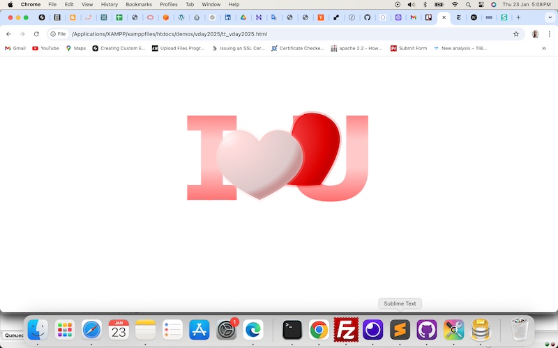
Our goal is to have "I ♥ U" as the final image, so let's work backwards and create a
pink heart. In this case, it's a path. I copied it from a previous repository to save time, and adjusted the position.
<svg width="800px" height="400px" style="display:block; margin:5% auto 0 auto">
<defs>
<linearGradient id="textBackground" x1="0" x2="0" y1="0" y2="1">
<stop offset="0%" stop-color="rgb(255, 50, 50)" />
<stop offset="40%" stop-color="rgb(255, 200, 200)" />
<stop offset="60%" stop-color="rgb(255, 200, 200)" />
<stop offset="100%" stop-color="rgb(255, 50, 50)" />
</linearGradient>
</defs>
<text x="400px" y="300px" text-anchor="middle"
font-size="300px" font-family="Verdana" font-weight="bold"
fill="url(#textBackground)">I U
</text>
<path d="M 350 150
q -50 -60, -100 0
q -50 80, 100 150
q 150 -70, 100 -150
q -50 -60, -100 0
Z"
>
</path>
</svg>
We set the fill to a gradient background which we'll create shortly, The outline will be a translucent
pink.
<path d="M 350 150
q -50 -60, -100 0
q -50 80, 100 150
q 150 -70, 100 -150
q -50 -60, -100 0
Z"
fill="url(#pinkheartBackground)" stroke="rgba(255, 200, 200, 0.2)" stroke-width="10px"
>
</path>
Because we haven't created the background yet, you should only see the outline of the heart.
In the definitions, create the
pinkheartBackground gradient. It will be radial, going from almost
white, then
pink, then
deep pink.
<defs>
<linearGradient id="textBackground" x1="0" x2="0" y1="0" y2="1">
<stop offset="0%" stop-color="rgb(255, 50, 50)" />
<stop offset="40%" stop-color="rgb(255, 200, 200)" />
<stop offset="60%" stop-color="rgb(255, 200, 200)" />
<stop offset="100%" stop-color="rgb(255, 50, 50)" />
</linearGradient>
<radialGradient id="pinkheartBackground" cx="10%" cy="10%" r="90%" fx="10%" fy="10%">
<stop offset="0%" style="stop-color:rgb(255, 250, 250); stop-opacity:1" />
<stop offset="20%" style="stop-color:rgb(255, 220, 220); stop-opacity:1" />
<stop offset="90%" style="stop-color:rgb(220, 200, 200); stop-opacity:1" />
<stop offset="100%" style="stop-color:rgb(200, 150, 150); stop-opacity:1" />
</radialGradient>
</defs>
There's a
pink heart!
We're now going to cover the letters with
red hearts. To that end, let's first define the gradient. It's basically a copy of
pinkheartBackground but with redder hues.
<defs>
<linearGradient id="textBackground" x1="0" x2="0" y1="0" y2="1">
<stop offset="0%" stop-color="rgb(255, 50, 50)" />
<stop offset="40%" stop-color="rgb(255, 200, 200)" />
<stop offset="60%" stop-color="rgb(255, 200, 200)" />
<stop offset="100%" stop-color="rgb(255, 50, 50)" />
</linearGradient>
<radialGradient id="pinkheartBackground" cx="10%" cy="10%" r="90%" fx="10%" fy="10%">
<stop offset="0%" style="stop-color:rgb(255, 250, 250); stop-opacity:1" />
<stop offset="20%" style="stop-color:rgb(255, 220, 220); stop-opacity:1" />
<stop offset="90%" style="stop-color:rgb(220, 200, 200); stop-opacity:1" />
<stop offset="100%" style="stop-color:rgb(200, 150, 150); stop-opacity:1" />
</radialGradient>
<radialGradient id="redheartBackground" cx="10%" cy="10%" r="90%" fx="10%" fy="10%">
<stop offset="0%" style="stop-color:rgb(255, 150, 150); stop-opacity:1" />
<stop offset="20%" style="stop-color:rgb(255, 100, 100); stop-opacity:1" />
<stop offset="90%" style="stop-color:rgb(220, 0, 0); stop-opacity:1" />
<stop offset="100%" style="stop-color:rgb(200, 0, 0); stop-opacity:1" />
</radialGradient>
</defs>
Now let's create one heart. It's a copy of the
pink heart, but using
redheartBackground as the fill, and a
red outline.
<text x="400px" y="300px" text-anchor="middle"
font-size="300px" font-family="Verdana" font-weight="bold"
fill="url(#textBackground)">I U
</text>
<path d="M 350 150 q -50 -60, -100 0 q -50 80, 100 150 q 150 -70, 100 -150 q -50 -60, -100 0 Z"
fill="url(#redheartBackground)" stroke="rgba(255, 0, 0, 0.2)" stroke-width="10px"
>
</path>
<path d="M 350 150
q -50 -60, -100 0
q -50 80, 100 150
q 150 -70, 100 -150
q -50 -60, -100 0
Z"
fill="url(#pinkheartBackground)" stroke="rgba(255, 200, 200, 0.2)" stroke-width="10px"
>
</path>
But you won't see much, because that
red heart will be directly behind the
pink heart. Let's apply a bit of translation and rotation to it. We won't scale this one, but let's include it in there, anyway.
transform-origin should be set to the middle of the heart.
<path d="M 350 150 q -50 -60, -100 0 q -50 80, 100 150 q 150 -70, 100 -150 q -50 -60, -100 0 Z"
fill="url(#redheartBackground)" stroke="rgba(255, 0, 0, 0.2)" stroke-width="10px"
transform-origin="50% 50%" transform="translate(100, -50) rotate(-30) scale(1, 1)"
>
</path>
Now you can see a bit of it peeking out!
Now we are going to place differently translated, rotated and scaled
red hearts in the SVG. You don't have to do it exactly how I did, I just did these at random.
<path d="M 350 150 q -50 -60, -100 0 q -50 80, 100 150 q 150 -70, 100 -150 q -50 -60, -100 0 Z"
fill="url(#redheartBackground)" stroke="rgba(255, 0, 0, 0.2)" stroke-width="10px"
transform-origin="50% 50%" transform="translate(100, -50) rotate(-30) scale(1, 1)"
>
</path>
<path d="M 350 150 q -50 -60, -100 0 q -50 80, 100 150 q 150 -70, 100 -150 q -50 -60, -100 0 Z"
fill="url(#redheartBackground)" stroke="rgba(255, 0, 0, 0.2)" stroke-width="10px"
transform-origin="50% 50%" transform="translate(200, 0) rotate(90) scale(0.8, 0.8)"
>
</path>
<path d="M 350 150 q -50 -60, -100 0 q -50 80, 100 150 q 150 -70, 100 -150 q -50 -60, -100 0 Z"
fill="url(#redheartBackground)" stroke="rgba(255, 0, 0, 0.2)" stroke-width="10px"
transform-origin="50% 50%" transform="translate(200, 50) rotate(-20) scale(1, 1)"
>
</path>
<path d="M 350 150 q -50 -60, -100 0 q -50 80, 100 150 q 150 -70, 100 -150 q -50 -60, -100 0 Z"
fill="url(#redheartBackground)" stroke="rgba(255, 0, 0, 0.2)" stroke-width="10px"
transform-origin="50% 50%" transform="translate(0, 50) rotate(-90) scale(0.8, 0.8)"
>
</path>
<path d="M 350 150 q -50 -60, -100 0 q -50 80, 100 150 q 150 -70, 100 -150 q -50 -60, -100 0 Z"
fill="url(#redheartBackground)" stroke="rgba(255, 0, 0, 0.2)" stroke-width="10px"
transform-origin="50% 50%" transform="translate(-150, -100) rotate(-20) scale(1, 1)"
>
</path>
<path d="M 350 150 q -50 -60, -100 0 q -50 80, 100 150 q 150 -70, 100 -150 q -50 -60, -100 0 Z"
fill="url(#redheartBackground)" stroke="rgba(255, 0, 0, 0.2)" stroke-width="10px"
transform-origin="50% 50%" transform="translate(-150, 100) rotate(50) scale(0.8, 0.8)"
>
</path>
<path d="M 350 150 q -50 -60, -100 0 q -50 80, 100 150 q 150 -70, 100 -150 q -50 -60, -100 0 Z"
fill="url(#redheartBackground)" stroke="rgba(255, 0, 0, 0.2)" stroke-width="10px"
transform-origin="50% 50%" transform="translate(-50, -50) rotate(-50) scale(1, 1)"
>
</path>
<path d="M 350 150 q -50 -60, -100 0 q -50 80, 100 150 q 150 -70, 100 -150 q -50 -60, -100 0 Z"
fill="url(#redheartBackground)" stroke="rgba(255, 0, 0, 0.2)" stroke-width="10px"
transform-origin="50% 50%" transform="translate(50, -150) rotate(-20) scale(0.5, 0.5)"
>
</path>
<path d="M 350 150 q -50 -60, -100 0 q -50 80, 100 150 q 150 -70, 100 -150 q -50 -60, -100 0 Z"
fill="url(#redheartBackground)" stroke="rgba(255, 0, 0, 0.2)" stroke-width="10px"
transform-origin="50% 50%" transform="translate(0, -100) rotate(-80) scale(0.5, 0.5)"
>
</path>
<path d="M 350 150 q -50 -60, -100 0 q -50 80, 100 150 q 150 -70, 100 -150 q -50 -60, -100 0 Z"
fill="url(#redheartBackground)" stroke="rgba(255, 0, 0, 0.2)" stroke-width="10px"
transform-origin="50% 50%" transform="translate(-250, 150) rotate(100) scale(0.5, 0.5)"
>
</path>
<path d="M 350 150 q -50 -60, -100 0 q -50 80, 100 150 q 150 -70, 100 -150 q -50 -60, -100 0 Z"
fill="url(#redheartBackground)" stroke="rgba(255, 0, 0, 0.2)" stroke-width="10px"
transform-origin="50% 50%" transform="translate(-50, 50) rotate(-60) scale(0.5, 0.5)"
>
</path>
<path d="M 350 150 q -50 -60, -100 0 q -50 80, 100 150 q 150 -70, 100 -150 q -50 -60, -100 0 Z"
fill="url(#redheartBackground)" stroke="rgba(255, 0, 0, 0.2)" stroke-width="10px"
transform-origin="50% 50%" transform="translate(150, 50) rotate(80) scale(0.5, 0.5)"
>
</path>
<path d="M 350 150
q -50 -60, -100 0
q -50 80, 100 150
q 150 -70, 100 -150
q -50 -60, -100 0
Z"
fill="url(#pinkheartBackground)" stroke="rgba(255, 200, 200, 0.2)" stroke-width="10px"
transform-origin="50% 50%" transform="translate(0, 0) scale(1, 1)"
>
</path>
Yep, all these hearts.
Now on to animation!
We've set the stage. We want the
pink heart to look like it fell right onto the heap of
red hearts. To do that, we first scale the
pink heart upwards, i.e, increase its size.
<path d="M 350 150
q -50 -60, -100 0
q -50 80, 100 150
q 150 -70, 100 -150
q -50 -60, -100 0
Z"
fill="url(#pinkheartBackground)" stroke="rgba(255, 200, 200, 0.2)" stroke-width="10px"
transform-origin="50% 50%" transform="translate(0, 0) scale(1.5, 1.5)"
>
See what we did to the
pink heart?
Now, we are going to simulate a fall "towards" the
red hearts. TO that end, we will reduce the size of the
pink heart in animation. To that end we will add the
animateTransform tag. What we are going to alter is the
transform attribute, thus
transform will be the value of
attributeName. We want to alter the scale, so that's the value of
type.
from and
to attributes are straightforward. The original values are 1.5, and we want to scale it down to 0.5.
<path d="M 350 150
q -50 -60, -100 0
q -50 80, 100 150
q 150 -70, 100 -150
q -50 -60, -100 0
Z"
fill="url(#pinkheartBackground)" stroke="rgba(255, 200, 200, 0.2)" stroke-width="10px"
transform-origin="50% 50%" transform="translate(0, 0) scale(1.5, 1.5)"
>
<animateTransform
attributeName="transform"
type="scale"
from="1.5 1.5"
to="0.5 0.5"
/>
</path>
Then we further add details.
begin will be set to 0 seconds so that the animation fires off as soon as the SVG loads.
dur is how long the animation lasts, and I specified 1.5 seconds. We set
repeatCount to 1, which means it only happens once.
<animateTransform
attributeName="transform"
type="scale"
from="1.5 1.5"
to="0.5 0.5"
begin="0s"
fill="freeze"
dur="1.5s"
repeatCount="1"
/>
Refresh. Your
pink heart should appear large, then grow smaller as it "falls".
Here, I've added some more scaling animations to reflect the
pink heart shaking as it "hits" the
red hearts and stops. You notice that the last one has an id,
finalPinkHeartScale. This is a bad naming convention because this is far from "final", but in any case, we need this one to have an id because we are going to be taking reference from it.
<path d="M 350 150
q -50 -60, -100 0
q -50 80, 100 150
q 150 -70, 100 -150
q -50 -60, -100 0
Z"
fill="url(#pinkheartBackground)" stroke="rgba(255, 200, 200, 0.2)" stroke-width="10px"
transform-origin="50% 50%" transform="translate(0, 0) scale(1.5, 1.5)"
>
<animateTransform
attributeName="transform"
type="scale"
from="1.5 1.5"
to="0.5 0.5"
begin="0s"
fill="freeze"
dur="1.5s"
repeatCount="1"
/>
<animateTransform
attributeName="transform"
type="scale"
from="0.5 0.5"
to="0.6 0.6"
begin="1.5s"
fill="freeze"
dur="0.2s"
repeatCount="1"
/>
<animateTransform
id="finalPinkHeartScale"
attributeName="transform"
type="scale"
from="0.6 0.6"
to="0.5 0.5"
begin="1.7s"
fill="freeze"
dur="0.2s"
repeatCount="1"
/>
</path>
Time to animate the
red hearts. We want each
red heart to look like the
pink heart is "absorbing" it. So we should have it move back towards the center of the
pink heart and shrink till nothing while doing that. Let's use the first
red heart as an example. Add an animation. Again
attributeName is
transform,
type is
translate, and we take reference from the
path tag's
transform attribute's
translate directive. From that value to 0, which is, not-so-coincidentally, where the
pink heart is.
<path d="M 350 150 q -50 -60, -100 0 q -50 80, 100 150 q 150 -70, 100 -150 q -50 -60, -100 0 Z"
fill="url(#redheartBackground)" stroke="rgba(255, 0, 0, 0.2)" stroke-width="10px"
transform-origin="50% 50%" transform="translate(100, -50) rotate(-30) scale(1, 1)"
>
<animateTransform
attributeName="transform" type="translate" from="100 -50" to="0 0"
/>
</path>
We need to make it start half a second after
finalPinkHeartScale ends. I set this animation's duration at 1 second. We don't want this to repeat, so set
repeatCount to 1.
<path d="M 350 150 q -50 -60, -100 0 q -50 80, 100 150 q 150 -70, 100 -150 q -50 -60, -100 0 Z"
fill="url(#redheartBackground)" stroke="rgba(255, 0, 0, 0.2)" stroke-width="10px"
transform-origin="50% 50%" transform="translate(100, -50) rotate(-30) scale(1, 1)"
>
<animateTransform
attributeName="transform" type="translate" from="100 -50" to="0 0"
begin="finalPinkHeartScale.end+0.5s" fill="freeze" dur="1s" repeatCount="1"
/>
</path>
Here's a second animation. This one makes the
red heart shrink to 0. Again, the
from attribute should take reference from the
path tag's
transform attribute's
scale directive. We need to add the
additive attribute and set it to
sum. This is so that it doesn't mess up the first animation.
<path d="M 350 150 q -50 -60, -100 0 q -50 80, 100 150 q 150 -70, 100 -150 q -50 -60, -100 0 Z"
fill="url(#redheartBackground)" stroke="rgba(255, 0, 0, 0.2)" stroke-width="10px"
transform-origin="50% 50%" transform="translate(100, -50) rotate(-30) scale(1, 1)"
>
<animateTransform
attributeName="transform" type="translate" from="100 -50" to="0 0"
begin="finalPinkHeartScale.end+0.5s" fill="freeze" dur="1s" repeatCount="1"
/>
<animateTransform
attributeName="transform" type="scale" from="1 1" to="0 0"
begin="finalPinkHeartScale.end+0.5s" fill="freeze" dur="1s" repeatCount="1" additive="sum"
/>
</path>
We add a third animation to "reset" rotation to 0. As before, the
additive attribute is
sum.
<path d="M 350 150 q -50 -60, -100 0 q -50 80, 100 150 q 150 -70, 100 -150 q -50 -60, -100 0 Z"
fill="url(#redheartBackground)" stroke="rgba(255, 0, 0, 0.2)" stroke-width="10px"
transform-origin="50% 50%" transform="translate(100, -50) rotate(-30) scale(1, 1)"
>
<animateTransform
attributeName="transform" type="translate" from="100 -50" to="0 0"
begin="finalPinkHeartScale.end+0.5s" fill="freeze" dur="1s" repeatCount="1"
/>
<animateTransform
attributeName="transform" type="scale" from="1 1" to="0 0"
begin="finalPinkHeartScale.end+0.5s" fill="freeze" dur="1s" repeatCount="1" additive="sum"
/>
<animateTransform
attributeName="transform" type="rotate" from="-30" to="0"
begin="finalPinkHeartScale.end+0.5s" fill="freeze" dur="1s" repeatCount="1" additive="sum"
/>
</path>
Now do this for all
red hearts! I varied the
begin and
dur attributes for all of them.
<path d="M 350 150 q -50 -60, -100 0 q -50 80, 100 150 q 150 -70, 100 -150 q -50 -60, -100 0 Z"
fill="url(#redheartBackground)" stroke="rgba(255, 0, 0, 0.2)" stroke-width="10px"
transform-origin="50% 50%" transform="translate(100, -50) rotate(-30) scale(1, 1)"
>
<animateTransform
attributeName="transform" type="translate" from="100 -50" to="0 0"
begin="finalPinkHeartScale.end+0.5s" fill="freeze" dur="1s" repeatCount="1"
/>
<animateTransform
attributeName="transform" type="scale" from="1 1" to="0 0"
begin="finalPinkHeartScale.end+0.5s" fill="freeze" dur="1s" repeatCount="1" additive="sum"
/>
<animateTransform
attributeName="transform" type="rotate" from="-30" to="0"
begin="finalPinkHeartScale.end+0.5s" fill="freeze" dur="1s" repeatCount="1" additive="sum"
/>
</path>
<path d="M 350 150 q -50 -60, -100 0 q -50 80, 100 150 q 150 -70, 100 -150 q -50 -60, -100 0 Z"
fill="url(#redheartBackground)" stroke="rgba(255, 0, 0, 0.2)" stroke-width="10px"
transform-origin="50% 50%" transform="translate(200, 0) rotate(90) scale(0.8, 0.8)"
>
<animateTransform
attributeName="transform" type="translate" from="200 0" to="0 0"
begin="finalPinkHeartScale.end+1s" fill="freeze" dur="0.5s" repeatCount="1"
/>
<animateTransform
attributeName="transform" type="scale" from="0.8 0.8" to="0 0"
begin="finalPinkHeartScale.end+1s" fill="freeze" dur="0.5s" repeatCount="1" additive="sum"
/>
<animateTransform
attributeName="transform" type="rotate" from="90" to="0"
begin="finalPinkHeartScale.end+1s" fill="freeze" dur="0.5s" repeatCount="1" additive="sum"
/>
</path>
<path d="M 350 150 q -50 -60, -100 0 q -50 80, 100 150 q 150 -70, 100 -150 q -50 -60, -100 0 Z"
fill="url(#redheartBackground)" stroke="rgba(255, 0, 0, 0.2)" stroke-width="10px"
transform-origin="50% 50%" transform="translate(200, 50) rotate(-20) scale(1, 1)"
>
<animateTransform
attributeName="transform" type="translate" from="200 50" to="0 0"
begin="finalPinkHeartScale.end+0.5s" fill="freeze" dur="0.5s" repeatCount="1"
/>
<animateTransform
attributeName="transform" type="scale" from="1 1" to="0 0"
begin="finalPinkHeartScale.end+0.5s" fill="freeze" dur="0.5s" repeatCount="1" additive="sum"
/>
<animateTransform
attributeName="transform" type="rotate" from="-20" to="0"
begin="finalPinkHeartScale.end+0.5s" fill="freeze" dur="0.5s" repeatCount="1" additive="sum"
/>
</path>
<path d="M 350 150 q -50 -60, -100 0 q -50 80, 100 150 q 150 -70, 100 -150 q -50 -60, -100 0 Z"
fill="url(#redheartBackground)" stroke="rgba(255, 0, 0, 0.2)" stroke-width="10px"
transform-origin="50% 50%" transform="translate(0, 50) rotate(-90) scale(0.8, 0.8)"
>
<animateTransform
attributeName="transform" type="translate" from="0 50" to="0 0"
begin="finalPinkHeartScale.end+1s" fill="freeze" dur="0.5s" repeatCount="1"
/>
<animateTransform
attributeName="transform" type="scale" from="0.8 0.8" to="0 0"
begin="finalPinkHeartScale.end+1s" fill="freeze" dur="0.5s" repeatCount="1" additive="sum"
/>
<animateTransform
attributeName="transform" type="rotate" from="-90" to="0"
begin="finalPinkHeartScale.end+1s" fill="freeze" dur="0.5s" repeatCount="1" additive="sum"
/>
</path>
<path d="M 350 150 q -50 -60, -100 0 q -50 80, 100 150 q 150 -70, 100 -150 q -50 -60, -100 0 Z"
fill="url(#redheartBackground)" stroke="rgba(255, 0, 0, 0.2)" stroke-width="10px"
transform-origin="50% 50%" transform="translate(-150, -100) rotate(-20) scale(1, 1)"
>
<animateTransform
attributeName="transform" type="translate" from="-150 -100" to="0 0"
begin="finalPinkHeartScale.end+1s" fill="freeze" dur="0.5s" repeatCount="1"
/>
<animateTransform
attributeName="transform" type="scale" from="1 1" to="0 0"
begin="finalPinkHeartScale.end+1s" fill="freeze" dur="0.5s" repeatCount="1" additive="sum"
/>
<animateTransform
attributeName="transform" type="rotate" from="-20" to="0"
begin="finalPinkHeartScale.end+1s" fill="freeze" dur="0.5s" repeatCount="1" additive="sum"
/>
</path>
<path d="M 350 150 q -50 -60, -100 0 q -50 80, 100 150 q 150 -70, 100 -150 q -50 -60, -100 0 Z"
fill="url(#redheartBackground)" stroke="rgba(255, 0, 0, 0.2)" stroke-width="10px"
transform-origin="50% 50%" transform="translate(-150, 100) rotate(50) scale(0.8, 0.8)"
>
<animateTransform
attributeName="transform" type="translate" from="-150 100" to="0 0"
begin="finalPinkHeartScale.end+0.5s" fill="freeze" dur="0.5s" repeatCount="1"
/>
<animateTransform
attributeName="transform" type="scale" from="0.8 0.8" to="0 0"
begin="finalPinkHeartScale.end+0.5s" fill="freeze" dur="0.5s" repeatCount="1" additive="sum"
/>
<animateTransform
attributeName="transform" type="rotate" from="50" to="0"
begin="finalPinkHeartScale.end+0.5s" fill="freeze" dur="0.5s" repeatCount="1" additive="sum"
/>
</path>
<path d="M 350 150 q -50 -60, -100 0 q -50 80, 100 150 q 150 -70, 100 -150 q -50 -60, -100 0 Z"
fill="url(#redheartBackground)" stroke="rgba(255, 0, 0, 0.2)" stroke-width="10px"
transform-origin="50% 50%" transform="translate(-50, -50) rotate(-50) scale(1, 1)"
>
<animateTransform
attributeName="transform" type="translate" from="-50 -50" to="0 0"
begin="finalPinkHeartScale.end+0.5s" fill="freeze" dur="1s" repeatCount="1"
/>
<animateTransform
attributeName="transform" type="scale" from="1 1" to="0 0"
begin="finalPinkHeartScale.end+0.5s" fill="freeze" dur="1s" repeatCount="1" additive="sum"
/>
<animateTransform
attributeName="transform" type="rotate" from="-50" to="0"
begin="finalPinkHeartScale.end+0.5s" fill="freeze" dur="1s" repeatCount="1" additive="sum"
/>
</path>
<path d="M 350 150 q -50 -60, -100 0 q -50 80, 100 150 q 150 -70, 100 -150 q -50 -60, -100 0 Z"
fill="url(#redheartBackground)" stroke="rgba(255, 0, 0, 0.2)" stroke-width="10px"
transform-origin="50% 50%" transform="translate(50, -150) rotate(-20) scale(0.5, 0.5)"
>
<animateTransform
attributeName="transform" type="translate" from="50 -150" to="0 0"
begin="finalPinkHeartScale.end" fill="freeze" dur="0.5s" repeatCount="1"
/>
<animateTransform
attributeName="transform" type="scale" from="0.5 0.5" to="0 0"
begin="finalPinkHeartScale.end" fill="freeze" dur="0.5s" repeatCount="1" additive="sum"
/>
<animateTransform
attributeName="transform" type="rotate" from="-20" to="0"
begin="finalPinkHeartScale.end" fill="freeze" dur="0.5s" repeatCount="1" additive="sum"
/>
</path>
<path d="M 350 150 q -50 -60, -100 0 q -50 80, 100 150 q 150 -70, 100 -150 q -50 -60, -100 0 Z"
fill="url(#redheartBackground)" stroke="rgba(255, 0, 0, 0.2)" stroke-width="10px"
transform-origin="50% 50%" transform="translate(0, -100) rotate(-80) scale(0.5, 0.5)"
>
<animateTransform
attributeName="transform" type="translate" from="0 -100" to="0 0"
begin="finalPinkHeartScale.end" fill="freeze" dur="1s" repeatCount="1"
/>
<animateTransform
attributeName="transform" type="scale" from="0.5 0.5" to="0 0"
begin="finalPinkHeartScale.end" fill="freeze" dur="1s" repeatCount="1" additive="sum"
/>
<animateTransform
attributeName="transform" type="rotate" from="-80" to="0"
begin="finalPinkHeartScale.end" fill="freeze" dur="1s" repeatCount="1" additive="sum"
/>
</path>
<path d="M 350 150 q -50 -60, -100 0 q -50 80, 100 150 q 150 -70, 100 -150 q -50 -60, -100 0 Z"
fill="url(#redheartBackground)" stroke="rgba(255, 0, 0, 0.2)" stroke-width="10px"
transform-origin="50% 50%" transform="translate(-250, 150) rotate(100) scale(0.5, 0.5)"
>
<animateTransform
attributeName="transform" type="translate" from="-250 150" to="0 0"
begin="finalPinkHeartScale.end" fill="freeze" dur="1s" repeatCount="1"
/>
<animateTransform
attributeName="transform" type="scale" from="0.5 0.5" to="0 0"
begin="finalPinkHeartScale.end" fill="freeze" dur="1s" repeatCount="1" additive="sum"
/>
<animateTransform
attributeName="transform" type="rotate" from="100" to="0"
begin="finalPinkHeartScale.end" fill="freeze" dur="1s" repeatCount="1" additive="sum"
/>
</path>
<path d="M 350 150 q -50 -60, -100 0 q -50 80, 100 150 q 150 -70, 100 -150 q -50 -60, -100 0 Z"
fill="url(#redheartBackground)" stroke="rgba(255, 0, 0, 0.2)" stroke-width="10px"
transform-origin="50% 50%" transform="translate(-50, 50) rotate(-60) scale(0.5, 0.5)"
>
<animateTransform
attributeName="transform" type="translate" from="-50 50" to="0 0"
begin="finalPinkHeartScale.end" fill="freeze" dur="0.5s" repeatCount="1"
/>
<animateTransform
attributeName="transform" type="scale" from="0.5 0.5" to="0 0"
begin="finalPinkHeartScale.end" fill="freeze" dur="0.5s" repeatCount="1" additive="sum"
/>
<animateTransform
attributeName="transform" type="rotate" from="-60" to="0"
begin="finalPinkHeartScale.end" fill="freeze" dur="0.5s" repeatCount="1" additive="sum"
/>
</path>
<path d="M 350 150 q -50 -60, -100 0 q -50 80, 100 150 q 150 -70, 100 -150 q -50 -60, -100 0 Z"
fill="url(#redheartBackground)" stroke="rgba(255, 0, 0, 0.2)" stroke-width="10px"
transform-origin="50% 50%" transform="translate(150, 50) rotate(80) scale(0.5, 0.5)"
>
<animateTransform
attributeName="transform" type="translate" from="150 50" to="0 0"
begin="finalPinkHeartScale.end" fill="freeze" dur="0.5s" repeatCount="1"
/>
<animateTransform
attributeName="transform" type="scale" from="0.5 0.5" to="0 0"
begin="finalPinkHeartScale.end" fill="freeze" dur="0.5s" repeatCount="1" additive="sum"
/>
<animateTransform
attributeName="transform" type="rotate" from="80" to="0"
begin="finalPinkHeartScale.end" fill="freeze" dur="0.5s" repeatCount="1" additive="sum"
/>
</path>
See all these hearts starting to move...
...and some of them are still staying in place...
...but eventually they all get "absorbed".
This does not look all that realistic. The
pink heart should actually get bigger the more
red hearts it "absorbs". So add another animation to increase the size of the
pink heart, half a second after
finalPinkHeartScale ends, to coincide with some of the "absorbings".
<path d="M 350 150
q -50 -60, -100 0
q -50 80, 100 150
q 150 -70, 100 -150
q -50 -60, -100 0
Z"
fill="url(#pinkheartBackground)" stroke="rgba(255, 200, 200, 0.2)" stroke-width="10px"
transform-origin="50% 50%" transform="translate(0, 0) scale(1.5, 1.5)"
>
<animateTransform
attributeName="transform"
type="scale"
from="1.5 1.5"
to="0.5 0.5"
begin="0s"
fill="freeze"
dur="1.5s"
repeatCount="1"
/>
<animateTransform
attributeName="transform"
type="scale"
from="0.5 0.5"
to="0.6 0.6"
begin="1.5s"
fill="freeze"
dur="0.2s"
repeatCount="1"
/>
<animateTransform
id="finalPinkHeartScale"
attributeName="transform"
type="scale"
from="0.6 0.6"
to="0.5 0.5"
begin="1.7s"
fill="freeze"
dur="0.2s"
repeatCount="1"
/>
<animateTransform
attributeName="transform"
type="scale"
from="0.4 0.4"
to="0.7 0.7"
begin="finalPinkHeartScale.end+0.5s"
fill="freeze"
dur="0.2s"
repeatCount="1"
/>
</path>
A little more...
<path d="M 350 150
q -50 -60, -100 0
q -50 80, 100 150
q 150 -70, 100 -150
q -50 -60, -100 0
Z"
fill="url(#pinkheartBackground)" stroke="rgba(255, 200, 200, 0.2)" stroke-width="10px"
transform-origin="50% 50%" transform="translate(0, 0) scale(1.5, 1.5)"
>
<animateTransform
attributeName="transform"
type="scale"
from="1.5 1.5"
to="0.5 0.5"
begin="0s"
fill="freeze"
dur="1.5s"
repeatCount="1"
/>
<animateTransform
attributeName="transform"
type="scale"
from="0.5 0.5"
to="0.6 0.6"
begin="1.5s"
fill="freeze"
dur="0.2s"
repeatCount="1"
/>
<animateTransform
id="finalPinkHeartScale"
attributeName="transform"
type="scale"
from="0.6 0.6"
to="0.5 0.5"
begin="1.7s"
fill="freeze"
dur="0.2s"
repeatCount="1"
/>
<animateTransform
attributeName="transform"
type="scale"
from="0.4 0.4"
to="0.7 0.7"
begin="finalPinkHeartScale.end+0.5s"
fill="freeze"
dur="0.2s"
repeatCount="1"
/>
<animateTransform
attributeName="transform"
type="scale"
from="0.5 0.5"
to="0.9 0.9"
begin="finalPinkHeartScale.end+1s"
fill="freeze"
dur="0.2s"
repeatCount="1"
/>
</path>
...and some more.
<path d="M 350 150
q -50 -60, -100 0
q -50 80, 100 150
q 150 -70, 100 -150
q -50 -60, -100 0
Z"
fill="url(#pinkheartBackground)" stroke="rgba(255, 200, 200, 0.2)" stroke-width="10px"
transform-origin="50% 50%" transform="translate(0, 0) scale(1.5, 1.5)"
>
<animateTransform
attributeName="transform"
type="scale"
from="1.5 1.5"
to="0.5 0.5"
begin="0s"
fill="freeze"
dur="1.5s"
repeatCount="1"
/>
<animateTransform
attributeName="transform"
type="scale"
from="0.5 0.5"
to="0.6 0.6"
begin="1.5s"
fill="freeze"
dur="0.2s"
repeatCount="1"
/>
<animateTransform
id="finalPinkHeartScale"
attributeName="transform"
type="scale"
from="0.6 0.6"
to="0.5 0.5"
begin="1.7s"
fill="freeze"
dur="0.2s"
repeatCount="1"
/>
<animateTransform
attributeName="transform"
type="scale"
from="0.4 0.4"
to="0.7 0.7"
begin="finalPinkHeartScale.end+0.5s"
fill="freeze"
dur="0.2s"
repeatCount="1"
/>
<animateTransform
attributeName="transform"
type="scale"
from="0.5 0.5"
to="0.9 0.9"
begin="finalPinkHeartScale.end+1s"
fill="freeze"
dur="0.2s"
repeatCount="1"
/>
<animateTransform
attributeName="transform"
type="scale"
from="0.7 0.7"
to="1 1"
begin="finalPinkHeartScale.end+1.5s"
fill="freeze"
dur="0.2s"
repeatCount="1"
/>
</path>
Finally, I have an animation applied on the
stroke-width attribute that will carry on indefinitely once the
pink heart has grown to its full size.
<path d="M 350 150
q -50 -60, -100 0
q -50 80, 100 150
q 150 -70, 100 -150
q -50 -60, -100 0
Z"
fill="url(#pinkheartBackground)" stroke="rgba(255, 200, 200, 0.2)" stroke-width="10px"
transform-origin="50% 50%" transform="translate(0, 0) scale(1.5, 1.5)"
>
<animateTransform
attributeName="transform"
type="scale"
from="1.5 1.5"
to="0.5 0.5"
begin="0s"
fill="freeze"
dur="1.5s"
repeatCount="1"
/>
<animateTransform
attributeName="transform"
type="scale"
from="0.5 0.5"
to="0.6 0.6"
begin="1.5s"
fill="freeze"
dur="0.2s"
repeatCount="1"
/>
<animateTransform
id="finalPinkHeartScale"
attributeName="transform"
type="scale"
from="0.6 0.6"
to="0.5 0.5"
begin="1.7s"
fill="freeze"
dur="0.2s"
repeatCount="1"
/>
<animateTransform
attributeName="transform"
type="scale"
from="0.4 0.4"
to="0.7 0.7"
begin="finalPinkHeartScale.end+0.5s"
fill="freeze"
dur="0.2s"
repeatCount="1"
/>
<animateTransform
attributeName="transform"
type="scale"
from="0.5 0.5"
to="0.9 0.9"
begin="finalPinkHeartScale.end+1s"
fill="freeze"
dur="0.2s"
repeatCount="1"
/>
<animateTransform
attributeName="transform"
type="scale"
from="0.7 0.7"
to="1 1"
begin="finalPinkHeartScale.end+1.5s"
fill="freeze"
dur="0.2s"
repeatCount="1"
/>
<animate
attributeName="stroke-width"
values="10px; 50px; 10px"
begin="finalPinkHeartScale.end+1.5s"
fill="freeze"
dur="0.5s"
repeatCount="indefinite"
/>
</path>
Tell me this ain't awesome.
Final touches...
This is entirely superfluous, but still fun to do. Add two circles to the SVG. Both are a translucent
deep pink, though the second one is more translucent. You won't see anything since both have
r attributes set to 0.
<path d="M 350 150
q -50 -60, -100 0
q -50 80, 100 150
q 150 -70, 100 -150
q -50 -60, -100 0
Z"
fill="url(#pinkheartBackground)" stroke="rgba(255, 200, 200, 0.2)" stroke-width="10px"
transform-origin="50% 50%" transform="translate(0, 0) scale(1.5, 1.5)"
>
<animateTransform
attributeName="transform"
type="scale"
from="1.5 1.5"
to="0.5 0.5"
begin="0s"
fill="freeze"
dur="1.5s"
repeatCount="1"
/>
<animateTransform
attributeName="transform"
type="scale"
from="0.5 0.5"
to="0.6 0.6"
begin="1.5s"
fill="freeze"
dur="0.2s"
repeatCount="1"
/>
<animateTransform
id="finalPinkHeartScale"
attributeName="transform"
type="scale"
from="0.6 0.6"
to="0.5 0.5"
begin="1.7s"
fill="freeze"
dur="0.2s"
repeatCount="1"
/>
<animateTransform
attributeName="transform"
type="scale"
from="0.4 0.4"
to="0.7 0.7"
begin="finalPinkHeartScale.end+0.5s"
fill="freeze"
dur="0.2s"
repeatCount="1"
/>
<animateTransform
attributeName="transform"
type="scale"
from="0.5 0.5"
to="0.9 0.9"
begin="finalPinkHeartScale.end+1s"
fill="freeze"
dur="0.2s"
repeatCount="1"
/>
<animateTransform
attributeName="transform"
type="scale"
from="0.7 0.7"
to="1 1"
begin="finalPinkHeartScale.end+1.5s"
fill="freeze"
dur="0.2s"
repeatCount="1"
/>
<animate
attributeName="stroke-width"
values="10px; 50px; 10px"
begin="finalPinkHeartScale.end+1.5s"
fill="freeze"
dur="0.5s"
repeatCount="indefinite"
/>
</path>
<circle r="0" fill="rgba(200, 150, 150, 0.8)">
</circle>
<circle r="0" fill="rgba(200, 150, 150, 0.5)">
</circle>
We want each circle to traverse the perimeter of the
pink heart. So we'll input the path for the
pink heart into an
animateMotion animation. We want this to begin only after
finalPinkHeartScale. The duration is set to 5 seconds and we set this to animate forever.
<circle r="0" fill="rgba(200, 150, 150, 0.8)">
<animateMotion
path="M 350 150
q -50 -60, -100 0
q -50 80, 100 150
q 150 -70, 100 -150
q -50 -60, -100 0
Z"
begin="finalPinkHeartScale.end+1.5s"
fill="freeze"
dur="5s"
repeatCount="indefinite"
/>
</circle>
<circle r="0" fill="rgba(200, 150, 150, 0.5)">
</circle>
And here's another animation, this one animating the
r attribute from 5 to 10 pixels. This animation is faster and will also repeat forever.
<circle r="0" fill="rgba(200, 150, 150, 0.8)">
<animateMotion
path="M 350 150
q -50 -60, -100 0
q -50 80, 100 150
q 150 -70, 100 -150
q -50 -60, -100 0
Z"
begin="finalPinkHeartScale.end+1.5s"
fill="freeze"
dur="5s"
repeatCount="indefinite"
/>
<animate
attributeName="r"
values="5px; 10px; 5px"
begin="finalPinkHeartScale.end+1.5s"
fill="freeze"
dur="0.5s"
repeatCount="indefinite"
/>
</circle>
<circle r="0" fill="rgba(200, 150, 150, 0.5)">
</circle>
We'll do the same for the second circle, but with slightly different animaton values for contrast.
<circle r="0" fill="rgba(200, 150, 150, 0.8)">
<animateMotion
path="M 350 150
q -50 -60, -100 0
q -50 80, 100 150
q 150 -70, 100 -150
q -50 -60, -100 0
Z"
begin="finalPinkHeartScale.end+1.5s"
fill="freeze"
dur="5s"
repeatCount="indefinite"
/>
<animate
attributeName="r"
values="5px; 10px; 5px"
begin="finalPinkHeartScale.end+1.5s"
fill="freeze"
dur="0.5s"
repeatCount="indefinite"
/>
</circle>
<circle r="0" fill="rgba(200, 150, 150, 0.5)">
<animateMotion
path="M 350 150
q -50 -60, -100 0
q -50 80, 100 150
q 150 -70, 100 -150
q -50 -60, -100 0
Z"
begin="finalPinkHeartScale.end+1.5s"
fill="freeze"
dur="3s"
repeatCount="indefinite"
/>
<animate
attributeName="r"
values="3px; 10px; 3px"
begin="finalPinkHeartScale.end+1.5s"
fill="freeze"
dur="0.5s"
repeatCount="indefinite"
/>
</circle>
And there you have the two translucent
deep pink circles traversing the perimeter of the
pink heart.
Well, it's been a pleasure!
SVG animations can be a lot of fun, especially when we're just doing silly inconsequential stuff like that. Have a nice, romantic week!
Don't U just ♥ SVG?
T____T




.jpg)
