In case you didn't get the pun, Niu is the Chinese character for "Ox". It's the Year of the Ox, and quite coincidentally as it turns out, the festival coincides with Valentine's Day this year. It's rare that these two occasions collide, though they've come awfully close in recent years.
I thought long and hard about it, but eventually decided that the occasion deserves a two-in-one web tutorial. Today, we will create an SVG animation to commemorate both the Year of the Ox and Valentine's Day.
We begin with some HTML.
<!DOCTYPE html>
<html>
<head>
<title>CNY 2021</title>
<style>
</style>
</head>
<body>
</body>
</html>
<html>
<head>
<title>CNY 2021</title>
<style>
</style>
</head>
<body>
</body>
</html>
We'll also start with some CSS. These are the dimensions of the SVG.
<!DOCTYPE html>
<html>
<head>
<title>CNY 2021</title>
<style>
body
{
background-color: #FFFFFF;
font-size: 10px;
}
#svgContainer
{
width: 800px;
height: 550px;
margin: 5% auto 0 auto;
outline: 0px solid #FF0000;
}
svg
{
width: 800px;
height: 550px;
background-color: rgba(200, 200, 200, 0);
}
</style>
</head>
<body>
</body>
</html>
Naturally, we'll then need a div with an id of svgContainer, and within it, the svg tag itself.
<body>
<div id="svgContainer">
<svg>
</svg>
</div>
</body>
<div id="svgContainer">
<svg>
</svg>
</div>
</body>
Pre-emptively, we will now be adding more CSS classes - light, medium and dark. These will be applied to g tags, with fill properties for a light shade of pink, a nice orange, and brown.
svg
{
width: 800px;
height: 550px;
background-color: rgba(200, 200, 200, 0);
}
g.light
{
fill: rgba(255, 100, 0, 0.5);
}
g.medium
{
fill: rgba(255, 100, 0, 1);
}
g.dark
{
fill: rgba(100, 0, 0, 1);
}
{
width: 800px;
height: 550px;
background-color: rgba(200, 200, 200, 0);
}
g.light
{
fill: rgba(255, 100, 0, 0.5);
}
g.medium
{
fill: rgba(255, 100, 0, 1);
}
g.dark
{
fill: rgba(100, 0, 0, 1);
}
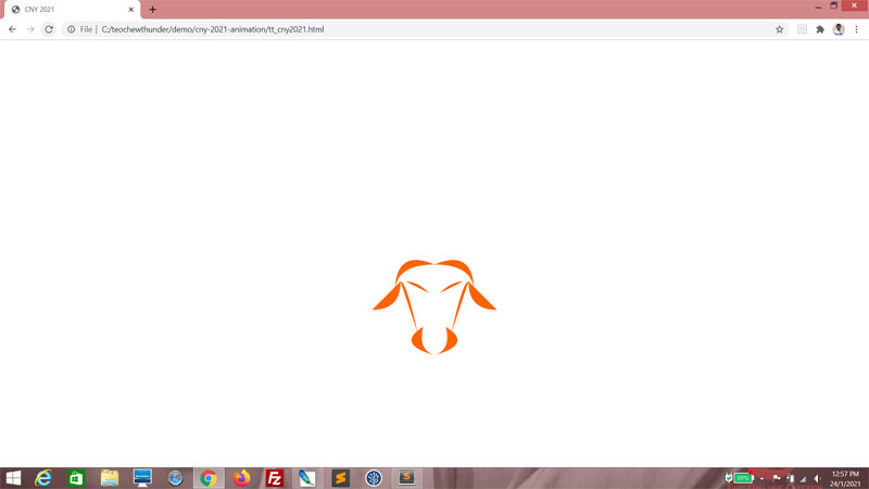
Creating an ox head
The g tag is for grouping. It's not absolutely necessary in this context, but it helps to keep code well-organized. Let's begin with a g tag and style it using the CSS class medium. Here, we'll add two path tags. Remember that the SVG is 800 pixels wide and 550 pixels tall, so the starting coordinates for the d tag should give you a good idea where it begins. We have Z here because this is supposed to be a closed path.<svg>
<g class="medium">
<path d="M400 320 Z"></path>
</g>
</svg>
<g class="medium">
<path d="M400 320 Z"></path>
</g>
</svg>
Here, q means we go 70 pixels left and 50 pixels down, then 70 pixels right again and 50 pixels up. This won't produce anything...
<svg>
<g class="medium">
<path d="M400 320 q -70 50 q 70 -50 Z"></path>
</g>
</svg>
<g class="medium">
<path d="M400 320 q -70 50 q 70 -50 Z"></path>
</g>
</svg>
...until we add curves.
<svg>
<g class="medium">
<path d="M400 320 q-70 -30 -70 50 q0 -50 70 -50 Z"></path>
</g>
</svg>
<g class="medium">
<path d="M400 320 q-70 -30 -70 50 q0 -50 70 -50 Z"></path>
</g>
</svg>
Nice going.

We put another one in there, this one almost a mirror image, with the x-coordinates reversed.
<svg>
<g class="medium">
<path d="M400 320 q-70 -30 -70 50 q 0 -50 70 -50 Z"></path>
<path d="M400 320 q70 -30 70 50 q 0 -50 -70 -50 Z"></path>
</g>
</svg>
<g class="medium">
<path d="M400 320 q-70 -30 -70 50 q 0 -50 70 -50 Z"></path>
<path d="M400 320 q70 -30 70 50 q 0 -50 -70 -50 Z"></path>
</g>
</svg>
What this is supposed to do, is form the curve of the ox's scalp.

Next is two more paths that form the sides of the ox's face.
<g class="medium">
<path d="M400 320 q-70 -30 -70 50 q0 -50 70 -50 Z"></path>
<path d="M400 320 q70 -30 70 50 q0 -50 -70 -50 Z"></path>
<path d="M340 350 q10 0 30 90 Z"></path>
<path d="M460 350 q-10 0 -30 90 Z"></path>
</g>
<path d="M400 320 q-70 -30 -70 50 q0 -50 70 -50 Z"></path>
<path d="M400 320 q70 -30 70 50 q0 -50 -70 -50 Z"></path>
<path d="M340 350 q10 0 30 90 Z"></path>
<path d="M460 350 q-10 0 -30 90 Z"></path>
</g>
It's early days yet, but can you see this taking shape?

Let's shape the brows!
<g class="medium">
<path d="M400 320 q-70 -30 -70 50 q0 -50 70 -50 Z"></path>
<path d="M400 320 q70 -30 70 50 q0 -50 -70 -50 Z"></path>
<path d="M340 350 q10 0 30 90 Z"></path>
<path d="M460 350 q-10 0 -30 90 Z"></path>
<path d="M350 350 q20 0 40 20 Z"></path>
<path d="M450 350 q-20 0 -40 20 Z"></path>
</g>
<path d="M400 320 q-70 -30 -70 50 q0 -50 70 -50 Z"></path>
<path d="M400 320 q70 -30 70 50 q0 -50 -70 -50 Z"></path>
<path d="M340 350 q10 0 30 90 Z"></path>
<path d="M460 350 q-10 0 -30 90 Z"></path>
<path d="M350 350 q20 0 40 20 Z"></path>
<path d="M450 350 q-20 0 -40 20 Z"></path>
</g>
Yep, definitely a face forming.

Time to do the nose.
<g class="medium">
<path d="M400 320 q-70 -30 -70 50 q0 -50 70 -50 Z"></path>
<path d="M400 320 q70 -30 70 50 q0 -50 -70 -50 Z"></path>
<path d="M340 350 q10 0 30 90 Z"></path>
<path d="M460 350 q-10 0 -30 90 Z"></path>
<path d="M350 350 q20 0 40 20 Z"></path>
<path d="M450 350 q-20 0 -40 20 Z"></path>
<path d="M380 430 q-50 30 20 50 q-30 -10 -20 -50 Z"></path>
<path d="M420 430 q50 30 -20 50 q30 -10 20 -50 Z"></path>
</g>
The nose knows!

And finally, let's add the ears.
<g class="medium">
<path d="M340 350 q0 50 -50 50 Z"></path>
<path d="M460 350 q0 50 50 50 Z"></path>
<path d="M400 320 q-70 -30 -70 50 q0 -50 70 -50 Z"></path>
<path d="M400 320 q70 -30 70 50 q0 -50 -70 -50 Z"></path>
<path d="M340 350 q10 0 30 90 Z"></path>
<path d="M460 350 q-10 0 -30 90 Z"></path>
<path d="M350 350 q20 0 40 20 Z"></path>
<path d="M450 350 q-20 0 -40 20 Z"></path>
<path d="M380 430 q-50 30 20 50 q-30 -10 -20 -50 Z"></path>
<path d="M420 430 q50 30 -20 50 q30 -10 20 -50 Z"></path>
</g>
Damn, ain't this a beauty?
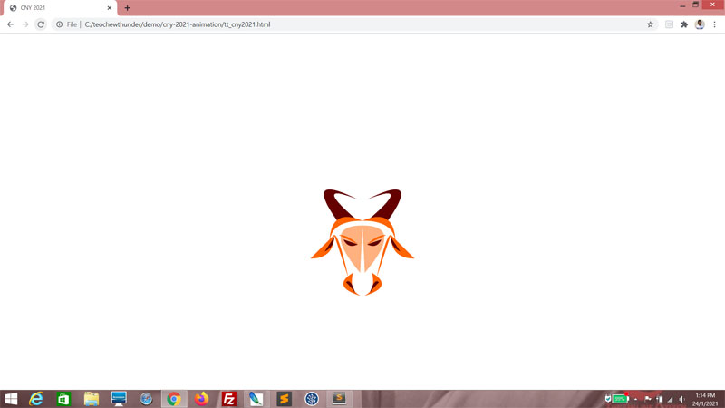
What we've done so far is add a basic frame for the face. We will next add some highlights. Add new g tag. Style it using the CSS class dark.
<svg>
<g class="medium">
<path d="M340 350 q0 50 -50 50 Z"></path>
<path d="M460 350 q0 50 50 50 Z"></path>
<path d="M400 320 q-70 -30 -70 50 q0 -50 70 -50 Z"></path>
<path d="M400 320 q70 -30 70 50 q0 -50 -70 -50 Z"></path>
<path d="M340 350 q10 0 30 90 Z"></path>
<path d="M460 350 q-10 0 -30 90 Z"></path>
<path d="M350 350 q20 0 40 20 Z"></path>
<path d="M450 350 q-20 0 -40 20 Z"></path>
<path d="M380 430 q-50 30 20 50 q-30 -10 -20 -50 Z"></path>
<path d="M420 430 q50 30 -20 50 q30 -10 20 -50 Z"></path>
</g>
<g class="dark">
</g>
</svg>
Just a few strokes!
<g class="dark">
<path d="M390 370 q-20 10 -30 -10 Z"></path>
<path d="M410 370 q20 10 30 -10 Z"></path>
<path d="M365 450 q10 -10 20 25 q0 -5 -20 -25 Z"></path>
<path d="M435 450 q-10 -10 -20 25 q0 -5 20 -25 Z"></path>
<path d="M340 355 q0 20 -20 30 Z"></path>
<path d="M460 355 q0 20 20 30 Z"></path>
</g>
<path d="M390 370 q-20 10 -30 -10 Z"></path>
<path d="M410 370 q20 10 30 -10 Z"></path>
<path d="M365 450 q10 -10 20 25 q0 -5 -20 -25 Z"></path>
<path d="M435 450 q-10 -10 -20 25 q0 -5 20 -25 Z"></path>
<path d="M340 355 q0 20 -20 30 Z"></path>
<path d="M460 355 q0 20 20 30 Z"></path>
</g>
And what a difference that makes.

Just add a little shading here. Add a new g tag with a CSS class of light.
<g class="light">
</g>
<g class="medium">
<path d="M340 350 q0 50 -50 50 Z"></path>
<path d="M460 350 q0 50 50 50 Z"></path>
<path d="M400 320 q-70 -30 -70 50 q0 -50 70 -50 Z"></path>
<path d="M400 320 q70 -30 70 50 q0 -50 -70 -50 Z"></path>
<path d="M340 350 q10 0 30 90 Z"></path>
<path d="M460 350 q-10 0 -30 90 Z"></path>
<path d="M350 350 q20 0 40 20 Z"></path>
<path d="M450 350 q-20 0 -40 20 Z"></path>
<path d="M380 430 q-50 30 20 50 q-30 -10 -20 -50 Z"></path>
<path d="M420 430 q50 30 -20 50 q30 -10 20 -50 Z"></path>
</g>
</g>
<g class="medium">
<path d="M340 350 q0 50 -50 50 Z"></path>
<path d="M460 350 q0 50 50 50 Z"></path>
<path d="M400 320 q-70 -30 -70 50 q0 -50 70 -50 Z"></path>
<path d="M400 320 q70 -30 70 50 q0 -50 -70 -50 Z"></path>
<path d="M340 350 q10 0 30 90 Z"></path>
<path d="M460 350 q-10 0 -30 90 Z"></path>
<path d="M350 350 q20 0 40 20 Z"></path>
<path d="M450 350 q-20 0 -40 20 Z"></path>
<path d="M380 430 q-50 30 20 50 q-30 -10 -20 -50 Z"></path>
<path d="M420 430 q50 30 -20 50 q30 -10 20 -50 Z"></path>
</g>
Another two path tags here...
<g class="light">
<path d="M400 330 q90 0 5 100 Z"></path>
<path d="M400 330 q-90 0 -5 100 Z"></path>
</g>
<g class="medium">
<path d="M340 350 q0 50 -50 50 Z"></path>
<path d="M460 350 q0 50 50 50 Z"></path>
<path d="M400 320 q-70 -30 -70 50 q0 -50 70 -50 Z"></path>
<path d="M400 320 q70 -30 70 50 q0 -50 -70 -50 Z"></path>
<path d="M340 350 q10 0 30 90 Z"></path>
<path d="M460 350 q-10 0 -30 90 Z"></path>
<path d="M350 350 q20 0 40 20 Z"></path>
<path d="M450 350 q-20 0 -40 20 Z"></path>
<path d="M380 430 q-50 30 20 50 q-30 -10 -20 -50 Z"></path>
<path d="M420 430 q50 30 -20 50 q30 -10 20 -50 Z"></path>
</g>
...and this gives us a nice ox head! Well, except that this ox head needs horns.

Time to get horny! (heh heh) We add another g tag styled using the CSS class dark. This one has to render behind the head, so it has to be written first in the SVG.
<g class="dark">
</g>
<g class="light">
<path d="M400 330 q90 0 5 100 Z"></path>
<path d="M400 330 q-90 0 -5 100 Z"></path>
</g>
</g>
<g class="light">
<path d="M400 330 q90 0 5 100 Z"></path>
<path d="M400 330 q-90 0 -5 100 Z"></path>
</g>
I won't go into detail how the path tags are shaped. The curve is going to be a little more extreme, though.
<g class="dark">
<path d="M380 320 l-30 5 q-80 -110 40 -50 q-100 -40 0 45 Z"></path>
<path d="M420 320 l30 5 q80 -110 -40 -50 q100 -40 0 45 Z"></path>
</g>
<g class="light">
<path d="M400 330 q90 0 5 100 Z"></path>
<path d="M400 330 q-90 0 -5 100 Z"></path>
</g>
<path d="M380 320 l-30 5 q-80 -110 40 -50 q-100 -40 0 45 Z"></path>
<path d="M420 320 l30 5 q80 -110 -40 -50 q100 -40 0 45 Z"></path>
</g>
<g class="light">
<path d="M400 330 q90 0 5 100 Z"></path>
<path d="M400 330 q-90 0 -5 100 Z"></path>
</g>
Here's our ox head, complete with horns.
Some animation
Just for fun, let's animate the eyes a little. Make this guy wink. To to that, we need to insert an animate tag within the path tag that rendered one of the eyes. In this case, I choose the eye on my left.<g class="dark">
<path d="M390 370 q-20 10 -30 -10 Z">
<animate />
</path>
<path d="M410 370 q20 10 30 -10 Z"></path>
<path d="M365 450 q10 -10 20 25 q0 -5 -20 -25 Z"></path>
<path d="M435 450 q-10 -10 -20 25 q0 -5 20 -25 Z"></path>
<path d="M340 355 q0 20 -20 30 Z"></path>
<path d="M460 355 q0 20 20 30 Z"></path>
</g>
Give this animation an id, animateEyeClose. The attribute we want to animate is d. The from attribute's value is exactly the same as the path's d attribute. For to, we will copy the same for now. We don't want the animation to revert abruptly, so set fill to "freeze". repeatCount is definitely 1, because we only want this animation to repeat on our terms. I intend to have this animation begin 5 seconds into loading, and take half a second to execute. So set begin and dur accordingly.
<path d="M390 370 q-20 10 -30 -10 Z">
<animate
id="animateEyeClose"
attributeName="d"
from="M390 370 q-20 10 -30 -10 Z"
to="M390 370 q-20 10 -30 -10 Z"
fill="freeze"
begin="5s;
dur="0.5s"
repeatCount="1"
/>
</path>
<animate
id="animateEyeClose"
attributeName="d"
from="M390 370 q-20 10 -30 -10 Z"
to="M390 370 q-20 10 -30 -10 Z"
fill="freeze"
begin="5s;
dur="0.5s"
repeatCount="1"
/>
</path>
Now adjust to.
<path d="M390 370 q-20 10 -30 -10 Z">
<animate
id="animateEyeClose"
attributeName="d"
from="M390 370 q-20 10 -30 -10 Z"
to="M390 375 q-20 0 -30 -10 Z"
fill="freeze"
begin="5s;
dur="0.5s"
repeatCount="1"
/>
</path>
<animate
id="animateEyeClose"
attributeName="d"
from="M390 370 q-20 10 -30 -10 Z"
to="M390 375 q-20 0 -30 -10 Z"
fill="freeze"
begin="5s;
dur="0.5s"
repeatCount="1"
/>
</path>
Blink and you'll miss it!

Add a second animate tag that reverses the first one. The id will be animateEyeOpen. from and to are the exact opposite of animateEyeClose's from and to values. For the begin attribute, set it to start when animateEyeClose ends.
<path d="M390 370 q-20 10 -30 -10 Z">
<animate
id="animateEyeClose"
attributeName="d"
from="M390 370 q-20 10 -30 -10 Z"
to="M390 375 q-20 0 -30 -10 Z"
fill="freeze"
begin="5s"
dur="0.5s"
repeatCount="1"
/>
<animate
id="animateEyeOpen"
attributeName="d"
from="M390 375 q-20 0 -30 -10 Z"
to="M390 370 q-20 10 -30 -10 Z"
fill="freeze"
begin="animateEyeClose.end"
dur="0.5s"
repeatCount="1"
/>
</path>
<animate
id="animateEyeClose"
attributeName="d"
from="M390 370 q-20 10 -30 -10 Z"
to="M390 375 q-20 0 -30 -10 Z"
fill="freeze"
begin="5s"
dur="0.5s"
repeatCount="1"
/>
<animate
id="animateEyeOpen"
attributeName="d"
from="M390 375 q-20 0 -30 -10 Z"
to="M390 370 q-20 10 -30 -10 Z"
fill="freeze"
begin="animateEyeClose.end"
dur="0.5s"
repeatCount="1"
/>
</path>
This will be fine if you only want the ox to wink once. But I want our ox to keep winking. So at the begin attribute of animateEyeClose, we specify that animateEyeClose not only begins after 5 seconds, it will also begin 10 seconds after animateEyeOpen ends. So now our ox should wink 5 seconds after the SVG loads, and every 10 seconds thereafter!
<path d="M390 370 q-20 10 -30 -10 Z">
<animate
id="animateEyeClose"
attributeName="d"
from="M390 370 q-20 10 -30 -10 Z"
to="M390 375 q-20 0 -30 -10 Z"
fill="freeze"
begin="5s;animateEyeOpen.end + 10s"
dur="0.5s"
repeatCount="1"
/>
<animate
id="animateEyeOpen"
attributeName="d"
from="M390 375 q-20 0 -30 -10 Z"
to="M390 370 q-20 10 -30 -10 Z"
fill="freeze"
begin="animateEyeClose.end"
dur="0.5s"
repeatCount="1"
/>
</path>
<animate
id="animateEyeClose"
attributeName="d"
from="M390 370 q-20 10 -30 -10 Z"
to="M390 375 q-20 0 -30 -10 Z"
fill="freeze"
begin="5s;animateEyeOpen.end + 10s"
dur="0.5s"
repeatCount="1"
/>
<animate
id="animateEyeOpen"
attributeName="d"
from="M390 375 q-20 0 -30 -10 Z"
to="M390 370 q-20 10 -30 -10 Z"
fill="freeze"
begin="animateEyeClose.end"
dur="0.5s"
repeatCount="1"
/>
</path>
No comments:
Post a Comment