Wednesday 27 December 2017

The Monkey's Fist Analogy

Ahoy! It's time for another ropework analogy. Here's hoping you enjoy this one...

The Monkey's Fist, in nautical terms, is a heaving line knot, decorative in style, used to weigh down the end of a line and make it easier to throw.

Occasionally, it has a round weight worked into its core to make it even heavier. Or a core of cork or styrofoam to enable it to float when thrown into water.

Basically what happens is that you have a rope and a core...

...and then you have a Monkey's Fist!


Decades ago, when I first learned how to tie one, it never occurred to me how this is a somewhat apt analogy for web development. Specifically, how the back-end and front-end portions of a web application work together.

The Monkey's Fist is ultimately just a bit of rope with the end bunched together in a decorative knot. The core is what gives the knot its power, while the rope is what makes that power usable. The Monkey's Fist is greater than the sum of its parts.

The rope, and the front-end

The rope can be tied into a Monkey's Fist and works pretty well even without the core. But having a core increases the power of the knot tenfold. With the rope, the user can now heave the core further distances and retrieve it. The rope adds utility to the core.

In the same way, a well-designed user interface allows the user to interact with the data from storage more efficiently and elegantly. You could still have an application using only the front-end and browser storage, but it wouldn't get you very far.

The core, and the back-end

Consider what the core is, whether it's a ball of iron or cork. On its own, this ball of iron is either a shot putt or an ugly paperweight. On its own, the ball of cork is just a floating object.

Just like the back-end of a web application - basically a database with the power to process - retrieve, sort and group - raw data into coherent information. But without a front-end or user interface, a lot of its power goes unharnessed.

Where am I going with this?

Well, there's been a fair bit of debate over what's more important to a web application - the front-end or back-end. And my opinion is that a developer can't realistically have one without the other. They're two vital components of the same solution.

Thanks for reading. I had a ball of a time.
T___T

Friday 22 December 2017

Web Tutorial: Christmas-themed LESS Demo (Part 4/4)

We're at the final part of this tutorial, and we will get the blue theme up for this one, and use some more LESS in the process. (More LESS, geddit? Hur hur)

As before, make a blank copy of the CSS class theme_green and name it theme_blue. This one will be a centered single-column layout.

styles.less
/*GREEN*/
@green_content_background: rgba(100,255,100,0.7);
@color_green_text: rgba(0,0,0,0.8);

.theme_green
{
    font-family:arial;
    font-size:1.2em;

    .container
    {
        width:100%;
        height:100%;
        background: url(../img/bg_green00.jpg);
        background-repeat:no-repeat;
        background-position:left top;
        background-size:20%;
    }

    .header_wrapper
    {
        width:100%;
        height:20%;
    }

    .body_wrapper
    {
        width:100%;
        height:65%;
    }

    .footer_wrapper
    {
        width:100%;
        height:15%;
        background: #FFFFFF; /* Old browsers */
        background: -moz-linear-gradient(top, #FFFFFF 0%, @green_content_background 41%); /* FF3.6-15 */
        background: -webkit-linear-gradient(top, #FFFFFF 0%,@green_content_background 41%); /* Chrome10-25,Safari5.1-6 */
        background: linear-gradient(to bottom, #FFFFFF 0%,@green_content_background 41%); /* W3C, IE10+, FF16+, Chrome26+, Opera12+, Safari7+ */
        filter: progid:DXImageTransform.Microsoft.gradient( startColorstr='#FFFFFF', endColorstr='@green_content_background',GradientType=0 ); /* IE6-9 */
    }

    .content_wrapper
    {
        width:95%;
        padding-top:2%;
        padding-bottom:2%;
        .centered;
    }

    .content
    {
        .rounded_corners(2em);
        border:0.5em solid darken(@green_content_background,50%);
        background-color: darken(@green_content_background,10%);
        color:@color_green_text;
        width:75%;
        .centered;
        padding:1em;
    }

    .header
    {
        width:80%;
        height:20%;
        .centered;
        text-align:center;
        font-size:6.5em;
        font-family: impact;
        color:darken(@green_content_background,50%);
    }

    .content1
    {
        width:100%;
        .content;
    }

    .content1:after
    {
        display:block;
        content:"";
        clear:both;
    }

    .content1 p
    {
        float:left;
        margin-left:2em;
    }

    .content2
    {
        width:100%;
        margin-top:1em;
        .content;
        .centered;
    }

    .content3
    {
        width:100%;
        height:150px;
        background-image:url(../img/bg_green01.jpg);
        background-repeat:no-repeat;
        background-position:right center;
        background-size:contain;
        margin-top:-10%;
        margin-right:-10%;
    }

    .footer
    {
        margin-top:1em;
        color:@color_green_text;
        font-size:0.7em;
    }
}

/*BLUE*/

.theme_blue
{
    .container
    {

    }

    .header_wrapper
    {

    }

    .body_wrapper
    {

    }

    .footer_wrapper
    {

    }

    .content_wrapper
    {

    }

    .content
    {

    }

    .header
    {

    }

    .content1
    {

    }

    .content2
    {

    }

    .content3
    {

    }

    .footer
    {

    }
}


Start by declaring four variables that we'll use later: color_blue_overlay, color_blue_content_background, color-blue-border and color-blue-text. They're all different shades of blue or grey. Within theme_blue, set the font to Verdana. Y'know, just for variety.

styles.less
/*BLUE*/
@color_blue_overlay: rgba(50,50,100,0.7);
@color_blue_content_background: rgba(255,255,255,0.8);
@color-blue-border: #4444FF;
@color-blue-text: #AAAAFF;

.theme_blue
{
    font-family:verdana;


Now, for this theme, we will set the entire screen to use the image shown below as the background.

bg_blue00.jpg

styles.less
.theme_blue
{
    font-family:verdana;

    background-image:url(../img/bg_blue00.jpg);
    background-repeat:no-repeat;
    background-position:center bottom;
    background-size:cover;


Ain't she a beauty? But wait, there's more.


Now, set the container class to use centered as a mixin, make the width 70% of screen width and the height 100% of screen height. For the background, use the variable color_blue_overlay.

styles.less
    .container
    {
        width:70%;
        height:100%;
        background-color: @color_blue_overlay;
        .centered;
    }


Got that? Good.


Now for the header_wrapper, body_wrapper and footer_wrapper classes, specify a 100% width for all of them, and varying heights. Use the darken() function with the color_blue_overlay variable as an argument for the background colors of header_wrapper and footer_wrapper, with different percentages.

styles.less
    .container
    {
        width:70%;
        height:100%;
        background-color: @color_blue_overlay;
        .centered;
    }

    .header_wrapper
    {
        background-color: darken(@color_blue_overlay,50%);
        width:100%;
        height:20%;
        text-align:center;
    }

    .body_wrapper
    {
        width:100%;
        height:70%;
    }

    .footer_wrapper
    {
        background-color: darken(@color_blue_overlay,10%);
        width:100%;
        height:10%;
    }


A bit messy. We'll be cleaning that right up.


This should help. A bit of padding goes a long way.

styles.less
    .content_wrapper
    {
        width:98%;
        padding-top:1%;
        padding-bottom:1%;
        .centered;
    }


Now, style content with a blue border using the variable color-blue-border and a background using the darken() version of color_blue_overlay, and set the text color to the variable color-blue-text. Add some padding and use the rounded_corners() function we created, for good measure. Then use content as a mixin in content1 and content2. content1 and content2 will float left and right respectively.
styles.less
    .content
    {
        border:2px solid @color-blue-border;
        background-color: darken(@color_blue_overlay,10%);
        color:@color-blue-text;
        padding:1em;
        .rounded_corners(0.5em);
    }

    .header
    {

    }

    .content1
    {
        width:35%;
        float:left;
        font-size:0.85em;
        .content;
    }

    .content2
    {
        width:55%;
        float:right;
        .content;
    }


Looking prettier now.


Now style the header class. Use the lighten() function on the variable color_blue_overlay. That's a new one, eh?

styles.less
    .header
    {
        font-size:5.5em;
        font-family:verdana;
        color: lighten(@color_blue_overlay,50%);
        font-weight:bold;
    }


Merry Christmas!


Now start styling the footer too.

styles.less
    .footer
    {
        color:lighten(@color-blue-text,10%);
        font-size:0.7em;
    }


Here you go.


Finally, let's stye content3. Use the image below.


bg_blue01.png

styles.less
    .content3
    {
        width:400px;
        height:400px;
        float:right;
        background-image:url(../img/bg_blue01.png);
        background-repeat:no-repeat;
        background-position:center center;
        background-size:contain;
    }


Not bad. Not bad at all!


Have fun switching between themes. Today's web tutorial was meant to illustrate how useful LESS can be when dealing with nested CSS classes. Lots of reusability there.
Wishing you a very Christmas!
T___T

Monday 18 December 2017

Web Tutorial: Christmas-themed LESS Demo (Part 3/4)

It's time to set up the green theme. Before that, however, try something. Select the green theme from the drop-down list. Does the layout change? Yep, it does. To white background, black text. That's because we haven't specified anything for theme_green. We're going to change that, right now.

We could start by copying and pasting the entirety of theme_red and  changing the name of the new CSS class to theme_green, then removing all the properties inside theme_green. Got that? Now we have a nice template to work with.

styles.less
/*RED*/
@color_red_text: #FFAAAA;

.theme_red
{
    font-family:arial;

    .container
    {
        width:100%;
        height:100%;
        background: url(../img/bg_red00.jpg);
        background-repeat:no-repeat;
        background-position:center center;
        background-size:cover;
    }

    .header_wrapper
    {
        width:20%;
        height:100%;
        float:left;
        background: url(../img/bg_red01.jpg);
    }

    .body_wrapper
    {
        width:70%;
        height:90%;
        float:right;
        border-bottom:3px double @color_red_text;
    }

    .footer_wrapper
    {
        width:70%;
        float:right;
        height:10%;
    }

    .content_wrapper
    {
        width:100%;
    }

    .content
    {
        color:@color_red_text;
        padding:10px;
    }

    .header
    {
        color:@color_red_text;
        font-family:georgia;
        font-size:7em;
        -webkit-transform-origin:100% 100%;
        -webkit-transform:rotate(-90deg);
        transform-origin:100% 100%;
        transform:rotate(-90deg);
        margin-top:1em;
    }

    .content1
    {
        width:45%;
        float:left;
        .content;
    }

    .content2
    {
        font-size:1.5em;
        width:45%;
        height:50%;
        float:right;
        .content;
    }

    .content3
    {
        width:45%;
        height:300px;
        margin-top:10px;
        float:right;
        background-image:url(../img/bg_red02.jpg);
        background-repeat:no-repeat;
        background-position:left center;
        background-size:contain;
    }

    .footer
    {
        color:#FFFFFF;
        font-size:0.7em;
    }
}

/*GREEN*/

.theme_green
{
    .container
    {

    }

    .header_wrapper
    {

    }

    .body_wrapper
    {

    }

    .footer_wrapper
    {

    }

    .content_wrapper
    {

    }

    .content
    {

    }

    .header
    {

    }

    .content1
    {

    }

    .content2
    {

    }

    .content3
    {

    }

    .footer
    {

    }
}


First thing we do is declare two variables - green_content_background and color_green_text. They are translucent shades of green and black, respectively. Then we specify the font. We'll be using Arial again.

styles.less
/*GREEN*/
@green_content_background: rgba(100,255,100,0.7);
@color_green_text: rgba(0,0,0,0.8);

.theme_green
{
    font-family:arial;
    font-size:1.2em;


Again, container will use up 100% of screen height and width. The background will be the image below, but only appear on the top left hand corner.

bg_green00.jpg


styles.less
    .container
    {
        width:100%;
        height:100%;
        background: url(../img/bg_green00.jpg);
        background-repeat:no-repeat;
        background-position:left top;
        background-size:20%;
    }


There.


Now style header_wrapper and header. Specify the height and width, and the font. I'll leave it to you, but this is what I'd go with.

styles.less
    .header_wrapper
    {
        width:100%;
        height:20%;
    }

    .body_wrapper
    {

    }

    .footer_wrapper
    {

    }

    .content_wrapper
    {

    }

    .content
    {

    }

    .header
    {
        width:80%;
        text-align:center;
        font-size:6.5em;
        font-family: impact;
        color:darken(@green_content_background,50%);
    }


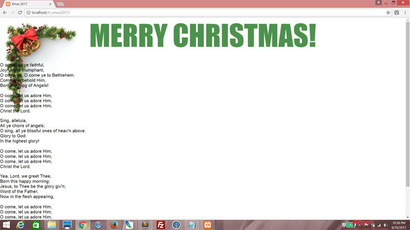
This is kind of OK. I mean, technically it's acceptable but not very Christmas-y. Let's tweak it a little.


Start by aligning header_wrapper to the middle of the screen. I know what you're thinking - we never defined centered as a CSS class, right?

styles.less
    .header
    {
        width:80%;
        .centered;
        text-align:center;
        font-size:6.5em;
        font-family: impact;
    }


Hey, no sweat. We can fix that now. Let's define centered outside of the theme_green class so we can reuse it later.

styles.less
html, body
{
    height:100%;
    padding:0px;
    margin:0px;
    font-size:14px;
}

.centered
{
    margin-left:auto;
    margin-right:auto;
}


Looking better already!


Now, let's change the color of the header so it's not all strikingly black. Remember we specified green_content_background as a variable? Well, let's use that color now, except we use LESS's darken() function to deepen the color by 50%. Functions are part of the LESS specification, and lemme tell you, they utterly fucking rock.

Here's a list of LESS's functions. (http://lesscss.org/functions/)

styles.less
    .header
    {
        width:80%;
        .centered;
        text-align:center;
        font-size:6.5em;
        font-family: impact;
        color:darken(@green_content_background,50%);
    }


And... we have a header!


Now, let's align all content to the middle like we did with header_wrapper. Note how we reuse centered for content_wrapper. Right now, we're just specifying all that padding and stuff. Not really vital, use as needed.

styles.less
    .header_wrapper
    {
        width:100%;
        height:20%;
    }

    .body_wrapper
    {
        width:100%;
        height:65%;
    }

    .footer_wrapper
    {
        width:100%;
        height:15%;
    }

    .content_wrapper
    {
        width:95%;
        padding-top:2%;
        padding-bottom:2%;
        .centered;
    }

    .content
    {

    }

    .header
    {
        width:80%;
        .centered;
        text-align:center;
        font-size:6.5em;
        font-family: impact;
        color:darken(@green_content_background,50%);
    }


For content1, again we add content as a mixin. For content, we use the green_content_background variable for both border and background, except we apply the darken() function using different arguments. That way, if you ever change the color, everything else will follow suit in proportion!

Then we use color_green_text for the text.

styles.less
    .content
    {
        border:0.5em solid darken(@green_content_background,50%);
        background-color: darken(@green_content_background,10%);
        color:@color_green_text;
        width:75%;
        .centered;
    }

    .header
    {
        width:80%;
        height:20%;
        .centered;
        text-align:center;
        font-size:6.5em;
        font-family: impact;
        color:darken(@green_content_background,50%);
    }

    .content1
    {
        width:100%;
        .content;
    }


Get the idea yet? Needs more tweaking, but we're making progress.


Now try this. We'll make our own LESS function! It's just like creating a class, except with parentheses and a parameter. Here, the border-radius property is set to the value of that parameter. Since we might be reusing this, let's create it outside of all the themes, next to centered.

styles.less
html, body
{
    height:100%;
    padding:0px;
    margin:0px;
    font-size:14px;
}

.centered
{
    margin-left:auto;
    margin-right:auto;
}

.rounded_corners(@radius)

    border-radius:@radius;
}


And call rounded_corners() as a mixin! Pass in 2em as an argument.

styles.less
    .content
    {
        .rounded_corners(2em);
        border:0.5em solid darken(@green_content_background,50%);
        background-color: darken(@green_content_background,10%);
        color:@color_green_text;
        width:75%;
        .centered;
    }


Great, right? We're coming along nicely.


However, the Christmas carol is taking up way too much space. So let's tweak the paragraph tags a little. We ensure they all are floated left and have a nice 2em margin on the left.

styles.less
    .content
    {
        .rounded_corners(2em);
        border:0.5em solid darken(@green_content_background,50%);
        background-color: darken(@green_content_background,10%);
        color:@color_green_text;
        width:75%;
        .centered;
    }

    .content1 p
    {
        float:left;
        margin-left:2em;
    }


Uh-oh. Now the paragraphs are aligned nicely, but the parent div has collapsed!


Just add the after pseudoselector to the content1 class, and use it to clear the floats.

styles.less
    .content1
    {
        width:100%;
        .content;
    }

    .content1:after
    {
        display:block;
        content:"";
        clear:both;
    }

    .content1 p
    {
        float:left;
        margin-left:2em;
    }


Now we're talking.


Now do the same thing for the class content2.

styles.less
    .content1
    {
        width:100%;
        .content;
    }

    .content1:after
    {
        display:block;
        content:"";
        clear:both;
    }

    .content1 p
    {
        float:left;
        margin-left:2em;
    }

    .content2
    {
        width:100%;
        margin-top:1em;
        .content;
        .centered;
    }


Good. But we need a little padding.


Do this for the content class. This will add 1em of padding to all content.

styles.less
    .content
    {
        .rounded_corners(2em);
        border:0.5em solid darken(@green_content_background,50%);
        background-color: darken(@green_content_background,10%);
        color:@color_green_text;
        width:75%;
        .centered;
        padding:1em;
    }


Much better.


Now, content1 and content2 contain text, but content3 will be something else altogether. It will host an image background, using the image below.

bg_green01.jpg

styles.less
    .content1
    {
        width:100%;
        .content;
    }

    .content1:after
    {
        display:block;
        content:"";
        clear:both;
    }

    .content1 p
    {
        float:left;
        margin-left:2em;
    }

    .content2
    {
        width:100%;
        margin-top:1em;
        .content;
        .centered;
    }

    .content3
    {
        width:100%;
        height:150px;
        background-image:url(../img/bg_green01.jpg);
        background-repeat:no-repeat;
        background-position:right center;
        background-size:contain;
    }


That's nice, but let's move it up a little. We'll need a little space for what we're going to do with the footer.


Just give it a negative 10% top and right margin.

styles.less
    .content3
    {
        width:100%;
        height:150px;
        background-image:url(../img/bg_green01.jpg);
        background-repeat:no-repeat;
        background-position:right center;
        background-size:contain;
        margin-top:-10%;
        margin-right:-10%;
    }


Good stuff.


Now style footer. Set a smaller font size and use the variable color_green_text as the color, and shift it slightly lower.

styles.less
    .footer
    {
        margin-top:1em;
        color:@color_green_text;
        font-size:0.7em;
    }


Here, I'm using a gradient generated from ColorZilla. It graduates from the top, white to green, giving it a nice touch! The green we're using in this case is the variable green_content_background.

styles.less
    .footer_wrapper
    {
        width:100%;
        height:15%;
        background: #FFFFFF; /* Old browsers */
        background: -moz-linear-gradient(top, #FFFFFF 0%, @green_content_background 41%); /* FF3.6-15 */
        background: -webkit-linear-gradient(top, #FFFFFF 0%,@green_content_background 41%); /* Chrome10-25,Safari5.1-6 */
        background: linear-gradient(to bottom, #FFFFFF 0%,@green_content_background 41%); /* W3C, IE10+, FF16+, Chrome26+, Opera12+, Safari7+ */
        filter: progid:DXImageTransform.Microsoft.gradient( startColorstr='#FFFFFF', endColorstr='@green_content_background',GradientType=0 ); /* IE6-9 */
    }


And that's it for your green theme!


Try using the drop-down list to switch between red and green themes. See what we did with LESS? We could have used regular CSS, but for stuff like this, LESS is a lot more maintainable. Without LESS, we'd have to duplicate a lot of code.

Next

We've just got one more theme to go. Bear with me for another blogpost!

Friday 15 December 2017

Web Tutorial: Christmas-themed LESS Demo (Part 2/4)

Welcome back!

We got the setup out of the way in the last part of this web tutorial, and now let's roll those sleeves up and dive into some LESS code. First off, let's make this one change to the HTML. This ensures that your starting theme is always the red one.

index.html
<body class="theme_red">


Now, in your LESS file, create a CSS class for theme_red. We're also going to create a variable called color_red_text. This is a variable that holds the color code for a nice tasteful pink. Also, within theme_red, let's specify that this theme will be using Arial as a font.

styles.less
html, body
{
    height:100%;
    padding:0px;
    margin:0px;
    font-size:14px;
}

/*RED*/
@color_red_text: #FFAAAA;

.theme_red
{
    font-family:arial;
}


And then within theme_red, we set the CSS class container. This isn't possible with standard CSS, but it is with LESS. It's a great boon, and you'll see why by the end of the tutorial. width and height properties are set to 100%. This makes container cover the entire screen. The background properties basically uses the image below as a wallpaper.

bg_red00.jpg

styles.less
/*RED*/
@color_red_text: #FFAAAA;

.theme_red
{
    font-family:arial;

    .container
    {
        width:100%;
        height:100%;
        background: url(../img/bg_red00.jpg);
        background-repeat:no-repeat;
        background-position:center center;
        background-size:cover;
    }
}


Got that?


Now, we can hardly see the text, so let's just set the text to use the color we so nicely defined with the variable color_red_text. So now the CSS class header's text color will be defined by color_red_text. The font uses Georgia, though the rest of the page is still in Arial font.

styles.less
.theme_red
{
    font-family:arial;

    .container
    {
        width:100%;
        height:100%;
        background: url(../img/bg_red00.jpg);
        background-repeat:no-repeat;
        background-position:center center;
        background-size:cover;
    }

    .header
    {
        color:@color_red_text;
        font-family:georgia;
        font-size:7em;
    }
}


Pretty!


Now, let's do some more fancy LESS stuff. Declare a CSS class, content, and set the color. Give some padding, say, 10 pixels.
styles.less
    .content
    {
        color:@color_red_text;
        padding:10px;
    }

    .header
    {
        color:@color_red_text;
        font-family:georgia;
        font-size:7em;
    }


Then create two more CSS classes, content1 and content2, and include content as part of the specification! Now all the properties set by content will be part of content1 and content2.

Notice that I specified the font-size property of content2. I did that because it makes me happy and there's really no vital need for you to do so.
styles.less
    .content
    {
        color:@color_red_text;
        padding:10px;
    }

    .header
    {
        color:@color_red_text;
        font-family:georgia;
        font-size:7em;
    }

    .content1
    {
        .content;
    }

    .content2
    {
        font-size:1.5em;
        .content;
    }


See what we did there?


OK, enough dicking around with the colors for now. Let's set some layout. Create the following CSS classes - header_wrapper, body_wrapper, footer_wrapper and content_wrapper. content_wrapper will fit 100% of its parent's width.

styles.less
    font-family:arial;

    .container
    {
        width:100%;
        height:100%;
        background: url(../img/bg_red00.jpg);
        background-repeat:no-repeat;
        background-position:center center;
        background-size:cover;
    }

    .header_wrapper
    {

    }

    .body_wrapper
    {

    }

    .footer_wrapper
    {

    }

    .content_wrapper
    {
        width:100%;
    }

    .content
    {
        color:@color_red_text;
        padding:10px;
    }


Here, we're trying to make a three-column layout, with the header to the left. So header_wrapper takes up 20% of the screen width and floats left. And we'll use the following image below as wallpaper.

bg_red01.jpg

styles.less
    .header_wrapper
    {
        width:20%;
        height:100%;
        float:left;
        background: url(../img/bg_red01.jpg);
    }


Nice, eh? Yes it's rather messy, but trust me when I say this will all work out in time.


Now do this. body_wrapper will take up 70% of screen width and 90% of screen height, and be floated right. We'll also add a nice pink line at the bottom.
styles.less
    .body_wrapper
    {
        width:70%;
        height:90%;
        float:right;
        border-bottom:3px double @color_red_text;
    }


Getting there...


Let's set the footer as well. We want it right under the body, so set the width to 70% as well, but with a height of 10% (to use up the remainder of the screen height) and also float it right.
styles.less
    .footer_wrapper
    {
        width:70%;
        float:right;
        height:10%;
    }


We should, of course, style footer content! Make the font white and a little smaller.
styles.less
    .content1
    {
        .content;
    }

    .content2
    {
        font-size:1.5em;
        .content;
    }

    .footer
    {
        color:#FFFFFF;
        font-size:0.7em;
    }


You can see that the footer overlaps the content somewhat. We'll be fixing that.


Make changes to content1 and content2. content1, which house the Christmas carol, will take up 45% of its parent div, and float left. content2, which houses the Lorem Ipsum text, will take up another 45% and float right. It will also only have a height of 50% of its parent div because we want to make space for more content!

styles.less
    .content1
    {
        width:45%;
        float:left;
        .content;
    }

    .content2
    {
        font-size:1.5em;
        width:45%;
        height:50%;
        float:right;
        .content;
    }


Presto!


Now let's put in content3. Like content2, it takes up 45% of screen width and is floated right. We'll give it a top margin of 10 pixels to give it some breathing space from content2, and provide a height of 300 pixels. Then we set the background to use the image below.

bg_red02.jpg


styles.less
    .content1
    {
        width:45%;
        float:left;
        .content;
    }

    .content2
    {
        font-size:1.5em;
        width:45%;
        height:50%;
        float:right;
        .content;
    }

    .content3
    {
        width:45%;
        height:300px;
        margin-top:10px;
        float:right;
        background-image:url(../img/bg_red02.jpg);
        background-repeat:no-repeat;
        background-position:left center;
        background-size:contain;
    }


Looking good! Now all we've got to fix is that header.


We'll rotate the header 90 degrees anti-clockwise from its bottom right corner, and add a little margin at the top.
    .header
    {
        color:@color_red_text;
        font-family:georgia;
        font-size:7em;
        -webkit-transform-origin:100% 100%;
        -webkit-transform:rotate(-90deg);
        transform-origin:100% 100%;
        transform:rotate(-90deg);
        margin-top:1em;
    }


Excellent!


That's it for your red theme. We'll be uncovering more LESS goodness in the next part!

Next

The green theme is next, and a beauty it will be.

Tuesday 12 December 2017

Web Tutorial: Christmas-themed LESS Demo (Part 1/4)

Hey, guys.

Christmas won't be here for another couple weeks, but this tutorial is a four-parter. Not only are we going to be using HTML, CSS and (very minimal) JavaScript, we will be using LESS.

Here's some reading about LESS. (http://lesscss.org/)

We're using LESS for this case because it's more maintainable. You'll see what I mean in due course. For this, you'll also need a pre-processor to convert the LESS file into CSS. Me, I'm just running it through my Apache server. There are other, perfectly valid alternatives, so feel free to use them.

What are we making?

It's a Christmas webpage that will change in appearance and layout depending on the option you select. We will be making three different themes - Red, Green and Blue, in keeping with the RGB color system.

Setup

First, let's get your setup right. This is how it should look like, with a HTML file, index.html in the main directory and thee sub-directories: img, css and js.


In the css directory, create a file named styles.less.

In the img directory, I've placed a few images. You can pick them up here.

In the js directory, you need the less.min.js file. This one may be picked up here.

Today, you will be working only with index.html and styles.less.

Getting started

Here's some HTML. Here, we have a link to the stylesheet styes.less and the JavaScript file, less.min.js.

index.html
<!DOCTYPE html>
<html>
    <head>
        <title>Xmas 2017</title>
        <link rel="stylesheet/less" type="text/css" href="css/styles.less" />

        <script src="js/less.min.js"></script>

        <script>

        </script>
    </head>
   
    <body>

    </body>
</html>


Since we're going to be dealing with three different themes, we need to ensure that the HTML and body are prepped. This won't have any visible effect on the page, not yet at least. But we'll set the padding and margin properties to zero so that they'll work better across browsers. The HTML and body's height are set to 100% of the screen height, and we set a default font size of 14 pixels.

styles.less
html, body
{
    height:100%;
    padding:0px;
    margin:0px;
    font-size:14px;
}


Now, we'll need to hit the ground running, fast. This page will be subject to many on-the-fly CSS changes, so it's important that we structure it well. Make it robust. That may mean a lot of inner and outer divs. In fact, we'll start with one big outer div with a class of container. Within are three other divs, one for your header, one for your body and one for our footer. They're all styled using appropriate CSS class names, and we will add those classes later.

index.html
<!DOCTYPE html>
<html>
    <head>
        <title>Xmas 2017</title>
        <link rel="stylesheet/less" type="text/css" href="css/styles.less" />

        <script src="js/less.min.js"></script>

        <script>

        </script>
    </head>

    <body>
        <div class="container">
            <div class="header_wrapper">

            </div>

            <div class="body_wrapper">

            </div>

            <div class="footer_wrapper">

            </div>
        </div>
    </body>
</html>


Within each of these, we'll have another div with a class of content_wrapper.

index.html
<!DOCTYPE html>
<html>
        <div class="container">
            <div class="header_wrapper">
                <div class="content_wrapper">

                </div>
            </div>

            <div class="body_wrapper">
                <div class="content_wrapper">

                </div>
            </div>

            <div class="footer_wrapper">
                <div class="content_wrapper">

                </div>
            </div>
        </div>


Now let's put some content in there. There will be more divs, each with an appropriately named CSS class.

index.html
<!DOCTYPE html>
<html>
        <div class="container">
            <div class="header_wrapper">
                <div class="content_wrapper">
                    <div class="header">
                        MERRY CHRISTMAS!
                    </div>
                </div>
            </div>

            <div class="body_wrapper">
                <div class="content_wrapper">
                    <div class="content1">

                    </div>

                    <div class="content2">

                    </div>

                    <div class="content3">

                    </div>
                </div>
            </div>

            <div class="footer_wrapper">
                <div class="content_wrapper">
                    <div class="footer">
                        This site was produced by <i>TeochewThunder</i> &copy; 2017. All rights reserved.
                    </div>
                </div>
            </div>
        </div>


That's what we have at the moment.


Now, let's put some content in the body. A random Christmas carol in the first div and some Lorem Ipsum text in the second. Leave the third one blank.

index.html
            <div class="body_wrapper">
                <div class="content_wrapper">
                    <div class="content1">
                        <p>
                        O come, all ye faithful,<br />
                        Joyful and triumphant,<br />
                        O come ye, O come ye to Bethlehem.<br />
                        Come and behold Him,<br />
                        Born the King of Angels!<br /><br />

                        O come, let us adore Him,<br />
                        O come, let us adore Him,<br />
                        O come, let us adore Him,<br />
                        Christ the Lord.
                        </p>

                        <p>
                        Sing, alleluia,<br />
                        All ye choirs of angels;<br />
                        O sing, all ye blissful ones of heav'n above.<br />
                        Glory to God<br />
                        In the highest glory!<br /><br />

                        O come, let us adore Him,<br />
                        O come, let us adore Him,<br />
                        O come, let us adore Him,<br />
                        Christ the Lord.
                        </p>

                        <p>
                        Yea, Lord, we greet Thee,<br />
                        Born this happy morning;<br />
                        Jesus, to Thee be the glory giv'n;<br />
                        Word of the Father,<br />
                        Now in the flesh appearing,<br /><br />

                        O come, let us adore Him,<br />
                        O come, let us adore Him,<br />
                        O come, let us adore Him,<br />
                        Christ the Lord.
                        </p>
                    </div>

                    <div class="content2">
                        Lorem ipsum dolor sit amet, consectetur adipiscing elit. Phasellus porttitor nec lectus ac eleifend. Pellentesque egestas et eros sit amet porttitor. Cras finibus tristique justo, quis fringilla mauris pulvinar sit amet. Aliquam semper, leo ut ullamcorper porta, sem arcu auctor nulla, sed elementum ex massa vitae sapien. Aliquam sit amet vestibulum orci, ut convallis ante. In hac habitasse platea dictumst. Quisque lacinia gravida velit et tempus. Vestibulum et mi quis tortor ornare blandit vitae id tortor.
                    </div>

                    <div class="content3">

                    </div>
                </div>
            </div>


Yep, getting there.


For the footer, let's create a drop-down list which we'll use to select the theme.

index.html
            <div class="footer_wrapper">
                <div class="content_wrapper">
                    <div class="footer">
                        This site was produced by <i>TeochewThunder</i> &copy; 2017. All rights reserved.
                        <br />
                        Select Theme:
                        <select>
                            <option value="theme_red" selected>Red</option>
                            <option value="theme_green" >Green</option>
                            <option value="theme_blue">Blue</option>
                        </select>
                    </div>
                </div>
            </div>


Got all that?


This first part is a little short. But we're getting somewhere soon, promise!

Just one last thing...

Make this change to the HTML.

index.html
        <select onchange="change_css(this.value);">
            <option value="theme_red" selected>Red</option>
            <option value="theme_green" >Green</option>
            <option value="theme_blue">Blue</option>
        </select>


And then create the change_css() function in your JavaScript. In this case, we pass in the selected value of the drop-down list as an argument. The parameter is newcss. We grab the body tag using the getElementsByTagName() method. This returns an array of all elements that are named "body". There's of course, only one body tag, so just reference the first element and set the CSS class to newcss. This causes the body to be styled differently every time you select a different value from the drop-down list!

index.html
        <script>
            function change_css(newcss)
            {
                var body = document.getElementsByTagName("body");
                body[0].className = newcss;
            }
        </script>


However, since we haven't written any of the CSS classes, you will see no visible change right now...

Next

The first theme is coming up! Don't go away!