Showing posts with label LESS. Show all posts

Thursday, 21 December 2023

Web Tutorial: The Random Christmas Card (Part 1/2)

It's less than a week to Christmas, and I'd like to welcome you to the traditional Christmas-themed web tutorial!

This year, just as we did back in 2017, we will be working with LESS. Nothing fancy, just that we will have multiple themes for the stylesheets and something like LESS makes sense. What we are attempting to create is a randomly generated online Christmas card with a random theme and a random message. This will be accomplished using PHP. With that in mind, let's proceed!

First, we have two folders - img and css. index.php will be in the main folder. styles.less will be in the css folder, with the LESS JavaScript file in the js folder. Three images will be in the img folder.

img/snow.jpg


img/food.jpg


img/nativity.jpg


We have some HTML here, with a reference to the LESS file and the JavaScript file for LESS.

index.php
<!DOCTYPE html>
<html>
    <head>
        <title>Xmas 2023</title>
        <link rel="stylesheet/less" type="text/css" href="css/styles.less" />

        <script src="js/less.min.js"></script>
    </head>

    <body>

    </body>
</html>


We will insert a placeholder for the body tag's class.

index.php
<body class="theme_">

</body>


Within, we will have a div styled using card.

index.php
<body class="theme_">
    <div class="card">

    </div>

</body>


And inside that, we have three more divs, one styled using image and the other styled using greeting. The last one is just to offset whatever the float properties for image and greeting eventually become.

index.php
<body class="theme_">
    <div class="card">
        <div class="image">

        </div>

        <div class="greeting">

        </div>

        <div style="clear: both"></div>

  </div>
</body>


And we'll have a header and paragraph tag inside the div styled by greeting.

index.php
<body class="theme_">
  <div class="card">
        <div class="image">

        </div>

        <div class="greeting">
          <h1></h1>
          <p></p>
        </div>

        <div style="clear: both"></div>
  </div>
</body>


The LESS file starts with some styling for the html and body tags. This basically just defines font size and resets margins and padding. We also define centered so that we can use this as a mixin for other classes later.

css/styles.less
html, body
{
    height: 100%;
    padding: 0px;
    margin: 0px;
    font-size: 14px;
}

.centered
{
    margin-left: auto;
    margin-right: auto;
}


There's not going to be much to see here. We first need to add some PHP. The first line we add is the variable name. If there is a parameter by the name of, well, name, in the URL, use that value. If not, just use the string "Human Being".

index.php
<?php
    $name = (isset($_GET["name"]) ? $_GET["name"] : "Human Being");
?>


<!DOCTYPE html>
<html>
    <head>
        <title>Xmas 2023</title>
        <link rel="stylesheet/less" type="text/css" href="css/styles.less" />

        <script src="js/less.min.js"></script>
    </head>

    <body>
        <div class="card">
            <div class="image">

            </div>

            <div class="greeting">
                <h1></h1>
                <p></p>
            </div>

            <div style="clear: both"></div>
        </div>
    </body>
</html>


Then we have an array, themes. It has three elements, each of them an array with keys. The name key values have been provided. The rest are right now empty strings.

index.php
<?php
    $name = (isset($_GET["name"]) ? $_GET["name"] : "Human Being");

    $themes = [
        ["name" => "snow", "title" => "", "prompt" => ""],
        ["name" => "food", "title" => "", "prompt" => ""],
        ["name" => "nativity", "title" => "", "prompt" => ""],
    ];

?>


Here, I've filled in the other values. title is what is going to appear as a header in your eventual output. These strings use the variable name. prompt is what we will be using later, to get content.

index.php
<?php
    $name = (isset($_GET["name"]) ? $_GET["name"] : "Human Being");

    $themes = [
        ["name" => "snow", "title" => "Seasons Greetings for a White Christmas, " . $name . "!", "prompt" => "Generate a short paragraph, between 80 to 100 words, as a greeting on a Christmas Card, involving snow and winter"],
        ["name" => "food", "title" => "Dear " . $name . ", wishing you festive food and fun!", "prompt" => "Generate a short poem, using less than 100 words, as a greeting on a Christmas Card, revoving around food"],
        ["name" => "nativity", "title" => "Have a blessed Christmas, " . $name . "!", "prompt" => "Generate a short paragraph, between 50 to 100 words, as a greeting on a Christmas Card, involving Jesus and the Nativity"]
    ];
?>


And then we use the rand() function to define the variable index as a value from 0 to 2. Then we define content as the prompt key value of the element of themes referenced by the value of index. Thus every time the page is reloaded, a different theme is used!

index.php
<?php
    $name = (isset($_GET["name"]) ? $_GET["name"] : "Human Being");

    $themes = [
        ["name" => "snow", "title" => "Seasons Greetings for a White Christmas, " . $name . "!", "prompt" => "Generate a short paragraph, between 80 to 100 words, as a greeting on a Christmas Card, involving snow and winter"],
        ["name" => "food", "title" => "Dear " . $name . ", wishing you festive food and fun!", "prompt" => "Generate a short poem, using less than 100 words, as a greeting on a Christmas Card, revoving around food"],
        ["name" => "nativity", "title" => "Have a blessed Christmas, " . $name . "!", "prompt" => "Generate a short paragraph, between 50 to 100 words, as a greeting on a Christmas Card, involving Jesus and the Nativity"]
    ];

    $index = rand(0, 2);

    $content = $themes[$index]["prompt"];

?>


However, since we're at the design stage, we hardcode the value of index at 0.

index.php
<?php
    $name = (isset($_GET["name"]) ? $_GET["name"] : "Human Being");

    $themes = [
        ["name" => "snow", "title" => "Seasons Greetings for a White Christmas, " . $name . "!", "prompt" => "Generate a short paragraph, between 80 to 100 words, as a greeting on a Christmas Card, involving snow and winter"],
        ["name" => "food", "title" => "Dear " . $name . ", wishing you festive food and fun!", "prompt" => "Generate a short poem, using less than 100 words, as a greeting on a Christmas Card, revoving around food"],
        ["name" => "nativity", "title" => "Have a blessed Christmas, " . $name . "!", "prompt" => "Generate a short paragraph, between 50 to 100 words, as a greeting on a Christmas Card, involving Jesus and the Nativity"]
    ];

    $index = rand(0, 2);
    $index = 0;

    $content = $themes[$index]["prompt"];
?>


In the HTML, add in the PHP code to display title strings and content.

index.php
<!DOCTYPE html>
<html>
    <head>
        <title>Xmas 2023</title>
        <link rel="stylesheet/less" type="text/css" href="css/styles.less" />

        <script src="js/less.min.js"></script>
    </head>

    <body class="theme_<?php echo $themes[$index]["name"]; ?>">
        <div class="card">
            <div class="image">

            </div>

            <div class="greeting">
                <h1><?php echo $themes[$index]["title"]; ?></h1>
                <p><?php echo $content; ?></p>
            </div>

            <div style="clear: both"></div>
        </div>
    </body>
</html>


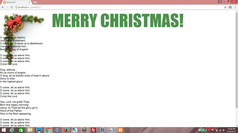
If you were to run the code now, it would look like this. This is in dire need of styling.


We'll do it in the LESS file. Start by creating a style called theme_snow. That's the one that is currently active because we hardcoded the value of index to 0. While we're at it, create classes for theme_food and theme_nativity.

css/styles.less
html, body
{
    height: 100%;
    padding: 0px;
    margin: 0px;
    font-size: 14px;
}

.centered
{
    margin-left: auto;
    margin-right: auto;
}

.theme_snow
{

}

.theme_food
{

}

.theme_nativity
{

}


In here, we want to set the font and the background to a deep blue.

css/styles.less
.theme_snow
{
    font-family: arial;

    background: rgb(0, 0, 100);

}


Now we want to style card within theme_snow. In this case, card will be a translucent white rectangle in the middle of the screen, with rounded corners. We'll use centered here, which we defined earlier.

css/styles.less
.theme_snow
{
    font-family: arial;

    background: rgb(0, 0, 100);

    .card
    {
        margin-top: 10px;
        width: 600px;
        height: 650px;
        padding: 2em;
        border-radius: 10px;
        .centered;
        background: rgba(255, 255, 255, 0.5);
    }

}


We then style image. It will be circular and it will use the snowman image as its background. Again, it is in the middle of its parent, so use centered.

css/styles.less
.theme_snow
{
    font-family: arial;

    background: rgb(0, 0, 100);

    .card
    {
        margin-top: 10px;
        width: 600px;
        height: 650px;
        padding: 2em;
        border-radius: 10px;
        .centered;
        background: rgba(255, 255, 255, 0.5);
    }

    .image
    {
        width: 250px;
        height: 250px;
        border-radius: 50%;
        margin-bottom: 10px;
        background-image: url(../img/snow.jpg);
        background-position: center center;
        background-size: cover;
        background-repeat: no-repeat;
        .centered;
    }

}


Finally, we style greeting. It will have white text, and take the full width and a certain height.

css/styles.less
.theme_snow
{
    font-family: arial;

    background: rgb(0, 0, 100);

    .card
    {
        margin-top: 10px;
        width: 600px;
        height: 650px;
        padding: 2em;
        border-radius: 10px;
        .centered;
        background: rgba(255, 255, 255, 0.5);
    }

    .image
    {
        width: 250px;
        height: 250px;
        border-radius: 50%;
        margin-bottom: 10px;
        background-image: url(../img/snow.jpg);
        background-position: center center;
        background-size: cover;
        background-repeat: no-repeat;
        .centered;
    }

    .greeting
    {
        width: 100%;
        height: 350px;
        color: rgb(255, 255, 255);
    }

}


Refresh. Quite a drastic change, ain't it?


Back to the PHP, change the value of index.

index.php
$index = rand(0, 2);
$index = 1;


And now we will work on the CSS class theme_food. As before, we set the font and change the background color to a deep red.

css/styles.less
.theme_food
{
    font-family: verdana;

    background: rgb(150, 0, 0);

}


The card styling here is another rectangle, also centered using centered, and it's an opaque cream color. We use box-shadow to give this card a translucent black shadow.

css/styles.less
.theme_food
{
    font-family: verdana;

    background: rgb(150, 0, 0);

    .card
    {
        margin-top: 10px;
        width: 800px;
        height: 600px;
        padding: 1em;
        .centered;
        background: rgb(200, 200, 100);
        box-shadow: 10px 10px rgba(0, 0, 0, 0.5);
    }

}


For image, we are going to float it left and make it a tall rectangle. Then we are going to make food.jpg its background.

css/styles.less
.theme_food
{
    font-family: verdana;

    background: rgb(150, 0, 0);

    .card
    {
        margin-top: 10px;
        width: 800px;
        height: 600px;
        padding: 1em;
        .centered;
        background: rgb(200, 200, 100);
        box-shadow: 10px 10px rgba(0, 0, 0, 0.5);
    }

    .image
    {
        width: 50%;
        height: 100%;
        float: left;
        background-image: url(../img/food.jpg);
        background-position: center center;
        background-size: cover;
        background-repeat: no-repeat;
    }

}


For greeting, we will float it right.

css/styles.less
.theme_food
{
    font-family: verdana;

    background: rgb(150, 0, 0);

    .card
    {
        margin-top: 10px;
        width: 800px;
        height: 600px;
        padding: 1em;
        .centered;
        background: rgb(200, 200, 100);
        box-shadow: 10px 10px rgba(0, 0, 0, 0.5);
    }

    .image
    {
        width: 50%;
        height: 100%;
        float: left;
        background-image: url(../img/food.jpg);
        background-position: center center;
        background-size: cover;
        background-repeat: no-repeat;
    }

    .greeting
    {
        width: 45%;
        height: 100%;
        float: right;
    }

}


And the final result is...


Great. Time to work on the final theme, theme_nativity. This one is slightly different in the sense that image and greeting are not next to each other, but occupy the same space. They intersect.

First, change the value of index to 2.

index.php

$index = rand(0, 2);
$index = 2;


Define font and background for theme_nativity. Let' go for beige.
css/styles.less
.theme_nativity
{
    font-family: georgia;

    background: rgb(150, 100, 50);

}


card is going to be a large rectangle, with no defined background, and a thick brown border. Again, we use centered to center it - bet you're glad we're using LESS now!

css/styles.less
.theme_nativity
{
    font-family: georgia;

    background: rgb(150, 100, 50);

    .card
    {
        margin-top: 50px;
        width: 800px;
        height: 600px;
        .centered;
        border: 1em solid rgb(50, 0, 0);
    }

}


We will use image to fill up the whole of card. For this, we set the position property to absolute and use nativity.jpg as the background image.

css/styles.less

.theme_nativity
{
    font-family: georgia;

    background: rgb(150, 100, 50);

    .card
    {
        margin-top: 50px;
        width: 800px;
        height: 600px;
        .centered;
        border: 1em solid rgb(50, 0, 0);
    }

    .image
    {
        width: 800px;
        height: 600px;
        position: absolute;
        background-image: url(../img/nativity.jpg);
        background-position: center center;
        background-size: cover;
        background-repeat: no-repeat;
    }

}


Here, greeting will be a translucent black box with white text and rounded corners, set right in the middle of image. Again, position will be set to absolute for this to happen. The margin-left and margin-top properties are a function of the width and height of greeting compared to the width and height of image.

css/styles.less
.theme_nativity
{
    font-family: georgia;

    background: rgb(150, 100, 50);

    .card
    {
        margin-top: 50px;
        width: 800px;
        height: 600px;
        .centered;
        border: 1em solid rgb(50, 0, 0);
    }

    .image
    {
        width: 800px;
        height: 600px;
        position: absolute;
        background-image: url(../img/nativity.jpg);
        background-position: center center;
        background-size: cover;
        background-repeat: no-repeat;
    }

    .greeting
    {
        width: 400px;
        height: 300px;
        position: absolute;
        margin-left: 200px;
        margin-top: 150px;
        padding: 1em;
        background-color: rgba(0, 0, 0, 0.8);
        color: rgb(255, 255, 255);
        border-radius: 5px;
    }

}


We'll even add in some stying for h1 for shits and giggles. I want it to be in italics.

css/styles.less
.theme_nativity
{
    font-family: georgia;

    background: rgb(150, 100, 50);

    .card
    {
        margin-top: 50px;
        width: 800px;
        height: 600px;
        .centered;
        border: 1em solid rgb(50, 0, 0);
    }

    .image
    {
        width: 800px;
        height: 600px;
        position: absolute;
        background-image: url(../img/nativity.jpg);
        background-position: center center;
        background-size: cover;
        background-repeat: no-repeat;
    }

    h1
    {
        font-style: italic;
        font-size: 1.5em;
        text-align: center;
    }


    .greeting
    {
        width: 400px;
        height: 300px;
        position: absolute;
        margin-left: 200px;
        margin-top: 150px;
        padding: 1em;
        background-color: rgba(0, 0, 0, 0.8);
        color: rgb(255, 255, 255);
        border-radius: 5px;
    }
}


Neat!


This didn't take long at all. We've managed to create styles for three different themes with radically different layouts, through the power of LESS.

Next

Filling in the text using ChatGPT.

Saturday, 24 April 2021

Ten sketches of actual programming projects

One of the greatest myths in development is that when developers write code, they simply park their asses down somewhere and type away till they're done. Nothing could be further from the truth. The process of writing code is thought. Lots of it. There has to be a rough outline before a developer even knows where to begin.

And one of the most common ways to provide a rough outline, is through sketching.

Yes, you read that right. Sketching. Pencil to paper. Crooked lines. Scribbled text. Stick figures. Here are some of the sketches I've done, that ultimately made the transition to working code. I thought it would be fun to provide a before-after dynamic. Notice how many of these sketches don't translate a hundred percent to the finished product. That's because requirements evolve. Sometimes, while I'm working on it mid-way, I hit upon a better way of implementing the idea. This may result in elements being moved around, text changed, and so on. That's just how it is.

1. Hong Kong Anti-extradition Protest Symbol (2019)

Whatever I eventually ended up thinking about the Anti-extradition Protests of 2019 in Hong Kong, there's no denying that this produced a lot of great art, some of which got me thinking about how one would represent one of these pieces in CSS.


The sketch was clumsy, the final product hopefully less so. It was basically the process of figuring out basic shapes in CSS and how to combine them. This was scribbled out over the course of devouring a lunch sandwich at my desk, and coded within the day in the evening.

2. Tic Tac Toe (2019)

Both the original and the Valentine's Day version were born from this little grid. It isn't much to look at, but there was more to this than just interface.


In here, I actually numbered the grid squares and thought about how to map out a win scenario, eventually going with an array as the main data structure.

3. Christmas-themed LESS Demo (2017)

I'm not sure at what point I decided to explore LESS, but it came in the form of making three different layouts to test my code with. Enter the 2017 Christmas-themed LESS Demo. Here, you can see the different layout drawings for each color.


Fun fact: The text in blue was preliminary thoughts for an unrelated piece of code for Ruby MadLibs.

4. Valentine Heart Animation (2019)

This was some idle doodling during an extremely boring meeting in which I was trying desperately not to fall asleep. Crude it may be, but it led to some amazing stuff.


I actually made this for my wife for Valentine's Day. She wasn't extremely impressed considering she's Chinese and doesn't celebrate Valentine's Day on 14th February... but it's the thought that counts, right?

5. The Pie Chart (2018)

While trying to produce a pie chart using CSS, there was a lot to think about in terms of angles and overlapping. The sketch I made during this thought process was extremely rudimentary. It certainly doesn't do justice to the insane amount of code I had to write in order to make this work.

The Pie Chart

However, work it did. For this, I had to think of all possible cases and how to handle them. Which was hard because at my level of CSS, I could only produce things at a right angle. Thus, the final result was a shit-ton of hacking.

6. Easter Bunny River Crossing Game (2019)

During another boring meeting, I sketched this beauty as my programmer brain clicked into full gear as to how I would make this work...


The final product differs a bit from the sketch. As you can see, I opted for full-body representations instead of cute icons. I can't recall the thought process behind it, other than "it would be cool".

7. Ada Lovelace Day Generator (2019)

During yet another boring meeting (see a pattern here?), this was born. I was thinking of ways to write a simple ReactJS app, and this came up. OK, so my drawing of Ada Lovelace looked more like some corporate suit but that was only meant to be a placeholder. I might have based the sketch on the office lady sitting opposite me at the meeting.


The controls for the number manipulation weren't as I originally envisioned. Certain considerations tend to come up only during implementation. But all is fine. I'm pretty happy with the outcome.

8. Scroll-down Christmas Carol (2016)

Work for the this was based on the scroll-down effect - but at that time I only knew how to use CSS to draw, and thus when rendering the caroler, I had to break it down into basic shapes. This was the sketch. Pretty rough, huh?


Well, as it turns out, I think my sketch actually had more life in it than the final product. Joke's on me!

9. CNY Rat SVG Animation (2020)

This one was an attempt by me to visualize how the string "2020" would morph into a graphical representation of a rat. As you can see, I had two versions, neither of which really resemble the final product.


On the other hand, these were lame. I think the end product is worlds better. I hit on the idea of using the bases of the "2"s as whiskers, while writing the code. But the sketches did give me that foundation to build on.

10. Contact Us Page (2019)

Another square drawing. This was pretty straightforward; I needed a layout for a typical Contact Us page, and just wanted to figure out what would go where.

Contact Us Page

You can even see the pin on what was my pathetic representation of a Google Map!

Whew, I'm done!

I'm definitely a worse artist than I am a developer, and that's saying something. Hopefully, from these, you can gain a greater appreciation of how this developer does things.

Sketch you later, alligator!
T___T

Friday, 9 April 2021

Choosing between CSS and SVG (Part 2/2)

Now, let's take a look at CSS.

CSS (Cascading Style Sheets)

CSS has been around a long time, and is really versatile. I picked it up almost fifteen years ago, and to this day I don't think I've managed to plumb even half of its depths. As browsers evolve, so, too, has CSS.

Use Case. For styling pages, specifying layout and such, CSS is the tool to use, no question. And that's because CSS is the only tool that can be used for this, right now. You can't use SVG to style a page unless your entire page is an SVG, which would be really bad for SEO.

Cross-browser compatibility. CSS has had issues with cross-browser performance and capability, but most browsers do support CSS, albeit with variations in implementation that will be worked out over time. Not to say CSS isn't sometimes a pain in the ass in this regard, but SVG can be much worse. Internet Explorer, in particular, doesn't render SVG well.

Power. The power of CSS isn't in its versatility (though that certainly doesn't hurt), but its organizational ability. With judicious use of CSS rules, you can organize site structure in such a way that maintaining the look and feel, or even making wholesale changes, is much less hassle than it needs to be.

CSS is easier to organize.

SVG, on its own, does not have that capability. Maintenance can become a right mess.
<svg height="210" width="500">
    <circle cx="150" cy="250" r="140" stroke="green" stroke-width="4" fill="yellow" />
    <rect width="300" height="100" stroke="green" stroke-width="4" fill="red" />
    <line x1="0" y1="10" x2="200" y2="200" stroke="blue" stroke-width="2" />
    <line x1="10" y1="20" x2="100" y2="200" stroke="blue" stroke-width="2" />
    <line x1="0" y1="30" x2="200" y2="200" stroke="blue" stroke-width="2" />
    <line x1="10" y1="40" x2="100" y2="200" stroke="blue" stroke-width="2" />
    <line x1="0" y1="50" x2="200" y2="200" stroke="blue" stroke-width="2" />
    <line x1="10" y1="60" x2="100" y2="200" stroke="blue" stroke-width="2" />
    <line x1="0" y1="70" x2="200" y2="200" stroke="blue" stroke-width="2" />
</svg>


Compared to CSS, which can cascade rules for maximum effect.
<style>
    .myStyle
    {
        font-family: arial;
        font-size: 16px;
    }

    .myStyle h1
    {
        font-size: 1.5em;
    }

    .myStyle ul li
    {
        font-size: 0.85em;
        font-weight: bold;
    }
</style>

<div class="myStyle">
    <h1>Header</h1>
    <p>Sample text</p>
    <ul>
        <li>Line 1</li>
        <li>Line 2</li>
        <li>Line 3</li>
        <li>Line 4</li>
    </u>
</div>


Preprocessor languages such as LESS and SASS add even more power to this organizational ability, providing added oomph through mixins, variables and hierarchy.

My recommendation

Don't choose one over the other. Learn both. SVG can be styled using CSS, and it's a killer combo - the power of SVG coupled with the organizational abilities of CSS.

<style>
    svg
    {
        width: 500px;
        height: 210px;
    }

    svg circle
    {
        stroke: green;
        stroke-width: 4;
        fill: yellow;
    }

    svg rect
    {
        stroke: green;
        stroke-width: 4;
        fill: red;
    }

    svg line
    {
        stroke: blue;
        stroke-width: 2;
    }
</style>

<svg height="210" width="500">
    <circle cx="150" cy="250" r="140" />
    <rect width="300" height="100" />
    <line x1="0" y1="10" x2="200" y2="200" />
    <line x1="10" y1="20" x2="100" y2="200" />
    <line x1="0" y1="30" x2="200" y2="200" />
    <line x1="10" y1="40" x2="100" y2="200" />
    <line x1="0" y1="50" x2="200" y2="200" />
    <line x1="10" y1="60" x2="100" y2="200" />
    <line x1="0" y1="70" x2="200" y2="200" />
</svg>


I might be a bit biased here because that's the route I took, but my recommendation would be to learn CSS first because the use case is more prevalent. After you've mastered a certain amount of CSS, using it to complement SVG should be a breeze.

Stylishly yours,
T___T

Friday, 22 December 2017

Web Tutorial: Christmas-themed LESS Demo (Part 4/4)

We're at the final part of this tutorial, and we will get the blue theme up for this one, and use some more LESS in the process. (More LESS, geddit? Hur hur)

As before, make a blank copy of the CSS class theme_green and name it theme_blue. This one will be a centered single-column layout.

styles.less
/*GREEN*/
@green_content_background: rgba(100,255,100,0.7);
@color_green_text: rgba(0,0,0,0.8);

.theme_green
{
    font-family:arial;
    font-size:1.2em;

    .container
    {
        width:100%;
        height:100%;
        background: url(../img/bg_green00.jpg);
        background-repeat:no-repeat;
        background-position:left top;
        background-size:20%;
    }

    .header_wrapper
    {
        width:100%;
        height:20%;
    }

    .body_wrapper
    {
        width:100%;
        height:65%;
    }

    .footer_wrapper
    {
        width:100%;
        height:15%;
        background: #FFFFFF; /* Old browsers */
        background: -moz-linear-gradient(top, #FFFFFF 0%, @green_content_background 41%); /* FF3.6-15 */
        background: -webkit-linear-gradient(top, #FFFFFF 0%,@green_content_background 41%); /* Chrome10-25,Safari5.1-6 */
        background: linear-gradient(to bottom, #FFFFFF 0%,@green_content_background 41%); /* W3C, IE10+, FF16+, Chrome26+, Opera12+, Safari7+ */
        filter: progid:DXImageTransform.Microsoft.gradient( startColorstr='#FFFFFF', endColorstr='@green_content_background',GradientType=0 ); /* IE6-9 */
    }

    .content_wrapper
    {
        width:95%;
        padding-top:2%;
        padding-bottom:2%;
        .centered;
    }

    .content
    {
        .rounded_corners(2em);
        border:0.5em solid darken(@green_content_background,50%);
        background-color: darken(@green_content_background,10%);
        color:@color_green_text;
        width:75%;
        .centered;
        padding:1em;
    }

    .header
    {
        width:80%;
        height:20%;
        .centered;
        text-align:center;
        font-size:6.5em;
        font-family: impact;
        color:darken(@green_content_background,50%);
    }

    .content1
    {
        width:100%;
        .content;
    }

    .content1:after
    {
        display:block;
        content:"";
        clear:both;
    }

    .content1 p
    {
        float:left;
        margin-left:2em;
    }

    .content2
    {
        width:100%;
        margin-top:1em;
        .content;
        .centered;
    }

    .content3
    {
        width:100%;
        height:150px;
        background-image:url(../img/bg_green01.jpg);
        background-repeat:no-repeat;
        background-position:right center;
        background-size:contain;
        margin-top:-10%;
        margin-right:-10%;
    }

    .footer
    {
        margin-top:1em;
        color:@color_green_text;
        font-size:0.7em;
    }
}

/*BLUE*/

.theme_blue
{
    .container
    {

    }

    .header_wrapper
    {

    }

    .body_wrapper
    {

    }

    .footer_wrapper
    {

    }

    .content_wrapper
    {

    }

    .content
    {

    }

    .header
    {

    }

    .content1
    {

    }

    .content2
    {

    }

    .content3
    {

    }

    .footer
    {

    }
}


Start by declaring four variables that we'll use later: color_blue_overlay, color_blue_content_background, color-blue-border and color-blue-text. They're all different shades of blue or grey. Within theme_blue, set the font to Verdana. Y'know, just for variety.

styles.less
/*BLUE*/
@color_blue_overlay: rgba(50,50,100,0.7);
@color_blue_content_background: rgba(255,255,255,0.8);
@color-blue-border: #4444FF;
@color-blue-text: #AAAAFF;

.theme_blue
{
    font-family:verdana;


Now, for this theme, we will set the entire screen to use the image shown below as the background.

bg_blue00.jpg

styles.less
.theme_blue
{
    font-family:verdana;

    background-image:url(../img/bg_blue00.jpg);
    background-repeat:no-repeat;
    background-position:center bottom;
    background-size:cover;


Ain't she a beauty? But wait, there's more.


Now, set the container class to use centered as a mixin, make the width 70% of screen width and the height 100% of screen height. For the background, use the variable color_blue_overlay.

styles.less
    .container
    {
        width:70%;
        height:100%;
        background-color: @color_blue_overlay;
        .centered;
    }


Got that? Good.


Now for the header_wrapper, body_wrapper and footer_wrapper classes, specify a 100% width for all of them, and varying heights. Use the darken() function with the color_blue_overlay variable as an argument for the background colors of header_wrapper and footer_wrapper, with different percentages.

styles.less
    .container
    {
        width:70%;
        height:100%;
        background-color: @color_blue_overlay;
        .centered;
    }

    .header_wrapper
    {
        background-color: darken(@color_blue_overlay,50%);
        width:100%;
        height:20%;
        text-align:center;
    }

    .body_wrapper
    {
        width:100%;
        height:70%;
    }

    .footer_wrapper
    {
        background-color: darken(@color_blue_overlay,10%);
        width:100%;
        height:10%;
    }


A bit messy. We'll be cleaning that right up.


This should help. A bit of padding goes a long way.

styles.less
    .content_wrapper
    {
        width:98%;
        padding-top:1%;
        padding-bottom:1%;
        .centered;
    }


Now, style content with a blue border using the variable color-blue-border and a background using the darken() version of color_blue_overlay, and set the text color to the variable color-blue-text. Add some padding and use the rounded_corners() function we created, for good measure. Then use content as a mixin in content1 and content2. content1 and content2 will float left and right respectively.
styles.less
    .content
    {
        border:2px solid @color-blue-border;
        background-color: darken(@color_blue_overlay,10%);
        color:@color-blue-text;
        padding:1em;
        .rounded_corners(0.5em);
    }

    .header
    {

    }

    .content1
    {
        width:35%;
        float:left;
        font-size:0.85em;
        .content;
    }

    .content2
    {
        width:55%;
        float:right;
        .content;
    }


Looking prettier now.


Now style the header class. Use the lighten() function on the variable color_blue_overlay. That's a new one, eh?

styles.less
    .header
    {
        font-size:5.5em;
        font-family:verdana;
        color: lighten(@color_blue_overlay,50%);
        font-weight:bold;
    }


Merry Christmas!


Now start styling the footer too.

styles.less
    .footer
    {
        color:lighten(@color-blue-text,10%);
        font-size:0.7em;
    }


Here you go.


Finally, let's stye content3. Use the image below.


bg_blue01.png

styles.less
    .content3
    {
        width:400px;
        height:400px;
        float:right;
        background-image:url(../img/bg_blue01.png);
        background-repeat:no-repeat;
        background-position:center center;
        background-size:contain;
    }


Not bad. Not bad at all!


Have fun switching between themes. Today's web tutorial was meant to illustrate how useful LESS can be when dealing with nested CSS classes. Lots of reusability there.
Wishing you a very Christmas!
T___T

Monday, 18 December 2017

Web Tutorial: Christmas-themed LESS Demo (Part 3/4)

It's time to set up the green theme. Before that, however, try something. Select the green theme from the drop-down list. Does the layout change? Yep, it does. To white background, black text. That's because we haven't specified anything for theme_green. We're going to change that, right now.

We could start by copying and pasting the entirety of theme_red and  changing the name of the new CSS class to theme_green, then removing all the properties inside theme_green. Got that? Now we have a nice template to work with.

styles.less
/*RED*/
@color_red_text: #FFAAAA;

.theme_red
{
    font-family:arial;

    .container
    {
        width:100%;
        height:100%;
        background: url(../img/bg_red00.jpg);
        background-repeat:no-repeat;
        background-position:center center;
        background-size:cover;
    }

    .header_wrapper
    {
        width:20%;
        height:100%;
        float:left;
        background: url(../img/bg_red01.jpg);
    }

    .body_wrapper
    {
        width:70%;
        height:90%;
        float:right;
        border-bottom:3px double @color_red_text;
    }

    .footer_wrapper
    {
        width:70%;
        float:right;
        height:10%;
    }

    .content_wrapper
    {
        width:100%;
    }

    .content
    {
        color:@color_red_text;
        padding:10px;
    }

    .header
    {
        color:@color_red_text;
        font-family:georgia;
        font-size:7em;
        -webkit-transform-origin:100% 100%;
        -webkit-transform:rotate(-90deg);
        transform-origin:100% 100%;
        transform:rotate(-90deg);
        margin-top:1em;
    }

    .content1
    {
        width:45%;
        float:left;
        .content;
    }

    .content2
    {
        font-size:1.5em;
        width:45%;
        height:50%;
        float:right;
        .content;
    }

    .content3
    {
        width:45%;
        height:300px;
        margin-top:10px;
        float:right;
        background-image:url(../img/bg_red02.jpg);
        background-repeat:no-repeat;
        background-position:left center;
        background-size:contain;
    }

    .footer
    {
        color:#FFFFFF;
        font-size:0.7em;
    }
}

/*GREEN*/

.theme_green
{
    .container
    {

    }

    .header_wrapper
    {

    }

    .body_wrapper
    {

    }

    .footer_wrapper
    {

    }

    .content_wrapper
    {

    }

    .content
    {

    }

    .header
    {

    }

    .content1
    {

    }

    .content2
    {

    }

    .content3
    {

    }

    .footer
    {

    }
}


First thing we do is declare two variables - green_content_background and color_green_text. They are translucent shades of green and black, respectively. Then we specify the font. We'll be using Arial again.

styles.less
/*GREEN*/
@green_content_background: rgba(100,255,100,0.7);
@color_green_text: rgba(0,0,0,0.8);

.theme_green
{
    font-family:arial;
    font-size:1.2em;


Again, container will use up 100% of screen height and width. The background will be the image below, but only appear on the top left hand corner.

bg_green00.jpg


styles.less
    .container
    {
        width:100%;
        height:100%;
        background: url(../img/bg_green00.jpg);
        background-repeat:no-repeat;
        background-position:left top;
        background-size:20%;
    }


There.


Now style header_wrapper and header. Specify the height and width, and the font. I'll leave it to you, but this is what I'd go with.

styles.less
    .header_wrapper
    {
        width:100%;
        height:20%;
    }

    .body_wrapper
    {

    }

    .footer_wrapper
    {

    }

    .content_wrapper
    {

    }

    .content
    {

    }

    .header
    {
        width:80%;
        text-align:center;
        font-size:6.5em;
        font-family: impact;
        color:darken(@green_content_background,50%);
    }


This is kind of OK. I mean, technically it's acceptable but not very Christmas-y. Let's tweak it a little.


Start by aligning header_wrapper to the middle of the screen. I know what you're thinking - we never defined centered as a CSS class, right?

styles.less
    .header
    {
        width:80%;
        .centered;
        text-align:center;
        font-size:6.5em;
        font-family: impact;
    }


Hey, no sweat. We can fix that now. Let's define centered outside of the theme_green class so we can reuse it later.

styles.less
html, body
{
    height:100%;
    padding:0px;
    margin:0px;
    font-size:14px;
}

.centered
{
    margin-left:auto;
    margin-right:auto;
}


Looking better already!


Now, let's change the color of the header so it's not all strikingly black. Remember we specified green_content_background as a variable? Well, let's use that color now, except we use LESS's darken() function to deepen the color by 50%. Functions are part of the LESS specification, and lemme tell you, they utterly fucking rock.

Here's a list of LESS's functions. (http://lesscss.org/functions/)

styles.less
    .header
    {
        width:80%;
        .centered;
        text-align:center;
        font-size:6.5em;
        font-family: impact;
        color:darken(@green_content_background,50%);
    }


And... we have a header!


Now, let's align all content to the middle like we did with header_wrapper. Note how we reuse centered for content_wrapper. Right now, we're just specifying all that padding and stuff. Not really vital, use as needed.

styles.less
    .header_wrapper
    {
        width:100%;
        height:20%;
    }

    .body_wrapper
    {
        width:100%;
        height:65%;
    }

    .footer_wrapper
    {
        width:100%;
        height:15%;
    }

    .content_wrapper
    {
        width:95%;
        padding-top:2%;
        padding-bottom:2%;
        .centered;
    }

    .content
    {

    }

    .header
    {
        width:80%;
        .centered;
        text-align:center;
        font-size:6.5em;
        font-family: impact;
        color:darken(@green_content_background,50%);
    }


For content1, again we add content as a mixin. For content, we use the green_content_background variable for both border and background, except we apply the darken() function using different arguments. That way, if you ever change the color, everything else will follow suit in proportion!

Then we use color_green_text for the text.

styles.less
    .content
    {
        border:0.5em solid darken(@green_content_background,50%);
        background-color: darken(@green_content_background,10%);
        color:@color_green_text;
        width:75%;
        .centered;
    }

    .header
    {
        width:80%;
        height:20%;
        .centered;
        text-align:center;
        font-size:6.5em;
        font-family: impact;
        color:darken(@green_content_background,50%);
    }

    .content1
    {
        width:100%;
        .content;
    }


Get the idea yet? Needs more tweaking, but we're making progress.


Now try this. We'll make our own LESS function! It's just like creating a class, except with parentheses and a parameter. Here, the border-radius property is set to the value of that parameter. Since we might be reusing this, let's create it outside of all the themes, next to centered.

styles.less
html, body
{
    height:100%;
    padding:0px;
    margin:0px;
    font-size:14px;
}

.centered
{
    margin-left:auto;
    margin-right:auto;
}

.rounded_corners(@radius)

    border-radius:@radius;
}


And call rounded_corners() as a mixin! Pass in 2em as an argument.

styles.less
    .content
    {
        .rounded_corners(2em);
        border:0.5em solid darken(@green_content_background,50%);
        background-color: darken(@green_content_background,10%);
        color:@color_green_text;
        width:75%;
        .centered;
    }


Great, right? We're coming along nicely.


However, the Christmas carol is taking up way too much space. So let's tweak the paragraph tags a little. We ensure they all are floated left and have a nice 2em margin on the left.

styles.less
    .content
    {
        .rounded_corners(2em);
        border:0.5em solid darken(@green_content_background,50%);
        background-color: darken(@green_content_background,10%);
        color:@color_green_text;
        width:75%;
        .centered;
    }

    .content1 p
    {
        float:left;
        margin-left:2em;
    }


Uh-oh. Now the paragraphs are aligned nicely, but the parent div has collapsed!


Just add the after pseudoselector to the content1 class, and use it to clear the floats.

styles.less
    .content1
    {
        width:100%;
        .content;
    }

    .content1:after
    {
        display:block;
        content:"";
        clear:both;
    }

    .content1 p
    {
        float:left;
        margin-left:2em;
    }


Now we're talking.


Now do the same thing for the class content2.

styles.less
    .content1
    {
        width:100%;
        .content;
    }

    .content1:after
    {
        display:block;
        content:"";
        clear:both;
    }

    .content1 p
    {
        float:left;
        margin-left:2em;
    }

    .content2
    {
        width:100%;
        margin-top:1em;
        .content;
        .centered;
    }


Good. But we need a little padding.


Do this for the content class. This will add 1em of padding to all content.

styles.less
    .content
    {
        .rounded_corners(2em);
        border:0.5em solid darken(@green_content_background,50%);
        background-color: darken(@green_content_background,10%);
        color:@color_green_text;
        width:75%;
        .centered;
        padding:1em;
    }


Much better.


Now, content1 and content2 contain text, but content3 will be something else altogether. It will host an image background, using the image below.

bg_green01.jpg

styles.less
    .content1
    {
        width:100%;
        .content;
    }

    .content1:after
    {
        display:block;
        content:"";
        clear:both;
    }

    .content1 p
    {
        float:left;
        margin-left:2em;
    }

    .content2
    {
        width:100%;
        margin-top:1em;
        .content;
        .centered;
    }

    .content3
    {
        width:100%;
        height:150px;
        background-image:url(../img/bg_green01.jpg);
        background-repeat:no-repeat;
        background-position:right center;
        background-size:contain;
    }


That's nice, but let's move it up a little. We'll need a little space for what we're going to do with the footer.


Just give it a negative 10% top and right margin.

styles.less
    .content3
    {
        width:100%;
        height:150px;
        background-image:url(../img/bg_green01.jpg);
        background-repeat:no-repeat;
        background-position:right center;
        background-size:contain;
        margin-top:-10%;
        margin-right:-10%;
    }


Good stuff.


Now style footer. Set a smaller font size and use the variable color_green_text as the color, and shift it slightly lower.

styles.less
    .footer
    {
        margin-top:1em;
        color:@color_green_text;
        font-size:0.7em;
    }


Here, I'm using a gradient generated from ColorZilla. It graduates from the top, white to green, giving it a nice touch! The green we're using in this case is the variable green_content_background.

styles.less
    .footer_wrapper
    {
        width:100%;
        height:15%;
        background: #FFFFFF; /* Old browsers */
        background: -moz-linear-gradient(top, #FFFFFF 0%, @green_content_background 41%); /* FF3.6-15 */
        background: -webkit-linear-gradient(top, #FFFFFF 0%,@green_content_background 41%); /* Chrome10-25,Safari5.1-6 */
        background: linear-gradient(to bottom, #FFFFFF 0%,@green_content_background 41%); /* W3C, IE10+, FF16+, Chrome26+, Opera12+, Safari7+ */
        filter: progid:DXImageTransform.Microsoft.gradient( startColorstr='#FFFFFF', endColorstr='@green_content_background',GradientType=0 ); /* IE6-9 */
    }


And that's it for your green theme!


Try using the drop-down list to switch between red and green themes. See what we did with LESS? We could have used regular CSS, but for stuff like this, LESS is a lot more maintainable. Without LESS, we'd have to duplicate a lot of code.

Next

We've just got one more theme to go. Bear with me for another blogpost!