Now, it's pretty obvious that I prefer the Titan version to the Vertigo version. But not in every case. While Titan's version was, in my opinion, superior overall, Vertigo did some things better.
Character illustrations
I'm gonna say that Titan was better with the character illustrations, because the crew of artists they had on this, did things more consistently. Vertigo's artists sometimes made the characters look completely different from panel to panel. It was like at some point, they just couldn't be arsed anymore.| Vertigo's version | Titan's version |
Annika Giannini |
|

|

|
Dragan Armansky |
|

|

|
Nils Bjurman |
|

|

|
Jan Bublanski |
|

|

|
Richard Ekström |
|

|

|
Erika Berger |
|
|

|
Holger Palmgren |
|

|

|
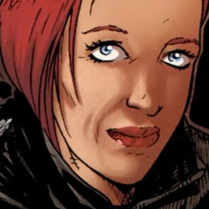
Lisbeth Salander |
|

|

|
Mikael Blomkvist |
|

|

|
Miriam Wu |
|

|

|
Ronald Neidermann |
|

|

|
Plague |
|

|

|
Sonia Modig |
|

|

|
Peter Teleborian |
|

|
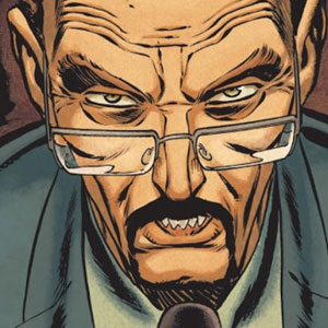
|
Zala |
|

|

|
Iconic scenes
Bjurman rapes Lisbeth. For sheer brutality on-canvas, Vertigo picks up a disturbing win. Titan's frenetic depiction of Lisbeth's rape at the hands of Nils Bjurman is stomach-churning, but Vertigo hits the ball out of the park with their dully-hued, unflinching rendition. I winced. And for eliciting that reaction, I declare Vertigo the victor. |
| Vertigo's version (the panels leading up to it are even worse) |
 |
| Titan's version looks bad, but trust me when I say it's tame compared to Vertigo's. |
 |
| Vertigo's version: acceptable. |
 |
| Titan's version: better. |
Lisbeth taking on the Svavelsjö Motorcycle Club. Vertigo doesn't embellish details and delivers a faithful retelling on how Lisbeth took on two bikers. Titan tries to bring it up a notch here by showing her against six. I think it's important to remember here that while Lisbeth Salander is a badass, she's primarily a superhacker. And she's so compelling precisely because she doesn't have the power to outfight and outrun everybody; every victory of hers is down to preparation and element of surprise. For believability and staying true to the spirit of the character, Vertigo wins this round.
 |
| Vertigo is suitably restrained here. |
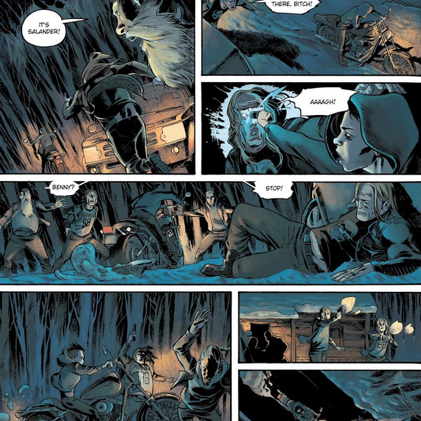 |
| Titan overdoes it. |
Roberto Paolo fights Ronald Neidermann. Vertigo doesn't deviate from the source material, but the art feels sloppy. Titan does the art better, though they tweak the story considerably by having Roberto be rescued when the car runs Neidermann down. Let's call this one a draw.
 |
| Honestly, Vertigo's version does nothing for me. |
 |
| Titan's implementation is nicer, though I take issue with the storyline changes. |
Lisbeth axes Zala. OK, I'm undecided here. Vertigo's version is suitably creepy what with the choice of colors and all, but again, the art feels sloppy. Titan's art is way better, but the setting feels just a bit too bright. For sheer effort and artistry, though, Titan's version emerges victorious.


I didn't include any scenes from The Girl Who Kicked The Hornet's Nest, because by then, Titan had deviated so much from the storyline that comparisons didn't feel meaningful anymore.
Conclusion
As mentioned, I liked Titan's version better. Just wasn't a big fan of the way they mangled the storyline. Their art certainly was better in terms of the drawing and details and yes, consistency.Vertigo was more evocative with the use of color, and they showed more respect for Stieg Larsson's work. In spirit, it does feel more like a Lisbeth Salander story. But dammit, in some places, the art sucks so much. It's a bummer. There were times when the graphic novels were really good, but unfortunately, those times came fewer and further in between as the story progressed.
Titan wins this one by a hair.
An effort of Titanic proportions! Well done!
T___T
T___T
No comments:
Post a Comment