Colors and layout are a huge part of UX, and while we won't be performing any astounding feats of wizardry today, we will at least be cleaning stuff up. It helps that the markup is already done, and all we really need to do is supply the CSS.
So let's begin by giving all divs a red outline for better clarity, and putting in some margin and padding resets for the html and body tags. Here, let's specify a black background and font properties.
<style>
html, body
{
padding: 0;
margin: 0;
font-size: 14px;
font-family: arial;
background-color: #000000;
height: 100%;
}
div
{
outline: 1px solid #FF0000;
}
.hide
{
display: none;
}
</style>
html, body
{
padding: 0;
margin: 0;
font-size: 14px;
font-family: arial;
background-color: #000000;
height: 100%;
}
div
{
outline: 1px solid #FF0000;
}
.hide
{
display: none;
}
</style>
Seeing a change already.

Next, we style contentContainer. This places all content in the middle of the screen via the margin property. Width is set to 800 pixels which will be wide enough for most screens, and height at 100%. The background has been set to white.
div
{
outline: 1px solid #FF0000;
}
.contentContainer
{
width: 800px;
height: 100%;
margin: 0 auto 0 auto;
background-color: #FFFFFF;
}
.hide
{
display: none;
}
{
outline: 1px solid #FF0000;
}
.contentContainer
{
width: 800px;
height: 100%;
margin: 0 auto 0 auto;
background-color: #FFFFFF;
}
.hide
{
display: none;
}
Yes, that's it...

contactContainer is styled next. It's the style for the div that goes inside contentContainer. Width is 90%, with some padding at the top, and the margin property sets it to the middle of its parent.
.contentContainer
{
width: 800px;
height: 100%;
margin: 0 auto 0 auto;
background-color: #FFFFFF;
}
.contactContainer
{
width: 90%;
padding-top: 10px;
margin: 0 auto 0 auto;
}
.hide
{
display: none;
}
{
width: 800px;
height: 100%;
margin: 0 auto 0 auto;
background-color: #FFFFFF;
}
.contactContainer
{
width: 90%;
padding-top: 10px;
margin: 0 auto 0 auto;
}
.hide
{
display: none;
}
See it taking shape!

The next thing we style is innerContainer, which comes after messageContainer (which we won't style yet) within contactContainer. The width is 100%, but that's about it. There will be no visible changes in your display, so don't bother refreshing. It's just a layout div to hold everything together.
.contactContainer
{
width: 90%;
padding-top: 10px;
margin: 0 auto 0 auto;
}
.innerContainer
{
width: 100%;
}
.hide
{
display: none;
}
{
width: 90%;
padding-top: 10px;
margin: 0 auto 0 auto;
}
.innerContainer
{
width: 100%;
}
.hide
{
display: none;
}
Now for something more visually substantial. The Form, the Card and the Map are three visual components of the Contact Us page. The Map will take up the bottom of the page, while the Form and the Card will fill the top of the page.
For formContainer, we're going with 50% of its parent's width, a bit of padding, and rounded corners. Background color and border have been set to a light grey. Then we set the float property to left.
.hide
{
display: none;
}
.formContainer
{
width: 50%;
float: left;
padding: 0.5em;
background-color: #DDDDDD;
border: 1px solid #DDDDDD;
border-radius: 10px;
}
{
display: none;
}
.formContainer
{
width: 50%;
float: left;
padding: 0.5em;
background-color: #DDDDDD;
border: 1px solid #DDDDDD;
border-radius: 10px;
}
Isn't that nice?

cardContainer takes up 40% width. We'll float it right, give it rounded corners and padding, and a light grey border.
.formContainer
{
width: 50%;
float: left;
padding: 0.5em;
background-color: #DDDDDD;
border: 1px solid #DDDDDD;
border-radius: 10px;
}
.cardContainer
{
width: 40%;
float: right;
padding: 0.5em;
border: 1px solid #DDDDDD;
border-radius: 10px;
}
{
width: 50%;
float: left;
padding: 0.5em;
background-color: #DDDDDD;
border: 1px solid #DDDDDD;
border-radius: 10px;
}
.cardContainer
{
width: 40%;
float: right;
padding: 0.5em;
border: 1px solid #DDDDDD;
border-radius: 10px;
}
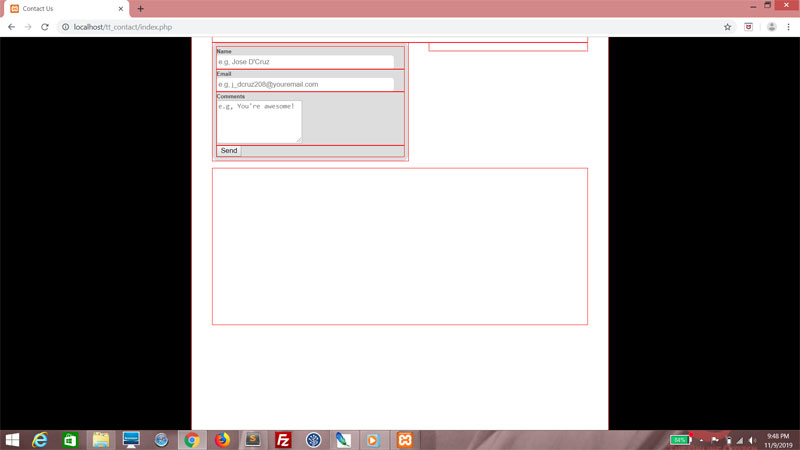
You'll see it's looking a little flat at the moment. That's because that div is empty with no defined height.

mapContainer will take up full width, and we'll define the height as well. A top margin gives it some space between the first two divs.
.formContainer
{
width: 50%;
float: left;
padding: 0.5em;
background-color: #DDDDDD;
border: 1px solid #DDDDDD;
border-radius: 10px;
}
.cardContainer
{
width: 40%;
float: right;
padding: 0.5em;
border: 1px solid #DDDDDD;
border-radius: 10px;
}
.mapContainer
{
width: 100%;
height: 300px;
float: left;
margin-top: 1em;
}
{
width: 50%;
float: left;
padding: 0.5em;
background-color: #DDDDDD;
border: 1px solid #DDDDDD;
border-radius: 10px;
}
.cardContainer
{
width: 40%;
float: right;
padding: 0.5em;
border: 1px solid #DDDDDD;
border-radius: 10px;
}
.mapContainer
{
width: 100%;
height: 300px;
float: left;
margin-top: 1em;
}
This should give you a better idea about the general layout.

The Form
Let's work on the form some more. Here's some styling for the labels.
.formContainer
{
width: 50%;
float: left;
padding: 0.5em;
background-color: #DDDDDD;
border: 1px solid #DDDDDD;
border-radius: 10px;
}
label
{
font-weight: bold;
font-size: 0.75em;
color: #444444;
}
.cardContainer
{
width: 40%;
float: right;
padding: 0.5em;
border: 1px solid #DDDDDD;
border-radius: 10px;
}
{
width: 50%;
float: left;
padding: 0.5em;
background-color: #DDDDDD;
border: 1px solid #DDDDDD;
border-radius: 10px;
}
label
{
font-weight: bold;
font-size: 0.75em;
color: #444444;
}
.cardContainer
{
width: 40%;
float: right;
padding: 0.5em;
border: 1px solid #DDDDDD;
border-radius: 10px;
}
You won't see much change yet, but trust me that it will look amazing once we're finished.

Now we style all input textboxes with a width, height, wounded corners and a bit of padding. Set the border to zero thickness!
label
{
font-weight: bold;
font-size: 0.75em;
color: #444444;
}
input[type = text]
{
width: 25em;
height: 1.5em;
padding: 0.25em;
border-radius: 5px;
border: 0px solid #000000;
}
.cardContainer
{
width: 40%;
float: right;
padding: 0.5em;
border: 1px solid #DDDDDD;
border-radius: 10px;
}
{
font-weight: bold;
font-size: 0.75em;
color: #444444;
}
input[type = text]
{
width: 25em;
height: 1.5em;
padding: 0.25em;
border-radius: 5px;
border: 0px solid #000000;
}
.cardContainer
{
width: 40%;
float: right;
padding: 0.5em;
border: 1px solid #DDDDDD;
border-radius: 10px;
}
Sweet!
This is the styling for the button, and it's really up to taste. I recommend that you float it right, and maybe add a hover pseudoselector so it changes color upon a mouseover.
input[type = text]
{
width: 25em;
height: 1.5em;
padding: 0.25em;
border-radius: 5px;
border: 0px solid #000000;
}
input[type = submit]
{
display: inline-block;
float: right;
width: 5em;
height: 2em;
border-radius: 5px;
border: 0px solid #000000;
background-color: #999999;
font-weight: bold;
cursor: pointer;
}
input[type = submit]:hover
{
background-color: #FFFFFF;
cursor: pointer;
}
.cardContainer
{
width: 40%;
float: right;
padding: 0.5em;
border: 1px solid #DDDDDD;
border-radius: 10px;
}
{
width: 25em;
height: 1.5em;
padding: 0.25em;
border-radius: 5px;
border: 0px solid #000000;
}
input[type = submit]
{
display: inline-block;
float: right;
width: 5em;
height: 2em;
border-radius: 5px;
border: 0px solid #000000;
background-color: #999999;
font-weight: bold;
cursor: pointer;
}
input[type = submit]:hover
{
background-color: #FFFFFF;
cursor: pointer;
}
.cardContainer
{
width: 40%;
float: right;
padding: 0.5em;
border: 1px solid #DDDDDD;
border-radius: 10px;
}
So now you have a pretty button!

The styling for the textarea tag is pretty much the same as for the input textboxes, except that this element doesn't inherit font settings from the body and you have to explicitly specify them.
input[type = submit]:hover
{
background-color: #FFFFFF;
cursor: pointer;
}
textarea
{
width: 25em;
padding: 0.25em;
border-radius: 5px;
border: 0px solid #000000;
font-family: arial;
}
.cardContainer
{
width: 40%;
float: right;
padding: 0.5em;
border: 1px solid #DDDDDD;
border-radius: 10px;
}
{
background-color: #FFFFFF;
cursor: pointer;
}
textarea
{
width: 25em;
padding: 0.25em;
border-radius: 5px;
border: 0px solid #000000;
font-family: arial;
}
.cardContainer
{
width: 40%;
float: right;
padding: 0.5em;
border: 1px solid #DDDDDD;
border-radius: 10px;
}
Great!

Let's style formrow so that there'll be a decent amount of padding. Specifying the font size here will also change the labels.
textarea
{
width: 25em;
padding: 0.25em;
border-radius: 5px;
border: 0px solid #000000;
font-family: arial;
}
.formrow
{
margin-top: 1em;
font-size: 1.5em;
}
.cardContainer
{
width: 40%;
float: right;
padding: 0.5em;
border: 1px solid #DDDDDD;
border-radius: 10px;
}
{
width: 25em;
padding: 0.25em;
border-radius: 5px;
border: 0px solid #000000;
font-family: arial;
}
.formrow
{
margin-top: 1em;
font-size: 1.5em;
}
.cardContainer
{
width: 40%;
float: right;
padding: 0.5em;
border: 1px solid #DDDDDD;
border-radius: 10px;
}
There you go.

Let's not forget the error messages. Let's make them red to really hammer home the point. The font size should be a teeny bit smaller, and in bold. Any span tags within that CSS class should have height specified, and maybe some padding. In order to specify height for an inline element like span, though, you'll need to set the display property to inline-block.
.formrow
{
margin-top: 1em;
font-size: 1.5em;
}
.error
{
color: #FF0000;
font-size: 0.8em;
font-weight: bold;
}
.error span
{
display: inline-block;
height: 1.5em;
padding-top: 0.25em;
}
.cardContainer
{
width: 40%;
float: right;
padding: 0.5em;
border: 1px solid #DDDDDD;
border-radius: 10px;
}
{
margin-top: 1em;
font-size: 1.5em;
}
.error
{
color: #FF0000;
font-size: 0.8em;
font-weight: bold;
}
.error span
{
display: inline-block;
height: 1.5em;
padding-top: 0.25em;
}
.cardContainer
{
width: 40%;
float: right;
padding: 0.5em;
border: 1px solid #DDDDDD;
border-radius: 10px;
}
This should be what you see if you click the Send button without filling in anything!

The Card
The purpose of the Card is to show contact details. And that's what we'll do. In this div, add three divs and style each one using the CSS class cardrow.
<div class="cardContainer">
<div class="cardrow">
</div>
<div class="cardrow">
</div>
<div class="cardrow">
</div>
</div>
<div class="cardrow">
</div>
<div class="cardrow">
</div>
<div class="cardrow">
</div>
</div>
Then fill in some details.
<div class="cardContainer">
<div class="cardrow">
+65 1234567
</div>
<div class="cardrow">
mail@teochewthunder.com
</div>
<div class="cardrow">
140 Cecil Street<br />
12-34a<br />
Singapore 069543
</div>
</div>
<div class="cardrow">
+65 1234567
</div>
<div class="cardrow">
mail@teochewthunder.com
</div>
<div class="cardrow">
140 Cecil Street<br />
12-34a<br />
Singapore 069543
</div>
</div>
Kind of cramped and plain, isn't it?

As with the formrow CSS class, styling cardrow this way affects font size and row spacing.
.cardContainer
{
width: 40%;
float: right;
padding: 0.5em;
border: 1px solid #DDDDDD;
border-radius: 10px;
}
.cardrow
{
margin-bottom: 1em;
font-size: 1.2em;
}
.mapContainer
{
width: 100%;
height: 300px;
float: left;
margin-top: 1em;
}
{
width: 40%;
float: right;
padding: 0.5em;
border: 1px solid #DDDDDD;
border-radius: 10px;
}
.cardrow
{
margin-bottom: 1em;
font-size: 1.2em;
}
.mapContainer
{
width: 100%;
height: 300px;
float: left;
margin-top: 1em;
}
Much better! But let's improve things further. Add more styles to each div that you've styled using the CSS class cardrow.

<div class="cardContainer">
<div class="cardrow icon_phone">
+65 1234567
</div>
<div class="cardrow icon_email">
mail@teochewthunder.com
</div>
<div class="cardrow icon_address">
123 South Dakota Avenue<br />
12-34a<br />
Singapore 112113
</div>
</div>
<div class="cardrow icon_phone">
+65 1234567
</div>
<div class="cardrow icon_email">
mail@teochewthunder.com
</div>
<div class="cardrow icon_address">
123 South Dakota Avenue<br />
12-34a<br />
Singapore 112113
</div>
</div>
And then let's write the classes icon_phone, icon_email and icon_address. Each of these uses the after pseudoselector. Set the display property to block, with width to 2em. Height is variable - for the phone number and email, they take up only one line, so the height should be 1em. But for the address, it should be 3em. All this is floated left because they will be to the left of the content., and the text is aligned center. For the content property, we'll use HTML symbols.
.cardrow
{
margin-bottom: 1em;
font-size: 1.2em;
}
.icon_phone:before
{
display: block;
content: "\260F";
width: 2em;
height: 1em;
float: left;
text-align: center;
}
.icon_email:before
{
display: block;
content: "\2709";
width: 2em;
height: 1em;
float: left;
text-align: center;
}
.icon_address:before
{
display: block;
content: "\2616";
width: 2em;
height: 3em;
float: left;
text-align: center;
}
.mapContainer
{
width: 100%;
height: 300px;
float: left;
margin-top: 1em;
}
{
margin-bottom: 1em;
font-size: 1.2em;
}
.icon_phone:before
{
display: block;
content: "\260F";
width: 2em;
height: 1em;
float: left;
text-align: center;
}
.icon_email:before
{
display: block;
content: "\2709";
width: 2em;
height: 1em;
float: left;
text-align: center;
}
.icon_address:before
{
display: block;
content: "\2616";
width: 2em;
height: 3em;
float: left;
text-align: center;
}
.mapContainer
{
width: 100%;
height: 300px;
float: left;
margin-top: 1em;
}
Beautiful!

Just one final touch! The card is significantly shorter than the form. While it would take effort to make them exactly equal in height, all we're really trying to do is achieve a little visual balance. So let's add a logo. I'm gonna go with my personal logo for this.
Use the after pseudoselector, float it right with a width and height of 3em, then set the background size to contain. The margin-top property has been set to a negative value so that it will overlap the last row just a bit!
.cardContainer
{
width: 40%;
float: right;
padding: 0.5em;
border: 1px solid #DDDDDD;
border-radius: 10px;
}
.cardContainer:after
{
content: "";
display: block;
width: 3em;
height: 3em;
float: right;
margin-top: -2em;
background: url(logo.png) right top no-repeat;
background-size: contain;
}
.cardrow
{
margin-bottom: 1em;
font-size: 1.2em;
}
{
width: 40%;
float: right;
padding: 0.5em;
border: 1px solid #DDDDDD;
border-radius: 10px;
}
.cardContainer:after
{
content: "";
display: block;
width: 3em;
height: 3em;
float: right;
margin-top: -2em;
background: url(logo.png) right top no-repeat;
background-size: contain;
}
.cardrow
{
margin-bottom: 1em;
font-size: 1.2em;
}
We're done for the Card!

Styling the message
There's one more thing - the message at the top of the page. It's currently in black and white, and while there's nothing wrong with that, it helps to use color for context.First, we set sizes, padding, round corners, all the purely aesthetic stuff. We'll use the before pseudoselector to add a 2em space at the start of the block.
.contactContainer
{
width: 90%;
padding-top: 10px;
margin: 0 auto 0 auto;
}
.messageContainer
{
width: 100%;
height: 2.5em;
padding-top: 1em;
font-weight: bold;
margin-bottom: 0.5em;
border-radius: 10px;
color: #FFFFFF;
}
.messageContainer:before
{
content: "";
display: block;
width: 2em;
height: 2em;
float: left;
font-size: 2em;
margin-top: -0.5em;
text-align: center;
}
.innerContainer
{
width: 100%;
}
{
width: 90%;
padding-top: 10px;
margin: 0 auto 0 auto;
}
.messageContainer
{
width: 100%;
height: 2.5em;
padding-top: 1em;
font-weight: bold;
margin-bottom: 0.5em;
border-radius: 10px;
color: #FFFFFF;
}
.messageContainer:before
{
content: "";
display: block;
width: 2em;
height: 2em;
float: left;
font-size: 2em;
margin-top: -0.5em;
text-align: center;
}
.innerContainer
{
width: 100%;
}
Then in the PHP, after declaring the variable message, declare the variable messageclass and set it to "message_error".
<?php
session_start();
$message = "";
$messageclass = "message_error";
$errors = array();
session_start();
$message = "";
$messageclass = "message_error";
$errors = array();
At these points, set messageclass. On any successful case, messageclass should be set to message_success. And message_error on any unsuccessful case.
if (!$mailsent)
{
$form_email = "";
$form_name = "";
$form_comments = "";
$message = "Email sent. Thank you!";
$messageclass = "message_success";
}
else
{
$message = "An error occured while trying to send your mail. Please try again.";
$messageclass = "message_error";
}
}
}
else
{
$message = "CSRF attack foiled!";
$messageclass = "message_error";
}
{
$form_email = "";
$form_name = "";
$form_comments = "";
$message = "Email sent. Thank you!";
$messageclass = "message_success";
}
else
{
$message = "An error occured while trying to send your mail. Please try again.";
$messageclass = "message_error";
}
}
}
else
{
$message = "CSRF attack foiled!";
$messageclass = "message_error";
}
In the HTML, set the div to be styled using not only messageContainer, but also hide if there is no message, and either message_error or message_success if there is a message.
<div class="messageContainer <?php echo ($message == "" ? "hide" : $messageclass); ?>">
<?php echo $message; ?>
</div>
<?php echo $message; ?>
</div>
Back to the CSS, we will write styles for message_error and message_success. The background color for message_error is a light red, and light blue for message_success. And we will use the before pseudoselector to set the content property in both cases - a tick for message_success and a cross for message_error.
.messageContainer
{
width: 100%;
height: 2.5em;
padding-top: 1em;
font-weight: bold;
margin-bottom: 0.5em;
border-radius: 10px;
color: #FFFFFF;
}
.messageContainer:before
{
content: "";
display: block;
width: 2em;
height: 2em;
float: left;
font-size: 2em;
margin-top: -0.5em;
text-align: center;
}
.message_error
{
background-color: #FF9999;
}
.message_success
{
background-color: #9999FF;
}
.message_error:before
{
content: "\02718";
}
.message_success:before
{
content: "\02714";
}
.innerContainer
{
width: 100%;
}
{
width: 100%;
height: 2.5em;
padding-top: 1em;
font-weight: bold;
margin-bottom: 0.5em;
border-radius: 10px;
color: #FFFFFF;
}
.messageContainer:before
{
content: "";
display: block;
width: 2em;
height: 2em;
float: left;
font-size: 2em;
margin-top: -0.5em;
text-align: center;
}
.message_error
{
background-color: #FF9999;
}
.message_success
{
background-color: #9999FF;
}
.message_error:before
{
content: "\02718";
}
.message_success:before
{
content: "\02714";
}
.innerContainer
{
width: 100%;
}
Now let's see what happens when we submit successfully.

An unsuccessful case!

And finally, remove the red outlines.
div
{
outline: 0px solid #FF0000;
}
{
outline: 0px solid #FF0000;
}
Yep, that's how it should look.

No comments:
Post a Comment