Now, as always with situations like these, I look for one thing - protest art. There's nothing quite like a perceived struggle against tyranny to bring out the creative romantic in all of us. My search turned out a whole bunch of images incorporating the three-fingered salute, and that's what we'll do today.
What we will use
This will be a combination of a HTML and CSS background, with the main parts done in SVG.The HTML
Here's the boilerplate.<!DOCTYPE html>
<html>
<head>
<title>Free Myanmar!</title>
<style>
</style>
</head>
<body>
</body>
</html>
<html>
<head>
<title>Free Myanmar!</title>
<style>
</style>
</head>
<body>
</body>
</html>
We will add a div with id svgContainer. Within it will be a svg tag.
<body>
<div id="svg_container">
<svg>
</svg>
</div>
</body>
<div id="svg_container">
<svg>
</svg>
</div>
</body>
For styling, svgContainer and the svg will be 800 by 700 pixels. svgContainer will be centered, and have a red outline so we have an idea of the borders we are working with.
<style>
#svg_container
{
width: 800px;
height: 700px;
outline: 1px solid red;
margin: 0 auto 0 auto;
}
svg
{
width: 800px;
height: 700px;
}
</style>
#svg_container
{
width: 800px;
height: 700px;
outline: 1px solid red;
margin: 0 auto 0 auto;
}
svg
{
width: 800px;
height: 700px;
}
</style>
There you go.

And then let's style the background. I'm opting for a deeper red background (the color of Aung San Suu Kyi's party flag) that will graduate elliptically to black in the middle.
<style>
body
{
background: -moz-radial-gradient(center, ellipse cover, #000000 0%, #aa0000 100%);
background: -webkit-radial-gradient(center, ellipse cover, #000000 0%,#aa0000 100%);
background: radial-gradient(ellipse at center, #000000 0%,#aa0000 100%);
}
#svg_container
{
width: 800px;
height: 700px;
outline: 1px solid red;
margin: 0 auto 0 auto;
}
svg
{
width: 800px;
height: 700px;
}
</style>
That's a good start! Really gives you that grim sense of foreboding, doesn't it?

Now for the SVG
We will be using path tags to represent the hand. First of all, we will style path tags to have a white outline. The background will be also white, but we will keep opacity at 0, for now.svg
{
width: 800px;
height: 700px;
margin: 0 auto 0 auto;
}
path
{
stroke-width: 1px;
stroke: rgba(255, 255, 255, 1);
fill: rgba(255, 255, 255, 0);
}
{
width: 800px;
height: 700px;
margin: 0 auto 0 auto;
}
path
{
stroke-width: 1px;
stroke: rgba(255, 255, 255, 1);
fill: rgba(255, 255, 255, 0);
}
The first part is the thumb. We begin with two straight lines.
<svg>
<path
d="M330 680 l0 -150
l-50 -100
"
/>
</svg>
<path
d="M330 680 l0 -150
l-50 -100
"
/>
</svg>
This will form part of the wrist and thumb. You won't see it just yet.

We follow up with a curve, and then another straight line.
<svg>
<path
d="M330 680 l0 -150
l-50 -100
q0 -20 30 -50
l130 -70
"
/>
</svg>
<path
d="M330 680 l0 -150
l-50 -100
q0 -20 30 -50
l130 -70
"
/>
</svg>
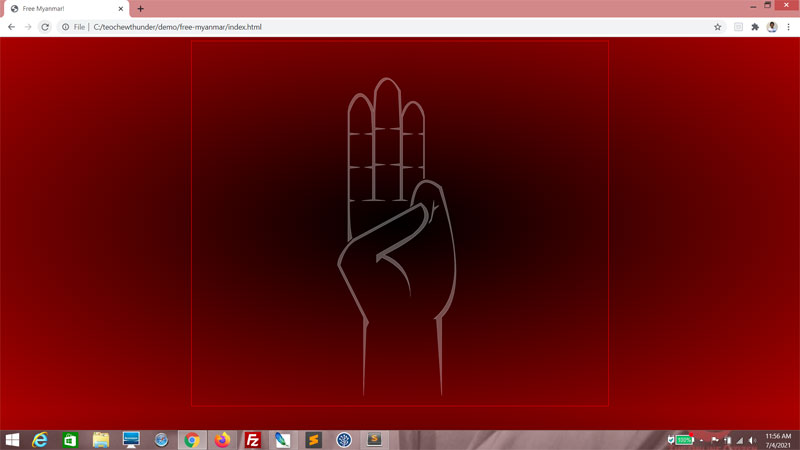
You can see the thumb and its knuckle taking shape.

We follow up with two curves.
<svg>
<path
d="M330 680 l0 -150
l-50 -100
q0 -20 30 -50
l130 -70
q50 40 -70 100
q50 20 50 80
"
/>
</svg>
<path
d="M330 680 l0 -150
l-50 -100
q0 -20 30 -50
l130 -70
q50 40 -70 100
q50 20 50 80
"
/>
</svg>
This completes the thumb and its base! The outline, anyway.

And here we retrace our earlier steps ending with a "Z"...
<svg>
<path
d="M330 680 l0 -150
l-50 -100
q0 -20 30 -50
l130 -70
q50 40 -70 100
q50 20 50 80
q0 -50 -55 -75
l-10 10
l0 -15
l70 -40
q35 -30 15 -55
l-120 65
q-25 10 -35 50
l55 110
l-5 10
Z
"
/>
</svg>
<path
d="M330 680 l0 -150
l-50 -100
q0 -20 30 -50
l130 -70
q50 40 -70 100
q50 20 50 80
q0 -50 -55 -75
l-10 10
l0 -15
l70 -40
q35 -30 15 -55
l-120 65
q-25 10 -35 50
l55 110
l-5 10
Z
"
/>
</svg>
...to form a hopefully artistic outline of the thumb.

The second part is two path tags to represent the little finger. This here is the crook of the little finger...
<path
d="M330 680 l0 -150
l-50 -100
q0 -20 30 -50
l130 -70
q50 40 -70 100
q50 20 50 80
q0 -50 -55 -75
l-10 10
l0 -15
l70 -40
q35 -30 15 -55
l-120 65
q-25 10 -35 50
l55 110
l-5 10
Z
"
/>
<path
d="M455 350 l5 -10
l5 -35
l0 15
l10 -5
l-10 10
l-5 20 Z
"
/>
d="M330 680 l0 -150
l-50 -100
q0 -20 30 -50
l130 -70
q50 40 -70 100
q50 20 50 80
q0 -50 -55 -75
l-10 10
l0 -15
l70 -40
q35 -30 15 -55
l-120 65
q-25 10 -35 50
l55 110
l-5 10
Z
"
/>
<path
d="M455 350 l5 -10
l5 -35
l0 15
l10 -5
l-10 10
l-5 20 Z
"
/>
Doesn't look like much so far? Patience, young Padawan.

...and this is the rest!
<path
d="M330 680 l0 -150
l-50 -100
q0 -20 30 -50
l130 -70
q50 40 -70 100
q50 20 50 80
q0 -50 -55 -75
l-10 10
l0 -15
l70 -40
q35 -30 15 -55
l-120 65
q-25 10 -35 50
l55 110
l-5 10
Z
"
/>
<path
d="M480 680 l0 -150
q55 -50 0 -250
q-50 -40 -60 38
l5 -5
q10 -65 50 -30
q65 190 -10 250
l5 0
Z"
/>
<path
d="M455 350 l5 -10
l5 -35
l0 15
l10 -5
l-10 10
l-5 20 Z
"
/>
Good going.

This last part takes care of the other fingers. It's a very long sequence, but you should be able to work this out.
<path
d="M455 350 l5 -10
l5 -35
l0 15
l10 -5
l-10 10
l-5 20 Z
"
/>
<path
d="M300 385 l0 -250
l2 -10
q20 -50 45 0
l2 10
l2 -40
q20 -50 50 0
l2 50
l2 -10
l5 -10
q15 -20 30 0
l5 10
l2 10
l0 118
l-2 1
l0 -20
l-10 -2
l10 -2
l0 -60
l-10 -2
l10 -2
l0 -30
q-20 -55 -40 0
l0 30
l20 2
l-20 2
l0 60
l20 2
l-20 2
l0 60
l10 2
l-30 0
l15 -2
l0 -65
l-20 -2
l20 -2
l0 -65
l-20 -2
l20 -2
l-3 -70
q-20 -45 -42 0
l-3 40
l-0 30
l20 2
l-20 2
l-0 65
l20 2
l-20 2
l0 65
l20 2
l-45 0
l20 -2
l0 -60
l-15 -2
l15 -2
l0 -60
l-15 -2
l15 -2
l-2 -40
q-20 -60 -42 0
l-0 40
l20 2
l-20 2
l-0 60
l20 2
l-20 2
l-0 60
l10 2
l-10 2
q0 50 5 70
Z"
/>
And here's our salute!

Now alter the CSS. The background and outline opacity we will set to 0.3...
path
{
stroke-width: 1px;
stroke: rgba(255, 255, 255, 0.3);
fill: rgba(255, 255, 255, 0.3);
}
{
stroke-width: 1px;
stroke: rgba(255, 255, 255, 0.3);
fill: rgba(255, 255, 255, 0.3);
}
Coolness, a ghostly hand!
Now for the text. Let's style this. Both the background and outline are red, but at different opacities. I've gone with huge Impact lettering.
path
{
stroke-width: 1px;
stroke: rgba(255, 255, 255, 0.3);
fill: rgba(255, 255, 255, 0.3);
}
text
{
stroke-width: 3px;
stroke: rgba(255, 0, 0, 0.2);
fill: rgba(255, 0, 0, 0.1);
font: 180px impact
}
{
stroke-width: 1px;
stroke: rgba(255, 255, 255, 0.3);
fill: rgba(255, 255, 255, 0.3);
}
text
{
stroke-width: 3px;
stroke: rgba(255, 0, 0, 0.2);
fill: rgba(255, 0, 0, 0.1);
font: 180px impact
}
And then place the text behind the salute.
<text x="250" y="350">
FREE
</text>
<text x="50" y="550">
MYANMAR
</text>
<path
d="M330 680 l0 -150
l-50 -100
q0 -20 30 -50
l130 -70
q50 40 -70 100
q50 20 50 80
q0 -50 -55 -75
l-10 10
l0 -15
l70 -40
q35 -30 15 -55
l-120 65
q-25 10 -35 50
l55 110
l-5 10
Z
"
/>
FREE
</text>
<text x="50" y="550">
MYANMAR
</text>
<path
d="M330 680 l0 -150
l-50 -100
q0 -20 30 -50
l130 -70
q50 40 -70 100
q50 20 50 80
q0 -50 -55 -75
l-10 10
l0 -15
l70 -40
q35 -30 15 -55
l-120 65
q-25 10 -35 50
l55 110
l-5 10
Z
"
/>
Here, you can see I adjusted the opacity so it blends in nicely.

And one final touch. What's protest art without a little blood? For this, we will use circle tags. Let's style them. So we can see what we're doing, I'm giving them a white outline.
text
{
stroke-width: 3px;
stroke: rgba(255, 0, 0, 0.2);
fill: rgba(255, 0, 0, 0.1);
font: 180px impact
}
circle
{
fill: rgba(255, 0, 0, 1);
stroke-width: 1px;
stroke: rgba(255, 255, 255, 1);
}
{
stroke-width: 3px;
stroke: rgba(255, 0, 0, 0.2);
fill: rgba(255, 0, 0, 0.1);
font: 180px impact
}
circle
{
fill: rgba(255, 0, 0, 1);
stroke-width: 1px;
stroke: rgba(255, 255, 255, 1);
}
Here, I varied the sizes of the blood drops, and their positioning.
l-10 2
q0 50 5 70
Z"
/>
<circle cx="250" cy="200" r="10" />
<circle cx="253" cy="220" r="5" />
<circle cx="260" cy="210" r="8" />
<circle cx="220" cy="200" r="2" />
<circle cx="230" cy="190" r="2" />
<circle cx="310" cy="190" r="1" />
<circle cx="210" cy="220" r="2" />
<circle cx="220" cy="210" r="2" />
<circle cx="230" cy="240" r="1" />
<circle cx="300" cy="180" r="2" />
<circle cx="200" cy="240" r="1" />
<circle cx="240" cy="245" r="3" />
<circle cx="250" cy="250" r="2" />
<circle cx="360" cy="230" r="2" />
<circle cx="350" cy="220" r="3" />
Adjust till you're happy.

Now turn the outline off. Here, I've opted to do that by setting the stroke-width property to 0 pixels, but you can do that just as easily by setting the stroke color to zero opacity.
circle
{
fill: rgba(255, 0, 0, 1);
stroke-width: 0px;
stroke: rgba(255, 255, 255, 1);
}
{
fill: rgba(255, 0, 0, 1);
stroke-width: 0px;
stroke: rgba(255, 255, 255, 1);
}
Turn this outline off as well.
#svg_container
{
width: 800px;
height: 700px;
outline: 0px solid red;
margin: 0 auto 0 auto;
}
{
width: 800px;
height: 700px;
outline: 0px solid red;
margin: 0 auto 0 auto;
}
Here's your completed protest art!

Finally...
I am rather more sympathetic towards the situation in Myanmar, than the overblown drama that was Hong Kong. I'm not sure exactly why, but it feels different. For one, there's a lot more violence in the Myanmar situation. It's a storm of brutal tactics exercised by a remorseless military. And nobody deserves that.Suu long!
T___T
T___T
No comments:
Post a Comment