Showing posts with label Hong Kong. Show all posts

Saturday, 24 April 2021

Ten sketches of actual programming projects

One of the greatest myths in development is that when developers write code, they simply park their asses down somewhere and type away till they're done. Nothing could be further from the truth. The process of writing code is thought. Lots of it. There has to be a rough outline before a developer even knows where to begin.

And one of the most common ways to provide a rough outline, is through sketching.

Yes, you read that right. Sketching. Pencil to paper. Crooked lines. Scribbled text. Stick figures. Here are some of the sketches I've done, that ultimately made the transition to working code. I thought it would be fun to provide a before-after dynamic. Notice how many of these sketches don't translate a hundred percent to the finished product. That's because requirements evolve. Sometimes, while I'm working on it mid-way, I hit upon a better way of implementing the idea. This may result in elements being moved around, text changed, and so on. That's just how it is.

1. Hong Kong Anti-extradition Protest Symbol (2019)

Whatever I eventually ended up thinking about the Anti-extradition Protests of 2019 in Hong Kong, there's no denying that this produced a lot of great art, some of which got me thinking about how one would represent one of these pieces in CSS.


The sketch was clumsy, the final product hopefully less so. It was basically the process of figuring out basic shapes in CSS and how to combine them. This was scribbled out over the course of devouring a lunch sandwich at my desk, and coded within the day in the evening.

2. Tic Tac Toe (2019)

Both the original and the Valentine's Day version were born from this little grid. It isn't much to look at, but there was more to this than just interface.


In here, I actually numbered the grid squares and thought about how to map out a win scenario, eventually going with an array as the main data structure.

3. Christmas-themed LESS Demo (2017)

I'm not sure at what point I decided to explore LESS, but it came in the form of making three different layouts to test my code with. Enter the 2017 Christmas-themed LESS Demo. Here, you can see the different layout drawings for each color.


Fun fact: The text in blue was preliminary thoughts for an unrelated piece of code for Ruby MadLibs.

4. Valentine Heart Animation (2019)

This was some idle doodling during an extremely boring meeting in which I was trying desperately not to fall asleep. Crude it may be, but it led to some amazing stuff.


I actually made this for my wife for Valentine's Day. She wasn't extremely impressed considering she's Chinese and doesn't celebrate Valentine's Day on 14th February... but it's the thought that counts, right?

5. The Pie Chart (2018)

While trying to produce a pie chart using CSS, there was a lot to think about in terms of angles and overlapping. The sketch I made during this thought process was extremely rudimentary. It certainly doesn't do justice to the insane amount of code I had to write in order to make this work.

The Pie Chart

However, work it did. For this, I had to think of all possible cases and how to handle them. Which was hard because at my level of CSS, I could only produce things at a right angle. Thus, the final result was a shit-ton of hacking.

6. Easter Bunny River Crossing Game (2019)

During another boring meeting, I sketched this beauty as my programmer brain clicked into full gear as to how I would make this work...


The final product differs a bit from the sketch. As you can see, I opted for full-body representations instead of cute icons. I can't recall the thought process behind it, other than "it would be cool".

7. Ada Lovelace Day Generator (2019)

During yet another boring meeting (see a pattern here?), this was born. I was thinking of ways to write a simple ReactJS app, and this came up. OK, so my drawing of Ada Lovelace looked more like some corporate suit but that was only meant to be a placeholder. I might have based the sketch on the office lady sitting opposite me at the meeting.


The controls for the number manipulation weren't as I originally envisioned. Certain considerations tend to come up only during implementation. But all is fine. I'm pretty happy with the outcome.

8. Scroll-down Christmas Carol (2016)

Work for the this was based on the scroll-down effect - but at that time I only knew how to use CSS to draw, and thus when rendering the caroler, I had to break it down into basic shapes. This was the sketch. Pretty rough, huh?


Well, as it turns out, I think my sketch actually had more life in it than the final product. Joke's on me!

9. CNY Rat SVG Animation (2020)

This one was an attempt by me to visualize how the string "2020" would morph into a graphical representation of a rat. As you can see, I had two versions, neither of which really resemble the final product.


On the other hand, these were lame. I think the end product is worlds better. I hit on the idea of using the bases of the "2"s as whiskers, while writing the code. But the sketches did give me that foundation to build on.

10. Contact Us Page (2019)

Another square drawing. This was pretty straightforward; I needed a layout for a typical Contact Us page, and just wanted to figure out what would go where.

Contact Us Page

You can even see the pin on what was my pathetic representation of a Google Map!

Whew, I'm done!

I'm definitely a worse artist than I am a developer, and that's saying something. Hopefully, from these, you can gain a greater appreciation of how this developer does things.

Sketch you later, alligator!
T___T

Thursday, 15 April 2021

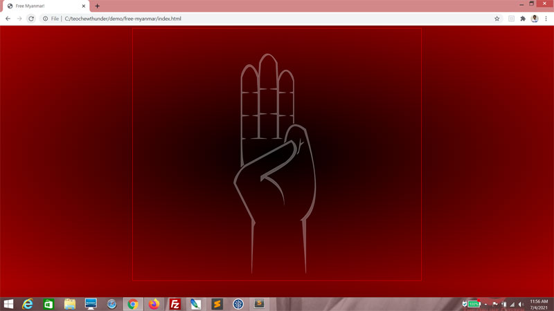
Web Tutorial: Free Myanmar

While the rest of the world struggles with a global pandemic, Myanmar has upped the ante in the form of a military coup that took place two months ago. The citizens of Myanmar have not been taking it lying down, however, and a massive and sustained outcry has made itself heard since. However, Myanmar has had a far rougher go of it than their counterparts in Hong Kong. The Anti-extradition protests in Hong Kong led to two deaths, one of which was due to some unlucky chap losing his balance and falling off the top of a building. The situation in Myanmar has seen, to date, at least seven hundred people die from military violence.

Now, as always with situations like these, I look for one thing - protest art. There's nothing quite like a perceived struggle against tyranny to bring out the creative romantic in all of us. My search turned out a whole bunch of images incorporating the three-fingered salute, and that's what we'll do today.

What we will use

This will be a combination of a HTML and CSS background, with the main parts done in SVG.

The HTML

Here's the boilerplate.
<!DOCTYPE html>
<html>
    <head>
        <title>Free Myanmar!</title>

        <style>

        </style>
    </head>

    <body>

    </body>
</html>


We will add a div with id svgContainer. Within it will be a svg tag.
<body>
    <div id="svg_container">
        <svg>

        </svg>
    </div>

</body>


For styling, svgContainer and the svg will be 800 by 700 pixels. svgContainer will be centered, and have a red outline so we have an idea of the borders we are working with.
<style>
    #svg_container
    {
        width: 800px;
        height: 700px;
        outline: 1px solid red;
        margin: 0 auto 0 auto;
    }

    svg
    {
        width: 800px;
        height: 700px;
    }

</style>


There you go.


And then let's style the background. I'm opting for a deeper red background (the color of Aung San Suu Kyi's party flag) that will graduate elliptically to black in the middle.
<style>
    body
    {
        background: -moz-radial-gradient(center, ellipse cover,  #000000 0%, #aa0000 100%);
        background: -webkit-radial-gradient(center, ellipse cover,  #000000 0%,#aa0000 100%);
        background: radial-gradient(ellipse at center,  #000000 0%,#aa0000 100%);
    }


    #svg_container
    {
        width: 800px;
        height: 700px;
        outline: 1px solid red;
        margin: 0 auto 0 auto;
    }

    svg
    {
        width: 800px;
        height: 700px;
    }
</style>


That's a good start! Really gives you that grim sense of foreboding, doesn't it?


Now for the SVG

We will be using path tags to represent the hand. First of all, we will style path tags to have a white outline. The background will be also white, but we will keep opacity at 0, for now.
svg
{
    width: 800px;
    height: 700px;
    margin: 0 auto 0 auto;
}

path
{
    stroke-width: 1px;
    stroke: rgba(255, 255, 255, 1);
    fill: rgba(255, 255, 255, 0);
}


The first part is the thumb. We begin with two straight lines.
<svg>
    <path
        d="M330 680 l0 -150
        l-50 -100
        "
    />

</svg>


This will form part of the wrist and thumb. You won't see it just yet.


We follow up with a curve, and then another straight line.
<svg>
    <path
        d="M330 680 l0 -150
        l-50 -100
        q0 -20 30 -50
        l130 -70

        "
    />
</svg>


You can see the thumb and its knuckle taking shape.


We follow up with two curves.
<svg>
    <path
        d="M330 680 l0 -150
        l-50 -100
        q0 -20 30 -50
        l130 -70
        q50 40 -70 100
        q50 20 50 80

        "
    />
</svg>


This completes the thumb and its base! The outline, anyway.


And here we retrace our earlier steps ending with a "Z"...
<svg>
    <path
        d="M330 680 l0 -150
        l-50 -100
        q0 -20 30 -50
        l130 -70
        q50 40 -70 100
        q50 20 50 80
        q0 -50 -55 -75
        l-10 10
        l0 -15
        l70 -40
        q35 -30 15 -55
        l-120 65
        q-25 10 -35 50
        l55 110
        l-5 10
        Z

        "
    />
</svg>


...to form a hopefully artistic outline of the thumb.


The second part is two path tags to represent the little finger. This here is the crook of the little finger...
<path
    d="M330 680 l0 -150
    l-50 -100
    q0 -20 30 -50
    l130 -70
    q50 40 -70 100
    q50 20 50 80
    q0 -50 -55 -75
    l-10 10
    l0 -15
    l70 -40
    q35 -30 15 -55
    l-120 65
    q-25 10 -35 50
    l55 110
    l-5 10
    Z
    "
/>

<path
    d="M455 350 l5 -10
    l5 -35
    l0 15
    l10 -5
    l-10 10
    l-5 20 Z
    "
/>


Doesn't look like much so far? Patience, young Padawan.


...and this is the rest!
<path
    d="M330 680 l0 -150
    l-50 -100
    q0 -20 30 -50
    l130 -70
    q50 40 -70 100
    q50 20 50 80
    q0 -50 -55 -75
    l-10 10
    l0 -15
    l70 -40
    q35 -30 15 -55
    l-120 65
    q-25 10 -35 50
    l55 110
    l-5 10
    Z
    "
/>

<path
    d="M480 680 l0 -150
    q55 -50 0 -250
    q-50 -40 -60 38
    l5 -5
    q10 -65 50 -30
    q65 190 -10 250
    l5 0
    Z"
/>


<path
    d="M455 350 l5 -10
    l5 -35
    l0 15
    l10 -5
    l-10 10
    l-5 20 Z
    "
/>


Good going.


This last part takes care of the other fingers. It's a very long sequence, but you should be able to work this out.
<path
    d="M455 350 l5 -10
    l5 -35
    l0 15
    l10 -5
    l-10 10
    l-5 20 Z
    "
/>

<path
    d="M300 385 l0 -250
    l2 -10
    q20 -50 45 0
    l2 10
    l2 -40
    q20 -50 50 0
    l2 50
    l2 -10
    l5 -10
    q15 -20 30 0
    l5 10
    l2 10
    l0 118
    l-2 1
    l0 -20
    l-10 -2
    l10 -2
    l0 -60
    l-10 -2
    l10 -2
    l0 -30
    q-20 -55 -40 0
    l0 30
    l20 2
    l-20 2
    l0 60
    l20 2
    l-20 2
    l0 60
    l10 2
    l-30 0
    l15 -2
    l0 -65
    l-20 -2
    l20 -2
    l0 -65
    l-20 -2
    l20 -2
    l-3 -70
    q-20 -45 -42 0
    l-3 40
    l-0 30
    l20 2
    l-20 2
    l-0 65
    l20 2
    l-20 2
    l0 65
    l20 2
    l-45 0
    l20 -2
    l0 -60
    l-15 -2
    l15 -2
    l0 -60
    l-15 -2
    l15 -2
    l-2 -40
    q-20 -60 -42 0
    l-0 40
    l20 2
    l-20 2
    l-0 60
    l20 2
    l-20 2
    l-0 60
    l10 2
    l-10 2
    q0 50 5 70
    Z"
/>


And here's our salute!


Now alter the CSS. The background and outline opacity we will set to 0.3...
path
{
    stroke-width: 1px;
    stroke: rgba(255, 255, 255, 0.3);
    fill: rgba(255, 255, 255, 0.3);
}


Coolness, a ghostly hand!


Now for the text. Let's style this. Both the background and outline are red, but at different opacities. I've gone with huge Impact lettering.
path
{
    stroke-width: 1px;
    stroke: rgba(255, 255, 255, 0.3);
    fill: rgba(255, 255, 255, 0.3);
}

text
{
    stroke-width: 3px;
    stroke: rgba(255, 0, 0, 0.2);
    fill: rgba(255, 0, 0, 0.1);   
    font: 180px impact
}


And then place the text behind the salute.
<text x="250" y="350">
    FREE
</text>

<text x="50" y="550">
    MYANMAR
</text>


<path
    d="M330 680 l0 -150
    l-50 -100
    q0 -20 30 -50
    l130 -70
    q50 40 -70 100
    q50 20 50 80
    q0 -50 -55 -75
    l-10 10
    l0 -15
    l70 -40
    q35 -30 15 -55
    l-120 65
    q-25 10 -35 50
    l55 110
    l-5 10
    Z
    "
/>


Here, you can see I adjusted the opacity so it blends in nicely.


And one final touch. What's protest art without a little blood? For this, we will use circle tags. Let's style them. So we can see what we're doing, I'm giving them a white outline.
text
{
    stroke-width: 3px;
    stroke: rgba(255, 0, 0, 0.2);
    fill: rgba(255, 0, 0, 0.1);   
    font: 180px impact
}

circle
{
    fill: rgba(255, 0, 0, 1);
    stroke-width: 1px;
    stroke: rgba(255, 255, 255, 1);
}


Here, I varied the sizes of the blood drops, and their positioning.
    l-10 2
    q0 50 5 70
    Z"
/>

<circle cx="250" cy="200" r="10" />
<circle cx="253" cy="220" r="5" />
<circle cx="260" cy="210" r="8" />
<circle cx="220" cy="200" r="2" />
<circle cx="230" cy="190" r="2" />
<circle cx="310" cy="190" r="1" />
<circle cx="210" cy="220" r="2" />
<circle cx="220" cy="210" r="2" />
<circle cx="230" cy="240" r="1" />
<circle cx="300" cy="180" r="2" />
<circle cx="200" cy="240" r="1" />
<circle cx="240" cy="245" r="3" />
<circle cx="250" cy="250" r="2" />
<circle cx="360" cy="230" r="2" />
<circle cx="350" cy="220" r="3" />


Adjust till you're happy.


Now turn the outline off. Here, I've opted to do that by setting the stroke-width property to 0 pixels, but you can do that just as easily by setting the stroke color to zero opacity.
circle
{
    fill: rgba(255, 0, 0, 1);
    stroke-width: 0px;
    stroke: rgba(255, 255, 255, 1);
}


Turn this outline off as well.
#svg_container
{
    width: 800px;
    height: 700px;
    outline: 0px solid red;
    margin: 0 auto 0 auto;
}


Here's your completed protest art!


Finally...

I am rather more sympathetic towards the situation in Myanmar, than the overblown drama that was Hong Kong. I'm not sure exactly why, but it feels different. For one, there's a lot more violence in the Myanmar situation. It's a storm of brutal tactics exercised by a remorseless military. And nobody deserves that.

Suu long!
T___T

Wednesday, 3 February 2021

The Big Tech Fallout From The Capitol Riots

It has been a crazy few weeks. Well, for the world at large, with the threat of COVID-19 and all, the entire year of 2020 and beyond has been nothing short of insane. But for the USA, things went a little extra nuts with that riot on the Capitol on the 6th of January.

I've avoided talking about it till now, because I firmly believe that as a Singaporean, it's not really my place to comment on USA politics. After all, I happen to find it extremely stupid and off-putting when non-citizens presume to tell Singaporeans what to think about Singapore's Government. Thus, I try not to do that. Until it begins affecting my industry. Then all bets are off.

The result of the fiasco where then-President Donald Trump was accused of inciting the mob to storm the Capitol, was that he was subsequently removed from Twitter and Facebook. Up to now, that "inciting" part is a bit of a mystery to me. I read a transcript of that speech and it just about put me to sleep.


Trump banned for
egging people on?

But anyway, back to Trump's removal from Social Media.

In related news, Social Media app Parler also had a rough time of it. Admittedly, I'd never heard of them until recently. Apparently, they were the destination and gathering point for all the extremist Right-wing groups, and their numbers surged when Twitter and Facebook began to purge those from their platform. Despite calls do do so, Parler refused to do likewise and purge these groups, citing Freedom of Speech or somesuch. However, this was soon brought to an end when Apple and Google removed the app from their respective platforms so that no one could install the app from those platforms. And then the nail in the proverbial coffin was introduced when Amazon, Parler's hosting provider at that time, withdrew their services citing Parler's refusal to remove content that incited violence.

In effect, both Donald Trump and the extreme faction of Right-wingers were pretty much cut off from Social Media. True, there was still e-mail and internet, but they no longer had a voice. Or, at least, they no longer had a platform from which they could spread their message.

Tech platforms taking sides?

It didn't take long for Left-wingers (and Trump-haters in general) to gloat that tech appeared to have finally chosen to side with them. Or their counterparts, the Right-wingers, to decry big tech for exactly the same thing. And indeed, it did appear that Twitter, Facebook, even Pinterest, had dropped all pretense of impartiality and done what they've been dying to do all along - embrace their Leftist base.


Taking sides.

I think these deluded children have forgotten one fact. These are tech businesses. They're not interested in your politics beyond what they can do to make money out of it. Nor should they ever be. Alienating roughly half your user base in order to pander to the dramatics of the other half, is a poor business decision.

There have been cries as to how tech is practicing censorship and stifling the oh-so-important Freedom of Speech. With all due respect, Freedom of Speech refers to Government action. These are private entities. As such, Twitter, Facebook and Amazon, among others, were perfectly within their rights - whether legally or ethically. Also, Donald Trump didn't leave Twitter and Facebook much choice in the matter here. Trump's speech, as insignificant as it may have been to me personally, undeniably meant something else to his base. And allowing him to keep stoking the fire in light of what happened at the Capitol, would have been highly irresponsible. So no, I don't think what they did was wrong. But it does raise some troubling questions.

Who to entrust with that kind of power?

Trevor Noah, one of my favorite comedians, has openly criticized big tech in the clip below. No, not for doing what they did, but for doing it too late.


What he said stood out to me, and as much as I enjoy watching him, it wasn't entirely in a good way.
"I think it's really funny how Social Media companies say they don't have a magic button to stop hate online, but then when Trump lost, suddenly they were like, oh we do have that button, here it is! So what - now these companies want a cookie for doing the right thing too late?"

On one hand, the dude has a point. Things should never have gotten as far as they did. And the fact that these companies seemingly waited till Donald Trump was soon to be no longer President, to act, does look an awful lot like cowardice.

On the other hand, what constitutes the right thing? Some might say - supporting causes that should be supported, and not tolerating causes that don't deserve your support. But who gets to decide that? These things are highly subjective. Do we really want Apple to decide which apps can or can't be online? Do we really want, say, Twitter, deciding what people can and can't read in public discourse? Sure, Trump-haters might be all for it now, but forget Trump. Look beyond petty grievances, and you'll realize how scary this is if big tech can be politicized to this extent.

Already, we have articles like these claiming that the Capitol riots should not be confused with the violence of Black Lives Matter or the HongKong protests that took up much of 2019. That's a matter of perspective, and highly subjective. What is an objective fact, is that laws were broken and public property was damaged, and lives were lost. Tech companies can, of course, be trusted to make decisions according to objective fact. It's when they are called upon to make subjective moral value judgements on behalf of their very diverse user base, that we might want to start worrying. What if Amazon one day decides that they don't want you to exist online? If you can't go to Amazon to host your app, where else could you go that has the same reach? If you can't build a Social Media presence on Facebook or Twitter, could you simply go elsewhere? Technically, you could, but options are slim to none.

Twitter
, Facebook, Amazon, et al, cannot and should not be faulted for having the huge user base they have today. But the fact remains that the recent banning of Trump and the deplatforming of Parler has laid bare the scary amount of power they do hold. It's a mind-boggling amount of power to have, and nobody wants that responsibility. Remember the case of Matthew Prince and The Daily Stormers roughly three years ago? Back then, Prince said something similar to what Jack Dorsey, CEO of Twitter, is saying today - no one should have that kind of power, and decisions like these set a dangerous precedent. Already, Twitter has the nigh-impossible task of enforcing its own rules consistently. Is it fair to expect them - or anyone, for that matter - to be the Moral Police? Sure, last week it was Donald Trump that got the short end of the stick. Who cares? He deserved it, right? But see... what happens when the big tech companies decide someone else deserves it? Someone you actually like? One day, it's the President of the USA, albeit an outgoing one. What's to stop these big tech companies from denying service to, say, Singapore? What if for some reason or other, Facebook suddenly decides that Singaporeans don't deserve Social Media?

Finally...

Some will tell you that these tech companies are private entities, and they can conduct business as they see fit. They aren't obliged to be consistent, or owe anyone any explanation regarding their decisions. And they certainly don't owe anyone a platform.

I'm not disputing any of that; it's all absolutely true.

But bear this in mind - business relationships are built on trust. If a company cannot be trusted to be transparent and act with some logical consistency, and instead is seen making arbitrary decisions based on internal or external pressures, that's bad for business. Something I suspect these companies are all too aware of.

Beware that slippery slope,
T___T

Friday, 1 November 2019

On Apple's decision to remove HKmap.live

The Hong Kong protests are still ongoing after more than fifteen weeks and these look to be harrowing times for the Pearl of the Orient. Amid all the hubbub, one fascinating aspect is how software tech ties into all this. Specifically, how web and mobile technology tie into it. That's a subject to dwell on another day - today I want to talk about something that happened weeks ago. The mobile app HKmap.live got pulled from the Apple App Store.

Now this by itself isn't that big a deal. Apps get uploaded and pulled all the time. The remarkable thing here are the circumstances around which this happened.

Apple pulled the app originally in early October, claiming that the app allowed users to evade law enforcement, and almost as quickly did the mobile app administration version of the Tokyo Drift, putting it back up and claiming it was a mistake. Then about a week later, Apple once again removed the app, and this time their CEO Tim Cook went online to provide an explanation.

"It is no secret that technology can be used for good or for ill. This case is no different. The app in question allowed for the crowdsourced reporting and mapping of police checkpoints, protest hotspots, and other information. On its own, this information is benign. However, over the past several days we received credible information, from the Hong Kong Cybersecurity and Technology Crime Bureau, as well as from users in Hong Kong, that the app was being used maliciously to target individual officers for violence and to victimize individuals and property where no police are present. This use put the app in violation of Hong Kong law. Similarly, widespread abuse clearly violates our ‌‌App Store‌‌ guidelines barring personal harm."

There have been voices from some quarters accusing Apple of not knowing right from wrong and allowing politics to interfere in tech. In principle, I agree. Tech should not be influenced by partisan politics. But here's the thing - while I don't like it, the world being what it is, I have to accept that this happens. To some degree or other, politics does have an effect on technology and how it is applied.

I don't think Apple was wrong to pull HKmap.live from their App Store. The only problem I have with their decision is them being so goddamn wishy-washy about it. Either allow the app or don't, but stick to your guns.

What is HKmap.live?

It's a mobile app that uses crowdsourced input from its users to provide a real-time report of police activity in Hong Kong, tracking movements of police officers. As one could imagine, such a utility would be of great help to the protestors. Unfortunately, it would also be of great help to attacks on the police force. There's been multiple reported incidents of police officers being targetted and assaulted, their families harassed. Whether the app actually has anything to do with this, as claimed by the Hong Kong Police, is yet to be proven. Yet, it doesn't take too much stretching of the imagination to see how this could be abused.


The app can still be run on the devices it is currently installed on and will still run on web browsers, though new downloads are no longer available. Even without HKmap.live, with other apps being able to perform pretty much the same function, it's unclear as though how much harm is actually being prevented by its omission from the App Store.

Why Apple was in the right

All tech providers are bound to obey the laws of the land, and if Hong Kong tells Apple that HKmap.live is in violation of their laws, endangers police officers and should be removed, Apple is obliged to acquiesce. That's not to say I think the pressure from Beijing didn't make an iota of difference; au contraire, I think it made all the difference in the world. But as far as I can see, Apple exercised their only feasible option, from both a legal and business point of view.

Why only HKmap.live, then? The question some laypeople are asking is, why only pull HKmap.live when other apps can do pretty much the same amount of damage? Why single HKmap.live out?

Well, the answer is pretty simple. It's a matter of manpower.

If Apple were to attempt to eradicate all apps in the App Store that could pose a danger to policemen, they would have to comb through the billion odd apps in there. Apple doesn't have time for that. They're too busy selling overpriced iPhones to their fanboys. The best they can do is respond to highlighted issues, investigate and react.

Messaging!

Wonder why messaging apps aren't pulled? They're a means of communication among the protestors, after all. (Telegram in particular seems pretty popular now). Because everyone knows that would be futile. Even if Apple removed all messaging apps from the App Store, what about games that have messaging functions? Where does it end?

That's the principle behind it. Respond to specific complaints, and do as little as possible. Apple isn't interested in protecting the lives of the Hong Kong Police. They're interested in staying on the right side of the law in the territories in which they operate. As they should be.

But what about freedom, democracy and stuff?

I'm definitely not a fan of China's heavy-handedness. From the NBA incident to PewDiePie, there have been numerous instances of China flexing their political muscle to silence and censor with regard to the ongoing spat with Hong Kong protestors. And as a Singaporean, I haven't forgotten the entire Terrex incident back in 2016 either. Make no mistake, China can be a right pain in the ass when she wants to be.

Not so peaceful.

I was happy to cheer these Hong Kong protestors on when all they were doing were peaceful marches. Months later, the protests are not so peaceful anymore. As a responsible adult, I am not going to encourage these guys to burn their city in the name of "Freedom and Universal Suffrage", all the while sitting there safely behind my computer screen. I'm not going to spout self-righteous bullshit like "some things are more important than wealth and stability" when it's not my wealth and stability that's under threat.

But let me just say this - Hong Kong is the city that these protestors live in. If they'd rather see it burn just to give China a black eye (and even then, how much of a black eye that would even be is up for debate), it's not for me to judge.

It's not my city they're burning. It's not my livelihood they're affecting and it's not my future they're claiming to fight for.

Similarly, these are not my country's policemen who are being targeted. If Hongkongers think that policemen getting assaulted and their families harassed is a small price to pay for change, that's their prerogative. But I certainly wouldn't recommend helping them to do it.


Peace,
T___T

Monday, 23 September 2019

Ten Inspirational Film Moments For A Web Developer

Tech movies are great and all, but it may surprise you to know that I do watch other movies, and TV shows. And while film is, for the most part, simply mindless entertainment to me, there have been odd times when certain scenes in them inspired me in my web development career.

Today, I will be sharing some of the scenes in movies and TV shows that struck that note. And here they are, not in any order of significance.

1. True Detective Season 2

A crime thriller series where crime boss Frank Semyon (Vince Vaughn) is holding court with his subordinates during the very first episode.

True Detective Season 2

Some serious shit has gone down, and one of Frank's stooges suggests a desperate course of action. Frank shuts him down with the following line:

"Never do anything out of hunger. Not even eating."


This singular truth can be applied to so many situations. Never wait till you're hungry to eat - you'll end up eating things that aren't good for you, or eat too much. Never wait till you're thirsty to drink water - if you're thirsty, you're already dehydrated. Never wait till you're unemployed to start monitoring the job market - you'll end up taking any old job.

Basically, never do anything out of desperation. Because when you're in dire need, you tend to make sub-optimal choices. You tend to take what's available instead of what's best in the long run. When I attend a job interview without actually needing a job, I can negotiate (or not negotiate, as is my style) without feeling any pressure to capitulate. I can afford to weigh my options carefully. And most significantly, I can make choices that I will not regret later.

Don't do anything out of hunger. You'll probably end up doing something really stupid.

2. Unfinished Business

Vince Vaughn again, and this very tepid comedy, while utterly forgettable, had one scene that struck me deep.

Unfinished Business

In it, Dan Trunkman (Vince Vaughn) and his employee, the unfortunately named Mike Pancake (Dave Franco), are sitting around a little group passing a bong, when Dan starts talking about why he wants to send his son to private school - to avoid bullies. And Mike, while normally managing to sound like a total retard, has this surprising little pearl of wisdom.

"You know the worst part with teasing? My dad would say, forget about it and ignore it, son. But he doesn't understand because in his day, kids would get teased at school all day but then they could go home. And nowadays, you come home and there's Facebook, and there's Instagram, and the bullies can get at you through all of that stuff. And it never really stops."


That was a truth about cyberbullying that thoroughly resonated. With the rise of tech, our lives have changed. Including school bullying. School bullying is no longer "school" bullying because people can now bully you wherever you go, as long as you're logged in. And we all need to understand that.

The solution? Don't let them.

Look, I know it's easier said than done, but hear me out. If you accept the fact that people are going to be total assholes every time you log on, the solution is not to stand up for yourself and have the last fucking word... because you should have higher standards. Some people have nothing more meaningful in life to do than win battles on the Internet. That's on them. You can quietly pity them, but don't be an idiot and validate their existence by joining them.

3. The Intern

I watched this movie originally because there was nothing else showing. It's about an old guy who signs up to be an intern at an up-and-rising startup, and ends up imparting wisdom and friendship and all that jazz.

The Intern

It was OK, but the one thing that stood out, aside from a very tasty-looking Rene Russo (hey I'm a seventies kid, so fuck you), was the scene where the titular intern Ben Whittaker (Robert De Niro) is shooting the breeze with some of his much younger colleagues, Jason (Adam DeVine) and Lewis (Jason Orley).

Jason: Wait, so you're saying you shave every day?
Ben: Yes.
Lewis: Even on Sundays?
Ben: Every day.
Jason: OK, and even if you know that you're not gonna see anyone that you know?
Ben: Yes.


See? Ben has a routine. Granted, it's a very minor one, but he keeps to it. And he does it even when nobody's looking. That's integrity and discipline. Sure, this three-second scene didn't make me start shaving every day (because sometimes I like a little fuzz on my chin) but when you apply it to other things, it holds just as true.

When I code, I'm obsessive about the spacing - both horizontal and vertical. The indentation. The casing. I try to keep things as visually neat as possible. Why, you may ask? The laypeople don't care as long as it works, and the techs aren't likely to notice. Well, if recognition is what you're going for, great. But I'm doing this because it's the right thing to do, or possibly because I'm OCD.

It may seem like a really small thing, just like shaving. But I firmly believe that if a professional can't be trusted with small things, then that professional can't be trusted with bigger things.

4. Captain Marvel

This is a superhero movie, and despite the controversy Brie Larson stirred up, I actually didn't hate it. Aside from some very cringey in-your-face feminist moments where I felt the film-makers were trying just a wee bit too vigorously, it met my KPIs for mindless fun.

Captain Marvel

Still, there was some inspiration to be taken from this particular scene. In it, Yon-Rogg (Jude Law) challenges Captain Marvel (Brie Larson) to a good old-fashioned fist fight, to prove to him that she can beat him without using her powers. Instead, Captain Marvel summarily hits him with an energy blast, and as she stands over his stunned body, utters the following line.

"I have nothing to prove to you."


Now, let's be clear: I think the character did the right thing. The stakes were too high to let her ego get in the way, and she did what was both sensible and efficient. She did not play Yon-Rogg's game, but simply did her own thing. But that line... for the love of God, what a stupid line. See, when you really don't have anything to prove to people, you don't do something counter-intuitive like defiantly declare it in the manner of some rebellious teenager. That was what Captain Marvel came off as, and this particular line inspires me not to do something this dumb. If you don't have anything to prove, make your decisions accordingly and don't waste time pointing it out.

A couple years ago, some loudmouth at work asked me what I was doing for the weekend. In all seriousness, I told him I would be trying to render a pie chart using CSS. He laughed and told me that was a waste of time, and I should be looking up new and cutting-edge technologies in my spare time, just like him.

Damn, someone was trying really hard to impress me there. Perhaps too hard.

Did I play his game? Hell, no, I did not. The next time he asked what my plans were for the weekend, I merely said I'd be screwing around with QBasic, and let him think he'd won. Like Captain Marvel, I did my own thing and didn't let anyone bait me into playing some meaningless game of one-upmanship. Unlike Captain Marvel, however, I had so little to prove to this dude that I didn't even feel the need to inform him of that fact.

Less is more, Captain Marvel.

5. Goldeneye

Back in 1995, I watched my first Pierce Brosnan-led Bond movie. And it was so good. Mindless actions? In spades. I remember it as the first time I ever saw Femke Janssen on screen as a hammy psycho chick, and it was so, so good.

Goldeneye

But the thing that really stood out for me was the computer nerd Boris (Alan Cumming) who had this habit. Whenever he accomplished something via his programming skill, he would pump his fists and dramatically declare...

"Yes! I am invincible!"


I've had similar moments while working. Successfully resolved a bug? Got some code to run? Output was exactly as expected, with no surprises?

Yes! I am invincible!

And yep, I would even do it in Alan Cumming's adorable Russian accent. Though, these days, I'm happy to occasionally say I am inevitable, just like Thanos.

6. Justice League

Another superhero movie, and while I generally think DC superhero movies aren't as good as the Marvel ones, there was an inspirational moment tucked away in this one.

Justice League

Flash (Ezra Miller) and Batman (Ben Affleck) are having a little conversation as they head off to hunt down the supervillain Steppenwolf. Flash is experiencing some panic and self-doubt, and Batman gives him some sage advice.

Flash: Okay, here's the thing. See, I'm afraid of bugs, and guns, and obnoxiously tall people, and murder. I can't be here. It's really cool you guys seem ready to do battle and stuff, but - full transparency - I've never done battle. I've just pushed some people and run away!
Batman: Save one.
The Flash: What?
Batman: Save one person.
The Flash: Uh... which one?
Batman: Don't talk, don't fight. Get in, get one out.
The Flash: And - and then?
Batman: You'll know.


This is actually very sensible advice. I've been in situations where I had to learn a new piece of tech - programming language, DevOps, API calls - and I had no goddamn clue how to do anything. And every single time, it was a similar mantra that got me started. Do something simple. Accomplish one basic objective, nothing else. Finish it, then go from there.

It could be a Hello World program. Playing around with an interface. Copy-pasting code, and then changing it to see what happens. Nothing significant, or spectacular. Just something to get me started.

The lesson to learn here is, many things look intimidating until you roll up your sleeves and just dive right in. I've learned a lot of stuff this way. Sure, I may not have gone very deep into those things, but at least I'm a lot less intimidated by them than when I practically knew nothing about them. And that's something.

Save one. Get in, get out. You'll know what comes next after you do it. You just need to take that first step.

7. Narcos Season 1

Narcos is a docu-drama about the life of infamous Colombian druglord Pablo Escobar (Wagner Moura), and the agents who try to bring him down, Steve Murphy (Boyd Holbrook) and Javier Pena (Pedro Pascal). It's a glorious smorgasbord of violence, sex and utter testosterone-laced badassery on all sides. I loved everything about this show, especially the fact that it's set in the sixties and seventies. Nothing like a little retro, eh?

Narcos Season 1

In the show, not everyone likes Boyd Holbrook narrating the scenes. But I do, and below is one of those times his lazy drawl hit me like a thunderbolt.

"When you kill someone, you lose all your leverage the moment they're dead. Now, you take someone's children away from them, you'd be amazed what they'd do to get them back."


Now, this is a little dark, but I like to think of it every time I'm being chewed out for something I did at work. Miswrote code, got caught napping during a meeting, spent too much time on my phone, or whatever. It's tempting to get demoralized when that happens, but really, that's probably when you're least in danger of getting fired.

Employers generally don't waste time warning employees that they're planning on dismissing. They just dismiss them, period. You're getting that warning because they still value you as an employee; either that, or replacing you on short notice is going to be a gigantic pain in the ass. That's not to say you don't have to check yourself, but going all Chicken Little the moment you're verbally warned, is an overreaction.

What employers do want (and expect) to see after you've been warned, is for you to visibly buck up. They expect you to react as though your kids have been taken away and you want them back. So do that. Whereas if you were to be fired, they can't reasonably expect to get any extra performance out of you.

8. True Detective Season 1

It's a buddy-cop crime thriller where the story spans decades. I enjoyed this one thoroughly, and I'd totally recommend it if you're into psychological thrillers.

True Detective Season 1

Rustin Cohle (Matthew McConaughey) and Martin Hart (Woody Harrelson) reunite after several long years to team up on an investigation, and they're starting to ask each other how things have been. Then Rustin drops this gem in Matthew McConaughey's trademark Southern drawl.

"Life's barely long enough to get good at one thing. So be careful what you get good at."


I'm in my forties now, and truth be told, there are many years which I spent unproductively, getting experienced in things that don't matter professionally. Like how to carry yourself in shady nightclubs. How to stack a Dungeons And Dragons character till he's basically unkillable. How to say the right things to a woman to get into her knickers.

I'm not saying that only professional skills matter... but damn I should have concentrated more on them when I was younger. Programming languages. Frameworks. Databases. Tech trends. As opposed to doing only stuff that was fun. Like, why the hell did I work so hard on being good in bed? It's not like I was training to be a gigolo. And twenty years on, that shit is no longer going to matter.

9. The Master of Tai-Chi

An example from Hong Kong! A Cantonese martial arts period drama I used to watch. This show is about a martial arts practitioner Mo Ma (Vincent Zhao) and his rivalry with Tuen Hiu-Sing (Raymond Lam). At first, Hiu-Sing kicks Mo Ma's ass in a fight, but as the show progresses and Mo Ma grows in maturity, he unlocks the secrets of Tai-chi. Mo Ma and Hiu-Sing eventually become friends as they work together to overcome a Police Chief, Chai Wai (Wilson Tsui).

The Master of Tai-chi

There's nothing really memorable about this show. It's painfully formulaic and pretty trite when you take away the action scenes. However, one thing stood out for me. Chai Wai, the show's villain, has hired a mercenary, Moon Yau-Ngo (Derek Kok). Yau-Ngo is supposed to get a shady task done, but he refuses. When Chai Wai asks him why, he declares...

"大丈夫有所为,有所不为"


Don't bother running this through Google Translate, because it'll make no goddamn sense. It barely even makes sense if read in Mandarin. It's a Cantonese phrase, which basically means: there are things a true man can do, and there are things a true man can't do.

That was what made the character interesting. Yau-Ngo is under no illusions here that he's anything but a bad guy. But he also thinks of himself as a true man. The two aren't mutually exclusive, unless you have totally no sense of nuance. From Yau-Ngo's point of view, he's an accomplished martial artist, and can kick ass. Certain actions are so craven that he considers himself above them. Chai Wai wasn't impressed with Yau-Ngo's statement, but does Yau-Ngo give a shit? Nope.

Everyone needs an ethical bottom line like our villainous friend there. I'm not saying I won't lie. But I won't make rash promises and once a promise is made, I'll do my dardest to keep it. I won't borrow money frivolously, or allow myself to forget about paying it back. And I won't pretend to be sick just so that I can have a day off from work to attend a job interview. Those are just a few of my personal bottom lines. And I don't care if anyone's impressed by those rules, because, again, those are my bottom lines.

10. The Karate Kid


No, not the original classic. This is the remake in 2010, which was inexplicably named the same despite the martial art in question being Chinese Kung-fu, not Karate.

The Karate Kid

The movie wasn't spectacular, but it was serviceable. What really helped was the part when Mr Han (Jackie Chan) is training Dre (Jaden Smith) for the first time during an iconic scene, and ends the lesson with an impassioned speech.

"Kung-fu lives in everything we do, Xiao Dre. It lives in how we put on a jacket, how we take off the jacket. It lives in how we treat people. Everything is Kung-fu."


Everything is Kung-fu. Words to live by. When Mr Han incorporated Kung-fu into actions that Dre was familiar with, the learning process became a whole lot clearer.

This mantra helped a lot in my tech learning process. Everything is web development. In some small part, it's also the inspiration behind the phrase work is part of life.

Let's stop thinking of tech as this oh-so-mystifying thing and realize that its roots are steeped in everyday life. Technology is not some unfathomable mystery. It is an extension of everything we know. A whole chunk of it is based on logic and common sense. Apps that solve everyday mundane problems (maps, bus schedules, pizza delivery) are built because mobile devices and the Internet exist. Rows and columns were a thing long before there were databases. Tech terms are words that had other meanings before the first computer was produced.

Being able to see parallels in the world around me, and use analogies while trying to understand the principles behind another aspect of technology, has helped me make sense of what I was learning.

And that's all!

The film moments that inspired me were mostly innocuous. But we all take inspiration from the strangest places. In fact, arguably, the ability to do so is pretty damn important. Because, you know, everything is Kung-fu.

I am invincible!
T___T

Saturday, 22 June 2019

Web Tutorial: Hong Kong Anti-extradition Bill Protest Art

June 2019 has been one stressful week for Hong Kong. Their citizens took to the streets - at least a million of them, give or take - and carried out organized protests against a proposed Extradition Bill. At the heart of these protests was the fear that China was behind this and their civil rights were being stripped away slowly but surely.

It was an inspiring sight, seeing that ocean of determined Hongkongers, inflamed with patriotism, marching peacefully towards the Government district. Here in Singapore, opinion is divided on this one. Some think we could learn a thing or two from Hong Kong, fuck China and their autocratic bullshit. Some think the protesters are a bunch of feckless youths who have too little to do. I've got my doubts on this. Yeah, all two million or so of protesters decided one day that they had nothing better to do than take long crowded marches under the hot sun and brave tear gas, rubber bullets and beanbag rounds from the riot police? Seems legit.

Anyway, as to who I think is in the right here, I'm gonna need to be sparing with my opinion because Mrs TeochewThunder is from China and I really don't want to sleep on the couch any more than necessary.

Suffice to say, one of the things that really interests me about the Anti-extradition Protests, is the art. Or the lack thereof. During the 2014 Umbrella Movement, there was no shortage of creative imagery utilizing the symbol of yellow umbrellas. What about 2019? Very little. Perhaps it's true, the Hongkongers are really going dark with their Social Media accounts. Still, I managed to find this beauty.


It's a stylized petal of the Bauhinia blakeana flower which makes up the symbol on Hong Kong's flag. Within that petal, instead of a star, we have a chain and handcuff! Very creative.

But you know what else I was thinking when I saw this? I was thinking, shit, I have got to CSS this sucker. And that's why we're here today.

Let's get some HTML up!
<!DOCTYPE html>
<html>
    <head>
        <title>HK Anti-extradition Bill Symbol</title>

        <style>

        </style>
    </head>

    <body>

    </body>
</html>


We'll give all divs a blue border temporarily, for visibility. And start off with a div with the id symbol_container.
<!DOCTYPE html>
<html>
    <head>
        <title>HK Anti-extradition Bill Symbol</title>

        <style>
            div {outline: 0px solid #0000FF;}
        </style>
    </head>

    <body>
        <div id="symbol_container">

        </div>
    </body>
</html>


Here's some styling for it. We make it a deep red square, and place it in the middle of the screen using the margin property. The overflow property is set to hidden because stuff might get out of this box.
        <style>
            div {outline: 1px solid #0000FF;}

            #symbol_container
            {
                width: 600px;
                height: 600px;
                margin: 5% auto 0 auto;
                background-color: #AA0000;
                overflow: hidden;
            }
        </style>


Off to a good start!


The next thing we need to do is create the main shape of the white flower petal. To do that, we should first define a container for it. This is a div with a class of petalbody.
        <div id="symbol_container">
            <div class="petalbody">

            </div>
        </div>


Here's the styling for it. It's 400 by 400 pixels and set vertically center of symbol_container, but flush right.
            #symbol_container
            {
                width: 600px;
                height: 600px;
                margin: 5% auto 0 auto;
                background-color: #AA0000;
                overflow: hidden;
            }

            .petalbody
            {
                width: 400px;
                height: 400px;
                margin: 100px 0 0 auto;
            }


We need another two divs inside this one. Style them with petalbody_left and petalbody_right.
        <div id="symbol_container">
            <div class="petalbody">
                <div class="petalbody_left">

                </div>

                <div class="petalbody_right">

                </div>
            </div>
        </div>


These divs both take up the full height of the parent, while taking up only half of the width. petalbody_left floats left while petalbody_right floats... well, right. petalbody_left has overflow set to hidden and petalbody_right to visible. You'll see why soon.
            .petalbody
            {
                width: 400px;
                height: 400px;
                margin: 100px 0 0 auto;
                /*-webkit-transform: rotate(15deg);   
                transform: rotate(15deg);*/
            }

            .petalbody_left
            {
                width: 200px;
                height: 400px;
                overflow: hidden;
                float: left;
            }

            .petalbody_right
            {
                width: 200px;
                height: 400px;
                overflow: visible;
                float: right;
            }


Here, you will see that the two divs take up exactly half of their parent each.


Let's start working on the div styled by petalbody_left. Insert another div, and style it using the CSS class whitepart. This is named because it's meant to be a white semicircle and will make up the main part of the petal.
                <div class="petalbody_left">
                    <div class="whitepart">

                    </div>
                </div>


Now style this. The background color is set to white. It's round, so the border-radius property is set to 50%. We'll give it the same height and width we gave petalbody.
            .petalbody_right
            {
                width: 200px;
                height: 400px;
                overflow: visible;
                float: right;
            }

            .whitepart
            {
                background-color: #FFFFFF;
                border-radius: 50%;
                width: 400px;
                height: 400px;
            }


Since the overflow property has been set to hidden for petalbody_left, what results is a white semicircle!


Now we work on this part. Three divs within this div, and style them using cutout_top, cutout_middle and cutout_bottom, respectively.
                <div class="petalbody_right">
                    <div class="cutout_top">

                    </div>

                    <div class="cutout_middle">

                    </div>

                    <div class="cutout_bottom">

                    </div>
                </div>


Now let's style these guys. Each of them have differing heights but the same widths.
            .whitepart
            {
                background-color: #FFFFFF;
                border-radius: 50%;
                width: 400px;
                height: 400px;
            }

            .cutout_top
            {
                width: 200px;
                height: 100px;
            }

            .cutout_middle
            {
                width: 200px;
                height: 150px;
            }

            .cutout_bottom
            {
                width: 200px;
                height: 150px;
            }


Stay with me here, things are about to get interesting!


Modify their margin-left properties.
            .cutout_top
            {
                width: 200px;
                height: 100px;
                margin-left: -20px;
            }

            .cutout_middle
            {
                width: 200px;
                height: 150px;
                margin-left: -25px;
            }

            .cutout_bottom
            {
                width: 200px;
                height: 150px;
                margin-left: -50px;
            }


Because the overflow property of the CSS class petalbody_right is set to visible, this is what we see.


Now let's add styling for the before pseudoselector  of cutout_top. Set the display property to block and content to an empty string. The width will be 40 pixels and height is the full height of its parent. Next, set float property to left. And let's set the background color to, hmmm, yellow?
            .cutout_top
            {
                width: 200px;
                height: 100px;
                margin-left: -20px;
            }

            .cutout_top:before
            {
                display: block;
                content: "";
                width: 40px;
                height: 100%;
                background-color: #FFFF00;
                float: left;
            }

            .cutout_middle
            {
                width: 200px;
                height: 150px;
                margin-left: -25px;
            }


There... we needed the width to be 40 pixels because its parent is offset 20 pixels left, and we need the middle of this yellow box to set flush on the flat side of the white semicircle.


Now what if it wasn't a rectangle, but round?
            .cutout_top:before
            {
                display: block;
                content: "";
                width: 40px;
                height: 100%;
                border-radius: 50%;
                background-color: #FFFF00;               
                float: left;
            }


Then we'd have a yellow oval. Trust me, we're getting there.


Let's do something similar for cutout_middle and cutout_bottom. Style their before pseudoselectors. The settings are the same as before, but the width will be double the left offset of their parents.
            .cutout_middle
            {
                width: 200px;
                height: 150px;
                margin-left: -25px;
            }

            .cutout_middle:before
            {
                display: block;
                content: "";
                width: 50px;
                height: 100%;
                border-radius: 50%;
                background-color: #FFFF00;
                float: left;
            }

            .cutout_bottom
            {
                width: 200px;
                height: 150px;
                margin-left: -50px;
            }

            .cutout_bottom:before
            {
                display: block;
                content: "";
                width: 100px;
                height: 100%;
                border-radius: 50%;
                background-color: #FFFF00;
                float: left;
            }


Now we have three yellow ovals!


But what if the top one was deep red, the middle was white and the bottom one was also deep red?
            .cutout_top
            {
                width: 200px;
                height: 100px;
                margin-left: -20px;
            }

            .cutout_top:before
            {
                display: block;
                content: "";
                width: 40px;
                height: 100%;
                border-radius: 50%;
                background-color: #AA0000;
                float: left;
            }

            .cutout_middle
            {
                width: 200px;
                height: 150px;
                margin-left: -25px;
            }

            .cutout_middle:before
            {
                display: block;
                content: "";
                width: 50px;
                height: 100%;
                border-radius: 50%;
                background-color: #FFFFFF;
                float: left;
            }

            .cutout_bottom
            {
                width: 200px;
                height: 150px;
                margin-left: -50px;
            }

            .cutout_bottom:before
            {
                display: block;
                content: "";
                width: 100px;
                height: 100%;
                border-radius: 50%;
                background-color: #AA0000;
                float: left;
            }


Oh damn, that looks like a flower petal taking shape!


Next up, the handcuff!

We'll do pretty much the same thing we did for petalbody_right. We'll be putting divs in petalbody_left. First up is a div styled using the CSS class handcuff.
                <div class="petalbody_left">
                    <div class="whitepart">
                        <div class="handcuff">

                        </div>
                    </div>
                </div>


This is the style for handcuff. It takes up 50% of the width of its parent, and full height. And it's floated left. Since it pretty much occupies the space of the white semicircle, you won't see anything when you refresh. It's just a container for the divs we're about to add.
            .cutout_bottom:before
            {
                display: block;
                content: "";
                width: 100px;
                height: 100%;
                border-radius: 50%;
                background-color: #AA0000;
                float: left;
            }

            .handcuff
            {
                width: 50%;
                height: 100%;
                float: left;
            }


Inside this div, another div is to be inserted. It is styled using the CSS class cuff.
                        <div class="handcuff">
                            <div class="cuff">

                            </div>
                        </div>


cuff draws a small square. With an offset in pixels that I've specified here.
         
            .handcuff
            {
                width: 50%;
                height: 100%;
                float: left;
            }

            .cuff
            {
                width: 40px;
                height: 40px;   
                margin-top: 140px;
                margin-left: 55px;       
            }


See this? Good job.


Now let's use the before pseudoselector. We'll use it to draw a deep red ring 5 pixels thick. The circle will have a 30 pixel diameter. 30 pixels, plus 5 pixels on both sides, is exactly 40 pixels, and this ring should sit snugly in its parent without any offset required.
            .cuff
            {
                width: 40px;
                height: 40px;   
                margin-top: 140px;
                margin-left: 55px;       
            }

            .cuff:before
            {
                display: block;
                content: "";
                width: 30px;
                height: 30px;
                border-radius: 50%;
                border: 5px solid #AA0000;           
            }


Our cuff is taking shape.


Now use the after pseudselector. Use it to draw a tiny yellow rectangle, and offset it almost flush to the right.
            .cuff:before
            {
                display: block;
                content: "";
                width: 30px;
                height: 30px;
                border-radius: 50%;
                border: 5px solid #AA0000;           
            }

            .cuff:after
            {
                display: block;
                content: "";
                width: 5px;
                height: 20px;
                background-color: #FFFF00;
                margin-top: -15px;
                margin-left: 30px;   
            }


See this yellow rectangle? We're about to do things to it.


First, we rotate it counter clockwise...
            .cuff:after
            {
                display: block;
                content: "";
                width: 5px;
                height: 20px;
                background-color: #FFFF00;
                margin-top: -15px;
                margin-left: 30px;   
                -webkit-transform: rotate(-35deg);       
                transform: rotate(-35deg);   
            }


Getting there...


Then we turn it white!
            .cuff:after
            {
                display: block;
                content: "";
                width: 5px;
                height: 20px;
                background-color: #FFFFFF;
                margin-top: -15px;
                margin-left: 30px;   
                -webkit-transform: rotate(-35deg);       
                transform: rotate(-35deg);   
            }


So now we have something that resembles a cuff!


Add another div, and style it with the CSS class cufflink.
                        <div class="handcuff">
                            <div class="cuff">

                            </div>

                            <div class="cufflink">

                            </div>
                        </div>


This one sits directly below the cuff.
            .cuff:after
            {
                display: block;
                content: "";
                width: 5px;
                height: 20px;
                background-color: #FFFFFF;
                margin-top: -15px;
                margin-left: 30px;
                -webkit-transform: rotate(-35deg);       
                transform: rotate(-35deg);               
            }

            .cufflink
            {
                width: 150px;
                height: 20px;   
            }


Yep, this is what you should see.


Again with the before pseudoselector. Make a 20 by 20 pixel deep red square.
            .cufflink
            {
                width: 150px;
                height: 20px;       
            }

            .cufflink:before
            {
                display: block;
                content: "";
                width: 20px;
                height: 20px;
                background-color: #AA0000;   
            }


See that deep red square left of the div?


Let's position this. Right in the middle.
            .cufflink:before
            {
                display: block;
                content: "";
                width: 20px;
                height: 20px;
                background-color: #AA0000;   
                margin: 0 auto 0 auto;   
            }


Looking good, but it could be better.


Shift its parent upwards by 5 pixels.
            .cufflink
            {
                width: 150px;
                height: 20px;   
                margin-top: -5px;
            }


Viola!


Finally, the chain. Add one more div. Style it using chain.
                        <div class="handcuff">
                            <div class="cuff">

                            </div>

                            <div class="cufflink">

                            </div>

                            <div class="chain">

                            </div>
                        </div>


Here's the style for it. It's tall, offset like so, and has its overflow property set to visible, for a reason which will be clear soon.
            .cufflink:before
            {
                display: block;
                content: "";
                width: 20px;
                height: 20px;
                background-color: #AA0000;   
                margin: 0 auto 0 auto;   
            }

            .chain
            {
                width: 80px;
                height: 200px;
                margin-left: 90px;
                margin-top: -30px;   
                overflow: visible;       
            }


See this? Good.


You guessed right, we'll use the before psudoselector. Make a round shape. This round shape has a 5 pixel thick dashed deep red border. It's larger than the box, but because its parent's overflow property is visible, even though the size pushes it out of the box, we still see it!
            .chain
            {
                width: 80px;
                height: 200px;
                margin-left: 90px;
                margin-top: -30px;   
                overflow: visible;       
            }

            .chain:before
            {
                display: block;
                content: "";
                width: 100%;
                height: 230px;
                border-radius: 50%;
                border: 5px dashed #AA0000;   
            }


So yes, we get that dashed effect, but how do we get rid of the lines we don't need?


By specifying that only the left side of the round div has that border.
            .chain:before
            {
                display: block;
                content: "";
                width: 100%;
                height: 230px;
                border-radius: 50%;
                border-left: 5px dashed #AA0000;   
            }


OK, but now it tapers off at the top, which is ugly....


So specify the same for the top border as well.
            .chain:before
            {
                display: block;
                content: "";
                width: 100%;
                height: 230px;
                border-radius: 50%;
                border-left: 5px dashed #AA0000;
                border-top: 5px dashed #AA0000;
            }


I know, this introduces a new problem, right? No problem at all.


Turn it transparent!!
            .chain:before
            {
                display: block;
                content: "";
                width: 100%;
                height: 230px;
                border-radius: 50%;
                border-left: 5px dashed #AA0000;
                border-top: 5px dashed transparent;
            }


Problem solved.


Now we just need to rotate it like so...
            .chain:before
            {
                display: block;
                content: "";
                width: 100%;
                height: 230px;
                border-radius: 50%;
                border-left: 5px dashed #AA0000;
                border-top: 5px dashed transparent;
                -webkit-transform: rotate(-25deg);       
                transform: rotate(-25deg);       
            }


Beautiful, isn't it? It's about to get even more awesome.


Now get rid of all the blue lines.
div {outline: 0px solid #0000FF;}


Nice! One last thing to do.


Rotate the whole damn thing clockwise by 15 degrees.
            .petalbody
            {
                width: 400px;
                height: 400px;
                margin: 100px 0 0 auto;
                -webkit-transform: rotate(15deg);   
                transform: rotate(15deg);
            }


Well, here it is! I know it's not pixel-perfect, but this is a good base for more adjustments till we get it to a point where it is good enough.


Can you hear the people sing?

Thankfully, not from where I am. But here's wishing Hong Kong all the best whatever happens.

Riotous regards,
T___T