Showing posts with label UI. Show all posts

Tuesday, 4 March 2025

Is Repeating The Password Field Really Necessary?

There is something that seems to be some kind of de facto standard where updating user passwords is concerned. And that is the practice of asking the user to enter in the password twice.

We'll need that
password again...

It's so much of a standard that whenever I create a for for users to edit their details (the password being among those details) I always have an extra field for the user to repeat the password, with the required validations. It's reflexive by now, and not once over the years have I ever thought to ask why.

Until now, that is.

That's a good question, though. Why this feature, and why not? Let's break it down.

Why this feature?

Well, for one, password entries tend to be masked. Therefore, users may misspell their initial choice of password. The Caps Lock key might have been on, or something. They keyboard might be jammed. Hey, not everyone can type stuff with 100% accuracy while blindfolded, OK?!

Typing while blindfolded.

Therefore, putting in a confirmation field helps ascertain that, yes, the user absolutely meant to key in "i_k1cK_@$$!556677".

The second reason I'm about to name, is a bit of a circular argument. As mentioned earlier, this UI pattern has been in use since... forever. Which means that users are comfortable with it by now. It's, despite its flaws, an established part of the process. People generally want to stick with established patterns instead of figuring new shit out.

I'm only including the reason above because legacy inertia is legitimate grounds where UI and UX are concerned. As a techie, I despise the argument that we should continue bad practices simply because it's the way we've always done things.

Why not?

There's a whole host of reasons not to do it.

While an extra confirmation field might help the user avoid typos, there's nothing stopping the user from copy-pasting passwords. This feature may also drive users to use overly simple passwords instead. Never underestimate the lengths users will go to, to make life easier for themselves. All of which make a system less secure, not more.

Copy-pasting.

An extra field adds overhead. Not only is there more data to input, there is more data validation to cover. We have to check that the field is not empty, matches the previously typed password, and so on. All in return for the dubious value of helping ensure users didn't mistype their chosen password.

And of course, from the user's point of view, one extra field, masked and with extra validations, is just more inconvenience. Although, in the case of security, anything that adds security almost always inconveniences the user to some degree.

All in all

What's the solution for this? There's no one single unified solution thus far. Some platforms prefer the tried-and-tested way. Other platforms prefer the visibility toggle on the password field so that users can see what they typed, if they so chose, with no extra field. With time, an eventual standard should emerge.

r3g@rd$!!12345,
T___T

Monday, 14 August 2023

Web Tutorial: The Chameleon Site

In recent weeks, I came across this amusing story about eBay. Basically, it's about UI and UX, and how users react negatively to sudden changes in a system unless that change takes place very slowly, over time. In the story, such a change was brought about, to the site's background color.

This story amused me so much that I just had to write a bit of code to replicate this effect. It's not spectacular and accomplishes nothing really new, but let's dive into it anyway, eh?

We first have some standard website HTML. I generated the text using ChatGPT.
<!DOCTYPE html>
<html>
    <head>
        <title>Chameleon</title>

        <script>

        </script>
    </head>

    <body>
        <p>
            Welcome to ColorShift! We are passionate about the power of colors to transform and enhance your world. Whether you're looking to revamp your home decor, design a striking logo, or simply add a touch of vibrancy to your digital creations, we have you covered. Our expert team is dedicated to helping you explore the endless possibilities of color.
        </p>

        <p>
            Discover a kaleidoscope of hues, shades, and tones that will ignite your creativity. Dive into our extensive color palette and find the perfect combination that speaks to your unique style. From bold and energetic to calm and soothing, we offer a vast spectrum of options to suit any mood or aesthetic.
        </p>

        <p>
            Our intuitive color selection tool allows you to experiment with different combinations, ensuring you find the harmony you're seeking. Adjust brightness, saturation, and contrast to achieve just the right balance. Create stunning gradients or play with complementary and contrasting colors to make your designs truly stand out.
        </p>

        <p>
            Whether you're a seasoned designer or a novice enthusiast, our blog is a treasure trove of inspiration and guidance. Dive into articles that delve into the psychology of color, explore the latest trends, and learn invaluable tips and tricks to make your colors pop.
        </p>

        <p>
            At ColorShift, we understand that colors have the power to evoke emotions, convey messages, and make a lasting impression. Let us be your guide on this chromatic journey. Unleash your imagination, unleash the colors!
        </p>
    </body>
</html>


Within the script tag, we create the setBgColor() function. It has three parameters. The first is maxDays, which is an integer that specifies how many days the change is going to take place over. fromColor and toColor are objects that dictate the beginning color and the end state color, each of these containing the RGB values in integers, as properties.
<script>
      function setBgColor(maxDays, fromColor, toColor)
      {

      }

</script>


When the site loads, we want to run the function. Let's first set it at 100 days, from the color white to orange.
<body onload="setBgColor(100, {r:255, g:255, b:255}, {r:255, g:200, b:0})">


Back to the setBgColor() function, we begin by declaring body as the HTML body tag.
function setBgColor(maxDays, fromColor, toColor)
{
      var body = document.getElementsByTagName("body");
      body = body[0];

}


We then declare startDate as a new Date object, and as a test, set it to the first day of this year. For this code to work, startDate should be before today's date.
function setBgColor(maxDays, fromColor, toColor)
{
      var body = document.getElementsByTagName("body");
      body = body[0];

      var startDate = new Date();
      startDate.setFullYear(2023, 0, 1);

}


Now we declare currentDate as another Date object, and it's today's date. Next, we have ms, which we use to calculate the number of milliseconds between currentDate and startDate.
function setBgColor(maxDays, fromColor, toColor)
{
      var body = document.getElementsByTagName("body");
      body = body[0];

      var startDate = new Date();
      startDate.setFullYear(2023, 0, 1);

      var currentDate = new Date();
      var ms = currentDate.getTime() - startDate.getTime();

}


And then we do some math on ms to get the number of days, assigning it to the variable days. We use floor() because days might not be a whole number, and it would be easier if it was.
function setBgColor(maxDays, fromColor, toColor)
{
      var body = document.getElementsByTagName("body");
      body = body[0];

      var startDate = new Date();
      startDate.setFullYear(2023, 0, 1);

      var currentDate = new Date();
      var ms = currentDate.getTime() - startDate.getTime();
      var days = Math.floor(ms / 86400000);
}


We declare finalColor and set it to the value of toColor.
function setBgColor(maxDays, fromColor, toColor)
{
    var body = document.getElementsByTagName("body");
    body = body[0];

    var startDate = new Date();
    startDate.setFullYear(2023, 0, 1);

    var currentDate = new Date();
    var ms = currentDate.getTime() - startDate.getTime();
    var days = Math.floor(ms / 86400000);

    var finalColor = toColor;
}


And now we set the background color of body to use the r, g and b properties in finalColor.
function setBgColor(maxDays, fromColor, toColor)
{
    var body = document.getElementsByTagName("body");
    body = body[0];

    var startDate = new Date();
    startDate.setFullYear(2023, 0, 1);

    var currentDate = new Date();
    var ms = currentDate.getTime() - startDate.getTime();
    var days = Math.floor(ms / 86400000);

    var finalColor = toColor;

    body.style.backgroundColor = "rgb(" + finalColor.r + ", " + finalColor.g + ", " + finalColor.b + ")";
}


What do we do with days, then? Well, we use a conditional statement to check if days is less than maxDays. If so, we'll alter the value of finalColor (not right now, though) but if not, the background color of body will effectively be the current value of finalColor, which is toColor.
function setBgColor(maxDays, fromColor, toColor)
{
    var body = document.getElementsByTagName("body");
    body = body[0];

    var startDate = new Date();
    startDate.setFullYear(2023, 0, 1);

    var currentDate = new Date();
    var ms = currentDate.getTime() - startDate.getTime();
    var days = Math.floor(ms / 86400000);

    var finalColor = toColor;

    if (days < maxDays)
    {

    }


    body.style.backgroundColor = "rgb(" + finalColor.r + ", " + finalColor.g + ", " + finalColor.b + ")";
}


Since it's 3rd August and definitely more than 100 days (the value of maxDays), you can see the color of background is orange!


Now in the If block, declare ratio. It's the result of dividing days by maxDays, which will give you a value less than 1 because days is less than maxDays.
if (days < maxDays)
{
    var ratio = days / maxDays;
}


Next, we declare rDiff, which is the difference between the r property of toColor and the r property of fromColor.
if (days < maxDays)
{
    var ratio = days / maxDays;

    var rDiff = toColor.r - fromColor.r;
}


Same for gDiff and bDiff.
if (days < maxDays)
{
    var ratio = days / maxDays;

    var rDiff = toColor.r - fromColor.r;
    var gDiff = toColor.g - fromColor.g;
    var bDiff = toColor.b - fromColor.b;  
 
}


If rDiff is greater than 0 (which means there is a difference), we alter the r property of finalColor to be the r property of fromColor, plus the ratio-ed value of rDiff! So the closer days is to maxDays, the closer the r property of finalColor will be to the r property of toColor.
if (days < maxDays)
{
    var ratio = days / maxDays;

    var rDiff = toColor.r - fromColor.r;
    var gDiff = toColor.g - fromColor.g;
    var bDiff = toColor.b - fromColor.b;    

    if (rDiff != 0) finalColor.r = fromColor.r + (Math.floor(rDiff * ratio));
}


Yes, we can do the same for the g and b properties of finalColor.
if (days < maxDays)
{
    var ratio = days / maxDays;

    var rDiff = toColor.r - fromColor.r;
    var gDiff = toColor.g - fromColor.g;
    var bDiff = toColor.b - fromColor.b;    

    if (rDiff != 0) finalColor.r = fromColor.r + (Math.floor(rDiff * ratio));
    if (gDiff != 0) finalColor.g = fromColor.g + (Math.floor(gDiff * ratio));
    if (bDiff != 0) finalColor.b = fromColor.b + (Math.floor(bDiff * ratio));

}


Let's test this! Change the value here to an entire year.
<body onload="setBgColor(365, {r:255, g:255, b:255}, {r:255, g:200, b:0})">


It's now 3rd August. That's 212 days after 1st Jan, right? 212 over 365 is 0.5808219178082191, give or take. So the color should be 58% orange!


Change this to an even bigger number...
<body onload="setBgColor(3650, {r:255, g:255, b:255}, {r:255, g:200, b:0})">


And you see the color gets closer to the "original" color, white.


Conclusion

I hope the logic was clear. This web tutorial is a little light on functionality, but it was fun to do. Which is the reason why I do anything on this blog.

Don't fade away on me now!
T___T

Friday, 6 May 2022

Reading Books In Modern Technology

One of the several advancements that technology has enabled in recent memory, is in reading. Electronic media now includes e-books, which has several advantages over traditional media. E-books are now ubiquitous over the internet, and many swear by them. While I acknowledge the use case of e-books - and you may feel free to call me old-fashioned here - there are many instances where I prefer having an actual physical book in hand as opposed to reading it off the screen.

Today, I will attempt to dive into the differences, advantages and disadvantages one medium has over the other.

E-books

These are basically electronic files which require a reader to translate into text and illustrations. Some of them may be in the free PDF format, and others in proprietary formats.


E-books

User Interface. Some readers have a search feature that will search for keywords within the text, and bring the user to that place in the book immediately. When doing research, this is invaluable. The bookmark functionality is related, and will bring the user to that specific place in the book to revisit. Traditional books have a physical bookmark feature, at most, and depending on how it's done, may damage the book.

Accessibility. Not all users are able-bodied. Some are visually impaired. However, readers can come with a voiceover feature that reads the book for the user. Traditional books have no such feature unless someone else reads the book for them. Braille is a good solution, but requires a whole new book created just for that purpose.

Physical storage. A staggering number of texts can be stored on the cloud or even just on the device, and recalled instantly with a click. No matter how large the book is, it all weighs the same on the reading device. For traditional books, each book takes up space and has weight, as is the case for all physical matter. This represents a challenge when attempting to store large numbers of them. And searching for a book takes way more time.

Environmental concerns. When all the books are in electronic format, all the user really needs to think about are carbon emissions when using electricity. For printed media, the paper used in the creation of a book, kills trees as well.

Lastly, you will never ever get a paper cut from an e-book.

Traditional books

There's no real need to elaborate what these are, unless you were born in the last five years, in which case you would hardly be reading this blog anyway, would you? Suffice to say, this refers to books with actual physical spines, pages and covers. Actual print.

Traditional media

Texture. Some people swear by the sensation of actually having a book in hand. The weight of it. The smell. The physical act of turning a page. This is not something that an e-book could reasonably reproduce. Also, the visual of having an entire library is a lot more awesome than simply having lots of files on an e-book reader.

Better for eyesight. Looking at the screen of an e-book reader may not be the best thing in the world for poor eyesight. This can be mitigated by better reader settings, though.

Cheaper to replace. This is largely contextual. Some books can be extremely rare and expensive. However, the average book certainly costs less to replace than an an e-book reader.

Final thoughts

E-books are here to stay - there's no question about that. But there's a place for traditional media too. Sadly, with newer generations being born into a world dominated by the Internet, actual physical books may eventually become a thing of the past. Hopefully, I'll be long gone by then.

Don't read too much into this,
T___T

Tuesday, 27 July 2021

Using Chinese in application user interfaces

Chinese can be a poetic and fantastically expressive language. And it's to my everlasting regret that I didn't take it more seriously when I was a schoolboy. That's because as my proficiency and exposure in my chosen trade increased and I eventually started learning how to make mobile apps, I discovered that UTF-8 was a great boon, because it allowed me to write Chinese characters in HTML.

What, you might ask, is the significance of Chinese characters in a mobile app? The answer, dear readers, is plenty.

You see, the one thing that a developer is always in need of, on a mobile app, is screen space. Due to small screen sizes, I'm always looking for creative ways to fit whatever functionality or information on that tiny screen. And where real estate is concerned, Chinese really saves the day.

Compactness

One Chinese character takes up one character space on screen. In fact, one Chinese character is one Chinese word! Therefore, text justification doesn't really apply to Chinese characters. Neither do word breaks.

Consider the example below from A Tale of Two Cities.
It was the best of times, it was the worst of times, it was the age of wisdom, it was the age of foolishness, it was the epoch of belief, it was the epoch of incredulity, it was the season of Light, it was the season of Darkness, it was the spring of hope, it was the winter of despair, we had everything before us, we had nothing before us, we were all going direct to Heaven, we were all going direct the other way – in short, the period was so far like the present period, that some of its noisiest authorities insisted on its being received, for good or for evil, in the superlative degree of comparison only.


Now the Chinese version (just a Google translation). You can probably see how compact the entire paragraph is - no spaces wasted.
那是最美好的时光,那是最糟糕的时光,那是智慧的时代,那是愚昧的时代,那是信仰的时代,那是怀疑的时代,那是光明的时代, 是黑暗的季节,是希望的春天,是绝望的冬天,我们眼前的一切,眼前的一切,我们都直接去天堂,我们都直接去天堂– 简而言之,这一时期与目前的时期如此遥远,以至于它的一些喧闹的当局坚持以最高的比较程度来接受它是好是坏。


Chinese characters
are compact.

The side effect of this is that we can cram a lot more information into one paragraph than we could with English... or any other language that uses the English alphabet. That's no small thing when you consider how much screen space there really is on your typical mobile app.

Conciseness

Remember I said the Chinese language was expressive? In the previous examples, I showed how a lot more words could be crammed into one space. Now, I'm going do the opposite - I will show you how much visual space a piece of information takes in different languages.

Take the word "welcome".

In English, it takes 7 character spaces.
welcome


In Malay, it's worse. It takes 11 character spaces.
akan datang


In Chinese? It takes 2 character spaces. Two!
欢迎


Imagine if so much information could be represented in that little amount of horizontal spacing, how much space a mobile app developer could save by using Chinese, and how much more space there would be to play with.

The Chinese Conclusion

The advantages of using Chinese as a medium for mobile apps, similarly applies to other Asian languages like Japanese, Burmese and Korean. Of course, the fact that English is almost universally known, is a huge point in its favor. But Chinese is catching up. And the China market is nothing to sniff at.

Thanks and goodbye! 谢谢, 拜拜!
T___T

Friday, 7 June 2019

Web Tutorial: The Liverpool Quiz (Part 3/3)

It's time for the most visual part of this web tutorial - layout and user experience. The quiz is quite functional as it is right now, but no one will ever accuse it of being pretty and user-friendly. Let's change that.

Set the background to a deep red, and give quizContainer a width of 600 pixels, then move it center of the screen.

css\styles.css
body
{
    background-color: #660000;
}

#quizContainer
{
    width: 600px;
    margin: 50px auto 0 auto;
}

.pnlMain, .pnlQuestions, .pnlResults
{
    display: none;
}


What a dramatic difference!


Now set font sizes and colors. I'm partial to Verdana myself... and white seems good if we're going to use that deep red as a background.

css\styles.css
.pnlMain, .pnlQuestions, .pnlResults
{
    width: 100%;
    font-family: verdana;
    font-size: 14px;
    color: #FFFFFF;
    display: none;
}


Better already.


Let's give the panels round corners and a translucent white border. And a padding of, say, 1em.

css\styles.css
.pnlMain, .pnlQuestions, .pnlResults
{
    width: 100%;
    font-family: verdana;
    font-size: 14px;
    color: #FFFFFF;
    padding: 1em;
    border-radius: 10px;
    border: 1px solid rgba(255, 255, 255, 0.5);
    display: none;
}


Nice!


Now let's give the main and results panels a larger amount of padding by setting the divs within, styled using content, a sizeable top and bottom margin, and center the text.

css\styles.css
.pnlMain.main, .pnlQuestions.questions, .pnlResults.results
{
    display: block;
}

.pnlMain .content, .pnlResults .content
{
    margin-top: 20%;
    margin-bottom: 20%;
    text-align: center;
}


Looking presentable.


We'll work on the buttons next. First, set all divs using the class buttons, to a 100% width and 3em height. Then for all buttons styled using btn, float them right. I've also given them rounded corners, white text, a scarlet background, padding and margins. And used a hover psudoselector to turn the background bright red if the user mouse the cursor over the button. Feel free to impose your own style.

css\styles.css
.pnlQuestions .content.current
{
    display: block;
}

.buttons
{
    width: 100%;
    height: 3em;
}

.btn
{
    float: right;
    width: 8em;
    border-radius: 5px;
    border: 0px solid #FFFFFF;
    padding: 0.5em;
    margin-left: 0.5em;
    font-weight: bold;
    color: #FFFFFF;
    background-color: #AA0000;
    cursor: pointer;
}

.btn:hover
{
    background-color: #FF0000;
}


Getting there, folks!


Let's move on to the questions section. Now you should see that the text isn't centered because we only centered text for the main and results panels. The main problem here is with the selectors. They don't really respond when moused over or clicked on. So let's first impose a hover pseudoselector on optionSelector, turning the border a deeper grey when the cursor moves over.

css\styles.css
.optionSelector
{
    width: 0.8em;
    height: 0.8em;
    border: 1px solid #AAAAAA;
    cursor: pointer;
    border-radius: 50%;
    float: left;
    background-color: transparent;
}

.optionSelector:hover
{
    border: 1px solid #999999;
}


Next, if the div is styled using both optionSelector and selected, change background color and border.

css\styles.css
.optionSelector:hover
{
    border: 1px solid #999999;
}

.optionSelector.selected
{
    background-color: #440000;
    border: 1px solid #000000;
}


In the HTML, add this template string. It's populated using the selected property of the current option object.

index.html
                        <div class="answers">
                            <div class="option" ng-repeat="option in question.options">
                                <div class="selector">
                                    <div class="optionSelector {{option.selected}}" ng-click="selectOption($parent.$index, $index)"></div>
                                </div>

                                <div class="text">
                                    <div class="optionText">{{option.text}}</div>
                                    <div class="optionExplanation {{isAnswered($parent.$index)}} {{getIndicator($parent.$index, $index)}}">{{question.explanation}}</div>
                                </div>
                            </div>
                        </div>


Now if you click on any of the options, you can tell right off!


But this isn't good enough. What we also need is an indicator to tell us if the answer is correct or wrong. Add a div here. Style it using optionIndicator, and add a template string using the getIndicator() function. Pass in the appropriate arguments. Also add in a template string using the selected property of the current option object.

index.html
                        <div class="answers">
                            <div class="option" ng-repeat="option in question.options">
                                <div class="selector">
                                    <div class="optionIndicator {{option.selected}} {{getIndicator($parent.$index, $index)}}"></div>
                                    <div class="optionSelector {{option.selected}}" ng-click="selectOption($parent.$index, $index)"></div>
                                </div>

                                <div class="text">
                                    <div class="optionText">{{option.text}}</div>
                                    <div class="optionExplanation {{isAnswered($parent.$index)}} {{getIndicator($parent.$index, $index)}}">{{question.explanation}}</div>
                                </div>
                            </div>
                        </div>


Write the optionIndicator CSS class. Use the before psudoselector to set content to an empty string by default.
css\styles.css
.btn:hover
{
    background-color: #FF0000;
}

.optionIndicator
{
    width: 1.5em;
    height: 1.5em;
    float: left;
}

.optionIndicator:before
{
    display: block;
    content: "";
    font-size: 1.5em;
}

.optionSelector
{
    width: 0.8em;
    height: 0.8em;
    border: 1px solid #AAAAAA;
    cursor: pointer;
    border-radius: 50%;
    float: left;
    background-color: transparent;
}


If the div is styled using optionIndicator and correct, the content is a bright green tick. If not, it's a bright red cross.

css\styles.css
.optionIndicator
{
    width: 1.5em;
    height: 1.5em;
    float: left;
}

.optionIndicator:before
{
    display: block;
    content: "";
    font-size: 1.5em;
}

.optionIndicator.selected.correct:before
{
    display: block;
    content: "\2713";
    color: #00FF00;
}

.optionIndicator.selected.wrong:before
{
    display: block;
    content: "\2717";
    color: #FF0000;
}


See that? So cool.


Let's clean stuff up by styling question, option, selector and text. questionText is styled as well, to set font size and such.

css\styles.css
.question
{
    width: 100%;
    height: 6em;   
}

.questionText
{
    width: 70%;
    float: left;
    font-size: 1.5em;
}

.option
{
    width: 100%;
    height: 3em;
}

.selector
{
    width: 3em;
    float: left;
}

.text
{
    width: 90%;
    float: left;
}

.optionIndicator
{
    width: 1.5em;
    height: 1.5em;
    float: left;
}


Coming along nicely!


Styling the timer

The timer is a little bare bones now, but we can beautify it. We're going to make it a brown circle with a translucent black background. Styling the paragraph tag within timer helps adjust the counter value a bit.

css\styles.css
.btn:hover
{
    background-color: #FF0000;
}

.timer
{
    width: 2em;
    height: 2em;
    font-size: 1.5em;
    font-weight: bold;
    text-align: center;
    border-radius: 50%;
    border: 3px solid #440000;
    background-color: rgba(0, 0, 0, 0.5);
    margin-top: -1.5em;
    margin-left: -1.5em;
}

.timer p
{
    margin-top: 0.25em;
}

.question
{
    width: 100%;
    height: 6em;   
}


Great!


Adding a progress indicator

It's better to do a quiz when you have an idea just how far you are along. Add template strings. currentQuestion needs to have 1 added because the count starts from 0.

index.html
                        <div class="question">
                            <div class="questionText">
                                {{question.text}}
                            </div>

                            <div class="questionProgress">
                                {{currentQuestion + 1}} of {{possible}}
                            </div>   
                        </div>


Some styling.

css\styles.css
.questionText
{
    width: 70%;
    float: left;
    font-size: 1.5em;
}

.questionProgress
{
    width: 30%;
    float: right;
    text-align: right;
}

.option
{
    width: 100%;
    height: 3em;
}


Yep, that's just what we're going for.


At this point, you may have noticed that the text needs more contrast. My bad. Style optionText and expand on the styling for optionExplanation. We'll make the text smaller and change the color to orange.

css\styles.css
.optionSelector.selected
{
    background-color: #440000;
    border: 1px solid #000000;
}

.optionText
{
    width: 100%;
    height: 1.5em;
    font-size: 0.9em;
}

.optionExplanation
{
    width: 80%;
    height: 2.5em;
    visibility: hidden;
    font-size: 0.7em;
    color: #FF4400;
}

Got that?


Back to the buttons...

Having each button say "Next" is well and good, but it would be better if the button says "Results" if it's the final question. To do that, modify the selectOption() function. Check if currentQuestion is less than the length of the questions array, minus 1. Essentially, that it's not the final question. If it's the final question, change proceed to "Results".

js\main.js
    $scope.selectOption =
    function (question, option)
    {
        if ($scope.isAnswered(question) != "answered")   
        {
            $scope.questions[question].options[option].selected = "selected";

            if (option == $scope.questions[question].answer)
            {
                $scope.result++;
            }

            if ($scope.currentQuestion < $scope.questions.length - 1)
            {
                $scope.proceed = "Next";
            }
            else
            {
                $scope.proceed = "Results";
            }
        }   
    };


Ah, it's the little things, amirite?


Also, since we've coded it in such a way that you can only go on to the next question after answering the current question, let's make it even more obvious via styling. Render btnNext in a darker color by default. Only use the standard colors if btnNext is also styled using answered.

css\styles.css
.btn:hover
{
    background-color: #FF0000;
}

#btnNext.btn
{
    color: #000000;
    background-color: #440000;
}

#btnNext.btn.answered
{
    color: #FFFFFF;
    background-color: #AA0000;
}

#btnNext.btn:hover
{
    background-color: #440000;
}

#btnNext.btn.answered:hover
{
    background-color: #FF0000;
}


Then add this template string to the btnNext button's class attribute, using the isAnswered() function with currentQuestion used as an argument.

index.html
                <div class="buttons">
                    <input type="button" id="btnNext" class="btn {{isAnswered(currentQuestion)}}" value="{{proceed}}" ng-click="nextQuestion()">
                    <input type="button" id="btnQuit" class="btn" value="Quit" ng-click="initQuiz()">
                </div>


There. Now it's more obvious that "Next" won't respond to clicks!


At the end

The message is a little sketchy on detail. We'll fix that. In the case of getting to the results panel, there are two ways to get there - either the timer runs out, of you complete the quiz. So we check if secodnsRemaining is greater than 0. In either case, change secondsRemainingMessage.

js\main.js
    $scope.getStage =
    function ()
    {
        if ($scope.currentQuestion == -1) return "main";

        if ($scope.currentQuestion == $scope.questions.length)
        {
            if ($scope.secondsRemaining > 0)
            {
                $scope.secondsRemainingMessage = "That was fast!";
            }
            else
            {
                $scope.secondsRemainingMessage = "Time's up!";
            }

            return "results";
        }

        return "questions";
    };


Then check the score. Wouldn't it be nice to have a message based on the score? So let's check result and see if the user scored more than 50%. Change resultsMessage based on that. Also change resultsGrade because we'll be using that soon.

js\main.js
    $scope.getStage =
    function ()
    {
        if ($scope.currentQuestion == -1) return "main";

        if ($scope.currentQuestion == $scope.questions.length)
        {
            if ($scope.secondsRemaining > 0)
            {
                $scope.secondsRemainingMessage = "That was fast!";
            }
            else
            {
                $scope.secondsRemainingMessage = "Time's up!";
            }

            if ($scope.result >= ($scope.possible / 2))
            {
                $scope.resultsMessage = "Well done!";
                $scope.resultsGrade = "good";
            }
            else
            {
                $scope.resultsMessage = "Do better next time!";
                $scope.resultsGrade = "poor";
            }

            return "results";
        }

        return "questions";
    };

Getting there!


Now for some pictures!

The layout is boring without them. I mean, this is a Liverpool FC Quiz, right? Add this to the styling for the panels. This basically fixes background images.

css\styles.css
.pnlMain, .pnlQuestions, .pnlResults
{
    width: 100%;
    font-family: verdana;
    font-size: 14px;
    color: #FFFFFF;
    padding: 1em;
    border-radius: 10px;
    border: 1px solid rgba(255, 255, 255, 0.5);
    background-size: cover;
    background-position: center center;
    background-repeat: no-repeat;
    display: none;
}


I'm gonna use this pic that I downloaded and doctored, and save it in the img folder. In it, it looks like Luis Garcia scored a goal or something.

main.jpg


And then let's embed the background in the HTML.

index.html
<div class="pnlMain {{getStage()}}" style="background-image: url(img/main.jpg)">

There it is...


There are a lot of pics I'm using for questions. I won't bother uploading them here. You can find them in the repository.

We do the same for the questions panel, only we embed a template string in the background image file name.

index.html
<div class="pnlQuestions {{getStage()}}" style="background-image: url(img/q{{currentQuestion}}.jpg)">


See what we did there? A question about Fernando Torres has a background picture of... Fernando Torres!


Now for the results panel. This one is slightly more interesting. I have two pics...

results_good.jpg

results_poor.jpg


And here I'll use resultsGrade in a template string for the embdedded background image.

index.html
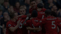
<div class="pnlResults {{getStage()}}" style="background-image: url(img/results_{{resultsGrade}}.jpg)">


And here we see the results! In the "poor" result, we get a picture of Sadio Mane looking really dejected. In the "good" result, Virgil Van Djik is being mobbed by the team.


Final Football Note

I finished writing this web tutorial just days after Liverpool won their 6th UEFA Champions League trophy. Still positively buzzing, so forgive me if the material comes up short.

You'll Never Code Alone,
T___T

Monday, 26 November 2018

Misfiring On User Experience

It's nearing the end of the month, and I'd like to share a little story that happened back when I was working in this tiny office as a wet-behind-the-ears web developer, and the valuable lesson I learned from it. My memory of the exact details are a little fuzzy, so bear with me if some of it doesn't make sense.

It all started with a little assignment...

Back then, my boss also doubled as a tech trainer, and he had a series of courses he marketed. At some point, he wanted me to write a course scheduler that would allow the user to pick a course, select the available dates and input his or her details. Discounted rates were available for prospective students who selected certain options (this little detail will be relevant later).

So I dug in and wrote the code. It was HTML and JavaScript, with a PHP back-end to send an email upon completion, with the details that the applicant had entered, to my boss. Within a day, I had the site up, and I was testing my JavaScript, and putting it through all the test cases I could think of. There were plenty of moving parts, so I had to be careful to try all options to ensure that the site displayed only the options that were available under certain conditions.

The site was up and running for a week. It seemed to work, and I received no complaints.

Change... and catastrophe

After a week, the boss requested that I make a slight change to the site. The discounted price would no longer be available no matter what options the applicant selected. I made the necessary adjustments, which amounted to some lines of code being commented out. It was a quick and dirty fix, but tests indicated that it worked.

Then one morning, all hell erupted. One applicant had somehow managed to get the discounted price on his application and raised a fuss when informed by my boss that the discounted price was no longer available. After the dust had settled, he was livid. He chewed me out for allowing this to happen. I didn't take it personally; I was too preoccupied trying to figure out where my tests had gone wrong.

Clicking repeatedly and randomly.

Speaking to the aggrieved applicant, it turned out that when the discounted price had not appeared, he simply assumed that it was a browser error and refreshed the page over and over again till he got the result he wanted. This somehow jammed up my asynchronous procedures, another reminder that where async is concerned, just getting correct output is never enough.

Rumination

When the dust settled, I took a long hard look at the entire thing I had set up, and the events that had led up to the catastrophe.

A user had succeeded in hacking the system; not by design, but by accident, which was worse. How could this have been prevented? Well, prevented is a strong word and presumes that the problem was technical. And yes, to an extent, it was. But there was a bigger picture behind this incident. Had the user known that the discounted price was no longer available, he would not have assumed that the system had calculated his final bill incorrectly and taken those actions.

What I learned from this, is that the importance of User Experience (UX) cannot be overestimated. The system had not even warned the user that the discount had been discontinued. There was no feedback that would take the user from one point to the next; no visibility. Sure, this would not have stopped a deliberate and determined hacker, but it would have made the system more user-friendly and forestalled the relatively innocent user from what I call "panic-clicking" and causing the system to malfunction. Not looking pretty is one thing; but clarity is important. When it gets to the point where the user is just randomly clicking around to see what happens, the system is failing. Not at a technical level, but at an interface level.

Lost in the interface.

Also, how many deliberate and determined hackers are there compared to the number of users with innocent intentions? I'd wager that the latter outnumbers the former by a factor of hundreds. Therefore, it's only good business sense to put in the extra bit of effort for those people.

Think about it: all it would have taken was a simple system message to inform the user that the discounted rate was no longer available! Such a simple thing, and so obvious in hindsight.

No matter how solid you think your code is, no matter how much you've tested the system, it will never be enough. Something's going to get through. Something you never foresaw. And if this can be mitigated with just a little more user-friendliness, it's worth it.

Till next time, stay UXcellent!
T___T

Saturday, 17 November 2018

Web Tutorial: The Smart Drop-down List (Part 1/3)

Howdy, and welcome to today's web tutorial!

We're going to make what I call a Smart Drop-down List. Not only can you select from this list, you can type in text and the list will show you only the options corresponding to that text. It's one of the most ubiquitous features in many UI packages today and you could probably just download one from the plethora of packages out there... or we could have some fun instead and make our own.

For that, let's first implement a classic drop-down list. It will be a very standard select element, id ddlCountries. The first option will be blank, and after that, I simply copied an entire list of countries from this site.

<!DOCTYPE html>
<html>
    <head>
        <title>Smart Drop-down List</title>

        <style>

        </style>

        <script>

        </script>
    </head>

    <body>
        <select id="ddlCountries">
            <option value="">(select one)</option>
            <option value="AF">Afghanistan</option>
            <option value="AX">Åland Islands</option>
            <option value="AL">Albania</option>
            <option value="DZ">Algeria</option>
            <option value="AS">American Samoa</option>
            <option value="AD">Andorra</option>
            ... (get the rest of the code here)
        </select>
    </body>
</html>


That's a very long list...


And what comes next, is that we wrap this within a div with a class of ddl_wrapper.
        <div class="ddl_wrapper">
            <select id="ddlCountries">
                <option value="">(select one)</option>
                <option value="AF">Afghanistan</option>
                <option value="AX">Åland Islands</option>
                <option value="AL">Albania</option>
                <option value="DZ">Algeria</option>
                <option value="AS">American Samoa</option>
                <option value="AD">Andorra</option>
                ... (get the rest of the code here)
            </select>
        </div>


Let's write the style for ddl_wrapper. Give it a black outline so we can see what's going on, set overflow to visible so that nothing gets cut off, and maybe a width and height, though height isn't really necessary.
        <style>
            .ddl_wrapper
            {
                outline: 1px solid black;
                overflow: visible;
                width: 200px;
                height: 30px;
            }
        </style>


Now you see that your drop-down list is encased within the div!


OK, here's the deal. We'll create something that simulates what this drop-down list does, and later hide this drop-down list.

So first, let's put in a div.
        <div class="ddl_wrapper">
            <div>

            </div>

            <select id="ddlCountries">
                <option value="">(select one)</option>
                <option value="AF">Afghanistan</option>
                <option value="AX">Åland Islands</option>
                <option value="AL">Albania</option>
                <option value="DZ">Algeria</option>
                <option value="AS">American Samoa</option>
                <option value="AD">Andorra</option>
                ... (get the rest of the code here)
            </select>
        </div>


Then add in two things - a text box with an id of txtCountries and another div containing the &#9660; symbol.
        <div class="ddl_wrapper">
            <div>
                <input placeholder="Countries" id="txtCountries">
                <div>&#9660;</div>
            </div>

            <select id="ddlCountries">
                <option value="">(select one)</option>
                <option value="AF">Afghanistan</option>
                <option value="AX">Åland Islands</option>
                <option value="AL">Albania</option>
                <option value="DZ">Algeria</option>
                <option value="AS">American Samoa</option>
                <option value="AD">Andorra</option>
                ... (get the rest of the code here)
            </select>
        </div>


Things looking a bit messy at the moment. Not to worry, we'll clean it up with some styling.


First, remove the black border in the ddl_wrapper CSS class.
        <style>
            .ddl_wrapper
            {
                outline: 0px solid black;
                overflow: visible;
                width: 200px;
                height: 30px;
            }
        </style>


Now, for the main div within the ddl_wrapper CSS class, give it a light grey border, and set the width to 100%. That means it'll occupy the entirety of the parent div.
        <style>
            .ddl_wrapper
            {
                outline: 0px solid black;
                overflow: visible;
                width: 200px;
                height: 30px;
            }

            .ddl_wrapper div
            {
                border: 1px solid #DDDDDD;
                width: 100%;
            }
        </style>


For the div with the &#9660; symbol, it's supposed to be clickable. So set the cursor property to pointer, give it a width of 10% and make it float right. Text alignment, border and padding are up to you, though I think the values I've used below work best.
        <style>
            .ddl_wrapper
            {
                outline: 0px solid black;
                overflow: visible;
                width: 200px;
                height: 30px;
            }

            .ddl_wrapper div
            {
                border: 1px solid #DDDDDD;
                width: 100%;
            }

            .ddl_wrapper div div
            {
                width: 10%;
                float: right;
                text-align: center;
                cursor: pointer;
                padding: 0;
                border: none;
            }
        </style>


As for the text box, give it 80% width, 90% height and set both the border and outline properties to none. This will make it totally seamless.
        <style>
            .ddl_wrapper
            {
                outline: 0px solid black;
                overflow: visible;
                width: 200px;
                height: 30px;
            }

            .ddl_wrapper div
            {
                border: 1px solid #DDDDDD;
                width: 100%;
            }

            .ddl_wrapper div div
            {
                width: 10%;
                float: right;
                text-align: center;
                cursor: pointer;
                padding: 0;
                border: none;
            }

            .ddl_wrapper div input
            {
                width: 80%;
                height: 90%;
                border: none;
                outline: none;
            }
        </style>


Looking much better now.


Now let's make it perform like a drop-down list! Insert an unordered list after the first div inside the div styled with ddl_wrapper. The id will be ulCountries. Make it disappear using an inline style attribute and display: none. Then put an onclick event in the "button". It should run the showList() function, passing in "Countries" and true as arguments.
            <div>
                <input placeholder="Countries" id="txtCountries">
                <div onclick="showList('Countries', true)">&#9660;</div>
            </div>

            <ul id="ulCountries" style="display:none;"></ul>


Let's write some JavaScript! The showList() function accepts two parameters - objName and showAll. objName is the name of the object you'll be accessing. In this case, it will be "Countries". showAll is a Boolean variable that tells you if we need to show the entire list or filter it by search. If we're clicking on the "button", that value is true. Because clicking on that button will show all results.

Declare two variables - ddl and ul. We'll use the objName parameter and the getElementById() method to derive the drop-down list and the unordered list. Initially, the unordered list will be empty.
        <script>
            function showList(objName, showAll)
            {
                var ddl = document.getElementById("ddl" + objName);
                var ul = document.getElementById("ul" + objName);

                ul.innerHTML = "";
            }
        </script>


Now let's toggle the unordered list. Each time you click on the "button", if the ulCountries list is hidden, it'll be displayed. If it's displayed, it'll be hidden. Bear in mind that this is only if showAll is true, which means the "button" has been clicked.
        <script>
            function showList(objName, showAll)
            {
                var ddl = document.getElementById("ddl" + objName);
                var ul = document.getElementById("ul" + objName);

                ul.innerHTML = "";

                if (showAll)
                {
                    if (ul.style.display == "none")
                    {
                        ul.style.display = "block";
                    }
                    else
                    {
                        ul.style.display = "none";
                    }
                }
            }
        </script>


After that, iterate through ddlCountries's options and add them, one by one, into the ulCountries! We do this by calling the addListItem() function and passing in objName, the current option's value and text as arguments.
        <script>
            function showList(objName, showAll)
            {
                var ddl = document.getElementById("ddl" + objName);
                var ul = document.getElementById("ul" + objName);

                ul.innerHTML = "";

                if (showAll)
                {
                    if (ul.style.display == "none")
                    {
                        ul.style.display = "block";

                        for (var i = 0; i < ddl.options.length; i++)
                        {
                            var opt = ddl.options[i];

                            addListItem(objName, opt.value, opt.text);
                        }
                    }
                    else
                    {
                        ul.style.display = "none";
                    }
                }
            }
        </script>


Now let's write the addListItem() function. It will accept the name of the object, and two other strings as parameters. val is the value of each option, and text is the displayed value.
        <script>
            function showList(objName, showAll)
            {
                var ddl = document.getElementById("ddl" + objName);
                var ul = document.getElementById("ul" + objName);

                ul.innerHTML = "";

                if (showAll)
                {
                    if (ul.style.display == "none")
                    {
                        ul.style.display = "block";

                        for (var i = 0; i < ddl.options.length; i++)
                        {
                            var opt = ddl.options[i];

                            addListItem(objName, opt.value, opt.text);
                        }
                    }
                    else
                    {
                        ul.style.display = "none";
                    }
                }
            }

            function addListItem(objName, val, text)
            {

            }
        </script>


Here, we declare the variable ul and repeat what we did in the showList() function. Then we use the createElement() method to create a list item.
            function addListItem(objName, val, text)
            {
                var ul = document.getElementById("ul" + objName);

                var li = document.createElement("li");
            }


Next, set the list item's displayed text to text, and append it to ddlCountries. For the time being, we won't use the val parameter.
            function addListItem(objName, val, text)
            {
                var ul = document.getElementById("ul" + objName);

                var li = document.createElement("li");
                li.innerHTML = text;
                ul.appendChild(li);
            }


Let's test this! Clicking on the "button" should toggle the list on and off! I know it looks shitty right now, but our objective is first to get it to work.


Now, what else should we implement? The list toggles on and off, but we can't select anything. That's what we'll do next. After setting the text, add an onclick handler that will run the selectOption() function with objName, val and text as arguments. Then create said function.
            function addListItem(objName, val, text)
            {
                var ul = document.getElementById("ul" + objName);

                var li = document.createElement("li");
                li.innerHTML = text;
                li.onclick = function()
                {
                    selectOption(objName, val, text);
                }
                ul.appendChild(li);
            }

            function selectOption(objName, val, text)
            {

            }


Here, we use objName to first do pretty much what we did for the other two functions, except that now we'll grab the textbox, txtCountries as well.
            function selectOption(objName, val, text)
            {
                var txt = document.getElementById("txt" + objName);
                var ddl = document.getElementById("ddl" + objName);
                var ul = document.getElementById("ul" + objName);
            }


Then we set the text in the txtCountries text box to text and ensure that ddlCountries is also set to val. After that, hide ulCountries.
            function selectOption(objName, val, text)
            {
                var txt = document.getElementById("txt" + objName);
                var ddl = document.getElementById("ddl" + objName);
                var ul = document.getElementById("ul" + objName);

                txt.value = text;
                ddl.value = val;
                ul.style.display = "none";
            }


Now try this. Click on the "button" and select, say, Ghana. Does "Ghana" appear in the text box? Does ddlCountries select Ghana too?


Next

It looks messy right now, so in the next part, we're going to pretty it up a bit. Stay with me!