Thursday, 5 March 2020

Web Tutorial: D3 Bar Chart (Part 3/4)

Every bar chart needs a scale. And the scale should fit the data it's meant for. The intervals can't be too granular, or it would be one tight squeeze. At the same time, making the intervals too large would pretty much make the scale useless.

So let's begin. Start by creating an array, scaleData. Then declare a variable, unitGrouping, initializing the value to 2. We don't make this a property of the config object because it's meant to be a temporary, throwaway variable.
filler
.style("width", function(d)
{
    return config.scaleWidth + "em";
})
.style("height", function(d)
{
    return config.legendHeight + "em";
});

var scaleData = [];
var unitGrouping = 2;

chart.selectAll("rect")
.data(dataSet.stats)
.enter()
.append("rect")
.attr("x", function(d, i)
{
    return ((i * (config.dataWidth + config.dataSpacing)) + 2) + "em";
})
.attr("y", function(d)
{
    return (height - (d * config.scale)) + "em";
})
.attr("width", function(d)
{
    return (config.dataWidth) + "em";
})
.attr("height", function(d)
{
    return (d * config.scale) + "em";
});


So as mentioned earlier, the scale has to fit the data. If the maximum data value is high, of course the intervals should be bigger. Right now unitGrouping is 2. If the max property of the config object (which we calculated earlier) is more than 10, we set unitGrouping to 5. If it's more than 20, we set it to 10.
var scaleData = [];
var unitGrouping = 2;
if (config.max > 10) unitGrouping = 5;
if (config.max > 20) unitGrouping = 10;


Now, let's iterate from 0 to the config object's max property. We want to scale it up a bit to leave space at the top even after displaying the largest data value, so multiply that by 1.5. At the last part of the For loop, increment i by unitGrouping.
var scaleData = [];
var unitGrouping = 2;
if (config.max > 10) unitGrouping = 5;
if (config.max > 20) unitGrouping = 10;

for (var i = 0; i < (config.max * 1.5); i += unitGrouping)
{
}


Then in the For loop, push each value into the scaleData array. These are the values we will use to populate the scale.
var scaleData = [];
var unitGrouping = 2;
if (config.max > 10) unitGrouping = 5;
if (config.max > 20) unitGrouping = 10;

for (var i = 0; i < (config.max * 1.5); i += unitGrouping)
{
    scaleData.push(i);
}


Now, use scale. We're going to insert line tags and use the scaleData array as data. Each appended line tag should be styled using the CSS class barChartLine, which we'll create later.
var scaleData = [];
var unitGrouping = 2;
if (config.max > 10) unitGrouping = 5;
if (config.max > 20) unitGrouping = 10;

for (var i = 0; i < (config.max * 1.5); i += unitGrouping)
{
    scaleData.push(i);
}

scale.selectAll("line")
.data(scaleData)
.enter()
.append("line")
.attr("class", "barChartLine");


Every line tag has x1, x2, y1 and y2 properties. That's easy to figure out. My intention is for each notch to be 1em in length, and be aligned to the right side of the scale. Therefore, x1 should be the width of the scale (which is the scaleWidth property of the config object), minus 1. x2 will be just the value of scaleWidth.
scale.selectAll("line")
.data(scaleData)
.enter()
.append("line")
.attr("class", "barChartLine")
.attr("x1", function(d)
{
    return (config.scaleWidth - 1) + "em";
})
.attr("x2", function(d)
{
    return config.scaleWidth + "em";
});


y1 and y2 will be the same, because each notch is a horizontal line. We want the notches to start from the bottom of the scale. So we take the height of the scale (which is the calculated value height) and deduct the value of d multiplied by the scale property of the config object. Since we used the scale property of the config object for the bars, we need to be consistent and use them here, too.
scale.selectAll("line")
.data(scaleData)
.enter()
.append("line")
.attr("class", "barChartLine")
.attr("x1", function(d)
{
    return (config.scaleWidth - 1) + "em";
})
.attr("y1", function(d)
{
    return (height - (d * config.scale)) + "em";
})
.attr("x2", function(d)
{
    return config.scaleWidth + "em";
})
.attr("y2", function(d)
{
    return (height - (d * config.scale)) + "em";
});


Let's not forget the CSS class barChartLine! Give it a 1px thickness and black outline.
.barLegendSvg text
{
    fill: rgba(0, 0, 0, 1);
    text-anchor: middle;
    font-weight: bold;


.barChartLine
{
    stroke: rgba(0, 0, 0, 1);
    stroke-width: 1px;
}


Good, good. Now it just needs some numbers.


Here, we use scale again to insert text tags. Again, we use scaleData as the dataset. The content is straightforward. For the most part, we use the value of d as is, unless it's 0. We don't want to display the 0 on the scale because that would just be silly.
scale.selectAll("line")
.data(scaleData)
.enter()
.append("line")
.attr("class", "barChartLine")
.attr("x1", function(d)
{
    return (config.scaleWidth - 1) + "em";
})
.attr("y1", function(d)
{
    return (height - (d * config.scale)) + "em";
})
.attr("x2", function(d)
{
    return config.scaleWidth + "em";
})
.attr("y2", function(d)
{
    return (height - (d * config.scale)) + "em";
});

scale.selectAll("text")
.data(scaleData)
.enter()
.append("text")
.text(function(d)
{
    return (d == 0 ? "" : d);
});


Now for the x and y values of the text tags. x will be even further left of the line tags, so deduct 3 from the scaleWidth property of the config object instead of just 1. For y, do what we did for the y1 and y2 properties of the line tags, but adjust slightly, by deducting 0.25em from the final value so that the notches will be aligned in the center of those numbers.
scale.selectAll("text")
.data(scaleData)
.enter()
.append("text")
.attr("x", function(d)
{
    return (config.scaleWidth - 3) + "em";
})
.attr("y", function(d)
{
    return (height - (d * config.scale - 0.25)) + "em";
})
.text(function(d)
{
    return (d == 0 ? "" : d);
});


Now try viewing appearances instead of goals, since the numbers are bigger. Do the intervals change? Yes, since the maximum number is now 49, the scale changes to increments of 10 instead of 5!


The scale text is a little large, however. Let's try to style it. We'll make it black and then make it half the current size.
.barScaleSvg
{
    width: 5em;
    height: 20em;
    float: left;
    background-color: rgba(0, 255, 0, 0.1);
}

.barScaleSvg text
{
    fill: rgba(0, 0, 0, 1);
    font-size: 0.5em;
}

.barChartSvg
{
    width: 20em;
    height: 20em;
    float: left;
    background-color: rgba(0, 0, 255, 0.1);
}


Refresh the page. You'll see that the text has shifted to the top left. That's because measurements of the layout and positioning are all in em, and that means reducing the font size will require a proportionate increase in the positioning values.


Do this. Adjust the x attribute. Instead of deducting 1em off the end, add 1em instead. As for the y attribute, every component in that equation has to be doubled.
scale.selectAll("text")
.data(scaleData)
.enter()
.append("text")
.attr("x", function(d)
{
    return (config.scaleWidth + 1) + "em";
})
.attr("y", function(d)
{
    return ((height * 2) - ((d * config.scale * 2) - 0.25)) + "em";
})
.text(function(d)
{
    return (d == 0 ? "" : d);
});


There you go. One last thing though.


This will align the numbers correctly.
.barScaleSvg text
{
    fill: rgba(0, 0, 0, 1);
    text-anchor: end;
    font-size: 0.5em;
}


Good job!


Adding a mean line

Now that we have a scale, it stands to reason that a line through the chart showing the average value would add to it greatly! We calculated the mean value earlier, and it's now the mean property of the config object. So now, in chart, just call the append() method. No need for all that other stuff because we're only appending one line and not going through an array of values. Give it the CSS class barChartDataMean.
chart.selectAll("text")
.data(dataSet.stats)
.enter()
.append("text")
.attr("x", function(d, i)
{
    return ((i * (config.dataWidth + config.dataSpacing)) + 2 + (config.dataWidth / 2)) + "em";
})
.attr("y", function(d)
{
    return (height - (d * config.scale) - 1) + "em";
})
.text(function(d)
{
    return d;
});

chart
.append("line")
.attr("class", "barChartDataMean");


For the x1 and x2 values, that's simple. It's from the left side of the chart to the right side, so naturally x1 is 0em and x2 is width.
chart
.append("line")
.attr("class", "barChartDataMean")
.attr("x1", function(d)
{
    return "0em";
})
.attr("x2", function(d)
{
    return width + "em";
});


And since it's a horizontal line, y1 and y2 will be the same. As in the bars, we'll use the value of height and deduct the value of the mean (multiplied by scale) properties of the config object.
chart
.append("line")
.attr("class", "barChartDataMean")
.attr("x1", function(d)
{
    return "0em";
})
.attr("y1", function(d)
{
    return (height - (config.mean * config.scale)) + "em";
})
.attr("x2", function(d)
{
    return width + "em";
})
.attr("y2", function(d)
{
    return (height - (config.mean * config.scale)) + "em";
});


Let's not forget to create the CSS class barChartDataMean. It's a 1 pixel dotted black line.
.barLegendSvg text
{
    fill: rgba(0, 0, 0, 1);
    text-anchor: middle;
    font-weight: bold;


.barChartDataMean
{
    stroke: rgba(0, 0, 0, 1);
    stroke-width: 1px;
    stroke-dasharray: 1, 5;


.barChartLine
{
    stroke: rgba(0, 0, 0, 1);
    stroke-width: 1px;
}


Do you see it? Try changing the values of the drop-down lists. The line should move with the data.


Next

The chart looks right, but we also want it to look nice. We will change the color scheme, mess about with the layout and add some D3 animations.

Tuesday, 3 March 2020

Web Tutorial: D3 Bar Chart (Part 2/4)

Time to render some data!

We're going to start off by creating a new object, config. This will hold values that will help scale the chart, and make adjustments according to the data presented.
var graphData =
{
    "cols":
    [
        {
            "title": "Adam Lallana",
            "stats":
            [
                {"year": 2015, "goals": 7, "appearances": 49},
                {"year": 2016, "goals": 8, "appearances": 35},
                {"year": 2017, "goals": 0, "appearances": 15},
                {"year": 2018, "goals": 0, "appearances": 16}
            ]
        },
        {
            "title": "Sadio Mané",
            "stats":
            [
                {"year": 2016, "goals": 13, "appearances": 29},
                {"year": 2017, "goals": 20, "appearances": 44},
                {"year": 2018, "goals": 26, "appearances": 50}
            ]
        },
        {
            "title": "Roberto Firminho",
            "stats":
            [
                {"year": 2015, "goals": 11, "appearances": 49},
                {"year": 2016, "goals": 12, "appearances": 41},
                {"year": 2017, "goals": 27, "appearances": 54},
                {"year": 2018, "goals": 16, "appearances": 48}
            ]
        },
        {
            "title": "Divock Origi",
            "stats":
            [
                {"year": 2015, "goals": 10, "appearances": 33},
                {"year": 2016, "goals": 11, "appearances": 43},
                {"year": 2017, "goals": 0, "appearances": 1},
                {"year": 2018, "goals": 7, "appearances": 21}
            ]
        },
        {
            "title": "Daniel Sturridge",
            "stats":
            [
                {"year": 2015, "goals": 13, "appearances": 25},
                {"year": 2016, "goals": 7, "appearances": 27},
                {"year": 2017, "goals": 3, "appearances": 14},
                {"year": 2018, "goals": 4, "appearances": 27}
            ]
        },
        {
            "title": "James Milner",
            "stats":
            [
                {"year": 2015, "goals": 7, "appearances": 45},
                {"year": 2016, "goals": 7, "appearances": 40},
                {"year": 2017, "goals": 1, "appearances": 47},
                {"year": 2018, "goals": 7, "appearances": 45}
            ]
        },
    ],
    "rows": [2015, 2016, 2017, 2018],
    "stats": ["goals", "appearances"]
};

var config =
{

};


These are the properties of the config object. All these numeric values are in units of em.

scale - defines how much bigger the chart will be than the actual values. So this value defines how much we want to scale up or down by. Any number less than 1 is a scaling down, while any number greater than 1 is a scaling up.
dataWidth - defines the width of the bar columns and legend labels.
dataSpacing - defines how much spacing there is between bars.
scaleWidth - that's the width of the scale, and the filler. It's already defined in the CSS, but that was just for illustration. We ideally want something more maintainable. Use, say, 6 as the value.
legendHeight - like scaleWidth, this defines the height of the legend, and the filler. Use 4 as the value.
max and mean - these are aggregated values of the displayed dataset and may change depending on the data. Both are initialized to 0.
var config =
{
    "scale": 0.5,
    "dataWidth": 10,
    "dataSpacing": 1,
    "scaleWidth": 6,
    "legendHeight": 4,
    "max": 0,
    "mean": 0
};


Now for the methods! As mentioned, the height and width of the chart depends on the data being displayed. Thus, we need a getChartHeight() method and a getChartWidth() method. The getChartWidth() method requires a parameter - the number of bars, to be precise. setData() is the method that renders all this. It will be the largest method.
var config =
{
    "scale": 0.5,
    "dataWidth": 10,
    "dataSpacing": 1,
    "scaleWidth": 6,
    "legendHeight": 4,
    "max": 0,
    "mean": 0,
    "getChartHeight": function()
    {

    },
    "getChartWidth": function(datalength)
    {

    },
    "setData": function ()
    {

    }
};


To get the chart height, first you get the maximum value of the dataset, which will be stored in the config object's max property, multiplied by the scale property. We then multiply the result by 1.5 just to add a little buffer at the top.
"getChartHeight": function()
{
    return (this.max * this.scale * 1.5);
},


For the getChartWidth() method, we use datalength (number of bars, remember?) multiplied by the sum of dataWidth property (how wide each bar is) and the dataSpacing property (how much pace there is between bars).
"getChartWidth": function(datalength)
{
    return (datalength * (this.dataWidth + this.dataSpacing));
},


And then we add a little spacing to the end, like, maybe half of datalength.
"getChartWidth": function(datalength)
{
    return (datalength * (this.dataWidth + this.dataSpacing)) + (datalength * 0.5);
},


Now, for the setData() method! We start with defining the data to be displayed. First, declare two variables, year and stat. Using the d3 object's select() method on the ddlYear and ddlStat drop-down lists will yield objects. Using the node() method on each will in turn yield an object whose value property is the drop-down list's selected value. In this case, it's "2015" and "goals" respectively.
"setData": function ()
{
    var year = d3.select("#ddlYear").node().value;
    var stat = d3.select("#ddlStat").node().value;
},


Next, create a dataSet object which holds the properties labels and stats. Both of these are empty arrays.
var year = d3.select("#ddlYear").node().value;
var stat = d3.select("#ddlStat").node().value;

var dataSet =
{
  "labels": [],
  "stats": []
};


Let's start grabbing the data from the graphData object. First, iterate through the cols array of the graphData object.
var dataSet =
{
  "labels": [],
  "stats": []
};

for (var i = 0; i < graphData.cols.length; i++)
{

}


Next, declare the variable filtered. Every element in cols has a stats array. This stats array should be run through the filter() function to return only the elements whose year property corresponds to year. The final result should be a single-element array, or an empty array, stored in filtered.
for (var i = 0; i < graphData.cols.length; i++)
{
    var filtered = graphData.cols[i].stats.filter(function(x) { return x.year == year;});
}


If filtered is not an empty array, use the push() function to add the title property into the labels array of the dataSet object. The value to push into the stats array of the dataSet object, should be the first (and only) element of the filtered object, either "goals" or "appearances". In this case, stat is "goals".
for (var i = 0; i < graphData.cols.length; i++)
{
    var filtered = graphData.cols[i].stats.filter(function(x) { return x.year == year;});

    if (filtered.length > 0)
    {
      dataSet.labels.push(graphData.cols[i].title);
      dataSet.stats.push(filtered[0][stat]);
    }
}


So now that we have our data, let's set the mean and max properties of the config object. For this, we can leverage on d3's aggregate methods, mean() and max(). Just pass in the stats array of the dataSet object for each, and for the second argument, provide an anonymous function. So convenient!
for (var i = 0; i < graphData.cols.length; i++)
{
    var filtered = graphData.cols[i].stats.filter(function(x) { return x.year == year;});

    if (filtered.length > 0)
    {
      dataSet.labels.push(graphData.cols[i].title);
      dataSet.stats.push(filtered[0][stat]);
    }
}

config.mean = d3.mean(dataSet.stats, function(d) { return d; });
config.max = d3.max(dataSet.stats, function(d) { return d; });


Now, use d3's select() method to get the div styled using the barChartContainer CSS class, and the barChart class, and assign those to the variables container and wrapper.

Declare variables height and width. For height, use the getChartHeight() method we created earlier. For width, use the getChartWidth() method. Pass in the size of the cols array of the graphData object, as an argument.
config.mean = d3.mean(dataSet.stats, function(d) { return d; });
config.max = d3.max(dataSet.stats, function(d) { return d; });

var container = d3.select(".barChartContainer");
var wrapper = d3.select(".barChart");

var height = config.getChartHeight();
var width = config.getChartWidth(graphData.cols.length);


Then set the width of container the D3 way, using the style() method. The total chart width should be the width of the chart area plus the width of the scale.
var container = d3.select(".barChartContainer");
var wrapper = d3.select(".barChart");

var height = config.getChartHeight();
var width = config.getChartWidth(graphData.cols.length);

container
.style("width", function(d)
{
    return (width + config.scaleWidth) + "em";
});


For wrapper, the height should be the chart height plus the height of the legend. Again, remember that units are all in em.
var container = d3.select(".barChartContainer");
var wrapper = d3.select(".barChart");

var height = config.getChartHeight();
var width = config.getChartWidth(graphData.cols.length);

container
.style("width", function(d)
{
    return (width + config.scaleWidth) + "em";
});

wrapper
.style("height", function(d)
{
    return (height + config.legendHeight) + "em";
});


You won't see any difference until you call the setData() method. Do that after populating the drop-down lists.
var ddlYear = d3.select("#ddlYear");

ddlYear.selectAll("option")
.data(graphData.rows)
.enter()
.append("option")
.property("selected", function(d, i)
{
    return i == 0;
})
.attr("value", function(d)
{
    return d;
})
.text(function(d)
{
    return d;
});

var ddlStat = d3.select("#ddlStat");

ddlStat.selectAll("option")
.data(graphData.stats)
.enter()
.append("option")
.property("selected", function(d, i)
{
    return i == 0;
})
.attr("value", function(d)
{
    return d;
})
.text(function(d)
{
    return d;
});

config.setData();


You can see that the chart area has changed!


Now, add these lines. These are event handlers that will fire off whenever the ddlYear or ddlStat drop-down lists' value is changed.
config.setData();

d3.select("#ddlYear").on("change", function() { config.setData(); });
d3.select("#ddlStat").on("change", function() { config.setData(); });


Change the year to, say, "2018". You'll see the chart area change again in accordance to the data! That's because there were a lot more goals scored in 2018. Or rather, in 2015 the leading goalscorer was Daniel Sturridge with 13 goals, but in 2018, the leading goalscorer was Sadio Mané with 26! So the max property of the config object was much higher for 2018, leading to the change in height.


Now, declare the scale, chart, legend and filler the same way.
var container = d3.select(".barChartContainer");
var wrapper = d3.select(".barChart");
var scale = d3.select(".barScaleSvg");
var chart = d3.select(".barChartSvg");
var legend = d3.select(".barLegendSvg");
var filler = d3.select(".barFillerSvg");

var height = config.getChartHeight();
var width = config.getChartWidth(graphData.cols.length);


For scale, set the width. This one is simple - it will be exactly how many em the scaleWidth property of the config object dictates.
container
.style("width", function(d)
{
    return (width + config.scaleWidth) + "em";
});

wrapper
.style("height", function(d)
{
    return (height + config.legendHeight) + "em";
});

scale
.style("width", function(d)
{
    return config.scaleWidth + "em";
});


Then set the height. It will be, in em, the height we earlier defined using the getChartHeight() method.
scale
.style("width", function(d)
{
    return config.scaleWidth + "em";
})
.style("height", function(d)
{
    return height + "em";
});


And then clear the contents of the object, making way for any SVG elements we'll insert later.
scale
.style("width", function(d)
{
    return config.scaleWidth + "em";
})
.style("height", function(d)
{
    return height + "em";
})
.html("");


You see what we're doing here?


Do the same for chart. Height and width are determined by what we got earlier using the getChartHeight() and getChartWidth() methods.
scale
.style("width", function(d)
{
    return config.scaleWidth + "em";
})
.style("height", function(d)
{
    return height + "em";
})
.html("");

chart
.style("height", function(d)
{
    return height + "em";
})
.style("width", function(d)
{
    return width + "em";
})
.html("");


Now that the scale and chart are aligned, you can see how they stack up.


Next is legend. We use the legendHeight property of the config object for the height, and use width for the width.
chart
.style("height", function(d)
{
    return height + "em";
})
.style("width", function(d)
{
    return width + "em";
})
.html("");

legend
.style("height", function(d)
{
    return config.legendHeight + "em";
})
.style("width", function(d)
{
    return width + "em";
})
.html("");


Now the legend is in place, and the only thing left is the filler.


Finally, filler. We use both scaleWidth and legendHeight properties for width and height respectively. No need to clear the HTML; we're never going to insert any SVG elements in it anyway. It's just filler to help align stuff.
legend
.style("height", function(d)
{
    return config.legendHeight + "em";
})
.style("width", function(d)
{
    return width + "em";
})
.html("");

filler
.style("width", function(d)
{
    return config.scaleWidth + "em";
})
.style("height", function(d)
{
    return config.legendHeight + "em";
});


Yes! Now the content fits the outline! And changing the values of the drop-down lists will adjust things accordingly!


Putting in data

Remember what we did with the drop-down lists? We'll be doing pretty much the same thing to populate data.

Use chart here as the element to fill, and use the selectAll() method with the argument "rect" because we are going to insert rect tags. Use the data() method and pass in the stats array of the dataSet object as an argument. Then, as in the code for the drop-down lists, use the enter() method and the append() method, passing in "rect" to the append method.
filler
.style("width", function(d)
{
    return config.scaleWidth + "em";
})
.style("height", function(d)
{
    return config.legendHeight + "em";
});

chart.selectAll("rect")
.data(dataSet.stats)
.enter()
.append("rect");


Now that we're appending rect tags as the bars, we need to define the width and height of those. For the width, we just use the dataWidth property of the config object. For height, we get a value that has been passed into the anonymous function, because that is the actual data value, and multiply it by the scale property of the config object. Remember that values are in em, so add that to your strings accordingly!
chart.selectAll("rect")
.data(dataSet.stats)
.enter()
.append("rect")
.attr("width", function(d)
{
    return (config.dataWidth) + "em";
})
.attr("height", function(d)
{
    return (d * config.scale) + "em";
});


We'll also want to set the x property, For that, we'll need to use the parameter i which determines which bar it is in the array. The x property defines how far away that bar is from the left side of the chart where the data starts. We'll add the dataWidth and dataSpacing properties of the config object, then multiply the result by i. Then we'll add 2 for some initial spacing.
chart.selectAll("rect")
.data(dataSet.stats)
.enter()
.append("rect")
.attr("x", function(d, i)
{
    return ((i * (config.dataWidth + config.dataSpacing)) + 2) + "em";
})
.attr("width", function(d)
{
    return (config.dataWidth) + "em";
})
.attr("height", function(d)
{
    return (d * config.scale) + "em";
});


Uh-oh! It's a bar chart all right and the bars look legit, but it's all upside down!


We need to set the y property as well. We know the maximum height of the chart and how to derive the height of each bar. So what we do is deduct the height of the bar from the height of the chart for the y value!
chart.selectAll("rect")
.data(dataSet.stats)
.enter()
.append("rect")
.attr("x", function(d, i)
{
    return ((i * (config.dataWidth + config.dataSpacing)) + 2) + "em";
})
.attr("y", function(d)
{
    return (height - (d * config.scale)) + "em";
})
.attr("width", function(d)
{
    return (config.dataWidth) + "em";
})
.attr("height", function(d)
{
    return (d * config.scale) + "em";
});


Nice.


But the bars on their own aren't enough to show us the value. So let's add some text! Again, we use the stats array from the dataSet object. Instead of appending rect tags, we will append text tags.
chart.selectAll("rect")
.data(dataSet.stats)
.enter()
.append("rect")
.attr("x", function(d, i)
{
    return ((i * (config.dataWidth + config.dataSpacing)) + 2) + "em";
})
.attr("y", function(d)
{
    return (height - (d * config.scale)) + "em";
})
.attr("width", function(d)
{
    return (config.dataWidth) + "em";
})
.attr("height", function(d)
{
    return (d * config.scale) + "em";
});

chart.selectAll("text")
.data(dataSet.stats)
.enter()
.append("text");


Use the text() method to input the value.
chart.selectAll("text")
.data(dataSet.stats)
.enter()
.append("text")
.text(function(d)
{
    return d;
});


For the x and y attribute, use the same thing we used for the rect tags.
chart.selectAll("text")
.data(dataSet.stats)
.enter()
.append("text")
.attr("x", function(d, i)
{
    return ((i * (config.dataWidth + config.dataSpacing)) + 2 + "em";
})
.attr("y", function(d)
{
    return (height - (d * config.scale)) + "em";
})
.text(function(d)
{
    return d;
});


It's all good. We just need a little adjustment.


For the y attribute, just deduct 1em from the final value.
chart.selectAll("text")
.data(dataSet.stats)
.enter()
.append("text")
.attr("x", function(d, i)
{
    return ((i * (config.dataWidth + config.dataSpacing)) + 2 + "em";
})
.attr("y", function(d)
{
    return (height - (d * config.scale) - 1) + "em";
})
.text(function(d)
{
    return d;
});


What a difference!


For the x attribute, you want to move the value to the middle of each corresponding bar. We know the width of each bar, so just divide that by 2 and add the resulting value to the final value!
chart.selectAll("text")
.data(dataSet.stats)
.enter()
.append("text")
.attr("x", function(d, i)
{
    return ((i * (config.dataWidth + config.dataSpacing)) + 2 + (config.dataWidth / 2)) + "em";
})
.attr("y", function(d)
{
    return (height - (d * config.scale) - 1) + "em";
})
.text(function(d)
{
    return d;
});


Good!


Let's add the labels!

Basically, we take legend and use the same method to append text tags, only this time we use the labels array of the dataSet object as an argument for the data() method.
chart.selectAll("text")
.data(dataSet.stats)
.enter()
.append("text")
.attr("x", function(d, i)
{
    return ((i * (config.dataWidth + config.dataSpacing)) + 2 + (config.dataWidth / 2)) + "em";
})
.attr("y", function(d)
{
    return (height - (d * config.scale) - 1) + "em";
})
.text(function(d)
{
    return d;
});

legend.selectAll("text")
.data(dataSet.labels)
.enter()
.append("text")
.text(function(d)
{
    return d;
});


For the x attribute, do what we did for the bar chart numbers. For the y attribute, maybe 1 or 2 em will do. Alternatively, just use the dataSpacing property of the config object.
legend.selectAll("text")
.data(dataSet.labels)
.enter()
.append("text")
.attr("x", function(d, i)
{
    return ((i * (config.dataWidth + config.dataSpacing)) + 2 + (config.dataWidth / 2)) + "em";
})
.attr("y", function(d)
{
    return config.dataSpacing + "em";
})
.text(function(d)
{
    return d;
});


You'll notice that the left edge of the legend text is just in the middle of each bar. It's the same for the bar chart numbers, only not quite so obvious because they're two-digit numbers.


Let's clean this up a tad. Style the text tags of the CSS classes barChartSvg and barLegendSvg. In both cases, they're set to black, bolded and most importantly, the text-anchor property is now "middle".
.barChartSvg
{
    width: 20em;
    height: 20em;
    float: left;
    background-color: rgba(0, 0, 255, 0.1);
}

.barChartSvg text
{
    fill: rgba(0, 0, 0, 1);
    text-anchor: middle;
    font-weight: bold;


.barFillerSvg
{
    width: 5em;
    height: 3em;
    float: left;
    background-color: rgba(0, 0, 0, 0.1);
}

.barLegendSvg
{
    width: 20em;
    height: 3em;
    float: left;
    background-color: rgba(255, 0, 0, 0.1);
}

.barLegendSvg text
{
    fill: rgba(0, 0, 0, 1);
    text-anchor: middle;
    font-weight: bold;
}


Looking reeeeal nice.


Try changing the values of the drop-down lists. The chart should change accordingly.


Next

There's only the scale left! Let's get on it...

Sunday, 1 March 2020

Web Tutorial: D3 Bar Chart (Part 1/4)

On the back of this web tutorial back in 2017, I did a little research into more modern ways to render charts. And presto, Data-Driven Documents, otherwise known as D3, popped up on my radar.

D3 is a charting and data visualization library that's fairly easy to get off the ground with. Today, we're going to render the animated Bar Chart using this library. We'll use pretty much the same data structure we used back then for Liverpool FC... but with some updates for 2020!

Also, D3 works better with SVG. A bar chart could quite easily be rendered using D3 and CSS but honestly, I'd recommend SVG any day of the week, if only to prime yourself for more complicated charts down the road.

Here, we have a basic HTML block. Let's set the default font.
<!DOCTYPE html>
<html>
    <head>
        <title>D3 Bar Chart</title>

        <style>
            body
            {
                font-size: 12px;
                font-family: arial;
            }    
        </style>
    </head>

    <body>

    </body>
</html>


Add in a link to the D3 JavaScript library. Also, for D3, an accepted convention is to have the script tag within the body tag.
<!DOCTYPE html>
<html>
    <head>
        <title>D3 Bar Chart</title>

        <style>
            body
            {
                font-size: 12px;
                font-family: arial;
            }    
        </style>

        <script src="https://d3js.org/d3.v3.min.js"></script>
    </head>

    <body>
        <script>

        </script>
    </body>
</html>


And then add a div with a class of barChartContainer, which will hold the entire thing.
<body>
    <div class="barChartContainer">

    </div>

    <script>

    </script>
</body>


In it, add two divs. One has an class of barDashboard, and the other, barChart.
<body>
    <div class="barChartContainer">
        <div class="barDashboard">

        </div>

        <div class="barChart">

        </div>
    </div>

    <script>

    </script>
</body>


In the first div, which is the dashboard, add two drop-down lists. Give them ids ddlYear and ddlStat. Don't give them any values yet!
<body>
    <div class="barChartContainer">
        <div class="barDashboard">
            <select id="ddlYear">

            </select>

            <select id="ddlStat">

            </select>
        </div>

        <div class="barChart">

        </div>
    </div>

    <script>

    </script>
</body>


Here's a preview of what you have...


Now, let's move on. The div that holds the bar chart will be made out of four SVGs. One is for the scale, and we will style it using the CSS class barScaleSvg.
<div class="barChart">
    <svg class="barScaleSvg">

    </svg>
</div>


The next one is for the data, and the class is barChartSvg.
<div class="barChart">
    <svg class="barScaleSvg">

    </svg>

    <svg class="barChartSvg">

    </svg>
</div>


Here we add a line break, making sure that it clears both sides of floats. You'll see why soon.
<div class="barChart">
    <svg class="barScaleSvg">

    </svg>

    <svg class="barChartSvg">

    </svg>

    <br style="clear:both"/>
</div>


Now we style the next SVG using CSS class barChartFiller. Because that's exactly what it is... filler. Nothing is going to go in there.
<div class="barChart">
    <svg class="barScaleSvg">

    </svg>

    <svg class="barChartSvg">

    </svg>

    <br style="clear:both"/>

    <svg class="barFillerSvg">

    </svg>
</div>


Finally, the last SVG using the CSS class barChartLegend. It will contain the names of the players.
<div class="barChart">
    <svg class="barScaleSvg">

    </svg>

    <svg class="barChartSvg">

    </svg>

    <br style="clear:both"/>

    <svg class="barFillerSvg">

    </svg>

    <svg class="barLegendSvg">

    </svg>
</div>


Let's do some styling!

The styling, by itself, makes no real difference to the final product. It's just to give you an idea of what your content placeholder SVGs look like now.

Let's style the barChartContainer CSS class to place everything middle of the screen...
body
{
    font-size: 12px;
    font-family: arial;
}

.barChartContainer
{
    margin: 0 auto 0 auto;
}


barDashboard takes up 100% width and is 2em in height. Use the text-align property to place everything in the middle. Give it a black outline.
body
{
    font-size: 12px;
    font-family: arial;
}

.barDashboard
{
    height: 2em;
    width: 100%;
    text-align: center;
}

.barChartContainer
{
    margin: 0 auto 0 auto;
}


barChart also has a black outline. Nothing else needs to be set.
body
{
    font-size: 12px;
    font-family: arial;
}

.barDashboard
{
    height: 2em;
    width: 100%;
    text-align: center;
}

.barChart
{
    outline: 1px solid #000000;
}

.barChartContainer
{
    margin: 0 auto 0 auto;
}


So far so good!


Now, let's style the placeholder SVGs. All of the SVGs will float left. For the scale and filler, we'll give a width of 5em to illustrate. The chart and legend will have a width of, say, 20em. As for heights, the scale and chart will be 20em tall, while the filler and legend will be 3em tall.
.barChartContainer
{
    margin: 0 auto 0 auto;
}

.barScaleSvg
{
    width: 5em;
    height: 20em;
    float: left;
}

.barChartSvg
{
    width: 20em;
    height: 20em;
    float: left;
}

.barFillerSvg
{
    width: 5em;
    height: 3em;
    float: left;
}

.barLegendSvg
{
    width: 20em;
    height: 3em;
    float: left;
}


Gve each of these SVGs a different background color, and set the opacity to 10%.
.barChartContainer
{
    margin: 0 auto 0 auto;
}

.barScaleSvg
{
    width: 5em;
    height: 20em;
    float: left;
    background-color: rgba(0, 255, 0, 0.1);
}

.barChartSvg
{
    width: 20em;
    height: 20em;
    float: left;
    background-color: rgba(0, 0, 255, 0.1);
}

.barFillerSvg
{
    width: 5em;
    height: 3em;
    float: left;
    background-color: rgba(0, 0, 0, 0.1);
}

.barLegendSvg
{
    width: 20em;
    height: 3em;
    float: left;
    background-color: rgba(255, 0, 0, 0.1);
}


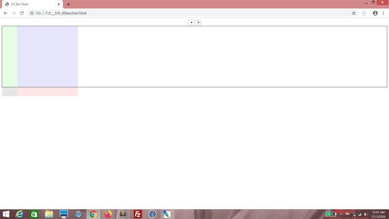
You should have a good idea of what your chart, sans all data, looks like now. That's really all there is to your HTML and CSS. We may make some adjustments to your CSS later, but that's about it.


The data

Right now, this is how the data looks like. If you need a recap of the data structure, hop on over to the original web tutorial here.
<script>
var graphData =
{
    "cols":
    [
        {
            "title": "Adam Lallana",
            "stats":
            [
                {"year": 2015, "goals": 7, "appearances": 49},
                {"year": 2016, "goals": 8, "appearances": 35},
                {"year": 2017, "goals": 0, "appearances": 15},
                {"year": 2018, "goals": 0, "appearances": 16}
            ]
        },
        {
            "title": "Sadio Mané",
            "stats":
            [
                {"year": 2016, "goals": 13, "appearances": 29},
                {"year": 2017, "goals": 20, "appearances": 44},
                {"year": 2018, "goals": 26, "appearances": 50}
            ]
        },
        {
            "title": "Roberto Firminho",
            "stats":
            [
                {"year": 2015, "goals": 11, "appearances": 49},
                {"year": 2016, "goals": 12, "appearances": 41},
                {"year": 2017, "goals": 27, "appearances": 54},
                {"year": 2018, "goals": 16, "appearances": 48}
            ]
        },
        {
            "title": "Divock Origi",
            "stats":
            [
                {"year": 2015, "goals": 10, "appearances": 33},
                {"year": 2016, "goals": 11, "appearances": 43},
                {"year": 2017, "goals": 0, "appearances": 1},
                {"year": 2018, "goals": 7, "appearances": 21}
            ]
        },
        {
            "title": "Daniel Sturridge",
            "stats":
            [
                {"year": 2015, "goals": 13, "appearances": 25},
                {"year": 2016, "goals": 7, "appearances": 27},
                {"year": 2017, "goals": 3, "appearances": 14},
                {"year": 2018, "goals": 4, "appearances": 27}
            ]
        },
        {
            "title": "James Milner",
            "stats":
            [
                {"year": 2015, "goals": 7, "appearances": 45},
                {"year": 2016, "goals": 7, "appearances": 40},
                {"year": 2017, "goals": 1, "appearances": 47},
                {"year": 2018, "goals": 7, "appearances": 45}
            ]
        },
    ],
    "rows": [2015, 2016, 2017, 2018],
    "stats": ["goals", "appearances"]
};
</script>


You can see I've replaced all the players from the mid 2000s with players from the tail end of the 2010s. Some of these guys just started playing for Liverpool when the last web tutorial was written! I've also used stats from all competitions rather than just the local league. We'll get bigger numbers this way.

Filling the drop-down lists

Now we're getting to the meat of the matter - D3 functionality. D3 has a very neat way of processing data, which we will leverage on to fill the drop-down lists. The drop-down lists are empty right now and they should be filled with the values of the elements from the rows and stats arrays. Back then, we had to use For loops to parse the data... well, now we no longer have to!

Let's begin with the ddlYear drop-down list. First, declare a variable, ddlYear and use the d3 object's select() method to get the DOM element ddlYear. Now ddlYear is a D3-enabled object.
<script>
var graphData =
{
    "cols":
    [
        {
            "title": "Adam Lallana",
            "stats":
            [
                {"year": 2015, "goals": 7, "appearances": 49},
                {"year": 2016, "goals": 8, "appearances": 35},
                {"year": 2017, "goals": 0, "appearances": 15},
                {"year": 2018, "goals": 0, "appearances": 16}
            ]
        },
        {
            "title": "Sadio Mané",
            "stats":
            [
                {"year": 2016, "goals": 13, "appearances": 29},
                {"year": 2017, "goals": 20, "appearances": 44},
                {"year": 2018, "goals": 26, "appearances": 50}
            ]
        },
        {
            "title": "Roberto Firminho",
            "stats":
            [
                {"year": 2015, "goals": 11, "appearances": 49},
                {"year": 2016, "goals": 12, "appearances": 41},
                {"year": 2017, "goals": 27, "appearances": 54},
                {"year": 2018, "goals": 16, "appearances": 48}
            ]
        },
        {
            "title": "Divock Origi",
            "stats":
            [
                {"year": 2015, "goals": 10, "appearances": 33},
                {"year": 2016, "goals": 11, "appearances": 43},
                {"year": 2017, "goals": 0, "appearances": 1},
                {"year": 2018, "goals": 7, "appearances": 21}
            ]
        },
        {
            "title": "Daniel Sturridge",
            "stats":
            [
                {"year": 2015, "goals": 13, "appearances": 25},
                {"year": 2016, "goals": 7, "appearances": 27},
                {"year": 2017, "goals": 3, "appearances": 14},
                {"year": 2018, "goals": 4, "appearances": 27}
            ]
        },
        {
            "title": "James Milner",
            "stats":
            [
                {"year": 2015, "goals": 7, "appearances": 45},
                {"year": 2016, "goals": 7, "appearances": 40},
                {"year": 2017, "goals": 1, "appearances": 47},
                {"year": 2018, "goals": 7, "appearances": 45}
            ]
        },
    ],
    "rows": [2015, 2016, 2017, 2018],
    "stats": ["goals", "appearances"]
};

var ddlYear = d3.select("#ddlYear");
</script>


We use the object's selectAll() method, and use it to select all option tags within the ddlYear object. Surprise - there aren't any! We're just using this selection as a placeholder for the option tags we are going to insert.
var ddlYear = d3.select("#ddlYear");

ddlYear.selectAll("option");


Using the method chaining that's modelled after jQuery syntax, we follow up by using the data() method. We pass the rows array of the graphData object as an argument, telling D3 that we want to use this set of data.
var ddlYear = d3.select("#ddlYear");

ddlYear.selectAll("option")
.data(graphData.rows);


The enter() method is next. This prepares ddlYear to add whatever new elements are needed.
var ddlYear = d3.select("#ddlYear");

ddlYear.selectAll("option")
.data(graphData.rows)
.enter();


This is followed up by the append() method, and since we want to append option tags, pass in "option" as an argument.
var ddlYear = d3.select("#ddlYear");

ddlYear.selectAll("option")
.data(graphData.rows)
.enter()
.append("option");


At this point, this is where we customize the option tags we're appending, with attributes. I want the first option to be selected by default, so I use the property() method, passing in "selected" as an argument. The second argument is a callback, for which I pass in arguments d and i, d representing the value of each element in the rows array and i representing the current index. Here, if i is 0, it returns true and false if not.
var ddlYear = d3.select("#ddlYear");

ddlYear.selectAll("option")
.data(graphData.rows)
.enter()
.append("option")
.property("selected", function(d, i)
{
    return i == 0;
});


I want to set the value of the option tag, so I use the attr() method and for the first argument, I pass in "value". For the second argument, I pass in a callback which returns me the value of d.
var ddlYear = d3.select("#ddlYear");

ddlYear.selectAll("option")
.data(graphData.rows)
.enter()
.append("option")
.property("selected", function(d, i)
{
    return i == 0;
})
.attr("value", function(d)
{
    return d;
});


The text() method is straightforward - it sets the text content in the element. Again, for the argument, we pass in a callback that returns the value of d, and we're done!
var ddlYear = d3.select("#ddlYear");

ddlYear.selectAll("option")
.data(graphData.rows)
.enter()
.append("option")
.property("selected", function(d, i)
{
    return i == 0;
})
.attr("value", function(d)
{
    return d;
})
.text(function(d)
{
    return d;
});


See, you now have a fully-populated drop-down list!


Do the equivalent for ddlStat.
var ddlYear = d3.select("#ddlYear");

ddlYear.selectAll("option")
.data(graphData.rows)
.enter()
.append("option")
.property("selected", function(d, i)
{
    return i == 0;
})
.attr("value", function(d)
{
    return d;
})
.text(function(d)
{
    return d;
});

var ddlStat = d3.select("#ddlStat");

ddlStat.selectAll("option")
.data(graphData.stats)
.enter()
.append("option")
.property("selected", function(d, i)
{
    return i == 0;
})
.attr("value", function(d)
{
    return d;
})
.text(function(d)
{
    return d;
});


Yep.


Next

Don't go away. We're going to do a lot more with what we've learned.