During an ongoing foray into the world of Data Analysis, I was introduced to a Data Visualization Tool known as
Tableau Desktop. Prior to that, my experience with Data Visualization had been limited to less sophisticated means - via the use of libraries such as D3; or worse, writing code without using libraries.
Tableau takes care of all the scaffolding required to produce passably decent-looking visualizations, and more.
It was picked up by
Salesforce in 2019, and this bodes well for its longevity. Today, I'd like to provide a quick overview of what makes
Tableau so attractive to a developer; or actually, just about anyone who needs a fuss-free way to analyze data beautifully.
The Premise
Tableau Desktop is used to manipulate one or more datasets, possibly joining them into a coherent whole, then using that data to create charts of several different types. From there, charts can be placed into dashboards, and in turn these dashboards can be used to form a Data Story.
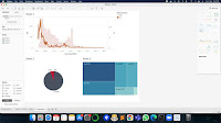 |
Dashboard and Data Stories
|
More intricate work such as interactivity can be added via Actions. Some of the cool things you can do using Actions are - redirect to another dashboard, open a URL, change data filters on an existing sheet, and more!
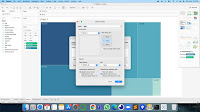 |
Actions
|
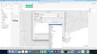
Data may also be manipulated using built-in functions provided by
Tableau.
 |
Built-in functions
|
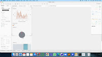
The Aesthetics
Tableau's color scheme, for the most part, is a very black and grey on a white background. That works for a clean look. Other colors come in once the charts are being created. By default, it's mostly a muted blue, but this can be customized.
 |
A clean aesthetic.
|
The Experience
It's fairly intuitive most of the time. Emphasis on "most". For simple charts, it's easy as pie (heh heh). For the more complicated chart types, the process becomes exponentially more complex. Perhaps it's just me, but trial and error reap little reward as opposed to consulting online documentation. Thankfully, the online documentation and tutorials are plentiful.
Response is fast, but in all honesty, the datasets I was working with were fairly limited.
The Interface
The majority of the controls on a drag-and-drop basis, with other functionality available via right-clicks and double-clicks. Options from the main menu duplicate this functionality in case the user prefers that route.
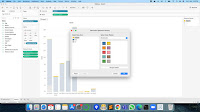
Sometimes there may be a bit of coding, and the interface allows for it. But there is plenty that can still be done without writing a single line of code. Most of the time, code is only involved when you want to do things like custom calculated fields and dashboard interactivity.
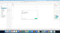 |
Code interface
|
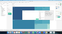
Additional levels of detail are available in menus upon right-clicking. There's a lot that is customizable.
 |
Many customizations
|
What I liked
Fast and responsive. I may have mentioned it before, but seeing data sort itself neatly into charts of various shapes without having to do much beyond drag and drop, is a beauty to behold.
Almost effortless.
Tableau saves you the trouble of having to painstakingly set up data visualization, by taking care of most of the hard work. All that's really left for the user is to customize the look and feel... and even then it's not a lot of work because the default setting already looks pretty decent.
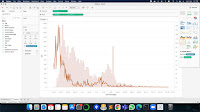
Huge variety of chart types. There are so many basic chart types, and variations on them. And quite a few I didn't even know existed.
 |
| Treemap |
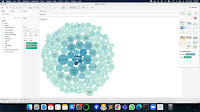 |
Bubble Chart
|
 |
Dual-axis Chart
|
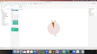 |
Pie Chart
|
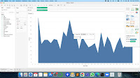 |
Filled Area Plot
|
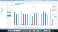 |
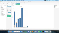
Grouped Bar Chart
|
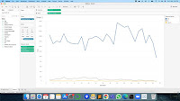 |
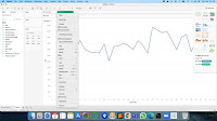
Line Chart
|
 |
Stacked Bar Chart
|
And while I might not use it much, I'd like to take a moment to gush about geographical data.
Tableau has all that covered. If you define data as Geographical, it gives you visual representation on an actual map.
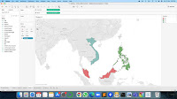 |
Geographical data
|
 |
Country names
|
And if you further break it down into county level, it actually has updated information on that as well! This is what it looks like for Singapore! Awesome, right?!
 |
County names
|
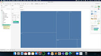
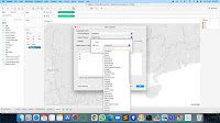
The different screen layout options for dashboards is a really nice touch.
Tableau does have a nose for the essentials.
 |
Layout for screen sizes
|
Online resources are vast. There will be times when you need help from more experienced users. It's out there, in spades. The
official documentation, on its own, is already pretty comprehensive.
What I didn't
Tableau can be complicated. While the interface is pretty intuitive and most basic uses cases can be resolved with relative ease, beyond that, there are times where things get tricky. Putting together something like a stacked bar chart, for example, can be a matter of a ridiculous amount of trial and error. Thankfully, for such scenarios, the extensive online documentation covers it more often than not.
Tableau would really benefit from an "Idiot Mode" - some step-by-step interface where the user chooses the visualization required and the software provides a guide as to what to drag/drop, and where.
Conclusion
There are probably many Data Visualization software packages out there which I haven't had the pleasure of using (unless one counts Microsoft's Excel or Google Charts), so do bear in mind that my frame of reference is woefully limited. However, having had the experience of having to create visualizations without the use of such a tool, my experience with
Tableau Desktop has been overwhelmingly positive.
My Rating
8.5 / 10
Give it a go; it'll bleau your mind!
T___T


No comments:
Post a Comment