Friday, 6 September 2019

Fiction Review: The Millennium Series Graphic Novels (Part 3/3)

Time for a side-by-side comparison!

Now, it's pretty obvious that I prefer the Titan version to the Vertigo version. But not in every case. While Titan's version was, in my opinion, superior overall, Vertigo did some things better.

Character illustrations

I'm gonna say that Titan was better with the character illustrations, because the crew of artists they had on this, did things more consistently. Vertigo's artists sometimes made the characters look completely different from panel to panel. It was like at some point, they just couldn't be arsed anymore.

Vertigo's version Titan's version

Annika Giannini

Dragan Armansky

Nils Bjurman

Jan Bublanski

Richard Ekström

Erika Berger

Holger Palmgren

Lisbeth Salander

Mikael Blomkvist

Miriam Wu

Ronald Neidermann

Plague

Sonia Modig

Peter Teleborian

Zala


Iconic scenes

Bjurman rapes Lisbeth. For sheer brutality on-canvas, Vertigo picks up a disturbing win. Titan's frenetic depiction of Lisbeth's rape at the hands of Nils Bjurman is stomach-churning, but Vertigo hits the ball out of the park with their dully-hued, unflinching rendition. I winced. And for eliciting that reaction, I declare Vertigo the victor.

Vertigo's version (the panels
leading up to it are even worse)

Titan's version looks bad, but trust
me when I say it's tame
compared to Vertigo's.
Bjurman gets tattooed. Both versions are evenly matched in their depictions of Lisbeth's grisly revenge on Bjurman, but one thing makes Titan's version stand out - the tattoo is in Swedish. Detail is everything, and Titan nails this one hard.

Vertigo's version: acceptable.

Titan's version: better.

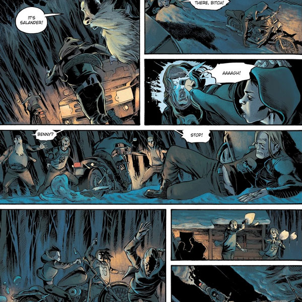
Lisbeth taking on the Svavelsjö Motorcycle Club. Vertigo doesn't embellish details and delivers a faithful retelling on how Lisbeth took on two bikers. Titan tries to bring it up a notch here by showing her against six. I think it's important to remember here that while Lisbeth Salander is a badass, she's primarily a superhacker. And she's so compelling precisely because she doesn't have the power to outfight and outrun everybody; every victory of hers is down to preparation and element of surprise. For believability and staying true to the spirit of the character, Vertigo wins this round.

Vertigo is suitably restrained here.

Titan overdoes it.

Roberto Paolo fights Ronald Neidermann. Vertigo doesn't deviate from the source material, but the art feels sloppy. Titan does the art better, though they tweak the story considerably by having Roberto be rescued when the car runs Neidermann down. Let's call this one a draw.


Honestly, Vertigo's version
does nothing for me.

Titan's implementation is nicer, though
I take issue with the storyline changes.

Lisbeth axes Zala. OK, I'm undecided here. Vertigo's version is suitably creepy what with the choice of colors and all, but again, the art feels sloppy. Titan's art is way better, but the setting feels just a bit too bright. For sheer effort and artistry, though, Titan's version emerges victorious.


I didn't include any scenes from The Girl Who Kicked The Hornet's Nest, because by then, Titan had deviated so much from the storyline that comparisons didn't feel meaningful anymore.

Conclusion

As mentioned, I liked Titan's version better. Just wasn't a big fan of the way they mangled the storyline. Their art certainly was better in terms of the drawing and details and yes, consistency.

Vertigo was more evocative with the use of color, and they showed more respect for Stieg Larsson's work. In spirit, it does feel more like a Lisbeth Salander story. But dammit, in some places, the art sucks so much. It's a bummer. There were times when the graphic novels were really good, but unfortunately, those times came fewer and further in between as the story progressed.

Titan wins this one by a hair.

An effort of Titanic proportions! Well done!
T___T

Wednesday, 4 September 2019

Fiction Review: The Millennium Series Graphic Novels (Part 2/3)

This version was published by Titan Comics in 2017. The adaptation was by Sylvain Runberg, with artwork by José Homs and Manuel Carot.


Covers by Claudia Ianiciello.

The Premise

Once again, the entire arc of The Girl with the Dragon Tattoo, The Girl Who Played With Fire, and The Girl Who Kicked The Hornet's Nest, is covered. However, there were extensive changes to the story, and while the outcome in the end remains pretty much the same, the changes are large enough to impact any future adaptations based on the David Lagercrantz novels.

The Characters

José Homs and Manolo Carot keep their art very consistent with each other's. The characters are rendered beautifully and with style.

The Mood

There are plenty of color schemes that signal a change in mood. When Lisbeth is doing her computer hacking schtick, it's predominantly blue. When there's a flashback, it's shades of grey and brown. And in between, everything's done in brilliant color.

What I liked

The art. Damn, I could rave about the art forever. The panels are smaller and there's a painstaking amount of detail put in each panel. The artists sure don't believe in the adage "less is more". No, they threaten to overwhelm you with detail. Like the clutter in Plague's apartment, for instance. Or the little shout-outs in the panels. Look at these...

See that sly nod to Noomi Rapace?

And that shout-out to Robert Englund!

And what about the numerous angles? The artists play with them all the time, sometimes giving us a top-down perspective, or a mouse-eye's view. It's spectacular.

One thing I really appreciate about the art, particular to the characters. The faces are very expressive. Mikael yells, looks smug, sympathetic, and more. Lisbeth, well, either smirks or scowls. Miriam rolls her eyes. Erika teases, scolds, and shows fear and trepiditation. Armansky ponders, pleads and commands. When Sonia Modig meets Zala, there's a delightful expression of revulsion on her face.

In many panels, Lisbeth is drawn to look like Ruby Rose. I kind of like Ruby Rose.

The numerous flashbacks throughout the series were great. They're not strictly part of the novels, but they serve to tell the story a great deal more coherently when you see snippets of the serial killer at work interspersed with what's going on during the story.

The iconic scenes are lovingly rendered. Take this shot of Lisbeth entering the courtroom below.

Awesome!

What I didn't

There was a whole shitload of plot changes. I can understand the author wanting to put his own spin on things, but some of those changes felt like change for the sake of change. Some of these tweaks are minor and can be amusing - like Lisbeth learning that Holger is still alive at a hockey game instead of Armansky's office. Or Neidermann getting nailed in the hands rather than the feet. Monica Figuerola has been almost completely written out and only makes a short appearance (under a different first name, no less). I can live with those.

But there are significant deviations in the plot that feel off. Peter Teleborian is shown to have physically molested Lisbeth as a kid, whereas in the novel he somehow seemed scarier because he restricted himself to psychological abuse. Lisbeth takes on a group of guys from the Svavelsjö Motorcycle Club instead of just two. The entire plot point of Lisbeth getting buried alive by Zala and Neidermann, has been reworked till it's almost unrecognizable. There's more, but I don't want to go into those at the moment.

In Runberg's version of events, Camilla Salander has become Lisbeth's forgiving and very non-criminal twin sister, unlike the role she plays in The Girl In The Spider's Web, the supposed follow up to the events of The Girl Who Kicked The Hornet's Nest by David Lagercrantz. It's probably safe to say that Runberg will not be adapting Lagercrantz's novels the way he did Larsson's.

Some of the characters emoted way too much. Lisbeth, in particular, is known for her simmering rage and tranquil fury, but in Runberg's narrative, she hams it up a whole lot. Her temper gets a lot more explosive. Mikael is less clever and assured, and more anxious. Angsty, even. Plague, too, gets some characterization inserted in the form of a sci-fi convention hobby.

Conclusion

If this were a piece of work unto itself, I'd give it top marks. The story was decent, with amazing visuals. But as an adaptation, it falls far short in terms of the plot. There are way too many deviations around the middle and end, and this leads to a noticeably different look and feel by the end of the story.

My Rating

7 / 10

Next

Comparing the Vertigo and Titan versions!

Sunday, 1 September 2019

Fiction Review: The Millennium Series Graphic Novels (Part 1/3)

If you liked my writings on The Millennium Series and the movies, here's some good news - they actually have graphic novels, published a few years back, based on the original works of Stieg Larsson.

If you didn't like them, well, tough titty I guess. I will be reviewing them today. I won't go through the storyline or the characters much - they've been covered in excruciating detail in my previous reviews of the books and the movies.

There are two series of graphic novels - one released in 2014 by Vertigo, and another published in 2017 by Titan. Why people thought the world needed two series of graphic novels will forever remain a mystery to me, but I ain't complaining. I will be reviewing Vertigo's version first, adapted by Denise Mina, with art by Antonio Fuso, Leonardo Manco and Andrea Mutti.


Covers by Lee Bermejo.

The Premise

These graphic novels by Vertigo covers the entire story arc of The Girl with the Dragon Tattoo, The Girl Who Played With Fire, and The Girl Who Kicked The Hornet's Nest. While there have been a few changes, it's pretty much all there.

The Characters

These are how the characters are drawn. For the purposes of brevity, I'm only going to include characters that appear in at least two out of all three graphic novels in the series, regardless of how great or small their roles are. You'll notice that they aren't all done by the same artist.

The Mood

The art is a study in contrast. There are parts where the colors are bland and light, but when Lisbeth goes to her really bad place, the colors get dimmer and bleaker. It's... interesting.

What I liked

Holy shit, the violent bits are horrifying. They're suitably grim and bloody.

The dialogue is different from the books, but they gel with the overall spirit of the story, and in some cases, work better. In fact, the dialogue feels distinctively American.
Dirch Frode: Best report I've ever read.
Dragan Armansky: Miss Salander's clients always say that.
Dirch Frode: Strange manner though.
Dragan Armansky: They always say that too.

Miriam Wu: (about Faste) Please tell me that guy isn't a rapist.
Jan Bublanski: Officer Faste is not a rapist, nor in any way inclined towards rape. He was very taken with your picture in the apartment. I think he's a little lovestruck.

Erika Berger: I'm leaving. Right now. Forever. And I'm appointing you acting chief editor.
Anders Holm: ...I still hate you.
Erika Berger: That's still mutual.


For the most part, what goes on in the graphic novel is pretty faithful to the novels, and haven't been cut out the way they have in the movies. Take the entire arc of Lisbeth's little vacation in the Carribbean in The Girl Who Played With Fire, for instance, pictured below.

A hotmail address, no less!

In that scene, they even featured Plague's email address! A nice little nod to the novels.

What I didn't

In many places, the art is pretty meh. The artists don't appear to have their hearts in it, and just seem to really put in effort at the more iconic scenes. Also, the art feels very inconsistent because there's a few illustrators at work here. Some of the art is really good and some is... ugh.

Mikael Blomkvist looks a little too much like Daniel Craig. Oh God, please, no. Even the scenes of him in bed with Lisbeth show off an unbelievably buff bod.

Geez, really?

I can't believe I'm complaining about this, but there are times when this graphic novel series is a little too faithful to the original. Even the time-wasting parts such as Erika Berger's encounter with a stalker, are reproduced.

Conclusion

The writing is good, but the inconsistent quality of the art really brings this series down several notches. Below-par effort. And it's a pity because I like Vertigo's stuff.

My Rating

6 / 10

Next

Another series came about three years after this one was published. Let's take a look at it!