Tuesday 29 March 2022

A Year of Learning Data Analytics (Part 2/2)

All in all, the first term went by smoothly. There was a bit of a time crunch when semestral assignments were due and the timing coincided with the festive periods of Christmas and Chinese New Year - moneymakers for my company.

Preparation, preparation,
preparation.

Fortunately, I've always been a proponent of doing my coursework and required reading (usually provided via LinkedIn Learning) on time, sometimes in advance. In fact, tutorial sessions for me weren't for doing the exercises, but for clarifying any doubts I encountered while making the above-mentioned advance preparations for those tutorial sessions.

The second term was a little more alien in terms of familiar territory, but it was entirely within expectations on that score.

Learning Statistics

Now, this subject was both fascinating and intimidating in equal measure. It involved a shit ton of mathematics and formulae. Fortunately, it was not necessary to memorize most of the formulae since the objective was to use Python for the calculations, and Python utilizes built-in libraries for said calculations. So the point here was usually to understand the objective of the calculations, and what numbers to use in order to feed the Python library functions and arrive at the required conclusions.


Statistics in action.

What we were given were statistical concepts such as Z-score, P-hat and Hypothesis Testing that I understood after some studying, but never quite hammered into my brain. Good thing there wasn't some kind of year-end exam, eh?

Learning Data Wrangling

Data Wrangling was an expansion on all the data cleaning that we did in the previous term while working with Data Visualization. Using Python, we codified and cleaned data to make it more consistent and usable. In fact, we took it a step further and converted all data to make it suitable for Machine Learning. This went a little further down the rabbit hole than I really wanted to go.

Box-and-Whiskers.

Still, there were some nifty tricks I picked up. This was the first time I ever encountered a Box-and-Whiskers chart, or used a Heat Map to find correlation.

All the Python I had learned during the previous term came in useful, because we really used a lot of it for this subject. In fact, the assignment for this subject was really tough. I spent many weekends on this, revising my code and the consequent report, and even then it just felt like I hadn't done enough.

The Educational Conclusion

Last October, I received this lovely letter from Ngee Ann Polytechnic. I was no longer a student. I'd graduated, with what felt like my hundredth Diploma at this point. Technically, only my fourth, but that's three more Diplomas than most people ever manage. My grades ranged from Bs to an A Plus. I didn't get a Distinction, but an A Plus is one step below that. It confirms what I've always known - that while my intelligence is painfully average, my enthusiasm and willingess to grind out results is always going to be the deciding factor.

Self-congratulations aside, this experience really made me feel my age. By the time I was done with my newly-minted Specialist Diploma in Data Analytics, I was a spent force for a while there. The fatigue was unbelievable, and this was actually easier on me than previous experiences! Even with my usual strategy of planning work on time instead of leaving it to the last minute, this was a strain. To be honest, I'm not sure how long I can keep this up.

However, as usual, I'm thankful for everything I've learned and committed to using whatever I can. It's only one more qualification on my ever-expanding list, but the myriad of things I discovered en route to this, is nothing to sniff at.


Keep learning!
T___T

Sunday 27 March 2022

A Year of Learning Data Analytics (Part 1/2)

During the COVID-19 pandemic that shook the world, people underwent varying degrees of distress and discomfort. Consequently, we all coped in different ways. I, personally, in addition to working from home and enduring lockdowns, was putting up with being separated from Mrs TeochewThunder. I coped by keeping myself really busy.

More specifically, I signed up for yet another Specialist Diploma. This one was in Data Analytics.

No, I'm not some kind of masochist. But as a software developer, it was a professional obligation on my part to take an interest, if not be some kind of Jedi Master, in the various ways new skills could be picked up and applied. Also, I was past 40 at this point and the financial burden of taking up these courses was made negligible by generous subsidies from the Singapore government.

And what better time to do this, than at a time I didn't really have much else going on? What else would I be doing with my time - planning overseas vacations I couldn't go to? It wasn't like FOMO was going to kick in here. Also, as mentioned before in a prior blogpost, I had been exploring Data Visualization and this looked like a good direction to continue.

So yep. I bit the bullet.

Lessons delivered
via video call.

After all the messy administration work, the October of 2020 arrived and it was time to start learning shit. Since this was the COVID-19 pandemic, there would be no exams. All lessons would be delivered via video calls and we would be assessed on coursework such as school projects and weekly assignments. Another small mercy, because the biggest pain in the ass I remember from past experience was all the traveling to and from school and office. Now with strict lockdowns imposed due to the pandemic, no more of this crap!

Learning Python

The first term started fairly simple. It involved one of my favorite activities - learning a new programming language. This language was Python, and while I had dabbled with it in the past, now I had actual professional guidance. On my MacBook, I installed Jupyter and that was my IDE.

Programming in Python.

Of course, we had to deal with the usual basic stuff like operators, logic blocks and iteration. But once we got past that, wow, Python's data structures were really something. I'm talking lists, arrays, dictionaries, series, datasets, the works. And at the end of it, by the time we got to HTML scraping using Python libraries, I was convinced. Python is some seriously good shit.

Not having to hunt for missing semi-colons and do curly brackets, was a nice change. It didn't even bother me too much that Python insists on proper indentation - I do that all the time anyway. Generally, just in terms of syntax alone, Python gave me almost as much pleasure as Ruby.

Learning Data Visualization

As mentioned earlier, Data Visualization was one of the areas I was looking to expand on. My instructors went one better - they delved into storytelling. I had expected maybe a little bit of D3 or some frontend code or other. Instead, I was given Data Visualization software to work with.

Dashboards and storytelling.

This was Tableau Desktop, and it made my work a whole lot easier, especially when you consider that it wasn't just Data Visualization, there was also the storytelling part I had to contend with. I was also shown a whole new world of storytelling with regard to data - how other people did it, and all the fascinating examples of how one could visually represent data to present a narrative.

There was plenty more to the science of storytelling, but all that can be explored at another time.

Next

A look at the second term.

Sunday 20 March 2022

Web Tutorial: The Highcharts Line Chart

Welcome to TeochewThunder's next web tutorial!

We covered the creation of a Highchart's column chart last year, and today we will dive right into creating a line chart. This is going to be a piece of cake, because all we really need to do is make a few adjustments.

If you need the previous code, you can get it here. This is important, because in true lazy programmer fashion, we will just be modifying the code to get what we want. No point repeating ourselves here, right?

Editor's Note: The screenshots provided for the title are inaccurate due to an error in the code, retroactively detected.

One of the first things we should change is the title.
<title>Line Chart</title>


We will then follow up with a name change to the function.
function renderLineChart()


... and the call in the HTML.
<div id="dashboard">
    <label for="ddlSeason">
        SEASON
        <select id="ddlSeason" onchange="renderLineChart()">

        </select>
    </label>

    <label for="ddlStat">
        STATISTICS
        <select id="ddlStat" onchange="renderLineChart()">
            <option value="appearances" selected>Appearances</option>
            <option value="goals">Goals</option>
        </select>
    </label>
</div>


... and in the JavaScript. Comment it out for now, as well.
//renderLineChart();    


And now for a major change. Line charts are most useful when they show statistics over a time period. So for this, we will change the drop-down list to make players selectable instead of seasons. The intended effect is that we can view statistics from player to player, and the line will display the statistics over different seasons.
<label for="ddlPlayer">
    PLAYER
    <select id="ddlPlayer" onchange="renderLineChart()">

    </select>
</label>


So we can get a list of the players from the data with this. The variable players is declared as an empty array.
var ddlPlayer = document.getElementById("ddlPlayer");
var keys = Object.keys(data);
var players = [];

for(let i = 0; i < keys.length; i++)
{
    var option = document.createElement("option");
    option.value = keys[i];
    option.innerHTML = keys[i];
    ddlSeason.appendChild(option);
}


We use a For loop to go through the data. This has not changed. What has changed is that we populate players with each element from the categories property of the current data object. And create an option to populate the drop-down list. Also, remember to rename the drop-down list!
var ddlPlayer = document.getElementById("ddlPlayer");
var keys = Object.keys(data);
var players = [];

for(let i = 0; i < keys.length; i++)
{
    for(let j = 0; j < data[keys[i]]["categories"].length; j++)
    {

        var option = document.createElement("option");
        option.value = data[keys[i]]["categories"][j];
        option.innerHTML = data[keys[i]]["categories"][j];
        ddlPlayer.appendChild(option);    
    }
}

//renderLineChart();


To avoid duplication, we use a conditional block to check if the current player name is already in the players array before the operation. And if not, in addition to the operation, we push the value into the players array.
var ddlPlayer = document.getElementById("ddlPlayer");
var keys = Object.keys(data);
var players = [];

for(let i = 0; i < keys.length; i++)
{
    for(let j = 0; j < data[keys[i]]["categories"].length; j++)
    {
        if (players.indexOf(data[keys[i]]["categories"][j]) == -1)
        {
            players.push(data[keys[i]]["categories"][j]);


            var option = document.createElement("option");
            option.value = data[keys[i]]["categories"][j];
            option.innerHTML = data[keys[i]]["categories"][j];
            ddlPlayer.appendChild(option);    
        }
    }
}

//renderLineChart();


Here we go, that's a good start!


The data

We won't change the data... but we will massage it into a form that the line chart will read properly. First, declare reasons and values as arrays. Also declare keys the same way we did previously.
function renderLineChart()
{
    var player = document.getElementById("ddlPlayer").value;
    var stat = document.getElementById("ddlStat").value;

    var arrAverage = [];
    var total = 0;

    var keys = Object.keys(data);
    var seasons = [];
    var values = [];


    for(let i = 0; i < data[season][stat].length; i++)
    {
        total += data[season][stat][i];
    }

    for(let i = 0; i < data[season][stat].length; i++)
    {
        arrAverage.push(parseFloat((total / data[season][stat].length).toFixed(2)));
    }


Iterate through keys, which is a list of seasons. declare playerIndex. We will use it to store the index position of player within the categories array of the current object. Then check if player actually exists within that array by making sure playerIndex is not -1.
var player = document.getElementById("ddlPlayer").value;
var stat = document.getElementById("ddlStat").value;

var arrAverage = [];
var total = 0;

var keys = Object.keys(data);
var seasons = [];
var values = [];

for(let i = 0; i < keys.length; i++)
{
    var playerIndex = data[keys[i]]["categories"].indexOf(player);
    if (playerIndex != -1)
    {

    }
}

for(let i = 0; i < data[season][stat].length; i++)
{
    total += data[season][stat][i];
}

for(let i = 0; i < data[season][stat].length; i++)
{
    arrAverage.push(parseFloat((total / data[season][stat].length).toFixed(2)));
}


If so, push the season into seasons. And push the value (determined by stat) into values.
var player = document.getElementById("ddlPlayer").value;
var stat = document.getElementById("ddlStat").value;

var arrAverage = [];
var total = 0;

var keys = Object.keys(data);
var seasons = [];
var values = [];

for(let i = 0; i < keys.length; i++)
{
    var playerIndex = data[keys[i]]["categories"].indexOf(player);
    if (playerIndex != -1)
    {
        seasons.push(keys[i]);
        values.push(data[keys[i]][stat][playerIndex]);

    }
}

for(let i = 0; i < data[season][stat].length; i++)
{
    total += data[season][stat][i];
}

for(let i = 0; i < data[season][stat].length; i++)
{
    arrAverage.push(parseFloat((total / data[season][stat].length).toFixed(2)));
}


Then we iterate through values twice using For loops, and derive total and average values using the elements of values instead.
var player = document.getElementById("ddlPlayer").value;
var stat = document.getElementById("ddlStat").value;

var arrAverage = [];
var total = 0;

var keys = Object.keys(data);
var seasons = [];
var values = [];

for(let i = 0; i < keys.length; i++)
{
    var playerIndex = data[keys[i]]["categories"].indexOf(player);
    if (playerIndex != -1)
    {
        seasons.push(keys[i]);
        values.push(data[keys[i]][stat][playerIndex]);
    }
}

for(let i = 0; i < values.length; i++)
{
    total += values[i];
}

for(let i = 0; i < values.length; i++)
{
    arrAverage.push(parseFloat((total / values.length).toFixed(2)));
}


Using the data

First, remove the type property.
const chart = Highcharts.chart("container", {
    chart:
    {
        /* type: "column",*/
        borderColor: "rgba(200, 0, 0, 1)",
        borderRadius: 10,
        borderWidth: 2,
    },


The xAxis property's categories property will be the seasons array.
xAxis:
{
    categories: seasons
},


Make these following changes. The name is self-explanatory. This series is used to display the average of the current player's requested statistics over the course of all the seasons he played for.
series:
[                        
    {
        name: "Average " + stat + " for " + player,
        type: "spline",
        data: arrAverage,
        lineColor: "rgba(255, 200, 0, 1)",
        lineWidth: 3,
        dashStyle: "Dot",
        marker:
        {
            fillColor: "rgba(255, 200, 0, 1)"
        }
    }
]


You'll see the yellow line. It's a straight line, and it will change when you change the player or the statistic. Note that the scale will change as well!


Add an object to the series array. It will be a solid red line, and the data will use the values array.
series:
[                        
    {
        name: "Average " + stat + " for " + player,
        type: "spline",
        data: arrAverage,
        lineColor: "rgba(255, 200, 0, 1)",
        lineWidth: 3,
        dashStyle: "Dot",
        marker:
        {
            fillColor: "rgba(255, 200, 0, 1)"
        }
    },                        
    {
        name: player + " " + stat,
        type: "spline",
        data: values,
        lineColor: "rgba(200, 0, 0, 1)",
        lineWidth: 5,
        dashStyle: "Solid",
        marker:
        {
            fillColor: "rgba(200, 0, 0, 1)"
        }
    }

]


Yep, and there it is! Now that you have a variance of values, the scale has more numbers.


Final notes

Highcharts is really easy to use once you get the hang of it. It took only a tiny bit of effort to covert from a column chart to a line chart.

Time to draw a line in the sand chart,
T___T

Tuesday 15 March 2022

Sick Leave during the COVID-19 Pandemic

The COVID-19 situation has been going on for years now, and one of the many effects it has had, is on employment. Working from home, in particular, has been a bit of a sore spot, specially for Boomer bosses, the kind I used to refer to as those suffering from the Chinese Towkay Syndrome.

So imagine the outrage last month when the Singapore government announced that employees should not be required to go to clinics for an MC if they came down with COVID-19 symptoms, and instead be allowed to stay home for isolation and recovery. Because if there's a super-infectious disease running rampant in society, the last thing you want is for infected individuals to have one more place they can spread it.

Things got worse when it was announced, a week earlier, that errant employers would face penalties for not adhering to the recommendation outlined above.

COVID19 positive!

These perturbed employers were, like, what if employees abuse that privilege? What's going to stop them from simply pretending to be sick?

Well, I have a couple things to say about that. First and most obviously...

Faking MCs has nothing to do with COVID-19

Does anyone seriously think that if an employee was determined to malinger, said employee couldn't simply get sick leave from any clinic? This employee would not even need to be particularly good at acting sick. Sick leave gets offered even on the occasions I consult a doctor for something minor, without me even asking for it.

Consultation.

Why, then, does COVID-19 make a difference? Because the employee wouldn't need to make the effort of going to the doctor and pay the consultation fee? That's a pittance and we know it.

If you have employees you can't trust, you are the problem

Think about it. What kind of idiot hires people that he or she can't trust? If you doubt the integrity of the people working for you, stop wasting each other's time and get rid of them.

And if you can't trust your employees because on principle, you can't bring yourself to trust people to be professional without your oversight, then where does the problem lie, exactly? Hint: you'll find the answer in any reflective surface.

You're looking
at the problem.


My boss trusts me not to malinger - because he knows I would keep working if at all possible. Because I work from home, and just because something prevents me from getting to the office, it won't stop me from giving my utmost. And if something does stop me from working, it won't be anything short of a broken leg or, well, something potentially debilitating like COVID-19.

Finally...

It's tragic that there seems to be a general lack of trust between employers and employees. Sure, employers seek people to get as much work done for as little as possible. And employees want to be paid as much as possible for as little work as possible. The two extreme positions are diametrically opposed. But there's a happy middle ground where the two should meet, and this mutual mistrust is unhealthy.

You can't go through life suspecting that everyone's out to take advantage of you. That's no way to live.


Oh, the COVIDity!
T___T

Friday 11 March 2022

Reference Review: The Clean Coder: A Code of Conduct for Professional Programmers

The Clean Coder: A Code of Conduct for Professional Programmers is a book I first picked up when I was working in a startup. My then-employer had a shelf full of these, and I spent what I call "decompression time" browsing through the chapters. Years later, I have decided to get off my ass and write a review.


This book was written by Robert C. Martin, a character of no small fame in the software industry. At the time of publication, he had over 40 years in the industry.

The Premise

This book is a collection of Robert C. Martin's opinions on what it takes to be a professional programmer. While there are times I consider some of his views extreme, to his credit, he makes no bones about the fact that all this is a matter of opinion.

You will likely not agree with everything I say here. After all, this is deeply personal stuff. In fact, you may violently disagree with some of my attitudes and principles. That's OK - they are not intended to be absolute truths for anyone other than me. What they are is one man's approach to being a professional coder.


I am not at a hundred percent agreement on his opinions, far from it. However, I have had so many people try to give me tech career advice (which I franky never asked for) even though they -don't know shit- are woefully underqualified to do so. Reading opinions from someone who is obviously qualified, for a change, feels like a breath of fresh air.

The Aesthetics

The cover used for this book is something like some kind of exploding star. Not really being into space photography, all I can really say is "eh, it's kinda pretty", and move on.

What's more interesting visually, however, are the little cartoons at the start of each chapter. They range from slightly lame to wickedly funny.

The Experience

Martin's writing style is certainly lively and dramatic, and very often, he does come off as more than a little self-righteous. Ultimately, though, this adds to the experience. To say I was both entertained and educated, would be an understatement.

Martin drops gems liberally, from his war stories to advice on scope negotiation, time management and design practices. There were times when I had to stop reading and conduct a Google search on the terms he was using.

Due to his vast experience, however, there were times where he simply lost me, especially when he was talking about tape decks and transistors. Robert C. Martin is a programmer from a very different era and sometimes it is easy to forget that.

The Interface

There are little snippets of humor, especially where the author has sprinkled footnotes. For the most part, content is neatly organized into coherent groups.

What I Liked

The Foreword to this book, contributed by Matthew Heusser, is great. It grabs you and really sets the tone for the rest to come.

The footnotes are really precious.

I resonated deeply with Martin's advice on owning one's career, taking responsibility for your professional growth and practicing one's craft. These were my dearly-held opinions long before I ever picked up this book.

The war stories in the book. In the course of reading the author's opinions on what it takes to be a professional, it is tempting to dismiss him as a pompous jackass. However, his war stories do not paint him as a hero. In fact, for the better part of them, these stories detail all the mistakes he made, both in technical terms and in terms of attitude.

This bit is something I have been ruminating on for a while, and Martin puts it nicely.
Perhaps we didn't get into programming to work with people. Tough luck for us. Programming is all about working with people. We need to work with our business, and we need to work with each other.


Martin's little summarization of various IDEs at the later part of the book, was charming.

Generally, there are some really thought-provoking parts in the book where the author illustrates just why a programmer going it solo is a terrible idea. It brught to mind all the times I've had to do it during my career, and how blissfully unaware I was at how unprofessional all this was. This gave me a very different, sometimes disturbing, perspective.

What I Didn't

Martin's very extreme take on professionalism.
What would happen if you allowed a bug to slip through a module and it cost your company $10,000? The nonprofessional would shrug his shoulders, say "stuff happens", and start writing the next module. The professional would write his company a check for $10,000!


This strikes me as unrealistic. What if your code is responsible for the loss of a life? Are you supposed to commit seppuku? What if your code is responsible for the loss of ten lives? Commit seppuku ten times? There's a certain point where that logic breaks down.

This bit. It's a common occurring theme in the book.
And indeed, doesn't it make sense that the first responsibility, and first goal, of an aspiring professional is to use his or her powers for good?


Martin makes this big song and dance about using our "powers" for good. I have my reservations, not because I want to do evil, but because I think assigning any sort of moral value to code is pure folly. Code is just code. Code is about solving problems. Whether that problem is about aiding orphans in Africa or getting past the security in a bank, is irrelevant as far as code is concerned. (The law, however, is another story)

However, and I mean this with great sincerity and respect, Robert C. Martin has done more in his career than I likely ever will. He is probably writing from that viewpoint. His code will affect far greater things than mine will.

Conclusion

This is not a bible, and should not be treated as such. It is, however, a good source of advice for those who find themselves at a loss as to how to proceed in their career, how to handle pressure and how to navigate the various intricacies of human communication.

After a re-reading of this text, I find myself strongly motivated to read the rest of his work.

My Rating

8.5 / 10

Time to get clean,
T___T

Thursday 3 March 2022

Web Tutorial: Ukraine Protest Art Generator

By now, the entire world will have heard of the catastrophic news regarding Russia's invasion of Ukraine. And regardless of your personal opinion on the actors in the world political stage, most of us would agree on one thing - neither the civilians of Ukraine, or Russia for that matter, deserve this level of fuckery.

So in solidarity, I searched out some protest art on the Clubhouse app, and as it turns out, most of it is a variation on the theme of Ukraine's blue-and-yellow flag.


This gave me the idea to create a simple graphic generator to create Ukraine invasion protest art!

Here's some HTML, and in it we will give the divs a red outline so we can see what we're doing. We also set some font styles. And before I forget, we also want to declare the function generateGraphic(), which has a parameter, section.
<!DOCTYPE html>
<html>
    <head>
        <title>#IStandWithUkraine</title>

        <style>
            div {outline: 1px solid red;}

            body
            {
                font-family: arial;
                font-size: 10px;
                line-height: 3em;
            }        
        </style>

        <script>
            function generateGraphic(section)
            {

            }
        </script>
    </head>
 
    <body>

    </body>
</html>


Now we set up two divs - one for the image and one for the dashboard. Their CSS styles will be named accordingly.
<body>
  <div class="image">

  </div>

  <div class="dashboard">

  </div>

</body>


Here's the styling. As you can see, the divs take up roughly half of the screen width, and they are floated to opposite sides.
body
{
  font-family: arial;
  font-size: 10px;
  line-height: 3em;
}        

.image
{
  width: 45%;
  height: 600px;
  float: left;
}

.dashboard
{
  width: 45%;
  float: right;
}


Simple so far. Only the div styled using image is a box, and that's because we specified the height.


Inside that div, we add two more divs, styling them with top and bottom. And in each of these divs, there is yet another div. They will have the id message1 and message2 respectively.
<div class="image">
    <div class="top">
        <div id="message1"></div>
    </div>

    <div class="bottom">
        <div id="message2"></div>
    </div>
</div>


Now, top and bottom will both take up full width, with 300 pixels height. Text will be aligned center. As with the Ukrainian flag, the top half has a blue background and the bottom half has a yellow background. This is reversed with the color property, and a lowered opacity.
.image
{
    width: 45%;
    height: 600px;
    float: left;
}

.top
{
    width: 100%;
    height: 300px;
    text-align: center;
    color: rgba(255, 255, 0, 0.8);
    background-color: rgba(0, 0, 200, 1);
}

.bottom
{
    width: 100%;
    height: 300px;
    text-align: center;
    color: rgba(0, 0, 200, 0.8);
    background-color: rgba(255, 255, 0, 1);
}


.dashboard
{
    width: 45%;
    float: right;
}


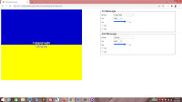
Oh there it is, right there.


Now let's concentrate on the dashboard. We want a fieldset here. Let's create a legend for it, with the text "1st Message".
<div class="dashboard">
    <fieldset>
        <legend>1st Message</legend>
    </fieldset>        
</div>


Here's some styling for the fieldset and legend tags. It's not necessary, but things will look nicer.
.dashboard
{
    width: 45%;
    float: right;
}

fieldset
{
    width: 90%;
}

legend
{
    font-size: 2em;
    font-weight: bold;
}


This is how the fieldset looks like.


Let's add a label and textbox. The id will be text1, we add a value and a placeholder attribute, then specify that if the value changes, the generateGraphic() function will be run with "1" passed in.
<fieldset>
    <legend>1st Message</legend>
    <label for="text1">Message: </label>
    <input id="text1" value="I stand with" onchange="generateGraphic(1)" placeholder="Top Message" />

</fieldset>


Here, we just set a standard width for labels. Again, not necessary, but it will be neater.
fieldset
{
    width: 90%;
}

legend
{
    font-size: 2em;
    font-weight: bold;
}

label
{
    display: inline-block;
    width: 10em;
}


Going good!


Next, we add a break and put in a drop-down list, with an id of font1. Again, we make sure that if the value changes, the generateGraphic() function will be run with "1" passed in.
<fieldset>
    <legend>1st Message</legend>
    <label for="text1">Message: </label>
    <input id="text1" value="I stand with" onchange="generateGraphic(1)" placeholder="Top Message" />
    <br />
    <label for="font1">Font: </label>
    <select id="font1" onchange="generateGraphic(1)">

    </select>

</fieldset>


Add some options here. You can add more options if you feel that the list is really limited, but these are just a few.
<fieldset>
    <legend>1st Message</legend>
    <label for="text1">Message: </label>
    <input id="text1" value="I stand with" onchange="generateGraphic(1)" placeholder="Top Message" />
    <br />
    <label for="font1">Font: </label>
    <select id="font1" onchange="generateGraphic(1)">
        <option value="arial">arial</option>
        <option value="georgia">georgia</option>
        <option value="impact">impact</option>
        <option value="verdana">verdana</option>

    </select>
</fieldset>


Here's the drop-down list!


We'll create a range input next. The id is size1. You can fill in whatever values you want for the value, min and max property, but these are what I recommend. However, the step property should be 1.
<fieldset>
    <legend>1st Message</legend>
    <label for="text1">Message: </label>
    <input id="text1" value="I stand with" onchange="generateGraphic(1)" placeholder="Top Message" />
    <br />
    <label for="font1">Font: </label>
    <select id="font1" onchange="generateGraphic(1)">
        <option value="arial">arial</option>
        <option value="georgia">georgia</option>
        <option value="impact">impact</option>
        <option value="verdana">verdana</option>
    </select>
    <br />
    <label for="size1">Size: </label>
    <input type="range" id="size1" value="28" min="8" max="35" step="1" onchange="generateGraphic(1)" /> px

</fieldset>


So far so good...


Here, we add two checkboxes, bold1 and italic1. We follow the same model for the rest of the elements we've created so far.
<fieldset>
    <legend>1st Message</legend>
    <label for="text1">Message: </label>
    <input id="text1" value="I stand with" onchange="generateGraphic(1)" placeholder="Top Message" />
    <br />
    <label for="font1">Font: </label>
    <select id="font1" onchange="generateGraphic(1)">
        <option value="arial">arial</option>
        <option value="georgia">georgia</option>
        <option value="impact">impact</option>
        <option value="verdana">verdana</option>
    </select>
    <br />
    <label for="size1">Size: </label>
    <input type="range" id="size1" value="28" min="8" max="35" step="1" onchange="generateGraphic(1)" /> px
    <br />
    <label for="bold1"><input type="checkbox" id="bold1" onchange="generateGraphic(1)" /> Bold</label>
    <br />
    <label for="italic1"><input type="checkbox" id="italic1" onchange="generateGraphic(1)" /> italic</label>

</fieldset>


Beautiful!


Copy the entire fieldset and paste it.
<div class="dashboard">
    <fieldset>
        <legend>1st Message</legend>
        <label for="text1">Message: </label>
        <input id="text1" value="I stand with" onchange="generateGraphic(1)" placeholder="Top Message" />
        <br />
        <label for="font1">Font: </label>
        <select id="font1" onchange="generateGraphic(1)">
            <option value="arial">arial</option>
            <option value="georgia">georgia</option>
            <option value="impact">impact</option>
            <option value="verdana">verdana</option>
        </select>
        <br />
        <label for="size1">Size: </label>
        <input type="range" id="size1" value="28" min="8" max="35" step="1" onchange="generateGraphic(1)" /> px
        <br />
        <label for="bold1"><input type="checkbox" id="bold1" onchange="generateGraphic(1)" /> Bold</label>
        <br />
        <label for="italic1"><input type="checkbox" id="italic1" onchange="generateGraphic(1)" /> italic</label>
    </fieldset>

</div>


Make these changes. We want this fieldset to be for the second message, so change the ids and the argument passed into the function call for generateGraphic().
<div class="dashboard">
    <fieldset>
        <legend>1st Message</legend>
        <label for="text1">Message: </label>
        <input id="text1" value="I stand with" onchange="generateGraphic(1)" placeholder="Top Message" />
        <br />
        <label for="font1">Font: </label>
        <select id="font1" onchange="generateGraphic(1)">
            <option value="arial">arial</option>
            <option value="georgia">georgia</option>
            <option value="impact">impact</option>
            <option value="verdana">verdana</option>
        </select>
        <br />
        <label for="size1">Size: </label>
        <input type="range" id="size1" value="28" min="8" max="35" step="1" onchange="generateGraphic(1)" /> px
        <br />
        <label for="bold1"><input type="checkbox" id="bold1" onchange="generateGraphic(1)" /> Bold</label>
        <br />
        <label for="italic1"><input type="checkbox" id="italic1" onchange="generateGraphic(1)" /> italic</label>
    </fieldset>

    <fieldset>
        <legend>2nd Message</legend>
        <label for="text2">Message: </label>
        <input id="text2" value="Ukraine" onchange="generateGraphic(2)" placeholder="Bottom Message" />
        <br />
        <label for="font2">Font: </label>
        <select id="font2" onchange="generateGraphic(2)">
            <option value="arial">arial</option>
            <option value="georgia">georgia</option>
            <option value="impact">impact</option>
            <option value="verdana">verdana</option>
        </select>
        <br />
        <label for="size2">Size: </label>
        <input type="range" id="size2" value="28" min="8" max="35" step="1" onchange="generateGraphic(2)" /> px
        <br />
        <label for="bold2"><input type="checkbox" id="bold2" onchange="generateGraphic(2)" /> Bold</label>
        <br />
        <label for="italic2"><input type="checkbox" id="italic2" onchange="generateGraphic(2)" /> italic</label>
    </fieldset>             
</div>


And there's your second fieldset!


Now let's work on the generateGraphic() function. We first declare message by using section along with "message" to get the div. Same for text, font, size, bold and italic.
function generateGraphic(section)
{
    var message = document.getElementById("message" + section);
    var text = document.getElementById("text" + section);
    var font = document.getElementById("font" + section);
    var size = document.getElementById("size" + section);
    var bold = document.getElementById("bold" + section);
    var italic = document.getElementById("italic" + section);

}


Next, we populate message with the value of text. We set the font and font size using the values of font and size respectively. Then we set bolding and italicizing using the checked properties of bold and italic respectively.
function generateGraphic(section)
{
    var message = document.getElementById("message" + section);
    var text = document.getElementById("text" + section);
    var font = document.getElementById("font" + section);
    var size = document.getElementById("size" + section);
    var bold = document.getElementById("bold" + section);
    var italic = document.getElementById("italic" + section);

    message.innerHTML = text.value;
    message.style.fontFamily = font.value;
    message.style.fontSize = size.value + "px";
    message.style.fontWeight = (bold.checked ? "bold" : "normal");
    message.style.fontStyle = (italic.checked ? "italic" : "normal");

}


And after that, let's make sure generateGraphic() is run twice upon page load, the first time with "1" passed in, and the second time with "2" passed in.
<body onload="generateGraphic(1); generateGraphic(2);">


Now reload. You see that the messages now appear in the blue and yellow halves of the graphic.


Play with the controls by changing the text, adjusting sizes and checking or unchecking the boxes!


But we want the top half text to be next to the line. So add this to the CSS. The padding-top property should take care of this.
.bottom
{
    width: 100%;
    height: 300px;
    text-align: center;
    color: rgba(0, 0, 200, 0.8);
    background-color: rgba(255, 255, 0, 1);
}

#message1
{
    padding-top: 270px;
}


.dashboard
{
    width: 45%;
    float: right;
}


Yes!


And just remove the red outline.
div {outline: 0px solid red;}


Here we go.


And all of this means jackshit unless we can print the result. So add this media class to the CSS. When printing, dashboard will be invisible and image will take up full width.
label
{
    display: inline-block;
    width: 10em;
}

@media print
{
    .dashboard
    {
        display: none;
    }

    .image
    {
        width: 100%;
    }
}


Try to print it!


Standing with Ukraine

Politics is a dirty business, but it's the people who suffer most. So hey, if you've got enough to spare, send some money over to help save lives!

#StandWithUkraine,
T___T